BIMM-143: INTRODUCTION TO BIOINFORMATICS (Lecture 5)
|
|
|
- Jonah Cody Cameron
- 5 years ago
- Views:
Transcription
1 BIMM-143: INTRODUCTION TO BIOINFORMATICS (Lecture 5) Data exploration and visualization in R Dr. Barry Grant Overview: One of the biggest attractions to the R programming language is that built into the language is the functionality required to have complete programmatic control over the plotting of complex figures and graphs. Whilst the use of these functions to generate simple plots is very easy, the generation of more complex multi-layered plots with precise positioning, layout, fonts and colors can be more challenging for novice users. Sections 1 to 3 of this hand-out are exercises designed to test your familiarity with R base plotting. Subsequent sections feature a rather detailed guide to plotting with base R and will be useful for answering the questions in the first three sections. My objective with the later sections is to provide you with everything you would need to create plots for almost any kind of data you may encounter in the future. Side-note: While I have attempted to cover all of the major graph types you re likely to use as a newcomer to base R these are obviously not the only way to do plotting in R. There are many other R graphing packages and libraries, which can be imported and each of these has advantages and disadvantages. The most common, and ridiculously popular, external library is ggplot2, we will introduce this add on package from CRAN next day. Section 1: Customizing simple plots A. The file weight_chart.txt from the example data available online contains data for a growth chart for a typical baby over the first 9 months of its life. Use the plot function to draw this as a point an line graph with the following changes: o Change the point character to be a filled square (pch=15) o Change the plot point size to be 1.5x normal size (cex=1.5) o Change the line thickness to be twice the default size (lwd=2) o Change the y-axis to scale between 2 and 10kg (ylim=c(2,10)) o Change the x-axis title to be Age (months) (xlab= Age (months) ) o Change the y-axis title to be Weight (kg) (ylab= Weight (kg) ) Page 1
2 o Add a suitable title to the top of the plot (main= Some title ) B. The file feature_counts.txt contains a summary of the number of features of different types in the mouse GRCm38 genome. Can you plot this as a barplot. Note that the data you need to plot is contained within the Count column of the data frame, so you pass only that column as the data. Once you have the basic plot make the following changes: o The bars should be horizontal rather than vertical (horiz=true). o The count axis should be labelled (ylab= A title ) o The feature names should be added to the y axis. (set names.arg to the Feature column of the data frame) o The plot should be given a suitable title (main= Some title ) o The text labels should all be horizontal (las=1) Note that you can pass this parameter either via par, or as an additional option to barplot. o The margins should be adjusted to accommodate the labels (par mar parameter). You need to supply a 4 element vector for the bottom,left,top and right margin values. Look at the value of par()$mar to see what the default values are so you know where to start. Note that you will have to redraw the barplot after making the changes to par. C. [Extension if you have time] Use this hist function to plot out the distribution of points sampled from a standard normal distribution (rnorm) along with another points sampled from the same distribution but with an offset of 4. o Example: c(rnorm(10000),rnorm(10000)+4) o Find a suitable number of breaks to make the plot look nicer (breaks=10 for example) Page 2
3 Section 2: Using and adjusting color in plots A. The file male_female_counts.txt contains a time series split into male and female count values. o Plot this as a barplot o Make all bars different colors using the rainbow function - rainbow takes a single argument, which is the number of colors to generate, eg rainbow(10) Try making the vector of colors separately before passing it as the col argument to barplot (col=rainbow(10)). - Rather than hard coding the number of colors, think how you could use nrow to automatically generate the correct number of colors for the size of dataset. o Replot, and make the bars for the males a different color to those for the females. In this case the male and female samples alternate so you can just pass a 2 color vector to the col parameter to achieve this effect. (col=c( blue2, red2 )) for example. B. The file up_down_expression.txt contains an expression comparison dataset, but has an extra column which classifies the rows into one of 3 groups (up, down or unchanging). Plot this as a scatterplot (plot) with the up being red, the down being blue and the unchanging being grey. o Read in the file o Start by just plotting the Condition1 column against the Condition2 column in a plot o Pass the State column as the col parameter (col=up.down$state for example). This will set the color according to the state of each point, but the colors will be set automatically from the output of palette Run palette() to see what colors are there initially and check that you can see how these relate to the colors you get in your plot. o Run levels() on the State column and match this with what you saw in palette() to see how each color was selected. Work out what colors you would need to put into palette to get the color selection you actually want. o Use the palette function to set the corresponding colors you want to use (eg palette(c( red, green, blue )) but using the correct colors in the correct order. o Redraw the plot and check that the colors are now what you wanted. Page 3
4 C. The file color_to_value_map.r contains a function to map a value from a range to a color from a predefined palette. The file expression_methylation.txt contains data for gene body methylation, promoter methylation and gene expression. Draw a scatterplot (plot) of the promoter.meth column against the gene.meth column. Now you can work on coloring this plot by the expression column. For this you are going to need to run the map.colors function we provided. This requires two bits of data one is simply the values in the expression column, but the other is a vector of colors which define your color scale. o You will need to start by constructing a color palette function from grey to red. - Run colorramppalette(c( grey, red )) to show that you can generate a function which will make colors running from grey to red. - Call the function to generate a set of 100 colors and save these into a s u i t a b l y n a m e d v a r i a b l e i e : colorramppalette(c( grey, red ))(100). o Now generate your actual color vector you re going to use. Call the map.colors function you ve been given with the set of expression column values, and the vector of colors you just generated. Save the per point colors which are returned into a new variable. Finally redraw the plot passing the per point colors to the col parameter. Section 3: Using overlays A. The file chromosome_position_data.txt contains positional count data for 3 different datasets (a WT and two mutants). Plot this as a line graph (using plot(type= l )) showing the 3 different datasets overlaid. o You ll need to do an initial plot with type= l specified followed by two additional layers using the lines function. The x values will be the Position column in each case. The y values will be the WT column for the initial plot, and then the Mut1 and Mut2 columns for the overlays. o Remember to calculate the full range of values across all 3 datasets when doing the initial plot so that all of the data will fit into the plot area. You can pass the whole data portion of the data frame (excluding the positions) to range to do the calculation ie: range(chr_positions[,2:4]) Page 4
5 o For the colors generate a 3 color palette from the Set1 RColorBrewer set using the brewer.pal(3, Set1 ) function and save it. Pass a different color from the palette to each of the plotting functions you call. o Use the legend function, to put a legend at the topleft of the plot with the data names and the corresponding colors (using the fill parameter). o Make the lines 2x as thick as standard (lwd=2) o Add suitable labels to each axis (using xlab and ylab). o The general structure for your code will therefore be: plot( [position data], [wt data], ylim=[range data], type= l, col=[first color], lwd=2 ) lines([position data], [mut1 data], col=[second color], lwd=2) lines([position data], [mut2 data], col=[third color], lwd=2) legend( topleft,c( wt, mut1, mut2 ),fill=[colors vector]) B. The file brain_bodyweight.txt contains data for the log10 brain and bodyweight for a range of species, along with an SEM measure for each point. Plot these data on a scatterplot (using plot) with error bars showing the mean +/- SEM and the names of the datasets under each point. o You will initially need to do a plot passing the Bodyweight and Brainweight columns as the data. Make sure this works before trying to add error bars. o You will need to add 2 sets of error bars, one for the Bodyweight and one for the Brainweight. These will be two separate additional layers, each consisting of an arrows function. Page 5
6 o The arguments for each arrows function are: - The x (brainweight) start position - The y (bodyweight) start position - The x (brainweight) end position - The y (bodyweight) end position - Additional common options will be angle=90 to produce a flat head to the bars code=3 to get a bar at both ends of the line length=0.05 so the bars aren t too long. o The start and end positions for one error bar will be the original value plus and minus the corresponding SEM. For example for the brainweight confidence interval the code would be something like: arrows ( data$bodyweight, data$brainweight data$brainweight.sem, data$bodyweight, data$brainweight + data$brainweight.sem, angle=90, code=3, length=0.05 ) You will, of course, need to replace data with whatever you actually called the data frame containing the data for this exercise. You would also need to repeat this modifying the Bodyweight values to get the Bodyweight error bars. o To add the names of the species just below each data point you would use the text function. The x and y values will just be the same as for the original plot (Brainweight and Bodyweight). The labels will be the Species column. Other options you will need to set will be: - pos=1 to put the text underneath each point - cex=0.7 to make the text slightly smaller Page 6
7 7 Section 4: A guide to plotting with base R Table of Contents Introduction... 9 Graphing Libraries in R... 9 The R Painter s Model... 9 Core Graph Types and Extensions Core Graph Types Control of Graph Appearance Internal Graph Options Axis Scales Axis Labels Plot title / subtitle Plotting character Plot Specific Options plot() barplot() dotchart() stripchart() hist() boxplot() pie() smoothscatter() Common Par Options Margins and spacing Fonts and Labels Multi-panel plots Using Color Specifying colors Built-in color schemes External color libraries Color Brewer colorramps Colorspace Applying color to plots Dynamic use of color Coloring by point density Mapping colors to quantitative values Complex Graph Types Page 7
8 Plot Overlays points() lines() / arrows() / segments() / abline() polygon() text() axis() legend() title() Multi axis plots Changing the plotting coordinate system Adding secondary axes Drawing outside the plot area Common extension packages Beanplot PHeatmap Heatmap colors Clustering options Exporting graphs Graphics Devices Graphics functions

9 Introduction One of the biggest attractions to the R programming language is that built into the language is the functionality required to have complete programmatic control over the plotting of complex figures and graphs. Whilst the use of these functions to generate simple plots is very easy, the generation of more complex multi-layered plots with precise positioning, layout, fonts and colors can be challenging. This course aims to go through the core R plotting functionality in a structured way which should provide everything you would need to create plots of any kind of data you may encounter in the future. Although the course is mostly restricted to the plotting functions of the core R language we will also introduce a few very common add-in packages which may prove to be useful. Graphing Libraries in R In this course we will deal mostly with the plotting functions built into the core R language. These cover all of the main graph types you re likely to use and will be available on any installation of R. These libraries are not the only way to do plotting in R though there are other graphing libraries which can be imported and each of these has advantages and disadvantages. The most common external library is ggplot, and this isn t covered in this course we have a whole separate course just on ggplot if you d like to learn about that. The R Painter s Model Plotting in R operates on what is known as a painter s model. Complex plots in core R are not drawn in a single operation, but require several different plotting layers to be laid down on top of each other. Newly added layers are placed over the top of whatever has already been drawn, and by default will obscure anything which was plotted underneath them. The addition of new layers is a one-way operation once a layer has been drawn there s no way to remove or modify it, so if you find you ve made a mistake in a lower layer the only way to correct it is to start over again from the bottom of the stack. The power of this approach is that you can define your own complex graph types by combining simple graph types in any combination, and there is very little that you can t do in terms of plotting using the core R plotting functions. 9
10 Core Graph Types and Extensions There are a number of built-in plotting functions in R, but in general they split into 2 main types. When drawing a complex plot the usual process is that you start by drawing a complete plot area. As well as drawing a graph this also sets the scaling used for the x and y coordinates which are then used for layers subsequently placed on top. Most commonly, the first plot drawn defines the entire plot area and the axis scales used by subsequent layers. Core Graph Types The R language defines a number of different plotting functions which draw different styles of plot. Each of the functions below defines a primary plot which draw a plot area (axes, scales, labels etc) as well as representing some data. All of these functions have many options which can dramatically change the appearance of the plot, and we ll look at these later so even if there isn t a plot which immediately looks the way you want, you can probably find one which can be adapted. 10
11 11
12 Control of Graph Appearance Internal Graph Options When drawing a plot it is very common to alter the default appearance to show exactly what you want to see. As with all other R functions you can therefore modify the action of the function by passing in additional options as key=value pairs. Whilst each plot type will have some plot specific options, a lot of the options you can pass end up being common to most plot types. You can see the full set of options for a given function on its help page (run?functionname), but we ll go through some of the common options below. Axis Scales Most plot types will auto-scale their axes to accommodate the range of data you initially supply. There are cases though where you need to manually specify the scale, either to expand or contract it to better show the data, or, if you re going to add more layers afterwards to ensure that the axis range is sufficient to accommodate all of the data you re later going to plot remember that you can t modify a layer once you ve drawn it. Adjustment of the range of axes is pretty universally provided by the options xlim and ylim, both of which require a vector of 2 values (min,max) to specify the range for the axis. Rather than specifying these values manually you can also use the output of the range function to calculate it. Remember that the scales are set by the data you initially pass to the base plot, so if you want to add further layers with a wider range later then you need to ensure that the ranges you set when drawing the initial plot are wide enough to accommodate all of the data you later intend to plot. Axis Labels Axis labels for the x and y axes can be set using the xlab and ylab options. These are different to the labels used to specify category labels for specific datasets. Plot title / subtitle Whilst titles can be added to plots as an overlay, you can normally add a main title using the main option, and a subtitle using the sub option. Plotting character For plots which use a specific character to indicate a data point you can choose from a range of different point shapes to use. These are set using the pch (point character) option and take a single number as its value. The shapes which correspond to each number are shown below. 12
13 The size of the plot characters can be changed using the cex (character expansion) option. This is a value where 1 is the default size and other values indicate the proportion of the default size you want to use. Plot Specific Options For each plot type there are a range of specific options which can be added to the required arguments to change the appearance of the plot. In the section below we will go through the different plot types, describe the format(s) of data they accept and what the most common supplementary options they use are. plot() The plot function is the generic x-y plotting chart type. Its default appearance is as a scatterplot, but by changing the way the points are plotted and joined you can make it into a line graph or a point and line graph. 13
14 Options: plot is hugely flexible and can take in almost any kind of data. Most custom data types will override plot to do something sensible with the data. For the common uses of plot you d pass in either 2 vectors of values (x and y), or a data frame or matrix with 2 columns (x and y) The type option determines what sort of plot you get o o o o o type= l gives you a line plot type= p gives you a scatter plot (the default) type= b gives you a dot and line plot For line plots lwd sets the line width (thickness) For line plots lty sets the line type 1. Solid line 2. Dashed line 3. Dotted line 4. Dot and dash line 5. Long dash line 6. Long then short dash line barplot() barplot is used to construct bar graphs. By varying the options applied you can create standard bar graphs, stacked bar graphs, or have groups of side by side bars. The graphs can be constructed either horizontally or vertically. 14

15 Options: barplot can either be given a simple vector of values for a single data series, or it can be given a matrix of values for sets of linked data series The names.arg option is used to set the category names. These will also be taken from the names associated with the data vector if it has them If you pass a matrix of data then you can set the beside argument to TRUE to have the data series grouped together on a common baseline, rather than presented as a stacked chart. If you want your bars to run horizontally then you set horiz to TRUE. You can alter the spacing between bars using the space argument. This can either be a single value to say what spacing separates all bars, or it can be one value per bar. If you have grouped bars then you can pass a vector of two values, the first for the between group space and the second for the within group space. dotchart() Options: dotchart will normally be given a simple vector of values for a single data series. You can pass it a matrix in which case it generates a facetted set of independent dot charts. The labels option is used to set the category names. These will also be taken from the names associated with the data vector if it has them. stripchart() Stripcharts are a way to show all individual measures for a set of related data points along with summarised values such as a mean. They are a better way of representing small datasets whose distribution doesn t 15
16 conform well enough to a standard distribution to be able to be accurately summarised by a boxplot or similar graph. Options: Stripchart s data is normally passed in as a list of numeric vectors containing the different series you want plot. This can be a data frame if the sets are the same size (since data frames are lists anyway). You can also use the data ~ factor notation to split a single dataset by a factor. You can use the method option to say what happens when multiple data points are the same. The default is that they plot over the top of each other, but you normally want to use method= jitter to spread them out horizontally. You can specify the numeric jitter argument to say how spread you want them to be. By default the plots are horizontal. You can make them vertical by using the vertical argument. Group names are taken from the names of the list slots if present, but you can specify them manually using group.names. hist() The hist function draws histograms which bin your data and then count the occurrences of data points within each bin. It is a natural way to summarise the distribution of a single continuous dataset. Options: 16 The hist function only takes a single vector of values for its data. To control the number of categories into which the data is broken you use the breaks argument. Most simply this is a single value indicating the total number of categories but you can also provide a vector of values between which the different categories will be constructed. If you re adventurous
17 you can also pass in a function which will calculate the breakpoint vector rather than passing the vector in directly. By default the plot shows the frequency with which data falls into each category, and the y axis is the number of observations. You can set the probability argument which turns the y values into proportions of the data, such that the sum of the values is 1. If you want to put text above each of the bars then you can pass a character vector in the labels argument. boxplot() A boxplot is a traditional way to summarise the major properties of a uni-modal distribution. It plots out the median, interquartile range and makes an estimate of the ends of the distribution and shows individual outliers which fall beyond this. Whilst it is a useful shortcut it has mostly been superseded by more accurate representations such as the violin plot or beanplot. Options: Data for boxplot can either be a single numeric vector, a list of numeric vectors or a formula of the form values ~ factor. The sensitivity of the whiskers on the plot is controlled by the range argument which specifies the maximal value for these in terms of a multiple of the inter-quartile range. Commonly used values would be 1.5 for outliers, 3 for extreme outliers, and 0 for the limits of the data values. The widths of the boxes can be controlled by the width argument. You can make the widths proportional to the number of observations by using the varwidth option. Group names are taken from the supplied dataset but can be overridden with the names argument. The plot is vertical by default but can be plotted sideways by setting the horizontal argument. pie() The pie function draws a pie chart to summarise the categorical division of a dataset into subgroups. 17

 The smoothscatter plot is a variant of the usual x-y plot function and is useful in cases where there are too many points in the plot to be able to accurately represent each one.")
18 Options: Data must be a numeric vector of positive values. Labels are taken from the data names but can be overridden by the labels argument. If the labels are big then you might need to reduce the size of the pie by setting the radius argument to a lower value. Categories are drawn anti-clockwise by default but you can set clockwise to make them go the other way. You can change the angle at which the first category starts using the angle argument. smoothscatter() The smoothscatter plot is a variant of the usual x-y plot function and is useful in cases where there are too many points in the plot to be able to accurately represent each one. In the smoothscatter plot instead of plotting individual points shaded areas are constructed to illustrate the density of points falling into each part of the plot allowing for an intuitive visualisation of very large datasets. Options: Data can be a pair of vectors (of the same length), a list of length 2, or a matrix with 2 columns. You can use the nbin argument to specify the number of bins the data range is split into for the density calculation, this can be a vector of length 2 if you want to set it separately for x and y. For color density you can use the colramp argument to provide a function which takes an integer value as an argument and returns that number of colors. You can also provide a custom function to map densities to colors using the transformation option. 18
19 Common Par Options As well as the options passed to the individual plotting functions there is also a global set of plotting options managed by the par function. These control high level attributes such as margins and spacing, font sizes and orientation and line styles. The par function manages all of these parameters which are held in a global list. You can edit the values stored in this list which will affect all of the plots you draw within the same plotting session. Editing the par values is done with the par function itself. You can pass in key=value pairs to set any of the par parameters to a new value. When you do this the return value is a list containing the values which were replaced. This allows you to re-run par on the output of the previous run to restore all parameters to their original values. For example, if we wanted to set character expansion (cex) to 1.5 we could first check what the current value was: par()$cex [1] 1 We could set a new value, and store the old one. par(cex=1.5) -> old.par par()$cex [1] 1.5 We can then later restore the original value. par(old.par) par()$cex [1] 1 Margins and spacing Margins in the plot area are set using the mar or mai parameters, which can be set either from par or within the plotting function. The only difference between these different parameters is the units they use (mar = number of lines, mai = inches) you can set the conversion between mar and mai using the mex parameter. When setting the margins you supply a vector of 4 values which represent the bottom, left, top and right margin sizes you would like. If you decrease your margins you need to be careful that you don t push plot elements (axis labels for example) off the plot area. If you increase your margins too much you will sometimes find that there is insufficient space left for the required plot area, and you ll get an error like: Error in plot.new() : figure margins too large 19
 parameters.")
, cex.main (plot title) or cex.sub (plot subtitle).")
20 Fonts and Labels There are various options you can set which will affect the appearance of fonts and labels within your plots. The simplest change you can make is to the size at which the various labels within the plot will be drawn. This can be changed using one of the cex (character expansion) parameters. The main cex parameter is a proportional value relative to 1 (the default size) and affects all text and plot characters. You can do more targeted changes by altering cex.axis (axis tick labels) cex.lab (axis titles), cex.main (plot title) or cex.sub (plot subtitle). You should also note that, confusingly, there is a cex parameter which can be passed to the plot function which only affects the plotting characters, and doesn t affect the fonts, which are only changed by altering this parameter through par. As well as changing the size of your labels you can also change the font which is used to draw them. R offers 4 standard font styles which can be assigned to the different plot elements. These are: 20
21 1. Plain text (the default) 2. Bold text 3. Italic text 4. Bold italic text These can be assigned to the font parameter to change all fonts in a plot, or to one of its sub-parameters, font.axis (axis tick labels), font.lab (axis titles), font.main (plot title) or font.sub (plot subtitle). In addition to changing the style of the font you can also change between 3 standard font families using the family parameter. These are sans (plain sans-serif font the default and what you should nearly always use), serif (a serif font similar to Times Roman shouldn t generally be used for plots), or mono (monospaced font where all letters are the same width. Can be useful if including DNA or Protein sequence tags in a plot). Finally you can choose the orientation of your labels by using the las parameter. This takes a numeric value whose meaning is: 0. Always parallel to the axis (the default) 1. Always horizontal (usually the easiest to read) 2. Always perpendicular to the axis 3. Always vertical Multi-panel plots One of the most common things to change in the par system is the overall layout of the plot area. Rather than having your plot command draw a graph which takes up the entire plot area you can divide this into a grid of sub-areas where each new plot command moves to the next sub-area until the entire plot area is full, at which point the next plot wipes the whole area and starts over again. You can set the plot area to be divided in this way using the mfrow parameter. This takes a vector of two values (rows, columns) to say how you want the division to occur. 21
22 22
23 Using Color Most plot types in R allow you some flexibility over the use of color. Most commonly you will provide either a custom vector of colors to use, or you can use a common color scheme to which your samples will be matched. In general there are two ways of specifying colors, either you can describe an individual color, or you can provide a function which can generate a custom set of colors dynamically. Specifying colors Colors can be manually specified either through a direct RGB hexadecimal string or through the use of a controlled set of color names defined within the language. You can see the predefined colors by running colors(). If you want to manually define a color then you can do this using hexadecimal notation where you can specify either 3 or 4 values in a single string. The first 3 required values are the amount of red, green and blue in hex values between 0 (00) and 255 (FF). The optional fourth value would be the alpha (transparency) value. For example: Pure red would be #FF0000 Pure blue would be #0000FF Dark green would be #007F00 Dark purple would be #CC00CC Semi-transparent yellow would be #FFFF0044 To convert to hexadecimal you can use as.hexmode() in R. Built-in color schemes Unless it s for a very simple application most of the time it doesn t make any sense to try to define your own color palettes to use in R. Defining a good palette with good color separation and equal visual impact is not a trivial task and it s better to use a pre-defined palette rather than make up your own. There are some color palettes built into the core R language. These are generally semi-quantitative schemes which can be useful but maybe aren t the best schemes available. The built-in color palette functions are: rainbow heat.colors cm.colors terrain.colors topo.colors Each of them simply takes the number of colors you want to generate as an argument. 23

24 External color libraries In addition to the color functions built into R there are some very good external color packages which are usually the best place to go for either pre-defined palettes, or for functions to easily generate your own palettes. Color Brewer One of the most popular color palette packages is RColorBrewer. The ColorBrewer project ( originated to make color schemes for maps, but the palettes it produced are now used in lots of applications. It really just consists of a set of pre-defined palettes from which you can select the one you like, and choose how many colors from it to extract. You can view all of the palettes available with: display.brewer.all() 24

25 particularly good for categorical palettes (the middle block in the image above). It s To extract colors from the palettes provided you simply use the brewer.pal function to say how many colors you want and which palette you want to take them from. brewer.pal(5,"set1") [1] "#E41A1C" "#377EB8" "#4DAF4A" "#984EA3" "#FF7F00" colorramps Whilst RcolorBrewer is very good for categorical palettes, if you want to generate quantitative color schemes which smoothly transition between different colors then the functions provided within colorramps may be a better choice. The package provides two functions which are useful for different tasks. colorramp takes a vector of key colors and returns a function into which you can pass a vector of values between 0 and 1 and you will get back a matrix of RGB values for colors which correspond to that value. colorramppalette takes a vector of key colors and returns a function into which you can pass an integer number and it will return you that number of colors sampled evenly from across the color palette which was created. colorramp(c("red","white","blue")) -> palette palette(seq(from=0,to=1,by=0.1)) [,1] [,2] [,3] [1,] [2,] [3,] [4,] [5,]
![[6,] 255 255 255 [7,] 204 204 255 [8,] 153 153 255 [9,] 102 102 255 [10,] 51 51 255 [11,] 0 0 255 colorramppalette(c("red","white","blue"))(5) [1] "#FF0000" "#FF7F7F" "#FFFFFF" "#7F7FFF" "#0000FF"](/docs-images/95/123555325/images/26-0.jpg "Colorspace Another package which provides an easy way to construct and select palettes is the colorspace package.")
26 [6,] [7,] [8,] [9,] [10,] [11,] colorramppalette(c("red","white","blue"))(5) [1] "#FF0000" "#FF7F7F" "#FFFFFF" "#7F7FFF" "#0000FF" Colorspace Another package which provides an easy way to construct and select palettes is the colorspace package. This provides a single function choose_palette() which opens up a graphical tool which allows you to select the type of palette you want and adjust some options to create something which you think is suitable. When you ve finished with it, it will return a function to generate the palette you selected to your program. This tool can only be used interactively you can t put it into a non-interactive R script since it requires your intervention in the selection, but it s a nice way to see what you re getting. Applying color to plots Most plot types will have an argument to pass in the colors you want to use (it s usually col). To fill this argument you can generally pass in one of two things: 1. You can pass a vector of colors which will then be applied to the corresponding data 2. In some plot types you can pass in a vector of factors which will relate to the data you provided so that the groups will be created automatically and colored according to the global palette. The first option is by far the simplest and can be used in conjunction with the palette generation methods described above. In the example below we take a set of 5 colors from the standard ColorBrewer Set1 palette and apply these to the chart. c(1,6,2,4,7) -> data brewer.pal(length(data),"set1") -> colors barplot(data,col=colors) 26
 will be assigned a different color from a standard palette. group.")
27 In this example we are just going to pass the Sex column from the data frame to the col parameter for the plot. This doesn t specify the actual colors which will be used but each factor ( Male and Female in this case) will be assigned a different color from a standard palette. group.data Sex Height Weight 1 Male Female Female Male Male Female Male Female Female Male Female Male Male Male Female Female Male plot(group.data$height,group.data$weight, col=group.data$sex, pch=19, cex=3) 27
28 If you use the factor method of assigning colors then you get whichever colors are in the global palette and the ordering of factors is whatever is specified in your factor vector. The global palette is simply a vector of colors associated with your R session from which plots using factors as colors can draw. You can see the colors present in the palette by calling the palette() function. > palette() [1] "black" "red" "green3" "blue" "cyan" "magenta" "yellow" "gray" If you want to change the colors then you can just pass a new vector of colors into the palette function to set this. This is a global setting and will apply to all plots which use the palette from this point on. palette(brewer.pal(9,"set1")) If you want to change the ordering of your different factors within a factor vector then you can alter this by resetting the levels. Levels in R are a little odd. You have a few related functions for dealing with levels and it s important to understand how these work. The levels() function can be used to change the naming, but NOT ordering of levels. In this example we change the name of levels from A and B to Dog and Cat. > level.data category data 1 A 1 2 A 2 3 B 3 4 B 4 > levels(level.data$category) [1] "A" "B" > levels(level.data$category) <- c("dog","cat") 28
29 > level.data category data 1 Dog 1 2 Dog 2 3 Cat 3 4 Cat 4 The relevel function allows you to change the ordering of levels, but only so that you can place one level ahead of the others. You can t set an arbitrary order. > level.data$category [1] A A B B C C Levels: A B C > relevel(level.data$category,"b") [1] A A B B C C Levels: B A C In this case the relevel function will just return you a new factor vector with the data in the same order but the specified factor ( B in this case) promoted to the front of the ordered list. If we wanted to keep this order we would need to send the output of relevel over the top of the existing category column. The general mechanism for defining arbitrary relevels of factors is to completely recreate the factor vector with an explicit set of levels. > level.data [1] D B A C F E Levels: A B C D E F > factor(level.data,levels=c("e","f","a","c","d","b")) [1] D B A C F E Levels: E F A C D B This is what we d need to use to reset the levels in our plot. levels(group.data$sex) [1] "Female" "Male" > group.data$sex <- factor(group.data$sex,levels=c("male","female")) > levels(group.data$sex) [1] "Male" "Female" 29

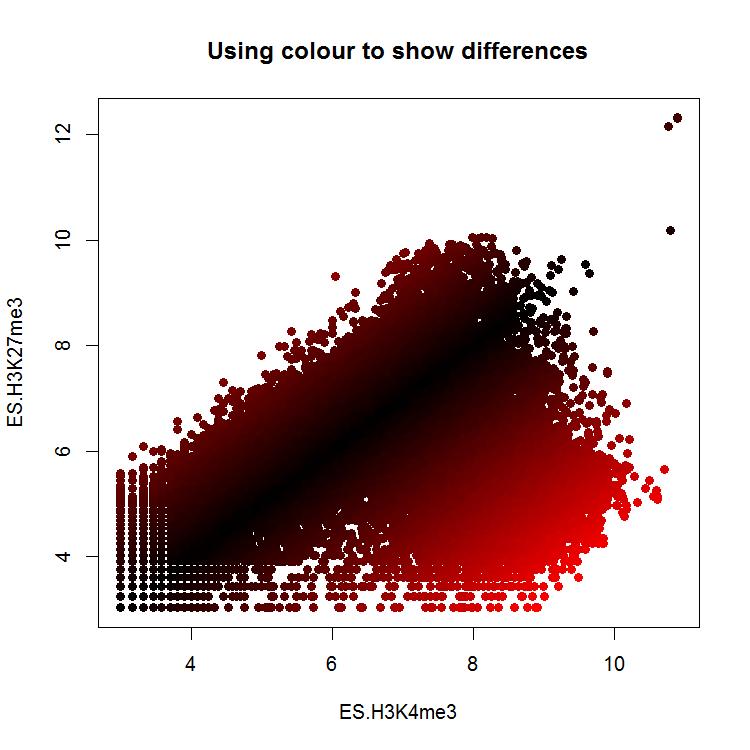
30 Dynamic use of color The uses of color described above would be what you d use to do categorical coloring, but often we want to use color for a more quantitative purpose. In some graph types you can specify a color function and it will dynamically generate an appropriate color for each data point, but it can be useful to do this more manually in other plot types. Coloring by point density One common use of dynamic color is to color a scatterplot by the number of points overlaid in a particular area so that you can get a better impression for where the majority of points fall. R has a built in function denscols which can take in the data for a scatterplot and will calculate an appropriate color vector to use to accurately represent the density. This has a built in color scheme which is just shades of blue, but you can pass in your own color generating function (such as one generated by colorramppalette) to get whatever coloring you prefer. plot(dens.cols.data,pch=19,main="no density coloring") plot(dens.cols.data, col=denscols(dens.cols.data, colramp = colorramppalette( c("blue2","green2","red2","yellow") ) ),pch=19, main="with custom density coloring" ) Mapping colors to quantitative values Whilst color in general isn t a great way to represent quantitative data it can be really useful to use the color of points in a plot as an extra quantitative variable. This will then require a way to map colors from a palette to values in a quantitative set. There is no built in function within R to do this, but it s fairly easy to write 30
31 your own small function to do this. The example below is pretty simplistic in that it scales the colors over the whole range which might be a problem if you had large outliers, but it should be easy to modify if you need something more complex than this. map.colors <- function(value,range,palette) { proportion <- (value-range[1])/(range[2]-range[1]) index <- round((length(palette)-1)*proportion)+1 } return(palette[index]) You could then use it like: diffs <- abs(dens.cols.data$es.h3k4me3 - dens.cols.data$es.h3k27me3) map.colors( diffs, range(diffs), colorramppalette(c("black","red"))(100) ) -> quant.colors plot(dens.cols.data, col=quant.colors, pch=19, main="using color to show differences") 31
32 32

33 Complex Graph Types Plot Overlays After you have drawn your initial plot area and have set the scaling of your x and y axes you can then overlay more layers of data or annotation on top of the original chart. Whilst it is possible to draw another complete plot over the top of an initial plot (we ll do that later), it is much more usual to use a separate set of functions which are designed to add more data to the top of an existing plot area. points() The points function allows you to plot individual scatterplot points over the top of an existing graph. It can be used to highlight subsets on a normal scatterplot or overlay individual data points on a graph type which summarises data. Options: Data is a pair of vectors (of the same length) giving the x and y positions of the points. lines() / arrows() / segments() / abline() These related functions allow you to place lines over an existing plot. The lines function is mostly used to add an extra dataset consisting of multiple x,y segments. The arrows function draws individual arrows onto plots, and can be modified to add error bars (which would be arrows with flat heads), and abline is used to draw a single line (usually a trend line or regression) to a plot. 33
34 Options: For lines the data is a pair of vectors (of the same length) giving the x and y positions of the points in the lines to plot. For arrows you specify separate vectors for x0, y0, x1 and y1 but you can plot multiple datasets at once. If plotting on a barplot then the return value from the barplot function will give you the centre positions of the bars which you can use in any overlays. For abline you specify the intercept (a) and slope (b), or you can pass in an object which defines a line, such as the output of a correlation. For lines you can set type in the same way as used for plot For arrows you can specify the length and angle of the arrowhead. You can also use the code to specify which type of arrowhead to draw (1=arrow at start, 2=arrow at end, 3=arrow both ends) polygon() The polygon function allows you to draw shaded areas on plots. It is often used to illustrate confidence intervals in complex plots, or can be used to provide background shading, or other types of highlight. Options: The data for polygon is a set of two vectors containing the x and y coordinates of the set of points which define the boundary of the polygon. 34
35 text() The text function allows you to place arbitrary text over the plot. It isn t generally used for normal graph components such as axis labels, which are normally options to the initial plot, or figure legends, which have their own function. It can be used to label points of interest or include other non-standard notation onto a plot (p-values for example). Options: The data for text are three vectors, one for the x coordinates, one for y coordinates and one for the labels themselves. Since you often don t want the text placed directly over the point you plotted you can adjust the label position either by changing x and y directly, or by specifying adj which is a 2 value vector indicating the offset to apply to x and y values, or by specifying pos where R will calculate an offset (1=below, 2=left, 3=above, 4=right). axis() Plot axis are normally provided by the function which originally draws the plot, you don t need to add them explicitly. There are times, however when having the ability to draw individual axes can be useful. This would include cases where you wanted to have multiple x or y-axes, or if you wanted the axis to be on a different scale to the data. Options: 35
36 The position relative to the plot is set with side (1=below, 2=left, 3=above, 4=right) The positions of the tick marks are set with at. The scaling is set by the last plot drawn so if you want a secondary axis you must draw a new plot area with new=true set in your par options to change the plotting scale. To move the axis back from its default position next to the plot area uses the lines option to say how much space to leave before drawing the axis. If you want to add text to the new axis then you can use the mtext function to add this. This is a separate function, and not a parameter to the axis command legend() The legend function is used to add a standard data legend to a plot. It can either be pinned to one of the corners of the plot, or placed at any arbitrary location in the graph. Options: The position of the legend can either be set with a compound text string such as topright or bottomleft or with specific x and y coordinates. If you want the legend to be positioned outside the main plot area an still be visible then you need to set xpd=na Labels are set with the legend argument. If you want shaded boxes next to the labels then pass a vector of colors to the fill argument. title() Most commonly you will add titles, subtitles and axis labels when you first create your plot, but you can use the title function to add these after plotting. Using the title function gives you a little more control over the placement of titles than may be available in the main options of the individual plot types. It would also allow for adding titles to whole sets of multi-panel plots. 36
37 Options: Two title strings can be passed into the function, one for the main title (above the plot) and another for the sub title (below the plot). If a multi-panel plots is being constructed then you can pass outer=true to have the title applied to the outer margins of the plot which are common to all of the sub-plots. Multi axis plots When adding an overlay to an existing plot you are only adding additional graphical elements, not generating a new plot area. The coordinate system for the plot is set by the first plotting command and is then retained through the addition of extra layers. In some cases though you want to be able to re-configure the scaling of the plot area, so that you can overlay plots on different scales. Drawing this kind of multi-scale plot brings up a couple of problems firstly how to change the plotting scale within a single plot area, and secondly how to add additional y-axes to be able to represent the different scales used for different lines within the graph. Changing the plotting coordinate system The mechanism you can use to change the coordinate system for a plot is to simply repeat the drawing of the base plot using a new dataset to reset the ranges of the x and y axes. Normally when you do this you would clear the previous plot and start a new one, however if you set par(new=true) then the previous plot area will not be cleared and the new plot will be overlaid. If you only apply this parameter then you will also overwrite the axes and borders of the original plot, so for the secondary plot it is usual to set xaxt= n and yaxt= n so as to not re-draw the x and y axes. It is then possible to add a secondary axis later by simply calling the axis function with side=4 to place it on the right using the new scale. plot(0:10,(0:10)*100,type="l",lwd=2,col="red",ylab="",xlab="values",main="mul ti Scale",yaxt="n") axis(side=2,col="red",lwd=2) par(new=true) plot(0:10,rev(0:10),type="l",lwd=2,col="blue",xaxt="n",yaxt="n",xlab="",ylab= "") axis(side=4,col="blue",lwd="2") 37
38 Adding secondary axes In the example above we simply used the axis function to add a new axis to the right side of the plot for the second scale. In some circumstances though we want the axis to appear as a secondary axis on the left. In this case you ll need to firstly adjust your par(mar) setting so that you leave a larger margin on the left of the plot to be able to accommodate a secondary axis. You can then do the plot as shown above, but now you can keep the axis on the left (side=2) and then use the lines option to say how far back to position it. Drawing outside the plot area By default most items plotted in R must be contained within the defined plot area. This would mean that you could plot a subsequent dataset which had values outside the original range for the plot, and it wouldn t escape the boundaries of the plot to draw over other parts of your figure. There are occasions though when you want to be able to draw outside the plot area. The most common of these is to place a data legend alongside the plot instead of within it, but there may be other cases where this is useful too. The variable you can adjust to control this is the par xpd variable. This can take one of 3 values. The default is FALSE and constrains drawing to the plot region. If you set it to TRUE you can draw over any part 38
) barplot(c(1,2,1.5,2.")
39 of the current figure, but can t overwrite onto other plots which might be on the same panel. If you set it to NA then you can draw anywhere. You can then specify an x and y position outside of the plot area to position any new elements. The scaling for x and y is still taken from the plot area. par(mar=c(4,4,4,10)) barplot(c(1,2,1.5,2.5,3),col=c("red","orange","yellow","green","blue")) par(xpd=true) legend(paste("sample",c("a","b","c","d","e")),fill=c("red","orange","yellow", "green","blue"),x=6.5,y=2.5) text("legend",x=7.6,y=2.7) 39
40 Common extension packages In addition to the plotting functions there are a couple of stand-alone packages which act in a very similar manner to the core plotting functions, but which add some very useful graph types which are otherwise not available, or not very user friendly. In particular the packages beanplot and heatmap.2 are worth looking at. Beanplot A beanplot is a graph type used to summarise the distribution of a set of values. The nature of the plot means that, much like a boxplot, it is easy to summarise several data series in a single plot, however, unlike a boxplot, the beanplot allows to you see the full range of the distribution of values, and makes no assumption about the data being normally distributed. It is therefore generally a better option than a boxplot in most cases. Beanplots are provided by the beanplot package, and the standard data arguments mirror those for a boxplot. You input data can be a single vector, a list, a data frame or a formula. boxplot(bean.data, las=1,names=1:4,pch=19,col="grey") beanplot(bean.data, las=1,names=1:4,col="grey") In the example above you can see that the fourth data series is actually bimodal in nature. In the boxplot this simply looks like increased variance, whereas the greater detail in the beanplot allows you to see the details of the distribution. There are a number of additional options which can be used with beanplot to alter the display, or to configure how data is shown. Options: The bw parameter determines the function used to draw the smoothed outline around the bean data. Normally you can leave this alone, but if you have a dataset with large numbers of replicates in it (especially zeros) then you may find that the plot refuses to draw because it can t estimate a suitable curve. In these cases setting bw=nrd0 (zero at the end) should allow the plot to proceed. 40

41 The what parameter allows you to remove parts of the plot. The default beanplot presentation shows the outline of the data density, but also a horizontal line for the average value, a set of small bean lines for each data point and a dashed line for the global average. The what parameter lets you set a vector of 4 values of 1 or 0 to say whether to draw the total average, beans, per-bean average and the density line. The names parameter allows you to explicitly name the groups in the plot if these aren t picked up automatically from the data. By using the side parameter you can say whether the data is plotted to both sides (the default) for just left or right. By using a subsequent over plot on the same scale you can then plot the other side to be able to make a direct comparison of two datasets. PHeatmap Although there is a heatmap function built into the core R plotting library it doesn t have the nicest of visual appearences, and the API for altering it isn t very intuitive. There are a few different competing alternative heatmap packages available in CRAN, but the one we like the best of the ones we ve tried is the pheatmap package. 41

42 The advantage of using pheatmap is that you can change a large number of the aspects of this plot very easily. For smaller heatmaps you can put boxes around each cell using border_color to specify their color, or NA to omit them. You can remove the color legend using legend=false You can use show_rownames and show_colnames to say whether you want the text labels to show. You can change the size of text with fontsize (or fontsize_row and fontsize_col if you want to be more specific) Heatmap colors The default pheatmap view will plot the data values supplied to it without any transformation or normalisation. The colors used therefore reflect the range of values in your data. If you don t like the default color scheme you can substitute your own by passing a vector of colors to the color parameter. The easiest way to make this vector would be to use the colorramppalette function to create a function to generate the colors you want, and then immediately call it to make the vector of colors. > colorramppalette(c("blue","black","green"))(20) [1] "#0000FF" "#0000E4" "#0000C9" "#0000AE" "#000093" 42
![[6] "#000078" "#00005D" "#000043" "#000028" "#00000D" [11] "#000D00" "#002800" "#004300" "#005D00" "#007800" [16] "#009300" "#00AE00" "#00C900" "#00E400" "#00FF00" The range and scaling of the colors](/docs-images/95/123555325/images/43-0.jpg "is determined by the breaks parameter.")
43 [6] "#000078" "#00005D" "#000043" "#000028" "#00000D" [11] "#000D00" "#002800" "#004300" "#005D00" "#007800" [16] "#009300" "#00AE00" "#00C900" "#00E400" "#00FF00" The range and scaling of the colors is determined by the breaks parameter. This is a vector of endpoint values used to define the different bins you want to use this would be the way to compress the scale used, or to map specific colors to specific values. col=colorramppalette(c("white","blue"))(50), breaks=seq(from=0, to=10, length.out=51) Clustering options In general terms there are two common types of clustering you are likely to use: 1. Euclidean clustering where the similarity between two datasets is determined by the difference in their absolute data values. 2. Correlation clustering where the similarity between two datasets is determined by the pattern and direction of their changes. In general you use Euclidean clustering when you want to focus on the importance of the absolute quantitated values. You would use correction clustering when you care about datasets having the same trends in their differences without actually caring about the magnitude of those changes. 43

44 pheatmap defaults to Euclidean clustering, which won t be appropriate for many applications, so it s useful to know how to change this to correlation clustering. The parameters which control this are clustering_distance_rows and clustering_distance_cols. These can be set to either correlation or euclidean to change the behaviour of the clustering. When doing a correlation based clustering you should also generally normalise your row data to z-scores to remove the effect of different absolute values, and different variances on different rows. To do this you set scale= row in the pheatmap options. You should see that the scale on the histogram changes to show z-scores. When plotting z-score based data you should generally use a diverging, symmetrical color scheme. 44
Plotting Complex Figures Using R. Simon Andrews v
 Plotting Complex Figures Using R Simon Andrews simon.andrews@babraham.ac.uk v2017-11 The R Painters Model Plot area Base plot Overlays Core Graph Types Local options to change a specific plot Global options
Recap From Last Time: Today s Learning Goals. Today s Learning Goals BIMM 143. Data visualization with R. Lecture 5. Barry Grant
 BIMM 143 Data visualization with R Lecture 5 Barry Grant http://thegrantlab.org/bimm143 Recap From Last Time: What is R and why should we use it? Familiarity with R s basic syntax. Familiarity with major
Statistical Programming with R
 Statistical Programming with R Lecture 9: Basic graphics in R Part 2 Bisher M. Iqelan biqelan@iugaza.edu.ps Department of Mathematics, Faculty of Science, The Islamic University of Gaza 2017-2018, Semester
Graphing Interface Overview
 Graphing Interface Overview Note: This document is a reference for using JFree Charts. JFree Charts is m-power s legacy graphing solution, and has been deprecated. JFree Charts have been replace with Fusion
Types of Plotting Functions. Managing graphics devices. Further High-level Plotting Functions. The plot() Function
 Function") 3 / 23 5 / 23 Outline The R Statistical Environment R Graphics Peter Dalgaard Department of Biostatistics University of Copenhagen January 16, 29 1 / 23 2 / 23 Overview Standard R Graphics The standard
3 / 23 5 / 23 Outline The R Statistical Environment R Graphics Peter Dalgaard Department of Biostatistics University of Copenhagen January 16, 29 1 / 23 2 / 23 Overview Standard R Graphics The standard
HOUR 12. Adding a Chart
 HOUR 12 Adding a Chart The highlights of this hour are as follows: Reasons for using a chart The chart elements The chart types How to create charts with the Chart Wizard How to work with charts How to
LAB 1 INSTRUCTIONS DESCRIBING AND DISPLAYING DATA
 LAB 1 INSTRUCTIONS DESCRIBING AND DISPLAYING DATA This lab will assist you in learning how to summarize and display categorical and quantitative data in StatCrunch. In particular, you will learn how to
An Introduction to R 2.2 Statistical graphics
 An Introduction to R 2.2 Statistical graphics Dan Navarro (daniel.navarro@adelaide.edu.au) School of Psychology, University of Adelaide ua.edu.au/ccs/people/dan DSTO R Workshop, 29-Apr-2015 Scatter plots
Intro to R Graphics Center for Social Science Computation and Research, 2010 Stephanie Lee, Dept of Sociology, University of Washington
 Intro to R Graphics Center for Social Science Computation and Research, 2010 Stephanie Lee, Dept of Sociology, University of Washington Class Outline - The R Environment and Graphics Engine - Basic Graphs
Table of Contents (As covered from textbook)
") Table of Contents (As covered from textbook) Ch 1 Data and Decisions Ch 2 Displaying and Describing Categorical Data Ch 3 Displaying and Describing Quantitative Data Ch 4 Correlation and Linear Regression
Table of Contents (As covered from textbook) Ch 1 Data and Decisions Ch 2 Displaying and Describing Categorical Data Ch 3 Displaying and Describing Quantitative Data Ch 4 Correlation and Linear Regression
Creating a Box-and-Whisker Graph in Excel: Step One: Step Two:
 Creating a Box-and-Whisker Graph in Excel: It s not as simple as selecting Box and Whisker from the Chart Wizard. But if you ve made a few graphs in Excel before, it s not that complicated to convince
Install RStudio from - use the standard installation.
 Session 1: Reading in Data Before you begin: Install RStudio from http://www.rstudio.com/ide/download/ - use the standard installation. Go to the course website; http://faculty.washington.edu/kenrice/rintro/
SAS Visual Analytics 8.2: Working with Report Content
 SAS Visual Analytics 8.2: Working with Report Content About Objects After selecting your data source and data items, add one or more objects to display the results. SAS Visual Analytics provides objects
FRONTPAGE STEP BY STEP GUIDE
 IGCSE ICT SECTION 15 WEB AUTHORING FRONTPAGE STEP BY STEP GUIDE Mark Nicholls ICT lounge P a g e 1 Contents Introduction to this unit.... Page 4 How to open FrontPage..... Page 4 The FrontPage Menu Bar...Page
1 Introduction to Using Excel Spreadsheets
 Survey of Math: Excel Spreadsheet Guide (for Excel 2007) Page 1 of 6 1 Introduction to Using Excel Spreadsheets This section of the guide is based on the file (a faux grade sheet created for messing with)
NCSS Statistical Software
 Chapter 152 Introduction When analyzing data, you often need to study the characteristics of a single group of numbers, observations, or measurements. You might want to know the center and the spread about
Survey of Math: Excel Spreadsheet Guide (for Excel 2016) Page 1 of 9
 Page 1 of 9") Survey of Math: Excel Spreadsheet Guide (for Excel 2016) Page 1 of 9 Contents 1 Introduction to Using Excel Spreadsheets 2 1.1 A Serious Note About Data Security.................................... 2 1.2
Survey of Math: Excel Spreadsheet Guide (for Excel 2016) Page 1 of 9 Contents 1 Introduction to Using Excel Spreadsheets 2 1.1 A Serious Note About Data Security.................................... 2 1.2
Exercises: Plotting Complex Figures Using R
 Exercises: Pltting Cmplex Figures Using R Versin 2017-11 Exercises: Pltting Cmplex Figures in R 2 Licence This manual is 2016-17, Simn Andrews. This manual is distributed under the creative cmmns Attributin-Nn-Cmmercial-Share
Data Visualization. Andrew Jaffe Instructor
 Module 9 Data Visualization Andrew Jaffe Instructor Basic Plots We covered some basic plots previously, but we are going to expand the ability to customize these basic graphics first. 2/45 Read in Data
Configuring Figure Regions with prepplot Ulrike Grömping 03 April 2018
 Configuring Figure Regions with prepplot Ulrike Grömping 3 April 218 Contents 1 Purpose and concept of package prepplot 1 2 Overview of possibilities 2 2.1 Scope.................................................
Chapter 6: DESCRIPTIVE STATISTICS
 Chapter 6: DESCRIPTIVE STATISTICS Random Sampling Numerical Summaries Stem-n-Leaf plots Histograms, and Box plots Time Sequence Plots Normal Probability Plots Sections 6-1 to 6-5, and 6-7 Random Sampling
Exercise 1: Introduction to MapInfo
 Geog 578 Exercise 1: Introduction to MapInfo Page: 1/22 Geog 578: GIS Applications Exercise 1: Introduction to MapInfo Assigned on January 25 th, 2006 Due on February 1 st, 2006 Total Points: 10 0. Convention
This activity will show you how to use Excel to draw cumulative frequency graphs. Earnings ( x/hour) 0 < x < x
 0 < x < x") Pay rates for men and women - Excel 2007 activity This activity will show you how to use Excel to draw cumulative frequency graphs. Information sheet The table gives the results from a survey about hourly
Pay rates for men and women - Excel 2007 activity This activity will show you how to use Excel to draw cumulative frequency graphs. Information sheet The table gives the results from a survey about hourly
Graphics #1. R Graphics Fundamentals & Scatter Plots
 Graphics #1. R Graphics Fundamentals & Scatter Plots In this lab, you will learn how to generate customized publication-quality graphs in R. Working with R graphics can be done as a stepwise process. Rather
The first thing we ll need is some numbers. I m going to use the set of times and drug concentration levels in a patient s bloodstream given below.
 Graphing in Excel featuring Excel 2007 1 A spreadsheet can be a powerful tool for analyzing and graphing data, but it works completely differently from the graphing calculator that you re used to. If you
Chapter 2 - Graphical Summaries of Data
 Chapter 2 - Graphical Summaries of Data Data recorded in the sequence in which they are collected and before they are processed or ranked are called raw data. Raw data is often difficult to make sense
Creating a Basic Chart in Excel 2007
 Creating a Basic Chart in Excel 2007 A chart is a pictorial representation of the data you enter in a worksheet. Often, a chart can be a more descriptive way of representing your data. As a result, those
Spreadsheet Warm Up for SSAC Geology of National Parks Modules, 2: Elementary Spreadsheet Manipulations and Graphing Tasks
 University of South Florida Scholar Commons Tampa Library Faculty and Staff Publications Tampa Library 2009 Spreadsheet Warm Up for SSAC Geology of National Parks Modules, 2: Elementary Spreadsheet Manipulations
Tips and Guidance for Analyzing Data. Executive Summary
 Tips and Guidance for Analyzing Data Executive Summary This document has information and suggestions about three things: 1) how to quickly do a preliminary analysis of time-series data; 2) key things to
Module 10. Data Visualization. Andrew Jaffe Instructor
 Module 10 Data Visualization Andrew Jaffe Instructor Basic Plots We covered some basic plots on Wednesday, but we are going to expand the ability to customize these basic graphics first. 2/37 But first...
Using Microsoft Excel
 Using Microsoft Excel Formatting a spreadsheet means changing the way it looks to make it neater and more attractive. Formatting changes can include modifying number styles, text size and colours. Many
Chapter 10 Working with Graphs and Charts
 Chapter 10: Working with Graphs and Charts 163 Chapter 10 Working with Graphs and Charts Most people understand information better when presented as a graph or chart than when they look at the raw data.
8. MINITAB COMMANDS WEEK-BY-WEEK
 8. MINITAB COMMANDS WEEK-BY-WEEK In this section of the Study Guide, we give brief information about the Minitab commands that are needed to apply the statistical methods in each week s study. They are
Package EnQuireR. R topics documented: February 19, Type Package Title A package dedicated to questionnaires Version 0.
 Type Package Title A package dedicated to questionnaires Version 0.10 Date 2009-06-10 Package EnQuireR February 19, 2015 Author Fournier Gwenaelle, Cadoret Marine, Fournier Olivier, Le Poder Francois,
INTRODUCTION TO R. Basic Graphics
 INTRODUCTION TO R Basic Graphics Graphics in R Create plots with code Replication and modification easy Reproducibility! graphics package ggplot2, ggvis, lattice graphics package Many functions plot()
Working with Charts Stratum.Viewer 6
 Working with Charts Stratum.Viewer 6 Getting Started Tasks Additional Information Access to Charts Introduction to Charts Overview of Chart Types Quick Start - Adding a Chart to a View Create a Chart with
Part II: Creating Visio Drawings
 128 Part II: Creating Visio Drawings Figure 5-3: Use any of five alignment styles where appropriate. Figure 5-4: Vertical alignment places your text at the top, bottom, or middle of a text block. You could
Decimals should be spoken digit by digit eg 0.34 is Zero (or nought) point three four (NOT thirty four).
 point three four (NOT thirty four).") Numeracy Essentials Section 1 Number Skills Reading and writing numbers All numbers should be written correctly. Most pupils are able to read, write and say numbers up to a thousand, but often have difficulty
Numeracy Essentials Section 1 Number Skills Reading and writing numbers All numbers should be written correctly. Most pupils are able to read, write and say numbers up to a thousand, but often have difficulty
DSCI 325: Handout 18 Introduction to Graphics in R
 DSCI 325: Handout 18 Introduction to Graphics in R Spring 2016 This handout will provide an introduction to creating graphics in R. One big advantage that R has over SAS (and over several other statistical
Excel 2013 Intermediate
 Instructor s Excel 2013 Tutorial 2 - Charts Excel 2013 Intermediate 103-124 Unit 2 - Charts Quick Links Chart Concepts Page EX197 EX199 EX200 Selecting Source Data Pages EX198 EX234 EX237 Creating a Chart
Lecture Notes 3: Data summarization
 Lecture Notes 3: Data summarization Highlights: Average Median Quartiles 5-number summary (and relation to boxplots) Outliers Range & IQR Variance and standard deviation Determining shape using mean &
Basics of Plotting Data
 Basics of Plotting Data Luke Chang Last Revised July 16, 2010 One of the strengths of R over other statistical analysis packages is its ability to easily render high quality graphs. R uses vector based
AA BB CC DD EE. Introduction to Graphics in R
 Introduction to Graphics in R Cori Mar 7/10/18 ### Reading in the data dat
Using Excel to produce graphs - a quick introduction:
 Research Skills -Using Excel to produce graphs: page 1: Using Excel to produce graphs - a quick introduction: This handout presupposes that you know how to start Excel and enter numbers into the cells
Bar Charts and Frequency Distributions
 Bar Charts and Frequency Distributions Use to display the distribution of categorical (nominal or ordinal) variables. For the continuous (numeric) variables, see the page Histograms, Descriptive Stats
Learning to use the drawing tools
 Create a blank slide This module was developed for Office 2000 and 2001, but although there are cosmetic changes in the appearance of some of the tools, the basic functionality is the same in Powerpoint
Regression III: Advanced Methods
 Lecture 3: Distributions Regression III: Advanced Methods William G. Jacoby Michigan State University Goals of the lecture Examine data in graphical form Graphs for looking at univariate distributions
Math 227 EXCEL / MEGASTAT Guide
 Math 227 EXCEL / MEGASTAT Guide Introduction Introduction: Ch2: Frequency Distributions and Graphs Construct Frequency Distributions and various types of graphs: Histograms, Polygons, Pie Charts, Stem-and-Leaf
Statistics Lecture 6. Looking at data one variable
 Statistics 111 - Lecture 6 Looking at data one variable Chapter 1.1 Moore, McCabe and Craig Probability vs. Statistics Probability 1. We know the distribution of the random variable (Normal, Binomial)
The basic arrangement of numeric data is called an ARRAY. Array is the derived data from fundamental data Example :- To store marks of 50 student
 Organizing data Learning Outcome 1. make an array 2. divide the array into class intervals 3. describe the characteristics of a table 4. construct a frequency distribution table 5. constructing a composite
Excel Core Certification
 Microsoft Office Specialist 2010 Microsoft Excel Core Certification 2010 Lesson 6: Working with Charts Lesson Objectives This lesson introduces you to working with charts. You will look at how to create
ENV Laboratory 2: Graphing
 Name: Date: Introduction It is often said that a picture is worth 1,000 words, or for scientists we might rephrase it to say that a graph is worth 1,000 words. Graphs are most often used to express data
Solution to Tumor growth in mice
 Solution to Tumor growth in mice Exercise 1 1. Import the data to R Data is in the file tumorvols.csv which can be read with the read.csv2 function. For a succesful import you need to tell R where exactly
An introduction to ggplot: An implementation of the grammar of graphics in R
 An introduction to ggplot: An implementation of the grammar of graphics in R Hadley Wickham 00-0-7 1 Introduction Currently, R has two major systems for plotting data, base graphics and lattice graphics
PyPlot. The plotting library must be imported, and we will assume in these examples an import statement similar to those for numpy and math as
 Geog 271 Geographic Data Analysis Fall 2017 PyPlot Graphicscanbeproducedin Pythonviaavarietyofpackages. We willuseapythonplotting package that is part of MatPlotLib, for which documentation can be found
SETTING UP A. chapter
 1-4283-1960-3_03_Rev2.qxd 5/18/07 8:24 PM Page 1 chapter 3 SETTING UP A DOCUMENT 1. Create a new document. 2. Create master pages. 3. Apply master pages to document pages. 4. Place text and thread text.
STA 570 Spring Lecture 5 Tuesday, Feb 1
 STA 570 Spring 2011 Lecture 5 Tuesday, Feb 1 Descriptive Statistics Summarizing Univariate Data o Standard Deviation, Empirical Rule, IQR o Boxplots Summarizing Bivariate Data o Contingency Tables o Row
MICROSOFT EXCEL Working with Charts
 MICROSOFT EXCEL 2010 Working with Charts Introduction to charts WORKING WITH CHARTS Charts basically represent your data graphically. The data here refers to numbers. In Excel, you have various types of
Excel Basics Rice Digital Media Commons Guide Written for Microsoft Excel 2010 Windows Edition by Eric Miller
 Excel Basics Rice Digital Media Commons Guide Written for Microsoft Excel 2010 Windows Edition by Eric Miller Table of Contents Introduction!... 1 Part 1: Entering Data!... 2 1.a: Typing!... 2 1.b: Editing
An Introduction to R Graphics
 An Introduction to R Graphics PnP Group Seminar 25 th April 2012 Why use R for graphics? Fast data exploration Easy automation and reproducibility Create publication quality figures Customisation of almost
SPSS. (Statistical Packages for the Social Sciences)
") Inger Persson SPSS (Statistical Packages for the Social Sciences) SHORT INSTRUCTIONS This presentation contains only relatively short instructions on how to perform basic statistical calculations in SPSS.
Inger Persson SPSS (Statistical Packages for the Social Sciences) SHORT INSTRUCTIONS This presentation contains only relatively short instructions on how to perform basic statistical calculations in SPSS.
L E S S O N 2 Background
 Flight, Naperville Central High School, Naperville, Ill. No hard hat needed in the InDesign work area Once you learn the concepts of good page design, and you learn how to use InDesign, you are limited
UNIT 15 GRAPHICAL PRESENTATION OF DATA-I
 UNIT 15 GRAPHICAL PRESENTATION OF DATA-I Graphical Presentation of Data-I Structure 15.1 Introduction Objectives 15.2 Graphical Presentation 15.3 Types of Graphs Histogram Frequency Polygon Frequency Curve
CSS Selectors. element selectors. .class selectors. #id selectors
 CSS Selectors Patterns used to select elements to style. CSS selectors refer either to a class, an id, an HTML element, or some combination thereof, followed by a list of styling declarations. Selectors
Adobe Illustrator. Quick Start Guide
 Adobe Illustrator Quick Start Guide 1 In this guide we will cover the basics of setting up an Illustrator file for use with the laser cutter in the InnovationStudio. We will also cover the creation of
DOING MORE WITH EXCEL: MICROSOFT OFFICE 2013
 DOING MORE WITH EXCEL: MICROSOFT OFFICE 2013 GETTING STARTED PAGE 02 Prerequisites What You Will Learn MORE TASKS IN MICROSOFT EXCEL PAGE 03 Cutting, Copying, and Pasting Data Basic Formulas Filling Data
Introduction to R: Day 2 September 20, 2017
 Introduction to R: Day 2 September 20, 2017 Outline RStudio projects Base R graphics plotting one or two continuous variables customizable elements of plots saving plots to a file Create a new project
Desktop Studio: Charts. Version: 7.3
 Desktop Studio: Charts Version: 7.3 Copyright 2015 Intellicus Technologies This document and its content is copyrighted material of Intellicus Technologies. The content may not be copied or derived from,
HTML and CSS a further introduction
 HTML and CSS a further introduction By now you should be familiar with HTML and CSS and what they are, HTML dictates the structure of a page, CSS dictates how it looks. This tutorial will teach you a few
Homework 1 Excel Basics
 Homework 1 Excel Basics Excel is a software program that is used to organize information, perform calculations, and create visual displays of the information. When you start up Excel, you will see the
Introduction to Geospatial Analysis
 Introduction to Geospatial Analysis Introduction to Geospatial Analysis 1 Descriptive Statistics Descriptive statistics. 2 What and Why? Descriptive Statistics Quantitative description of data Why? Allow
Creating a data file and entering data
 4 Creating a data file and entering data There are a number of stages in the process of setting up a data file and analysing the data. The flow chart shown on the next page outlines the main steps that
Adding CSS to your HTML
 Adding CSS to your HTML Lecture 3 CGS 3066 Fall 2016 September 27, 2016 Making your document pretty CSS is used to add presentation to the HTML document. We have seen 3 ways of adding CSS. In this lecture,
CAPE. Community Behavioral Health Data. How to Create CAPE. Community Assessment and Education to Promote Behavioral Health Planning and Evaluation
 CAPE Community Behavioral Health Data How to Create CAPE Community Assessment and Education to Promote Behavioral Health Planning and Evaluation i How to Create County Community Behavioral Health Profiles
Graphics in R STAT 133. Gaston Sanchez. Department of Statistics, UC Berkeley
 Graphics in R STAT 133 Gaston Sanchez Department of Statistics, UC Berkeley gastonsanchez.com github.com/gastonstat/stat133 Course web: gastonsanchez.com/stat133 Base Graphics 2 Graphics in R Traditional
Prepare a stem-and-leaf graph for the following data. In your final display, you should arrange the leaves for each stem in increasing order.
 Chapter 2 2.1 Descriptive Statistics A stem-and-leaf graph, also called a stemplot, allows for a nice overview of quantitative data without losing information on individual observations. It can be a good
Introduction to Minitab 1
 Introduction to Minitab 1 We begin by first starting Minitab. You may choose to either 1. click on the Minitab icon in the corner of your screen 2. go to the lower left and hit Start, then from All Programs,
Microsoft Excel 2007
 Microsoft Excel 2007 1 Excel is Microsoft s Spreadsheet program. Spreadsheets are often used as a method of displaying and manipulating groups of data in an effective manner. It was originally created
Introduction to the workbook and spreadsheet
 Excel Tutorial To make the most of this tutorial I suggest you follow through it while sitting in front of a computer with Microsoft Excel running. This will allow you to try things out as you follow along.
Fathom Dynamic Data TM Version 2 Specifications
 Data Sources Fathom Dynamic Data TM Version 2 Specifications Use data from one of the many sample documents that come with Fathom. Enter your own data by typing into a case table. Paste data from other
QDA Miner. Addendum v2.0
 QDA Miner Addendum v2.0 QDA Miner is an easy-to-use qualitative analysis software for coding, annotating, retrieving and reviewing coded data and documents such as open-ended responses, customer comments,
Adobe InDesign CS6 Tutorial
 Adobe InDesign CS6 Tutorial Adobe InDesign CS6 is a page-layout software that takes print publishing and page design beyond current boundaries. InDesign is a desktop publishing program that incorporates
Flow Cytometry Analysis Software. Developed by scientists, for scientists. User Manual. Version Introduction:
 Flowlogic Flow Cytometry Analysis Software Developed by scientists, for scientists User Manual Version 7.2.1 Introduction: Overview, Preferences, Saving and Opening Analysis Files www.inivai.com TABLE
Desktop Studio: Charts
 Desktop Studio: Charts Intellicus Enterprise Reporting and BI Platform Intellicus Technologies info@intellicus.com www.intellicus.com Working with Charts i Copyright 2011 Intellicus Technologies This document
An introduction to plotting data
 An introduction to plotting data Eric D. Black California Institute of Technology February 25, 2014 1 Introduction Plotting data is one of the essential skills every scientist must have. We use it on a
Lab1: Use of Word and Excel
 Dr. Fritz Wilhelm; physics 230 Lab1: Use of Word and Excel Page 1 of 9 Lab partners: Download this page onto your computer. Also download the template file which you can use whenever you start your lab
Window Designer. Opening Screen: When you start Window Designer, you will see the Opening Screen. Here you will be choosing from 4 options:
 Window Designer Opening Screen: When you start Window Designer, you will see the Opening Screen. Here you will be choosing from 4 options: New Design: Use this option when no pre-built templates are available
R Workshop Module 3: Plotting Data Katherine Thompson Department of Statistics, University of Kentucky
 R Workshop Module 3: Plotting Data Katherine Thompson (katherine.thompson@uky.edu Department of Statistics, University of Kentucky October 15, 2013 Reading in Data Start by reading the dataset practicedata.txt
CHAPTER 1. Introduction. Statistics: Statistics is the science of collecting, organizing, analyzing, presenting and interpreting data.
 1 CHAPTER 1 Introduction Statistics: Statistics is the science of collecting, organizing, analyzing, presenting and interpreting data. Variable: Any characteristic of a person or thing that can be expressed
Excel Tips and FAQs - MS 2010
 BIOL 211D Excel Tips and FAQs - MS 2010 Remember to save frequently! Part I. Managing and Summarizing Data NOTE IN EXCEL 2010, THERE ARE A NUMBER OF WAYS TO DO THE CORRECT THING! FAQ1: How do I sort my
CS7026 CSS3. CSS3 Graphics Effects
 CS7026 CSS3 CSS3 Graphics Effects What You ll Learn We ll create the appearance of speech bubbles without using any images, just these pieces of pure CSS: The word-wrap property to contain overflowing
MAXQDA and Chapter 9 Coding Schemes
 MAXQDA and Chapter 9 Coding Schemes Chapter 9 discusses how the structures of coding schemes, alternate groupings are key to moving forward with analysis. The nature and structures of the coding scheme
SHOW ME THE NUMBERS: DESIGNING YOUR OWN DATA VISUALIZATIONS PEPFAR Applied Learning Summit September 2017 A. Chafetz
 SHOW ME THE NUMBERS: DESIGNING YOUR OWN DATA VISUALIZATIONS PEPFAR Applied Learning Summit September 2017 A. Chafetz Overview In order to prepare for the upcoming POART, you need to look into testing as
Univariate Statistics Summary
 Further Maths Univariate Statistics Summary Types of Data Data can be classified as categorical or numerical. Categorical data are observations or records that are arranged according to category. For example:
SES123 Computer Methods Lab Procedures
 SES123 Computer Methods Lab Procedures Introduction Science and engineering commonly involve numerical calculations, graphs, photographic images, and various types of figures. In this lab, you will use
plot(seq(0,10,1), seq(0,10,1), main = "the Title", xlim=c(1,20), ylim=c(1,20), col="darkblue");
, seq(0,10,1), main = the Title, xlim=c(1,20), ylim=c(1,20), col=darkblue);") R for Biologists Day 3 Graphing and Making Maps with Your Data Graphing is a pretty convenient use for R, especially in Rstudio. plot() is the most generalized graphing function. If you give it all numeric
R for Biologists Day 3 Graphing and Making Maps with Your Data Graphing is a pretty convenient use for R, especially in Rstudio. plot() is the most generalized graphing function. If you give it all numeric
Using Microsoft Word. Tables
 Using Microsoft Word are a useful way of arranging information on a page. In their simplest form, tables can be used to place information in lists. More complex tables can be used to arrange graphics on
Statistics 251: Statistical Methods
 Statistics 251: Statistical Methods Summaries and Graphs in R Module R1 2018 file:///u:/documents/classes/lectures/251301/renae/markdown/master%20versions/summary_graphs.html#1 1/14 Summary Statistics
CS Multimedia and Communications REMEMBER TO BRING YOUR MEMORY STICK TO EVERY LAB! Lab 02: Introduction to Photoshop Part 1
 CS 1033 Multimedia and Communications REMEMBER TO BRING YOUR MEMORY STICK TO EVERY LAB! Lab 02: Introduction to Photoshop Part 1 Upon completion of this lab, you should be able to: Open, create new, save
Combo Charts. Chapter 145. Introduction. Data Structure. Procedure Options
 Chapter 145 Introduction When analyzing data, you often need to study the characteristics of a single group of numbers, observations, or measurements. You might want to know the center and the spread about