Basic Elements > Color
|
|
|
- Amanda Powers
- 5 years ago
- Views:
Transcription

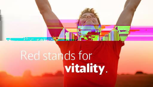
1 Contents At a glance: Our Corporate Colors CD guidelines: Values of the primary colors Values of our secondary colors Colors with special status Our colors are an essential part of our corporate design. People associate colors with emotions. And by selecting and applying our colors, we can steer these emotions. As ambassadors and conveyors of positive feelings, our corporate colors support the presence and emotional impact of our brands. We use color as a design element in all areas of Group communications and use it to differentiate the brand presences at DB. The corporate colors were determined following the fusion of West Germany s Deutsche Bundesbahn and East Germany s Deutsche Reichsbahn. Over the years their consistent use has had a lasting effect. Today our identity color DB Red and our color scheme are widely familiar. Page 1

2 At a glance: As the identity color for the entire Group, DB Red is the starting point for the character of the color scheme that results from our corporate colors. DB Red, DB Blue, and DB Gray are used to differentiate our brands. White and gray tones round out the primary color palette of DB. The new, enlarged DB color palette offers a wide spectrum of lighter and darker gradations of the DB primary colors, as well as an additional palette of DB secondary colors. These color tones can be used e.g. for mouse-over or mouse-down movements and to color complex illustrations, big data- and information graphics to the standards of our brand and corporate design. The color palette is used uniformly across all media and is available for downloading in RGB and CMYK. Page 2


3 Page 3
4 Used as a large pane color, DB Red represents the Passenger Transport and Rail Freight Transport divisions. DB Red identifies their products at first sight. Its consistent use as an identity color establishes reliability and a sense of place, and expresses the special status of passenger and freight rail transport. As a division color it distinguishes not only vehicles and products but also the complete line of advertising and communications of the DB brand. DB Blue is the primary color and identity color of our internationally active brand DB Schenker. By using DB Blue, DB Schenker underscores the independent status of its brand. Blue has the same associations in all cultural regions of the globalized transport and logistics market. Vehicles painted in DB Red dominate the appearance of regional transport. On long distance trains, DB Red appears as a red stripe along the vehicle s entire length, thereby symbolizing fast and direct connections between major cities. In all online and print media, DB Blue is an essential component of the DB Schenker brand identity. Page 4

5 DB Gray is used to identify the Group as well as the divisions Infrastructure and Services. DB Gray conveys practicality, solidity and neutrality. As the identity color of the brand DB Netze, DB Gray underscores the role of the service provider for infrastructure. DB Netze and the Group also use the color in online and print media. The Group also has the option of communicating without an identity color. With it, the Group presents itself as neutral and superior and conveys stability. To ensure a sober presence that is reserved in its coloration, the nonbright colors DB Dark Gray, DB Light Gray and DB White Gray are used for structuring and organizing. They are derived from the primary color DB Gray. Use of our gray tones ensures that our vibrant primary colors retain their special status. In addition, DB Silver is a special color for high grade representation in selected media of the Group. Page 5
6 CD guidelines: Values of the primary colors Color is applied to many different surfaces and materials, resulting in a multitude of color systems for the differing areas of application. Definitions of color are therefore only an approximation of an ideal image. Depending on the printing technique and dot gain, it may become necessary to adjust the values defined here. Our references are the current printed ISOcoated color sample books for Pantone und HKS. RGB 240/20/20 Web #F01414 CMYK 0/100/100/0 Grayscale 70% Pantone 485 HKS 14 RAL 3020 RGB 10/30/110 Web #0A1E6E CMYK 100/75/0/35 Grayscale 100% Pantone 281 RAL 5013 RGB 135/140/150 Web #878C96 CMYK 10/0/0/45 Grayscale 50% Pantone 430 RAL 7045 RGB 255/255/255 Web #ffffff CMYK 0/0/0/0 RAL 9010/9016 * * Realization of white in RAL color tones is application-specific (Environmental Design, Vehicles). Gradations of the primary colors Color gradations are no longer set up as simple brightening. They are used across media in optimized tones. For the most important color tones, realizations have been defined for Pantone, HKS and RAL. RGB 255/90/100 Web #FF5A64 CMYK 0/70/50/0 RGB 250/55/60 Web #FA373C CMYK 0/80/65/0 RGB 240/20/20 Web #F01414 CMYK 0/100/100/0 Grayscale 70% Pantone 485 HKS 14 RAL 3020 RGB 204/0/0 Web #CC0000 CMYK 0/100/100/15 RGB 178/0/0 Web #B20000 CMYK 0/100/100/25 RGB 154/0/0 Web #9A0000 CMYK 0/100/100/45 Please note: Color gradations are not used as division colors for sender identification, e.g. as color panes on brochure titles. RGB 102/0/0 Web # CMYK 0/100/100/65 Page 6
7 RGB 55/95/195 Web #375FC3 CMYK 80/55/0/0 RGB 35/65/155 Web #23419B CMYK 90/65/0/15 RGB 10/30/110 Web #0A1E6E CMYK 100/75/0/35 Grayscale 100% Pantone 281 RAL 5013 RGB 0/10/90 Web #000A5A CMYK 100/80/0/45 RGB 0/0/70 Web # CMYK 100/85/0/55 RGB 0/0/50 Web # CMYK 100/90/0/70 RGB 0/0/30 Web #00001E CMYK 100/95/0/85 RGB 240/243/245 Web #F0F3F5 CMYK 2/0/0/5 RGB 234/238/241 Web #EAEEF1 CMYK 2/0/0/10 RGB 225/230/235 Web #E1E6EB CMYK 3/0/0/13 Grayscale 10% Pantone Cool Gray 2 RAL 9002 RGB 215/220/225 Web #D7DCE1 CMYK 4/0/0/19 RGB 200/205/210 Web #C8CDD2 CMYK 5/0/0/25 Grayscale 30% Pantone 428 RAL 7047 RGB 175/180/187 Web #AFB4BB CMYK 7/0/0/35 RGB 155/160/170 Web #9BA0AA CMYK 9/0/0/40 RGB 135/140/150 Web #878C96 CMYK 10/0/0/45 Grayscale 50% Pantone 430 RAL 7045 RGB 120/125/135 Web #787D87 CMYK 12/0/0/55 RGB 100/105/115 Web # CMYK 15/0/0/65 Grayscale 70% Pantone 431 RAL 7012 RGB 80/85/95 Web #50555F CMYK 20/0/0/75 RGB 60/65/75 Web #3C414B CMYK 25/0/0/85 RGB 40/45/55 Web #282D37 CMYK 30/0/0/90 RGB 20/25/35 Web # CMYK 35/0/0/95 Note: The extensive new DB Gray palette replaces the previous brand-independent neutral gray tones. The new palette has been completely derived from the primary color DB Gray and fits harmoniously in our overall look. Page 7
8 Values of our secondary colors The secondary colors allow greater color differentiation, e.g. in information graphics, tables or special applications in product-, interior or UX-UI design. Both bright and subdued colors are available for branding that is target group specific and meets the brand's needs, all integrated in a balanced overall image. The secondary colors are sufficiently distinguishable from the primary colors and cannot be mistaken for them. You can use them across all media. RGB 255/220/60 Web #ffdc3c CMYK 0/10/90/0 RGB 255/205/0 Web #FFCD00 CMYK 0/20/100/0 Pantone 116 RAL 1021 HKS 4 RGB 255/175/0 Web #FFAF00 CMYK 0/40/100/0 Pantone 130 RAL 1037 HKS 6 RGB 255/140/0 Web #FF8C00 CMYK 0/55/90/0 Pantone 151 RAL 2009 HKS 7 RGB 250/105/0 Web #FA6900 CMYK 0/70/95/0 RGB 240/80/0 Web #F05000 CMYK 0/80/100/0 RGB 245/110/170 Web #F56EAA CMYK 0/65/0/0 RGB 240/70/165 Web #F046A5 CMYK 5/80/0/0 RGB 195/50/150 Web #C33296 CMYK 25/85/0/0 RGB 145/30/135 Web #911E87 CMYK 55/100/0/0 RGB 95/20/120 Web #5F1478 CMYK 75/100/0/30 Pantone 2623 RAL 4007 RGB 60/0/100 Web #3C0064 CMYK 85/100/0/40 RGB 170/240/70 Web #AAF046 CMYK 40/0/90/0 RGB 120/190/20 Web #78BE14 CMYK 55/0/100/0 Pantone 376 RAL 6018 HKS 66 RGB 60/165/50 Web #3CA532 CMYK 75/0/100/0 Pantone 361 RAL 6010 HKS 65 RGB 0/120/65 Web # CMYK 100/0/85/30 Pantone 7732 RAL 6016 RGB 0/85/35 Web # CMYK 100/0/95/55 RGB 0/60/25 Web #003c19 CMYK 100/0/100/75 RGB 40/215/255 Web #28D7FF CMYK 60/0/3/0 RGB 0/170/220 Web #00AADC CMYK 70/5/0/10 RGB 0/135/185 Web #0087B9 CMYK 80/15/0/20 RGB 0/100/140 Web #00648C CMYK 100/0/0/50 Pantone 7706 RAL 5017 RGB 0/75/100 Web #004B64 CMYK 100/0/0/65 RGB 0/50/70 Web # CMYK 100/0/0/80 RGB 230/205/165 Web #E6CDA5 CMYK 0/15/40/15 RGB 215/175/135 Web #D7AF87 CMYK 0/25/45/20 RGB 195/130/80 Web #C38250 CMYK 0/45/65/25 RGB 175/90/0 Web #AF5A00 CMYK 0/60/100/35 Pantone 1605 RAL 8023 RGB 140/50/0 Web #8C3200 CMYK 0/80/100/50 RGB 115/15/0 Web #730F00 CMYK 30/100/100/50 Page 8

9 RGB 195/160/185 Web #C3A0B9 CMYK 25/40/15/5 RGB 160/115/145 Web #A07391 CMYK 40/60/25/5 RGB 130/80/115 Web # CMYK 50/70/25/15 RGB 110/55/95 Web #6E375F CMYK 55/80/30/30 RGB 85/35/70 Web # CMYK 60/90/35/45 RGB 55/10/40 Web #370A28 CMYK 65/100/40/65 RGB 215/210/10 Web #D7D20A CMYK 25/5/95/0 RGB 180/180/0 Web #B4B400 CMYK 35/15/100/0 RGB 135/150/0 Web # CMYK 35/5/100/30 RGB 90/110/0 Web #5A6E00 CMYK 40/0/100/60 Pantone 371 RAL 6025 RGB 50/70/0 Web # CMYK 45/0/100/80 RGB 30/45/0 Web #1E2D00 CMYK 50/0/100/90 RGB 125/200/200 Web #7DC8C8 CMYK 55/0/25/0 RGB 95/180/180 Web #5FB4B4 CMYK 60/0/30/10 RGB 35/150/150 Web # CMYK 75/0/40/25 RGB 0/110/115 Web #006E73 CMYK 100/0/40/50 Pantone 323 RAL 6026 RGB 0/85/90 Web #00555A CMYK 100/0/40/65 RGB 0/60/65 Web #003C41 CMYK 100/0/40/75 Downloading color palettes for Adobe software The palettes of our corporate colors in CMYK and RGB can be downloaded here. They can be loaded into e.g. InDesign, Illustrator and Photoshop. You can find more information on the topic of color management and technical standards under the following link: Download: DB Corporate Colors File format: ZIP File size: 4 kb Technical Standards Colors with special status Additional colors have been created for special corporate design applications and customer products. You can find rules for using colors in these special areas in the respective CD guidelines. Browser-specific color tones Light modifications of the color tones are possible if intended to achieve optimized depiction on specific browsers or end devices. Digital Media, UX-UI Design Page 9

10 Copy colors Copy appears on printed pages generally in the pure tone black (0/0/0/100). On screens, use the highly readable and high-contrast color tone DB (RGB 40/45/55, #282d37). Finishing Special topics of printed Group communications can be finished with the special color DB Silver. This refinement of print publications is reserved for the Group. Pantone 877 RAL 9006 Brochures Additional links Office software (PowerPoint, Word) For an interim period, special colors have been defined for PowerPoint and Word. These will be adapted to the latest standard for corporate colors in a future update. PowerPoint Contact Questions about this page? [1] published: Verweisliste [1] Questions about this page?: design@deutschebahn.com Page 10
Questions on designing mobile applications? Please contact: the corporate design team [1]
![Questions on designing mobile applications? Please contact: the corporate design team [1]](/thumbs/95/123321151.jpg "Questions on designing mobile applications? Please contact: the corporate design team [1]") Contents At a glance: Corporate design guidelines: Application Icon Splash Screen Interface Technical standards of various operating systems ios/iphone Android DB has been successfully harnessing the growing
Contents At a glance: Corporate design guidelines: Application Icon Splash Screen Interface Technical standards of various operating systems ios/iphone Android DB has been successfully harnessing the growing
Digital Media, UX-UI Design > Website Principles
 Contents At a glance: Page layout header To ensure the correct appearance of our brands in a broad spectrum of applications with a web front end, uniform treatment of design elements is an absolute necessity.
At a glance: Digital Media, UX-UI Design > HTML Newsletters
 Contents At a glance: Look & Feel Constructing HTML newsletters Technical requirements CD guidelines: Brand and Markings Typography Cover letter Teasers Imprint An HTML newsletter is a circular sent via
Digital Media, UX-UI Design > Display Design
 Contents At a glance Displays in trains and buses Displays as operating element In the external presence of DB, screens are used to transmit information. Especially within the travel chain, they have a
Brand Identity Guide
 Brand Identity Guide Logos Preferred Logo The official logo for St. Vrain Valley Schools. Use the full-color version of the logo when possible. Logos can be downloaded at http://www.svvsd.org/logos FULL
Our brand guidelines. Our photography
 1 brand guidelines photography Hello. We re the Motor Ombudsman. Please give this document your full attention. It should help you get to know more about us and our corporate guidelines. 2 This section
Brand Overview COLORS / FONTS / LOGOS rd Street, Suite 210 Denver, CO communityengineeringcorps.org
 Brand Overview COLORS / FONTS / LOGOS 1031 33rd Street, Suite 210 Denver, CO 80205 720 204-3194 Color Palette PRIMARY COLORS PRIMARY PALETTE For most situations, it is important to utilize the two main
Colours Primary colours Secondary colours Combination of colours Colour definitions Digital templates
 Colours Primary colours Secondary colours Combination of colours Colour definitions Digital templates This corporate design guideline was printed on 18 February 2016, and at a later date may not correspond
CORPORATE IDENTITY 2017 For internal use.
 CORPORATE IDENTITY 2017 For internal use www.rivacase.com PAGE 2 DESIGN BY RIVACASE GERMANY CONTENTS Introduction RIVACASE positioning Four key elements of the corporate identity 1. Logo 2. Colours 3.
Version 2 December How to promote your BSI certification.
 Version 2 December 2013 How to promote your BSI certification. FM123456 FM123456 FM123456 BSI Assurance Mark Promote your commitment to excellence. Tell your customers about your commitment to achieving
Brand Guidelines
 Brand Guidelines 2017 11.22 Logo Logo Our company logo is the core of our identity and should be used on all communication materials. When used consistently and thoughtfully it will strengthen recognition
Brand Identity Guide. September 2017
 Brand Identity Guide September 2017 Welcome At Canada Drives our goal is to be the number one consumer lending company in Canada by making financing simple and accessible to every Canadian while maintaining
INTRODUCTION. Your brand guidelines detail exactly how to format all of your company s materials for every single person who works with your business.
 BRAND GUIDELINES INTRODUCTION Your brand guidelines detail exactly how to format all of your company s materials for every single person who works with your business. Refer back to these guidelines whenever
2 Sidra basic elements. Corporate identity manual
 2 Sidra basic elements Corporate identity manual 2 Sidra basic elements Contents 2.1 2.2 2.3 2.4 2.5 2.6 2.7 2.9 2.10 2.11 2.12 The Sidra mark Protecting the Sidra mark Standard use sizes Colour versions
the DB Systel Help Desk [1]
![the DB Systel Help Desk [1]](/thumbs/95/124094521.jpg "the DB Systel Help Desk [1]") Contents The new Corporate Presenter: New templates: Cover pages Content pages Sender identification through brand and color Presentation formats 4:3 and 16:9 Colors Functionalities and technical notes
Contents The new Corporate Presenter: New templates: Cover pages Content pages Sender identification through brand and color Presentation formats 4:3 and 16:9 Colors Functionalities and technical notes
Corporate Logo. However,
 For Business Partners JVCKENWOOD Brand Visual Identity Guidelines Branding, Advertising & Publicity Department JVCKENWOOD Corporation April 10, 2017 2017 JVCKENWOOD Corporation Corporate Logo The Corporate
CORPORATE IDENTITY 2017 For internal use.
 CORPORATE IDENTITY 2017 For internal use www.rivacase.com CONTENTS Introduction RIVACASE positioning Four key elements of the corporate identity 1. Logo 2. Colours 3. Imagery 4. Elements at work Profile
Brand Manual THE NEW CORPORATE DESIGN GUIDELINES FOR ARABRENEUR COMPANY CORPORATE DESIGN MANUAL V1 PREPARED FOR
 Davinci Digital Agency +2 010 2000 99 32 Brand Manual THE NEW CORPORATE DESIGN GUIDELINES FOR ARABRENEUR COMPANY CORPORATE DESIGN MANUAL V1 PREPARED FOR Address Phone & Fax Online Arabreneur Company City
BRANDING AND STYLE GUIDELINES
 BRANDING AND STYLE GUIDELINES INTRODUCTION The Dodd family brand is designed for clarity of communication and consistency within departments. Bold colors and photographs are set on simple and clean backdrops
BRAND STANDARDS PAGE 1
 2018 BRAND STANDARDS PAGE 1 LOGO PRIMARY PRIMARY / FULL-COLOR Use the primary, full-color logo whenever possible when production allows. This version of the logo should always be on white or 10% gray.
FLEET LOGO USAGE AND STANDARDS INNOVA BRANDING STANDARDS 2015 GUIDE
 FLEET LOGO USAGE AND STANDARDS INNOVA BRANDING STANDARDS 2015 GUIDE INNOVA BRANDING STANDARDS 2015 GUIDE 2 TABLE OF CONTENTS The Innova Brand 3 Branding Elements Logo Colors Typography 4 8 10 INNOVA BRANDING
GRAPHIC STANDARDS BRANDING GUIDELINES 2
 BRANDING GUIDELINES VERSION 1 OCTOBER 2016 GRAPHIC STANDARDS A brand is more than just a logo. It is a consistent look. It is a consistent feel. It is a consistent voice. And behind every successful brand
BRAND GUIDE 2017 Sitael S.p.A.
 BRAND GUIDE 2017 Sitael S.p.A. 01. LOGO 1.1 Our Logo 1.2 Proper Use 1.3 Black & White 1.4 Suggested Color Combinations 5 6 7 8 9 02. TIPOGRAPHY 2.1 Headings font 2.2 Paragraphs and text font 11 12 13
FAMILY RESOURCE NETWORK BRANDING STYLE GUIDE FIRST THINGS FIRST FAMILY RESOURCE NETWORK MARCH 2014 VERSION 1.2
 BRANDING STYLE GUIDE FIRST THINGS FIRST MARCH 2014 VERSION 1.2 CONTENTS Introduction 3 Logo Files 4 Clear Space / Logo Sizing 5 Co-Branding 6 Things to Avoid 7 Color Palette 8 Branding Approval 9 2 INTRODUCTION
GCU Students Association Brand Guidelines
 GCU Students Association Brand Guidelines December 2014 Our Identity It is essential for our organisation to deliver its corporate identity in a coherent manner at all times. The brand is the focal point
BRAND IDENTITY GUIDELINES FEBRUARY 2014 GIVE. ADVOCATE. VOLUNTEER. UnitedWay.org
 UNITED WAY BRAND IDENTITY GUIDELINES FEBRUARY 2014 GIVE. ADVOCATE. VOLUNTEER. UnitedWay.org OUR MASTER BRANDMARK PRIMARY BRANDMARK The most fundamental visual element of a brand identity is its brandmark.
MobileIron visual communication standards
 MobileIron visual communication standards 2018 update v0.2 Default logos Horizontal logo The default representation Vertical logo Useful for tighter spaces Stand alone logomark aka Planet M Logo Use the
OLIN BAJA Brand Guidelines
 OLIN BAJA Brand Guidelines Brand manual for maintaining consistent visual communication and identity OLIN BAJA Olin College of Engineering 2016-2017 OLINBAJA Olin Baja s Mission Engage students in a long-term,
District Branding Program. Manual of Graphic Standards.
 SEPTEMBER 2003 District Branding Program Manual of Graphic Standards. 11 S. Tenth St., top floor F 573.499.0421 TABLE OF CONTENTS 3 Positioning 4 Logo Standards 5 Typefaces 6 Logo Color 7 Color Palette
Fun for everyone. Share. Live. Go.
 Fun for everyone. Share. Live. Go. Index Please note this is an interactive (so clickable) guideline. Visual identity Logo Visual elements Imagery Visual identity Visual identity Logo Visual elements Imagery
BRAND IDENTITY GUIDELINES
 BRAND IDENTITY GUIDELINES table of contents Mechanics of the Logo 3 Correct Usage - Full Color Logo 4 Correct Usage - Grayscale Logo 5 Correct Usage - Black Only Logo 6 Reversed Identity 7 Clear Zone Requirements
National CyberWatch Center Brand Guidelines (truncated) January 2015
 January 2015") Brand Guidelines (truncated) January 2015 Introduction This book is meant to guide all internal, external, partner, alliance and member usage of the brand, logo, name and/or identity. It should guide all
Brand Guidelines (truncated) January 2015 Introduction This book is meant to guide all internal, external, partner, alliance and member usage of the brand, logo, name and/or identity. It should guide all
Version 2 June How to promote your BSI certification.
 Version 2 June 2014 How to promote your BSI certification. BSI Assurance Mark Promote your commitment to excellence. Tell your customers about your commitment to achieving and maintaining excellence by
Version 2 December How to promote your BSI certification.
 Version 2 December 2013 How to promote your BSI certification. BSI Assurance Mark Promote your commitment to excellence. Tell your customers about your commitment to achieving and maintaining excellence
20 _. 14 _ Visual Identity. 03 _ Brand Message. 24 _ Brand Consistency 04 _. 10 _ Color Palette. 02 _ Our Mission. Our Logo. Our.
 brand guidelines 02 Our Mission 03 Brand Message 04 Our Logo 06 Construction & Clearspace 07 Using Our Logo 08 Logo Don ts 09 On Photographs 10 Color Palette 12 Primary Colors 13 Complimentary Colors 14
March How to promote your BSI certification.
 March 2016 How to promote your BSI certification. BSI Assurance Mark Promote your commitment to excellence. Tell your customers about your commitment to achieving and maintaining excellence by using the
RIPE NCC Brand Guidelines Communications Department
 1 2015 Brand Guidelines 2 We serve our members by delivering a high quality registry and supporting the core Internet infrastructure. Connecting people within and beyond the technical community through
Brand Usage Guidelines
 Brand Usage Guidelines The Hospitality Newfoundland and Labrador logo depicts the many facets of Newfoundland and Labrador s tourism industry through five waving panels attached to a clothesline. From
onem2m Standards Certification Logo Usage Guidelines
 Logo Usage Guidelines December 2016 Logo Design Explanation Requirements of Use onem2m Logo shall only be used in relation to products that have undergone and completed the onem2m certification process
Objective: Introduce the new Larimer County brand and guidelines, review changes to the logo policy and discuss the proposed brand roll out plan.
 Type of Meeting: Administrative Matters Name of requestor: Michelle Bird, Public Affairs Manager Department: Preferred appearance date: 9/19/2017 Time required: 15 Date decision needed: 9/19/2017 Objective:
Product Brand Standards & Guidelines. Updated - October 2017
 Product Brand Standards & Guidelines Updated - October 2017 Introduction This document serves as a branding usage resource to ensure key themes, brand elements and creative are present and consistent throughout
Ele s Place Brand Standards Guide May, 2018
 Brand Standards Guide May, 2018 The Logo Purpose: The logo is the brand s strongest visual indicator. With its vibrant colors it is intended to catch the eye of viewers, while maintaining interest and
Visual Brand Identity Guide. UP_BRND_BK_BrandIDStandards_R8.1_ indd 1
 Visual Brand Identity Guide UP_BRND_BK_BrandIDStandards_R8.1_012916.indd 1 2 Introduction Institutional Logo Description 5 Stacked logo 6 Horizontal logo 7 Clear space 8 Incorrect applications 9 Logo colors
Introduction. Please review these usage guidelines to help protect the JGI brand, and always use the identity with great care.
 Brand Guidelines Introduction :: 2 Introduction The new Joint Genome Institute logo takes an evolutionary step into the future, while staying true to the strength of its past. It possesses smooth, flowing
CLIENT: Pro-Cut International, LLC. DATE: REV
 CLIENT:. DESIGN: Dept. of Shred DESIGNER: KRISTOFER HENRY DATE: 5.31.2006 REV. 2.21.2019 INTENT: The following is to be used as a Logo Usage Guideline when implementing the PRO-CUT LOGO in print, web and
Brand Guidelines Solano County Transit (SolTrans)
") Brand Guidelines Solano County Transit (SolTrans) May 2018 Table of Contents The SolTrans Story... 1 Brand Elements... 2 Logo Usage... 3 Color Palette... 7 Typography.... 8 Photography.... 9 The SolTrans
Brand Guidelines Solano County Transit (SolTrans) May 2018 Table of Contents The SolTrans Story... 1 Brand Elements... 2 Logo Usage... 3 Color Palette... 7 Typography.... 8 Photography.... 9 The SolTrans
UNC Eshelman School of Pharmacy
 UNC Eshelman School of Pharmacy Brand Guide FINAL Typography The primary typeface is Fira Sans (Hair, Extra Light, Book, Bold, Extra Bold as well as matching italic equivalents). This has been carefully
GESTALT COMMUNITY SCHOOLS BRANDING AND DESIGN GUIDELINES
 GESTALT COMMUNITY SCHOOLS BRANDING AND DESIGN GUIDELINES BRAND GUIDELINE V.2 2016 WELCOME IT S THE GESTALT COMMUNITY SCHOOLS BRANDING GUIDE TO THE GALAXY This guideline will help you determine the best
What is zspace Manifesto Brand Asset Usage Brand Voice zspace Name & Usage Brand Marks zspace Wordmark zspace Portal Mark Primary Logo Horizontal
 3 4 6 7 8 9 10 11 12 13 14 15 16 18 20 22 23 What is zspace Manifesto Brand Asset Usage Brand Voice zspace Name & Usage Brand Marks zspace Wordmark zspace Portal Mark Primary Logo Horizontal Version Primary
Tranont Mission Statement. Tranont Vision Statement. Change the world s economy, one household at a time.
 STYLE GUIDE Tranont Mission Statement Change the world s economy, one household at a time. Tranont Vision Statement We offer individuals world class financial education and training, financial management
1. Introduction GRAPHIC STANDARDS
 1. Introduction GRAPHIC STANDARDS This Graphic Standards Manual covers the basic guidelines for Northern Credit Union s new identity. Graphic standards began in the early part of the last century to communicate
DESIGN AND BRAND GUIDELINES
 DESIGN AND BRAND GUIDELINES Address Phone & Fax Online LinkResearchTools GmbH LeonardBernsteinStraße 10/ Floor 7 Saturn Tower 1220, Vienna, Austria, Europe Phone AT: +43 720 116 440 Phone US: +1 866 3473660
Part 01: Logo, Typography & Colours. Brand Identity Guidelines 2015
 Part 01: Logo, Typography & Colours Brand Identity Guidelines 2015 At a glance Logo Typography ITC Caslon No. 224 Univers Georgia Arial The core elements of the Arts Council identity makes our brand instantly
Connect with Your Most Valued Asset Your Employees. Dynamic Signal
 Connect with Your Most Valued Asset Your Employees Primary Logo Mark & Lockups Primary Monogram The most prominent brand element of the logo is the iconic lightning bolt monogram. This mark is simple yet
CORPORATE GRAPHIC STANDARD GUIDELINES. Revision: 07/17/2014
 CORPORATE GRAPHIC STANDARD GUIDELINES Revision: 07/17/2014 Graniterock Corporate Graphic Standard Guidelines 2 INTRODUCTION The Graniterock logo and graphics are an important part of our Company s identity.
Print Media > Newsletters
 Contents At a glance: Title pages, headers Content pages Templates as a design foundation Corporate design guidelines: Designing the header and title page Newsletters make it possible to inform customers
Logo. Logo. Symbol. Wordmark
 1725 Windward Concourse, Suite 300 Alpharetta, Georgia 30005 www.thinmanager.com info@thinmanager.com OFFICE 678-990-0945 FAX 678-990-0951 Introduction... 1 Logo... 2 Clear space and minimum size... 3
Brand Guidelines. Brand Guidelines. Keeper Security, Inc
 Brand Guidelines rev 9.21.17 Keeper Security, Inc. 2017 Keeper Security, Inc. 2017 1 Don't Get Hacked. Get Keeper. The Leading Secure Password Manager and Digital Vault for Businesses and Individuals.
At a glance. Railteam > Railteam Applications
 Contents At a glance Corporate design guidelines Stationery PowerPoint Presentation Information Material Brochures Network map Here are the corporate design guidelines of all Railteam applications such
Brand Guidelines 2017
 Brand Guidelines 2017 1. INTRO Signifyd was founded to make fraud-free e-commerce available to every business. Signifyd solves the challenges that growing e-commerce businesses persistently face: billions
Corporate Identity At-A-Glance. Abbreviated Version
 Corporate Identity At-A-Glance Abbreviated Version Corporate Signature The Corporate Signature is the key component of s visual identity. It s the primary expression that graphically represents across
Brand Identity Guidelines. For members, partners and liaisons.
 Brand Identity Guidelines For members, partners and liaisons. TABLE OF CONTENTS 2 OUR LOGO The NFC Forum Logo 4 Logo Minimum Size Requirements 5 Logo Clearspace 6 Logo Color 7 Usage of NFC Forum Logo and
LOGO & BRAND STANDARDS GUIDE
 LOGO & BRAND STANDARDS GUIDE INTRODUCTION The SparkPost Brand Standards Guide provides key information needed to accurately and consistently produce external and internal documents and communications.
The Roblox Brand Guidelines is a reflection of a company who s matured after an incredible 10+ year growth.
 Brand Guidelines The is a reflection of a company who s matured after an incredible 10+ year growth. The following pages detail the guiding principals of how to use the building blocks that make Roblox
Graphic Design Starter Pack
 Graphic Design Starter Pack Graphic Design Contact Us// E-mail: graphic.design@shawacademy.com www.shawacademy.com Hello This Starter Pack aims to give you a better understanding of what Graphic Design
MESSAGE FROM TRUSTED CHOICE
 Logo Rules MESSAGE FROM TRUSTED CHOICE Trusted Choice Logo Rules We are pleased that you decided to participate in Trusted Choice. We have invested substantial resources in developing the Trusted Choice
Introduction. ThinManager - A Rockwell Automation Technology
 1220 Old Alpharetta Road, Suite 390 Alpharetta, Georgia 30005 www.thinmanager.com info@thinmanager.com OFFICE 678-990-0945 Introduction... 1 Logo... 2 Clear space and minimum size... 3 Primary color palette...
TABLE OF CONTENTS. About OASIS. Branding. Typography. Colors. Brand Guidelines for OASIS Inc., First Edition 2015 OASIS Inc. All rights reserved.
 Brand Guidelines TABLE OF CONTENTS About OASIS 3 Mission, work and structure Branding 4 Primary logo 6 Alternate logos 8 Logo clear space & minimum size 10 Incorrect use of the logo Typography 12 Preferred
MINNESOTA STATE BRAND STYLE GUIDE
 MINNESOTA STATE BRAND STYLE GUIDE 2016 VISUAL IDENTITY By working together to strengthen our shared identity as the State of Minnesota, we have the opportunity to consistently engage with citizens and
IDENTITY STANDARDS VERSION 2.0 / FALL 2014
 IDENTITY STANDARDS VERSION 2.0 / FALL 2014 2 3 IDENTITY STANDARDS VERSION 2.0 / FALL 2014 This manual outlines the standards for the University Union. Please direct any comments or suggestions to the
Identity Standards Guide A guide to consistent use of brand elements
 08.01.04 A guide to consistent use of brand elements Contents 1 Introduction A cohesive identity system increases and strengthens our visibility to all audiences customers, partners, and prospects. Applying
UK NATIONAL QUANTUM TECHNOLOGIES PROGRAMME. Identity Guidelines
 Identity Guidelines Contents Background 02 Logo 04 Primary version 05 Other versions 06 Protection area 07 Sizing and positioning 08 Logo in use 09 Use with other logos 10 Colour palette 12 Typeface 13
QUICK GUIDE. Graphics Standards & Guidelines University of Nebraska at Kearney
 QUICK GUIDE Graphics Standards & Guidelines University of Nebraska at Kearney 08 2016 Summary The visual identity for the University of Nebraska Kearney is the face the school shows the public. It is representative
B R A N D GUIDELINES
 BRAND GUIDELINES You never get a second chance to make a first impression. 01 02 03 INTRODUCTION About the City of New Bedford s brand 5 THE LOGO The Logo and usage 7 Color & variations 7 Clearspace &
PDF to Print File Preparation
 PDF to Print File Preparation Contents File Preparation Adobe InDesign to PDF... 1.1 Document setup and file preparation...1.1 Merrill PDF Preset for Adobe InDesign...1.1 Exporting to PDF from InDesign...1.2
MOMENTUM 2008 STYLE GUIDE AS OF 3/18/2008
 MOMENTUM 2008 STYLE GUIDE AS OF 3/18/2008 Momentum 08 Prague Contents Momentum Prague 2008 CONTENTS Introduction Prague Logos 2 Momentum Prague and EMC Logos 3 Momentum Prague Logo with Location Prague
Brand Guidelines v1.0
 Brand Guidelines 05.09.2017 v1.0 Introduction Welcome to our brand guidelines. This document is intended to help with understanding the Glassbreakers brand and act as a catalyst for creativity in how you
Brand Style Guide. updated
 Brand Style Guide updated 12.19.18 Why Brand Identity Matters Effective January 1, 2019, KHA will begin using a new logo. We can all take pride in what it signifies: The well-known hospital H emblem in
CLIPPER DESIGN GUIDELINES. Issue 8 May 2018 EXTRACT
 DESIGN GUIDELINES Issue 8 May 2018 EXTRACT CONSISTENCY & RECOGNIZABILITY DESIGN GUIDELINES present the visual universe of Clipper. They illustrate the graphical elements of our design platform and explain
01: The Digital Explorer Identity
 Brand Guidelines Brand Guidelines 01: The Digital Explorer Identity 02: Use of the Identity 03: Color Palette 04: Logo Colour Usage 05: Use of the Digital Graphic 06: Typeface 07: File Formats 08: Sample
PART 1 BRAND VISUAL IDENTITY
 PART 1 BRAND VISUAL IDENTITY Colored version «hei» corporate mark has two components: Symbol -«hei» symbol; -«hei» wordmark. The two elements always have to be used together without interventions of any
Adform Brand Identity Guidelines
 Adform Brand Identity Guidelines Table of Contents Mission Statement 3 Logotype 4 Monochrome Logotype 5 White Logotype 6 Logotype Don ts 7 Clear Space 8 Minimum Size 9 Logotype with Tagline 10 Monochrome
2016 Marketing Guidelines Parallels International GmbH. All rights reserved. Terms of Use Privacy Policy
 2016 Marketing Guidelines 2016 Parallels International GmbH. All rights reserved. Terms of Use Privacy Policy Master Brand Components The Parallels logo is the cornerstone of the Parallels brand. Please
Brand Identity Guide. Raise Your Hand Texas Brand Identity Guide Standards and Practices
 Brand Identity Guide Raise Your Hand Texas Brand Identity Guide Standards and Practices August 2016 Primary Logo The Raise Your Hand Texas primary logo uses the letterforms from our name to present an
Brand Guidelines FEBRUARY 2018
 Brand Guidelines FEBRUARY 2018 Contents 1. Logo 1.1. Clear Space 1.2. Logo Variations 1.3. Minimum Size 2. Brand Elements 2.1. Tagline 2.2. Message and Separator 2.3. Frame 5. Imagery 5.1. Illustration
Odin BRAND GUIDELINES
 Odin BRAND GUIDELINES Updated January 2016 Table of Contents 2 3 3 3 4 4 5 5 5 6 6 6 7 7 8 8 8 8 9 9 9 10 Odin Brand Guidelines The Odin Logo Clear Space Minimum Sizes Improper Use of Logo Improper Examples
Logo + Stationery Guidelines logo guidelines
 logo guidelines The Lotteries Yukon logo was modernized in 2014. It was updated using a clean, modern font called Exo DemiBold. The blue of the original logo was changed to a warmer tone. The warm yellow
GRAPHIC S TANDARDS M ANUAL
 GRAPHIC S TANDARDS M ANUAL 9 x12 Folder PENN-HARRIS-MADISON GRAPHIC STANDARDS THE BRAND A BRAND IS MORE THAN JUST A LOGO. It is a consistent look. It is a consistent feel. It is a consistent voice. Founded
April 2017 STYLE GUIDE
 April 2017 STYLE GUIDE WHY IS VISUAL IDENTITY IMPORTANT? The Occidental College logo is a symbol of the Oxy community and our set of shared values of excellence, equity, access and service. The logo serves
Graphic Standards Manual. Version 1.3 February 2015
 Graphic Standards Manual Version 1.3 February 2015 2 introduction The Importance of Graphic Standards The way we identify ourselves in all types of communications is the way we tell the world who we are.
WCSD Graphic Standards and Logo Use Guide
 SM WCSD Graphic Standards and Logo Use Guide WCSD Logo WCSD logo with slogan SM The WCSD logo should be used on all school district signage and every District-generated publication, website or webpage,
Fiery Color Server. Fiery Color Reference
 Fiery Color Server Fiery Color Reference 2007 Electronics for Imaging, Inc. The information in this publication is covered under Legal Notices for this product. 45068852 26 October 2007 CONTENTS 3 CONTENTS
Ooma & Ooma Telo Style Guide
 Ooma & Ooma Telo Style Guide This document provides basic guidelines for the Ooma, Ooma Telo, and Ooma Office brands. 2-3 Ooma Signature 4 Ooma Telo Logotype 5 Ooma Office Logotype 6 Color Palette 7 Typography
Maintaining the integrity of our brand. Brand guidelines. August Version 1.
 Maintaining the integrity of our brand. This document is designed to be straightforward and cover any questions you might have when using the AoC Sport brand. By following this guide, we ll have a brand
We believe the simple moments in life lazy mornings, breakfast in bed, cuddles with kids bring the most happiness. That's why we strive to provide
 BRAND GUIDE 1.0 We believe the simple moments in life lazy mornings, breakfast in bed, cuddles with kids bring the most happiness. That's why we strive to provide families with comfortable, quality sleep
Marketing Guidelines. Parallels International GmbH. All rights reserved. Terms of Use Privacy Policy
 Marketing Guidelines Parallels International GmbH. All rights reserved. Terms of Use Privacy Policy Master Brand Components The Parallels logo is the cornerstone of the Parallels brand. Please use it correctly
LMP Style Guide. Logo and design elements
 LMP Style Guide Logo and design elements 2 SECTION 1 _ INTRODUCTION LMP 2015 BRAND GUIDELINES 01 Introduction WHAT IS THE LABOR MANAGEMENT PARTNERSHIP? The Labor Management Partnership (LMP) is an agreement
Brand use 3 Wordmarks 4 Layout 4 Size, Clear Space and Scaling 5 Colors 6 Sub-branding 7 FCS divisional identities 7 Departmental identities 8
 Brand use 3 Wordmarks 4 Layout 4 Size, Clear Space and Scaling 5 Colors 6 Sub-branding 7 FCS divisional identities 7 Departmental identities 8 Identity in text 10 Letterhead and envelopes 11 Business Cards
Miami Conservancy District Logo Specs
 Full Color CMYK 70% Black Reversed Out Treatment when using Color White C: 43, M: 0, Y: 0, K: 0 C: 43 M: 0 Y: 0 K: 0 C: 85 M: 15 Y: 0 K: 17 C: 85 M: 15 Y: 0 K: 38 C: 100 M: 75 Y: 0 K: 57 C: 0 M: 0 Y: 0
Malco Products, SBC. Corporate Trademark Guidelines EXTERNAL USE ONLY
 Malco Products, SBC Corporate Trademark Guidelines These corporate trademark guidelines have been created to make sure that you have the information and tools you need to create communications that support