IDENTITY & STYLE GUIDE. Keller Williams Identity & Style Guide 04.18
|
|
|
- Bathsheba Holmes
- 5 years ago
- Views:
Transcription
1 IDENTITY & STYLE GUIDE
2 THE PURPOSE OF THIS GUIDE Keller Williams believes that real estate is a local business, driven by individual agents and the market share they ve earned. This conviction is at the core of everything we do and why we will remain forever committed to being a powerful platform upon which agents can build their brand, grow their business, and fund big lives for themselves and their families. Because you are a stakeholder in Keller Williams success, we ask that you carefully review the information contained within this guide in order to ensure that your marketing materials are in compliance with our brand s established guidelines guidelines that will help protect you legally and create a strong, unifying standard; reflective of the world s largest and most powerful real estate franchise. The Keller Williams brand is an asset to your business only if we safeguard it. Thank you for helping with this effort and being part of the Keller Williams family.
3 KELLER WILLIAMS IDENTITY & STYLE GUIDE 1.0 Compliance Overview 1.1 Market Center DBA Logo 1.2 Ownership Statement 1.3 Local Regulations 2.0 Marketing - Signage 2.1 Yard Signs - Structure 2.2 Yard Signs - Examples 2.3 Yard Signs - Team-Branded Examples 2.4 Reception Area Signage 3.0 Marketing - Digital Applications 3.1 Websites 3.2 Signatures 3.3 Social Media Posts - Structure 3.4 Social Media Posts - Examples 4.0 Marketing - Print Applications 4.1 Business Cards - Structure 4.2 Business Cards - Examples 4.3 Listing Flier - Structure 4.4 Listing Flier - Examples 4.5 Letterhead - Structure 4.6 Letterhead/Envelope - Examples 5.0 Primary Logo Standards 5.1 Primary Logo 5.2 Informal Logos 5.3 Surrounding Space Restrictions 5.4 Size Restrictions 5.5 Unacceptable Executions 6.0 Colors 6.1 Color Palette 6.2 Market Center DBA Logo - Full-Color Reproduction 6.3 Market Center DBA Logo - One-Color Reproduction 6.4 Primary Logo - Full-Color Reproduction 6.5 Primary Logo - One-Color Reproduction 7.0 Typography 7.1 Primary Typefaces - Print 7.2 Primary Typefaces - Digital 8.0 Trademarks & Disclaimers 8.1 Trademarks 8.2 Disclaimers
4 1.0 Compliance Overview 1.1 Market Center DBA Logo 1.2 Ownership Statement 1.3 Local Regulations
5 1.0 Compliance Overview 1.1 MARKET CENTER DBA LOGO All DBA names must be approved by Keller Williams Realty International. Custom market center DBA logos are provided by Keller Williams Realty International and are hosted on KWConnect. Depending on the length of the DBA, one of the two configurations to the left is used to create your market center s DBA logo. The word REALTY may be included in either configuration. Inclusion of the word REALTY is required in some states, but if not, it may be included at the market center s discretion. Alternative configurations may be used on a case-by-case basis according to local rules and regulations. Note: Your market center DBA logo must appear on all marketing materials. 1.2 OWNERSHIP STATEMENT All marketing materials must include the ownership statement, Each Office Is Independently Owned and Operated 1.3 LOCAL REGULATIONS Check with your local licensing authority and board to ensure all of your marketing materials both print and digital meet their requirements, including market center DBA logo size/prominence.
6 2.0 Marketing - Signage 2.1 Yard Signs - Structure 2.2 Yard Signs - Examples 2.3 Yard Signs - Team-Branded Examples 2.4 Reception Area Signage
7 2.0 Marketing - Signage 2.1 YARD SIGNS STRUCTURE It is highly recommended that agents use an approved vendor for signs, but the choice is ultimately the agent s decision. Market center leadership and approved vendors are familiar with local advertising restrictions and are better able to ensure that signs will comply with local regulations and franchise requirements. Market center DBA logo Ownership statement REQUIRED All yard signs must meet the following requirements: Inclusion of market center DBA logo Inclusion of ownership statement Compliance with local board/ commission laws and rules See section 1.0 for more details. RECOMMENDED Fonts: Helvetica Neue LT Std Font Family Primary fonts for signs: Helvetica Neue 55 Roman, 75 Bold Color: Preferred 33% - 50% KW Red (CMYK or Pantone 200) Styling: Preferred to use color blocking to create a modern graphic look. Preferred no embellishments. Preferred no drop shadows. Preferred no gradients.


8 2.0 Marketing - Signage 2.2 YARD SIGNS EXAMPLES Market Center Branded Market Center Branded Market Center Branded REQUIRED Inclusion of market center DBA logo Inclusion of ownership statement Compliance with local board/ commission laws and rules Market Center Branded Agent Branded Agent Branded with Photo


9 2.0 Marketing - Signage 2.3 YARD SIGNS TEAM-BRANDED EXAMPLES Team Branded To build agent brand, a custom logo may be placed on the yard sign in partnership with the market center DBA logo. Market center leadership and approved vendors are familiar with local advertising restrictions and are better able to ensure that signs will comply with local regulations and franchise requirements. Approved vendors may be found on KWConnect. Team Branded with Photo REQUIRED Inclusion of market center DBA logo Inclusion of ownership statement Compliance with local board/ commission laws and rules

10 2.0 Marketing - Signage 2.4 RECEPTION AREA SIGNAGE Matte Black on a Light Wall Matte White on a Red Wall Brushed Silver on a Red or Light Wall Regulations in some jurisdictions may require that the market center DBA logo be used in place of the primary logo. Check with your local real estate bureau or commission to ensure compliance. Materials Specifications: 6-10 mm white or black sintra or brushed aluminum di-bond. Installation Measurements: The total height of your lobby logo should be no larger than approximately 2 ft. wide.
11 3.0 Marketing - Digital Applications 3.1 Websites 3.2 Signatures 3.3 Social Media Posts - Structure 3.4 Social Media Posts - Examples

 Compliance with local board/ commission laws and rules See section 1.")
12 3.0 Marketing - Digital Applications 3.1 WEBSITES REQUIRED All websites must meet the following requirements: Inclusion of market center DBA logo Inclusion of ownership statement (may be placed in website footer) Compliance with local board/ commission laws and rules See section 1.0 for more details. Market center DBA logo Ownership statement

13 3.0 Marketing - Digital Applications 3.2 SIGNATURES Graphical Signature - Agent on a Team REQUIRED All signatures must meet the following requirements: Inclusion of market center DBA logo Inclusion of ownership statement Compliance with local board/ commission laws and rules See section 1.0 for more details. HTML Signature - Agent on a Team AGENT NAME p: e: agent@kw.com Main Street City, ST Each Office Is Independently Owned and Operated Text Signature - Agent on a Team AGENT NAME Real Estate Agent at Awesome City Living p: e: agent@kw.com Keller Williams DBA Name 1234 Main Street City, ST Each Office Is Independently Owned and Operated
 Graphical Signature - Market Center Branded REQUIRED All email signatures must meet the following requirements: Inclusion of market center DBA logo Inclusion of ownership statement Compliance with")
14 3.0 Marketing - Digital Applications 3.2 SIGNATURES (CONT.) Graphical Signature - Market Center Branded REQUIRED All signatures must meet the following requirements: Inclusion of market center DBA logo Inclusion of ownership statement Compliance with local board/ commission laws and rules See section 1.0 for more details. HTML Signature - Market Center Branded AGENT NAME p: ext e: agent@kw.com Main Street City, ST Each Office Is Independently Owned and Operated Text Signature - Individual Agent AGENT NAME Real Estate Agent p: e: agent@kw.com Keller Williams DBA Name 1234 Main Street City, ST Each Office Is Independently Owned and Operated

15 3.0 Marketing - Digital Applications 3.3 SOCIAL MEDIA POSTS STRUCTURE REQUIRED All marketing-related social media posts must meet the following requirements: Inclusion of market center DBA logo Inclusion of ownership statement Compliance with local board/ commission laws and rules See section 1.0 for more details. Market center DBA logo Ownership statement RECOMMENDED Fonts: Helvetica Neue LT Std. Font Family Color: Preferred KW Red (RGB), gray, black and white Styling: Preferred to use color blocking to create a modern graphic look. Preferred no embellishments. Preferred no drop shadows. Preferred no gradients.


16 3.0 Marketing - Digital Applications 3.4 SOCIAL MEDIA POSTS EXAMPLES Facebook Post - Desktop REQUIRED Inclusion of market center DBA logo Inclusion of ownership statement Compliance with local board/ commission laws and rules Facebook Post - Mobile
17 4.0 Marketing - Print Applications 4.1 Business Cards - Structure 4.2 Business Cards - Examples 4.3 Listing Flier - Structure 4.4 Listing Flier - Examples 4.5 Letterhead - Structure 4.6 Letterhead/Envelope - Examples
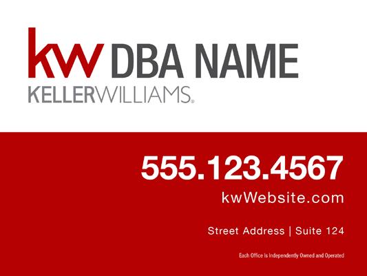
18 4.0 Marketing - Print Applications 4.1 BUSINESS CARDS STRUCTURE Market center DBA logo REQUIRED All business cards must meet the following requirements: Inclusion of market center DBA logo Inclusion of ownership statement Compliance with local board/ commission laws and rules See section 1.0 for more details. Ownership statement RECOMMENDED Fonts: Helvetica Neue LT Std Font Family Color: Preferred KW Red (CMYK or Pantone 200), gray, black and white Styling: Preferred to use color blocking to create a modern graphic look. Preferred no embellishments. Preferred no drop shadows. Preferred no gradients.


19 4.0 Marketing - Print Applications 4.2 BUSINESS CARDS EXAMPLES Agent Branded REQUIRED Inclusion of market center DBA logo Inclusion of ownership statement Compliance with local board/ commission laws and rules Agent Branded - Vertical

 Agent Branded REQUIRED")


20 4.0 Marketing - Print Applications 4.2 BUSINESS CARDS EXAMPLES (CONT.) Agent Branded REQUIRED Inclusion of market center DBA logo Inclusion of ownership statement Compliance with local board/ commission laws and rules Agent Branded with Photo Agent Branded with Photo

21 4.0 Marketing - Print Applications 4.3 LISTING FLIER STRUCTURE REQUIRED All fliers must meet the following requirements: Inclusion of market center DBA logo Inclusion of ownership statement Compliance with local board/ commission laws and rules See section 1.0 for more details. RECOMMENDED Fonts: Helvetica Neue LT Std. Font Family Color: Preferred KW Red (CMYK or Pantone 200), gray, black and white Styling: Preferred to use color blocking to create a modern graphic look. Preferred no embellishments. Preferred no drop shadows. Preferred no gradients. Market center DBA logo Ownership statement


22 4.0 Marketing - Print Applications 4.4 LISTING FLIER EXAMPLES Agent Branded Custom Team Branded REQUIRED Inclusion of market center DBA logo Inclusion of ownership statement Compliance with local board/ commission laws and rules

23 4.0 Marketing - Print Applications 4.5 LETTERHEAD STRUCTURE Market center DBA logo REQUIRED All letterhead and envelopes must meet the following requirements: Inclusion of market center DBA logo Inclusion of ownership statement Compliance with local board/ commission laws and rules See section 1.0 for more details. RECOMMENDED Fonts: Helvetica Neue LT Std. Font Family Color: Preferred KW Red (CMYK or Pantone 200), gray, black and white Styling: Preferred no embellishments. Preferred no drop shadows. Preferred no gradients. Ownership statement


24 4.0 Marketing - Print Applications 4.6 LETTERHEAD/ ENVELOPE EXAMPLES REQUIRED Inclusion of market center DBA logo Inclusion of ownership statement Compliance with local board/ commission laws and rules
25 5.0 Primary Logo Standards 5.1 Primary Logo 5.2 Informal Logos 5.3 Surrounding Space Restrictions 5.4 Size Restrictions 5.5 Unacceptable Executions
26 5.0 Primary Logo Standards 5.1 PRIMARY LOGO The primary Keller Williams logo is the most basic and commonly used element of the Keller Williams visual identity. Customized DBA logos for individual market centers and regions are created by integrating the DBA name of the market center with the Keller Williams logo using specific unit templates. NOTE Customized DBA logos for individual market centers and regions are created by integrating the DBA name of the market center with the Keller Williams logo using specific unit templates. See Section 1.1 for more details. 5.2 INFORMAL LOGOS Informal Logo Mark Informal Logo Linear The informal logos may be used in digital formats, watermarks and on casual internal applications, such as merchandise. Use of the informal logo mark alone in advertising is not permitted under the Keller Williams License Agreement or in some jurisdictions.
27 5.0 Primary Logo Standards 5.3 SURROUNDING SPACE RESTRICTIONS There must be at least the width of the W all the way around the logo.
28 5.0 Primary Logo Standards 5.4 SIZE RESTRICTIONS PRINT WEB Minimum size specifications have been established to ensure the legibility of Keller Williams logos. Your jurisdiction may have rules and laws regarding logo sizing and placement. Check with your local real estate bureau or commission to ensure compliance. Minimum Size - Formal Logo px 72 px KELLER WILLIAMS must not be smaller than 1 inch wide. KELLER WILLIAMS must not be smaller than 72 pixels wide. Minimum Size - Informal Logos px KW must not be smaller than inches wide. KW must not be smaller than 36 pixels wide. 1 KELLER WILLIAMS must not be smaller than 1 inch wide. 72 px KELLER WILLIAMS must not be smaller than 72 pixels wide.

29 5.0 Primary Logo Standards 5.5 UNACCEPTABLE EXECUTIONS Guidelines for acceptable treatment of the logo are found throughout this manual. Keller Williams logos should only be reproduced using the files provided by Keller Williams. Several examples of unacceptable variations are shown to the right. This list is not exhaustive. Do not reconfigure. Components of the logo should never be reconfigured. Space relationships among elements are not to be manipulated. Do not use the old bug. The old bug should not be used by itself or in replacement of the new KW mark. Do not resize individual elements. Size relationships among elements are not to be manipulated. Only the primary configuration of the logo is depicted in the examples, but these principles apply to market center DBA logos as well. Do not add embellishments. Do not use other fonts. Do not use the old bug with pipette. Do not add drop shadows, embossing or any other effect to the logo. Do not use any font to type out Keller Williams. The configuration of the old bug and the pipette should not be used.
30 6.0 Colors 6.1 Color Palette 6.2 Market Center DBA Logo - Full-Color Reproduction 6.3 Market Center DBA Logo - One-Color Reproduction 6.4 Primary Logo - Full-Color Reproduction 6.5 Primary Logo - One-Color Reproduction
31 6.0 Colors 6.1 COLOR PALETTE The primary colors for the Keller Williams visual identity system are KW Red (Pantone 200) and KW Main Gray (Pantone 424). Equivalent color formulas for four-color process printing and digital media are provided here. Pantone 200 or CMYK are to be used on print applications, while RGB/Hex are to be used for digital/screen applications. KW Red Pantone 200 CMYK RGB #B40101 KW Main Gray Pantone 424 CMYK RGB # Light Gray CMYK RGB #CCCCCC Medium Gray CMYK RGB # Black CMYK RGB #000000
32 6.0 Colors 6.2 MARKET CENTER DBA LOGO FULL-COLOR REPRODUCTION Ful Color Reversed Full Color
33 6.0 Colors 6.3 MARKET CENTER DBA LOGO ONE-COLOR REPRODUCTION Reversed Grayscale Grayscale Reversed White, Solid
34 6.0 Colors 6.4 PRIMARY LOGO FULL-COLOR REPRODUCTION Full Color Reversed Full Color
35 6.0 Colors 6.5 PRIMARY LOGO ONE-COLOR REPRODUCTION Grayscale Reversed Grayscale One-Color, Black, Solid Reversed White, Solid
36 7.0 Typography 7.1 Primary Typefaces - Print 7.2 Primary Typefaces - Digital
37 7.0 Typography 7.1 PRIMARY TYPEFACES PRINT PRIMARY HEADER TYPEFACE The primary sans serif typeface for Keller Williams printed applications is Helvetica Neue LT Std. This font is to be used in collateral materials and headlines. PRIMARY SERIF TYPEFACE The primary serif typeface for Keller Williams printed applications is Adobe Garamond Pro. This font is to be used in longer body copy. Helvetica Neue LT Std 47 Light Condensed 57 Condensed 67 Medium Condensed 45 Light 55 Roman 65 Medium 75 Bold 85 Heavy Adobe Garamond Pro Regular Italic Semibold Semibold Italic Note: Due to licensing restrictions, these fonts cannot be provided. To purchase fonts, go to fonts.com.
38 7.0 Typography 7.2 PRIMARY TYPEFACES DIGITAL PRIMARY BODY TYPEFACE The primary body typeface for Keller Williams digital applications is Roboto. It is is freely available at google.com/specimen/roboto. PRIMARY HEADER TYPEFACE The primary header typeface for Keller Williams digital applications is Nimbus Sans. Due to licensing restrictions, Nimbus Sans cannot be provided. It may be purchased at fonts/urw/nimbus-sans/. Roboto Thin Thin Italic Light Light Italic Regular Medium Medium Italic Bold Bold Italic Nimbus Sans Light Light Italic Regular Regular Italic Bold Bold Italic
39 8.0 Trademarks & Disclaimers 8.1 Trademarks 8.2 Disclaimers
40 8.0 Trademarks & Disclaimers 8.1 TRADEMARKS 8.1a DO DO NOT The trademarks, service marks and brands within the Keller Williams system are important assets and are integral to our strong image. It is vital that we use them properly. Please adhere to the following rules to help us be in compliance. The words comprising a service mark or trademark must NEVER be divided or separated with line breaks. 8.1b There should be no punctuation between the words KELLER WILLIAMS and the rest of the affiliate market center name. Training is a part of the KELLER WILLIAMS system. KELLER WILLIAMS MEMORIAL KELLER WILLIAMS NEW HORIZONS OF ILLINOIS Training is a part of the KELLER WILLIAMS system. KELLER WILLIAMS HOUSTON-MEMORIAL KELLER WILLIAMS - NEW HORIZONS OF ILLINOIS KELLER WILLIAMS, NEW HORIZONS OF ILLINOIS REALTY 8.1c When you use a trademark in printed material or in conversation, you must either: 8.1c.1 Follow the trademark with the product/service (generic noun) to which you are referring. KELLER WILLIAMS real estate brokerage 8.1c.2 Follow the trademark with the word brand. KWCONNECT brand
41 8.0 Trademarks & Disclaimers 8.1 TRADEMARKS (CONT.) The trademarks, service marks and brands within the Keller Williams system are important assets and are integral to our strong image. It is vital that we use them properly. Please adhere to the following rules to help us be in compliance. 8.1d It is preferable to use CAPS every time you type or write a trademark. If that is not possible, put the trademark in quotes, underline, italics, boldface or a different color. Preferred Method CAPS KELLER WILLIAMS real estate brokerage Other Methods quotes Keller Williams real estate brokerage underline Keller Williams real estate brokerage italics Keller Williams real estate brokerage boldface Keller Williams real estate brokerage different color Keller Williams real estate brokerage
42 8.0 Trademarks & Disclaimers 8.1 TRADEMARKS (CONT.) The trademarks, service marks and brands within the Keller Williams system are important assets and are integral to our strong image. It is vital that we use them properly. Please adhere to the following rules to help us be in compliance. 8.1e Only use the on federally registered marks or the if not federally registered and then the product name. If you have any question about whether an item requires the or, please contact us at Do not use the or symbol for state-registered marks or foreign-registered marks. The first time you type or write a trademark in a communication (outside letter, internal memo, etc.), follow it with the or symbol (whichever applies).
43 8.0 Trademarks & Disclaimers 8.1 TRADEMARKS (CONT.) 8.1f DO DO NOT The trademarks, service marks and brands within the Keller Williams system are important assets and are integral to our strong image. It is vital that we use them properly. Please adhere to the following rules to help us be in compliance. Do not use a trademark in the plural by adding letters s or es to a mark in written or spoken form. If the trademark ends in s, you can use the trademark with either a singular or plural noun. 8.1g Do not use a trademark in possessive form unless the mark itself is possessive. We will deliver two more dozen copies of MORE software. KELLER WILLIAMS real estate services KELLER WILLIAMS franchise McDONALD s restaurant We will deliver two dozen MOREs. KELLER WILLIAMS franchise 8.1h Trademarks are different from Corporate Names and Trade Names. Corporate Names and Trade Names are proper nouns. Corporate Names and Trade Names can be used in possessive form and do not require a noun after them. It is not proper to use the symbol with Corporate Names or Trade Names. Corporate Names This software is supplied by Keller Williams Realty, Inc. Trade Names This website is maintained by Keller Williams. Trademark Are you using KELLER WILLIAMS real estate brokerages?
44 8.0 Trademarks & Disclaimers 8.2 DISCLAIMERS There are two acceptable disclaimers for use on marketing materials. NOTE: There may be cases where state or local regulations require other verbiage. Preferred Each office is independently owned and operated. Also Acceptable Each Keller Williams Realty office is independently owned and operated. Residential & Commercial Property Signs Business Cards, Fliers & Stationery Social Media Posts & Websites Signatures Vehicle Wrap & Magnetic Sign Billboards Preferred Location Minimum Font Size Preferred Font Type Placed 1 above bottom edge of the panel Placed at bottom of page 1/2 minimum No smaller than 8 pt. font Helvetica Neue LT Std Font Family Helvetica Neue LT Std Font Family Placed beneath market center DBA logo No smaller than 8 pt. font Placed beneath market center DBA logo No smaller than 8 pt. font None Specified Must be large and clear enough to read from 15 ft. Placed at bottom of panel Must be large and clear enough to read from 50 ft. NOTE: The disclaimer is not required on apparel or specialty items.
CANES COMMUNITIES REGIONAL VISUAL IDENTITY MANUAL. March 2015
 CANES COMMUNITIES REGIONAL VISUAL IDENTITY MANUAL March 2015 Table of Contents Identity Introduction................................................. 1.0 Using This Manual... 1.1 Identity Policy.........................................................
corporate identity guidelines
 Seilevel Corporate Identity Guidelines Introduction 1 Preferred Signature and Components Logo Space and Minimum Size Signature Variations Color Palette Typography Signature Misuse 2 3 4 5 6 7 corporate
MINI BRAND GUIDELINES
 MINI BRAND GUIDELINES 9.18.17 TABLE OF CONTENTS SECTION 1 Introduction 3 SECTION 4 The Hamline Logo(s) & Seal 5 SECTION 5 Colors 16 SECTION 6 Typography 20 Questions about how to use this brand guide?
Corporate Identity Guidelines
 Corporate Identity Guidelines - CONTENTS 1.0 TRADEMARK Watco Companies Logo Logo Clear Space Logo Variations Project Logos Proper Logo Use 03 04 05 06 07 08 2.0 TYPOGRAPHY Type Family 3.0 COLOR Brand Color
FLEET LOGO USAGE AND STANDARDS INNOVA BRANDING STANDARDS 2015 GUIDE
 FLEET LOGO USAGE AND STANDARDS INNOVA BRANDING STANDARDS 2015 GUIDE INNOVA BRANDING STANDARDS 2015 GUIDE 2 TABLE OF CONTENTS The Innova Brand 3 Branding Elements Logo Colors Typography 4 8 10 INNOVA BRANDING
LOGO USE GUIDELINES BRAND GUIDELINES PUBLISHED ON FEBRUARY 17,
 LOGO USE GUIDELINES BRAND GUIDELINES PUBLISHED ON FEBRUARY 17, 2014 1 LOGO USE GUIDELINES LOGO USAGE GUIDELINES 13 LOGO USAGE GUIDELINES The Gardner-Webb logo is the centerpiece of the University's visual
IDENTITY PROGRAM: STANDARDS AND GUIDELINES. FCA Brand Mark. Key Visual Elements and Usage Guidelines
 IDENTITY PROGRAM: STANDARDS AND GUIDELINES FCA Brand Mark Key Visual Elements and Usage Guidelines March 2015 CONTENTS 3 Introduction 4 Area of Isolation 5 Coloring and Backgrounds 6 Basic Rules of Use
Logo and Visual Standards Guide
 OUR IDENTITY This prescribes how the district s name, logo and logo marks are to be used. San Benito Schools recognizes that the district s name, logo and logo marks, when used as prescribed, are an invaluable
CORPORATE GRAPHIC STANDARD GUIDELINES. Revision: 07/17/2014
 CORPORATE GRAPHIC STANDARD GUIDELINES Revision: 07/17/2014 Graniterock Corporate Graphic Standard Guidelines 2 INTRODUCTION The Graniterock logo and graphics are an important part of our Company s identity.
Somerston Estate Identity Guidelines
 Somerston Estate Identity Guidelines MARCH 2016 Somerston Estate Introduction Your brand identity is an extremely valuable and important asset. Its use, distribution, and implementation must be carefully
2018 Brand Guidelines
 2018 Brand Guidelines Logo Final Logo Our logo mark is the benchmark of our brand and one of our most valuable assets. Logo Versions Full Version - Linear A. Full Color The preferred way to use the Kinesics
Branding Policy 2015
 Branding Policy November 2015 Archery NZ Inc. Style Guide Table of Contents Use of the Archery NZ Inc. Brand...4 The Archery NZ Inc. Logo - General Use...5 The Archery NZ Inc. Logo - Reverse Use...6 The
Visual Style Guide. April 2016
 Visual Style Guide April 2016 Page 2 Contents Introduction to the Logo 3 Safe Area and Size 4 Incorrect Usage 5 Color Palette 6 Typography 7 Tone and Style of Photography 9 Print Examples 10 Screen Examples
Brand Standards & Style Guide
 Brand Standards & Style Guide Table of Contents 3 About This Guide 4 Color Palette Specifications 5 Logo - Correct Usage 7 Logo - Surrounding Space 8 Logo - Size Restrictions 9 Logo - Incorrect Usage 10
Introduction A global icon needs an iconic logo. Fashion has evolved since 1969, when Gap opened its first store. Our logo has changed with the
 Introduction A global icon needs an iconic logo. Fashion has evolved since 1969, when Gap opened its first store. Our logo has changed with the times, too. One thing that hasn t changed is our mission
Introduction. ThinManager - A Rockwell Automation Technology
 1220 Old Alpharetta Road, Suite 390 Alpharetta, Georgia 30005 www.thinmanager.com info@thinmanager.com OFFICE 678-990-0945 Introduction... 1 Logo... 2 Clear space and minimum size... 3 Primary color palette...
Brand Identity Guide. Raise Your Hand Texas Brand Identity Guide Standards and Practices
 Brand Identity Guide Raise Your Hand Texas Brand Identity Guide Standards and Practices August 2016 Primary Logo The Raise Your Hand Texas primary logo uses the letterforms from our name to present an
Brand Guidelines. version
 Brand Guidelines version 2017.1 Primary Logo The OPSWAT logo is a universal signature spanning all of our communications. Because it is such a recognizable and highly visible asset, it s important that
Graphic Standards Guide. September 2014 PREPARED BY:
 Graphic Standards Guide September 2014 PREPARED BY: Graphic Standards Guide Visual communications play an important role in how an organization is perceived. An organization s promotional materials, stationery,
Marketing Guidelines. Parallels International GmbH. All rights reserved. Terms of Use Privacy Policy
 Marketing Guidelines Parallels International GmbH. All rights reserved. Terms of Use Privacy Policy Master Brand Components The Parallels logo is the cornerstone of the Parallels brand. Please use it correctly
IDENTITY GRAPHIC STANDARDS MANUAL
 IDENTITY GRAPHIC STANDARDS MANUAL TABLE OF CONTENTS Identity Graphic standards manual v1.0 Table of Contents 1 Introduction and Importance of Graphic Standards 2 Logo System 3 Primary Logo and Variations
Identity Guidelines: How to use our logo. Version 1.0 April 2014
 Identity Guidelines: How to use our logo Version 1.0 April 2014 Contents 2 3 Introduction and Who to Contact 4 Writing the Company Name 5 The Fortune Brands Logo 6 Approved Logo Color Variations 7 Color
Marketing Guidelines. Parallels International GmbH. All rights reserved. Terms of Use Privacy Policy
 Marketing Guidelines Parallels International GmbH. All rights reserved. Terms of Use Privacy Policy Parallels Story Parallels Inc., a global leader in cross-platform solutions, makes it simple for customers
Brandbook. Wright State University Institutional Identity Standards Manual JUNE 2017 WRIGHT STATE UNIVERSITY ATHLETICS BRANDBOOK
 Brandbook Wright State University Institutional Identity Standards Manual JUNE 2017 WRIGHT STATE UNIVERSITY ATHLETICS BRANDBOOK Visual Identity Assets ATHLETICS MARKS All university athletics marks are
QUICK GUIDE. Graphics Standards & Guidelines University of Nebraska at Kearney
 QUICK GUIDE Graphics Standards & Guidelines University of Nebraska at Kearney 08 2016 Summary The visual identity for the University of Nebraska Kearney is the face the school shows the public. It is representative
2016 Marketing Guidelines Parallels International GmbH. All rights reserved. Terms of Use Privacy Policy
 2016 Marketing Guidelines 2016 Parallels International GmbH. All rights reserved. Terms of Use Privacy Policy Master Brand Components The Parallels logo is the cornerstone of the Parallels brand. Please
Graphics Standards Manual
 Graphics Standards Manual October 2007 City Manager s Message October 2007 The organization-wide identity graphic represents the City of Lawrence as the entire municipal government, as well as its departments.
Objective: Introduce the new Larimer County brand and guidelines, review changes to the logo policy and discuss the proposed brand roll out plan.
 Type of Meeting: Administrative Matters Name of requestor: Michelle Bird, Public Affairs Manager Department: Preferred appearance date: 9/19/2017 Time required: 15 Date decision needed: 9/19/2017 Objective:
Oracle Certification Program LOGO GUIDELINES
 Oracle Certification Program LOGO GUIDELINES TABLE OF CONTENTS INTRODUCTION 3 OFFICIAL TYPEFACES 4 COLOR PALETTE 5 CLEAR SPACE 6 MINIMUM SIZE 7 COLOR AND BACKGROUND USAGE 8 UNACCEPTABLE USAGE 9 Copyright
Corporate Identity Guidelines
 Corporate Identity Guidelines CONTENTS 1.0 TRADEMARK Watco Companies Logo Logo Clear Space Logo Variations Project Logos Proper Logo Use 03 04 05 06 07 08 2.0 TYPOGRAPHY Type Family 3.0 COLOR Brand Color
ARAP corporate and visual identity guidelines
 APPENDIX 3 ARAP corporate and visual identity guidelines edited by Ilaria Vescovo / www.iaiastudio.com in collaboration with Riccardo D Emidio 1 ARAP corporate and visual identity guidelines manual INDEX
Brand Identity Standards
 Brand Identity Standards A strong organization identity is an important element in building a positive, globally recognized and respected brand. This identity standards guide will be your key resource
JABRA CORPORATION GRAPHIC STANDARDS MANUAL
 JABRA CORPORATION GRAPHIC STANDARDS MANUAL A simple reference guide for how to use the JABRA Corporation logo in real-world communications applications. INTRODUCTION Corporate image is a valuable asset,
WELCOME TO WESTCONN ATHLETICS BRAND GUIDELINES
 AT H L E T I C S B R A N D G U I D E L I N E S WELCOME TO WESTCONN ATHLETICS This document serves as a resource for understanding and applying the WestConn Athletics brand, identity and creative expression.
Logo. Logo. Symbol. Wordmark
 1725 Windward Concourse, Suite 300 Alpharetta, Georgia 30005 www.thinmanager.com info@thinmanager.com OFFICE 678-990-0945 FAX 678-990-0951 Introduction... 1 Logo... 2 Clear space and minimum size... 3
Graphic Standards Manual. Version 1.3 February 2015
 Graphic Standards Manual Version 1.3 February 2015 2 introduction The Importance of Graphic Standards The way we identify ourselves in all types of communications is the way we tell the world who we are.
OTTER TAIL COUNTY - MINNESOTA LOGO USAGE POLICY
 OTTER TAIL COUNTY - MINNESOTA LOGO USAGE POLICY Prepared By: The Branding Task Force as directed by the Division Directors and the Otter Tail County Board of Commissioners. Manual Version Control Version
Brand Guidelines Solano County Transit (SolTrans)
") Brand Guidelines Solano County Transit (SolTrans) May 2018 Table of Contents The SolTrans Story... 1 Brand Elements... 2 Logo Usage... 3 Color Palette... 7 Typography.... 8 Photography.... 9 The SolTrans
Brand Guidelines Solano County Transit (SolTrans) May 2018 Table of Contents The SolTrans Story... 1 Brand Elements... 2 Logo Usage... 3 Color Palette... 7 Typography.... 8 Photography.... 9 The SolTrans
Oracle Education Partner Channel
 Oracle Education Partner Channel LOGO GUIDELINES TABLE OF CONTENTS INTRODUCTION 3 EDUCATION PARTNERS LOGO OVERVIEW 4 OFFICIAL COLOR PALETTE 5 OFFICIAL TYPEFACES 6 MINIMUM SIZE 7 CLEAR SPACE 8 COLOR AND
Graphic Identity Standards and Guidelines. Gilman School
 Graphic Identity Standards and Guidelines Gilman School P August 21, 2009 Why We have Guidelines The graphic identity for Gilman School is summarized in these Graphic Identity Standards and Guidelines.
Style guide.
 Style guide www.nam.org Logo Orientation The orientation of the Manufacturing Institute logo is shown below. The base line of the logo mark and typography should be aligned. The logo mark and typography
Our brand guidelines. Our photography
 1 brand guidelines photography Hello. We re the Motor Ombudsman. Please give this document your full attention. It should help you get to know more about us and our corporate guidelines. 2 This section
DESIGN BRAND STANDARDS
 DESIGN BRAND STANDARDS Design Brand Standards 2014 LCS. All rights reserved. Version 3.0-9.10.2014 table of contents Why Brand Standards?............ 3 Logo...................... 4 Size......................
BRAND & LOGO STYLE GUIDE
 BRAND & LOGO STYLE GUIDE 2015 StopWaste is the Alameda County Waste Management Authority, the Alameda County Source Reduction and Recycling Board, and the Energy Council operating as one public agency.
LOGO CONFIGURATION. The tag line Because Nutrition Matters TM. shall only be alinged to the right hand size of the logo.
 BRAND USAGE GUIDE LOGO CONFIGURATION The Jaylor word mark is the most visible component of the overall brand identity. The primary lockup consists of two parts: the Jaylor word mark set in the type family
Graphic Standards Guide
 Graphic Standards Guide Atlas Tissue 2017 CONTENTS Introduction 3 Identity Overview 4 Logo 5 - Logo Configuration 5 - Sizing Requirements 6 - Logo Colors 7 Color 8 Typography 9 ATLAS TISSUE GRAPHIC STANDARDS
Identity Standards Guide A guide to consistent use of brand elements
 08.01.04 A guide to consistent use of brand elements Contents 1 Introduction A cohesive identity system increases and strengthens our visibility to all audiences customers, partners, and prospects. Applying
Sprint Third Party Agent Guidelines
 4.1 Sprint Third Party Agent Guidelines 4.2 4.3 4.4 4.5 4.6 4.7 4.8 4.9 4.10 4.11 4.12 4.13 Logo Overview Logo Use Logo Clear Space & Minimum Size Logo Color Logo Do Not Nextel Logo Clear Space & Minimum
BRAND IDENTITY GUIDELINES
 BRAND IDENTITY GUIDELINES table of contents Mechanics of the Logo 3 Correct Usage - Full Color Logo 4 Correct Usage - Grayscale Logo 5 Correct Usage - Black Only Logo 6 Reversed Identity 7 Clear Zone Requirements
VISUAL IDENTITY and LOGO GUIDE
 VISUAL IDENTITY and LOGO GUIDE Visual Identity A clear, unified and consistent visual identity plays an important role in shaping Lakeland Community College s brand. The way Lakeland represents itself
Brand Guidelines HOAR PROGRAM MANAGEMENT. All rights reserved. Copyright 2014.
 Brand Guidelines 2014 0.1 Table of Contents Table of Contents 0.1 Contact Information Hoar Program Management Andi Sims Marketing Director asims@ (205) 423-2395 (office) (205) 213-7955 (cell) 1.0 Introduction
Brand Identity Guide. September 2017
 Brand Identity Guide September 2017 Welcome At Canada Drives our goal is to be the number one consumer lending company in Canada by making financing simple and accessible to every Canadian while maintaining
Official Lawrence Township Logo and Branding Standards Manual
 Official Lawrence Township Logo and Branding Standards Manual Updated: August 2015 Table of Contents The Lawrence Township Brand...3 Visual Identity Standards...4 Lawrence Township Logo...5 Correct Logo
This document describes the basic elements of our identity system and provides guidelines for their correct use.
 STYLE GUIDE CONTENT 3 INTRODUCTION 4 APPROVED PRIMARY LOGO 5 USE OF THE PRIMARY LOGO 10 APPROVED BRAND LOGOS 11 CLEAR SPACE 13 INCORRECT LOGO USAGE 14 FONTS 15 WEBSITE 16 SUMMARY Welcome to the EPIC style
Primary Logo. Corporate logo - primary. The centered logo is only to be used when the length of the common logo is problematic for an application.
 Primary Logo Corporate logo - primary The elements of the logo may be arranged in two predetermined configurations: the primary logo (which also has a small version and the centered logo. The centered
VISUAL IDENTITY AND STANDARDS MANUAL JULY 2008
 VISUAL IDENTITY AND STANDARDS MANUAL JULY 2008 TABLE OF CONTENTS 1 2 PAUL SMITH'S COLLEGE VISUAL IDENTITY AND STANDARDS AN OVERVIEW USING THIS MANUAL GRAPHIC IDENTITY SYSTEM COMPONENTS THE LOGO THE COLORS
FRAG BRAND IDENTITY GUIDELINES
 FRAG BRAND IDENTITY GUIDELINES Blount International, Inc. May 2017 INTRODUCTION As Blount Team Members, we all play a role in protecting our company s brand equity one of our most valuable assets. The
Iowa Corn Brand Identity Guide
 Brand Identity Guide January 2014 Logo Usage: The Iowa Corn Growers Association (ICGA) is a membership organization lobbying for agricultural issues on behalf of its members. The Iowa Corn Promotion Board
B R A N D G U I D E L I N E S
 BRAND GUIDELINES INDEX GENERAL GUIDELINES 3 Logos & Colors Fonts PNY PARTNER ADVERTISING 5 RULES & GUIDELINES TRADEMARKS & NOMENCLATURE 6 PNY NVIDIA COMPLIANCE CHECKLIST 8 This PNY Style Guide is designed
GCU Students Association Brand Guidelines
 GCU Students Association Brand Guidelines December 2014 Our Identity It is essential for our organisation to deliver its corporate identity in a coherent manner at all times. The brand is the focal point
Corporate Branding S t y l e g u i de & M a n ua l
 Corporate Branding S t y l e g u i d e & M a n ua l R E V I S E D J U N E, 2 0 1 1 Introduction................... 3 Corporate Branding Mission.............................. 3 Brand Policies and Procedures............................
District Branding Program. Manual of Graphic Standards.
 SEPTEMBER 2003 District Branding Program Manual of Graphic Standards. 11 S. Tenth St., top floor F 573.499.0421 TABLE OF CONTENTS 3 Positioning 4 Logo Standards 5 Typefaces 6 Logo Color 7 Color Palette
Brand Overview COLORS / FONTS / LOGOS rd Street, Suite 210 Denver, CO communityengineeringcorps.org
 Brand Overview COLORS / FONTS / LOGOS 1031 33rd Street, Suite 210 Denver, CO 80205 720 204-3194 Color Palette PRIMARY COLORS PRIMARY PALETTE For most situations, it is important to utilize the two main
Corporate Identity At-A-Glance. Abbreviated Version
 Corporate Identity At-A-Glance Abbreviated Version Corporate Signature The Corporate Signature is the key component of s visual identity. It s the primary expression that graphically represents across
UTILITY TRAILER MANUFACTURING COMPANY IDENTITY STANDARDS GUIDE
 1 TABLE OF CONTENTS LOGO OVERVIEW Corporate Logo General Corporate Logo / Tag line Aftermarket Parts Logo General COLORS Corporate Colors Corporate Logo Color Specifications Corporate Logo / Tag line Color
Branding Guidelines - gather, grow, go
 Branding Guidelines - gather, grow, go Heartland Community Church, June 2008 Brand Attributes 1 2 The Heartland gather, grow, go logos are made up of 2 different elements 1. Symbol - Each g logo has a
AFerry Brand Guidelines
 2 Contents Introduction 3 The AFerry Logo 4 Protecting Our Master Logo 5 Incorrect Master Logo Application 6 AFerry Family Logos 7 Typography 8 Print Typography 9 Digital Typography 10 Colour 11 Responsive
2 December NCFE Corporate Guidelines. Introduction
 Introduction Introduction How we connect with people through our brand is essential to who we are, and plays a big part in the NCFE experience. We created this document (which is simpler than it looks)
Carleton College Identity Guidelines UPDATED: JULY 2015
 Carleton College Identity Guidelines UPDATED: JULY 2015 INTRODUCTION 1 Table of Contents Introduction 1 Brand Identity Elements 2 Wordmark 2 Color 3 Associated Symbols 4 Symbol Colors 5 Wordmark Lockups
Logo Style Guide. February 20, 2008
 Logo Style Guide February 20, 2008 Table of Contents Communicating the Plexera Brand. 1 The Plexera Logo. 2 Using the Plexera Logo. 3 Color Palette. 4 Logo Don ts. 5 Typefaces. 6 Product Naming Typography.
Brand Guidelines
 Brand Guidelines 2017 11.22 Logo Logo Our company logo is the core of our identity and should be used on all communication materials. When used consistently and thoughtfully it will strengthen recognition
OUR IDENTITY AND ITS COMPONENTS. Logo Logo usage policy 03 Official logo 05 Dimensions 06 Improper usage 07
 VISUAL GUIDELINES TABLE OF CONTENT This document is intended for all those who use the ISPE visual identity in communications and supporting documents. Instructions provided in this guide will ensure consistency
EmpowHER Brand Standards
 EmpowHER 2 Introduction 3 EmpowHER Vocabulary 4 Logo & Slogan 6 HER Icon 7 Colors 8 Fonts 9 Contents 3 EmpowHER s provide a foundation for clear and consistent communication of the EmpowHER identity. This
Fort Edmonton Park Logo Guidelines 1
 Fort Edmonton Park Logo Guidelines 1 Visual Identity Fort Edmonton Park (FEP) is represented by a logo that incorporates distinctive typography combined with stylized illustration of the fort. The colour
Graphic Standards Manual. Version 1.5 May 2017
 Graphic Standards Manual Version 1.5 May 2017 2 introduction The Importance of Graphic Standards The way we identify ourselves in all types of communications is the way we tell the world who we are. Consistency
CORPORATE BRAND GUIDELINES
 CORPORATE BRAND GUIDELINES Implementing the Williams Scotsman brand in communications. Williams Scotsman 2017 Williams Scotsman, Inc. 901 S Bond Street, Baltimore MD 21231 THE WILLIAMS SCOTSMAN LOGO Primary
National CyberWatch Center Brand Guidelines (truncated) January 2015
 January 2015") Brand Guidelines (truncated) January 2015 Introduction This book is meant to guide all internal, external, partner, alliance and member usage of the brand, logo, name and/or identity. It should guide all
Brand Guidelines (truncated) January 2015 Introduction This book is meant to guide all internal, external, partner, alliance and member usage of the brand, logo, name and/or identity. It should guide all
RIPE NCC Brand Guidelines Communications Department
 1 2015 Brand Guidelines 2 We serve our members by delivering a high quality registry and supporting the core Internet infrastructure. Connecting people within and beyond the technical community through
Visual Standards Manual
 Visual Standards Manual fredonia.edu/brand 2 MISSION Fredonia enriches the world through academic scholarship, artistic expression, community engagement, and entrepreneurship. The university challenges
MoviePlex Graphic Standards 02.06
 MoviePlex Graphic Standards 02.06 Contents Logo Elements Unnacceptable Logo Usage Clear Space & Sizing Color Variations Background Control File Structure 3 4 5 6 7 9 Color Specifications Typography 10
Trinity University Identity Standards Manual. Trinity University Identity Standards Manual
 Trinity University Identity Standards Manual Trinity University Identity Standards Manual Table of Contents 2 Basic Signature Standards 2.1 The Trinity University Logo 2.2 The Formal Signature 2.3 The
LOGO & BRAND STANDARDS GUIDE
 LOGO & BRAND STANDARDS GUIDE INTRODUCTION The SparkPost Brand Standards Guide provides key information needed to accurately and consistently produce external and internal documents and communications.
A Graphic Standards Guide for Southlake Regional Health Centre
 Connecting with the Southlake Brand A Graphic Standards Guide for Southlake Regional Health Centre 1.0 A Special Message from the President and CEO 2.0 Logo Overview 2.1 Logo Variations (Standard) 2.2
BRAND GUIDELINES JANUARY 15,
 BRAND GUIDELINES JANUARY 15, 2015 1 THIS IS WORLDCARE Trusted, reassuring, knowledgeable and globally connected. To us, a brand is more than just a name, logo or tagline. It is a shared set of values and
MARMOL BRAND GUIDELINES APRIL Powered by TECKpert.com
 MARMOL BRAND GUIDELINES Powered by TECKpert.com 2 3 4 5 6 7 8 9 10 11 CONTENTS LOGO ICON CLEAR SPACE PROPORTION MINIMUM SIZE DON TS BACKGROUND COLOR COLOR TYPOGRAPHY 2 LOGO This is the primary Marmol logo.
Brand Guide April COMSOL
 Brand Guide April 2018 About COMSOL COMSOL is a global provider of simulation software for product design and research to technical enterprises, research labs, and universities. Its COMSOL Multiphysics
Identity Guidelines 2018
 Identity Guidelines 2018 Table of Contents The Signature Clear Space Minimum Size Color Formats Signature Misuses Color Palette Primary Color Palette Secondary Color Palette Support Typography: Sans Serif
VISUAL STYLE GUIDE Table of contents
 VISUAL STYLE GUIDE Table of contents Introduction...3 Color...4 Typefaces...5 The Colleges logo...6 Color variations...7 School logos...8 Unacceptable use...9 The college seal...10 Athletics logo...11
Logo Guidelines. Standards for use of the Military Families Learning Network Logo
 Logo Guidelines Standards for use of the Military Families Learning Network Logo Introduction Corporate identity is vital to establishing and reinforcing MFLN brand awareness and position. Consistency
BRANDING GUIDE INSTITUTIONAL SYMBOLS. Branding Guide Overview. The University Seal. Symbolism of the Seal
 Branding Guide Overview The Illinois Wesleyan University Branding Guide is designed to provide clear information on the proper use of approved graphics, colors and fonts for any application of the IWU
Brand stylebook. Version 2.0 updated
 Brand stylebook Version 2.0 updated 08.01.12 Contents 2 LOGO USAGE 3 Logo Implementation Approved Color Applications Logo Staging (Clear Space) Minimum Size Restrictions Approved Configurations Web Applications
Brand Style Guide. updated
 Brand Style Guide updated 12.19.18 Why Brand Identity Matters Effective January 1, 2019, KHA will begin using a new logo. We can all take pride in what it signifies: The well-known hospital H emblem in
Brand Identity Guide
 Brand Identity Guide Logos Preferred Logo The official logo for St. Vrain Valley Schools. Use the full-color version of the logo when possible. Logos can be downloaded at http://www.svvsd.org/logos FULL
BRAND IDENTITY GUIDELINES FEBRUARY 2014 GIVE. ADVOCATE. VOLUNTEER. UnitedWay.org
 UNITED WAY BRAND IDENTITY GUIDELINES FEBRUARY 2014 GIVE. ADVOCATE. VOLUNTEER. UnitedWay.org OUR MASTER BRANDMARK PRIMARY BRANDMARK The most fundamental visual element of a brand identity is its brandmark.
Third Party Identity Guidelines
 Third Party Identity Guidelines Introduction Introduction This document has been developed to provide anyone using The Wolfson Foundation logotype with clear guidelines on how the brand identity can be
Our Brand THIS BOOK SERVES AS A GUIDE TO THE BASIC ELEMENTS THAT MAKE UP LERO. IT WILL HELP YOU TO GET TO KNOW US BETTER.
 Brand Assets & Guidelines 2015 Our Brand THIS BOOK SERVES AS A GUIDE TO THE BASIC ELEMENTS THAT MAKE UP LERO. IT WILL HELP YOU TO GET TO KNOW US BETTER. These guidelines have been designed to show our
DMD DIAMOND, BRAND GUIDE ISSUE 01: DESIGN MANUAL CREATED FOR: DMD DIAMOND DESIGN AND BRAND GUIDELINE BOOK
 DMD DIAMOND, BRAND GUIDE ISSUE 01: DESIGN MANUAL CREATED FOR: DMD DIAMOND DESIGN AND BRAND GUIDELINE BOOK CREATION DATE: FEBRUARY 2018 ISSUE 01: BRAND GUIDELINE CREATED FOR: DMD Diamond www.bit.diamonds
GRAPHIC STANDARDS BRANDING GUIDELINES 2
 BRANDING GUIDELINES VERSION 1 OCTOBER 2016 GRAPHIC STANDARDS A brand is more than just a logo. It is a consistent look. It is a consistent feel. It is a consistent voice. And behind every successful brand
TECO Logo Guidelines Company Logos. TECO Energy Tampa Electric Peoples Gas TECO Partners TECO Services...
 Logo Guidelines Table of Contents The TECO Brand...2... 4 Colors...7 Typography... 8 TECO Logo... 9 Company Logos TECO Energy...10 Tampa Electric...11 Peoples Gas... 12 TECO Partners... 13 TECO Services...
Identity Standards Manual for Mississippi Department of Education
 Identity Standards Manual for Mississippi Department of Education Our brand is the distinctive image associated with our department. It is the visual, emotional, and rational impression that we elicit