PAGE ARCHITECTURE Architecture Coherent: Meaningful: Functional:
|
|
|
- Dwayne Powers
- 6 years ago
- Views:
Transcription

1 PAGE ARCHITECTURE Architecture deals with form and space. Typographic elements must be organized in ways that are: Coherent: The page and the entire document must hang together make sense as a whole. Meaningful: Page design should reveal logical hierarchy. Functional: Page design should aid readability and navigation.
2 PAGE ARCHITECTURE Page architecture depends on an underlying structure. Often this structure is a grid. A grid is a set of intersecting lines uniformly spaced, like graph paper. A grid can be as simple as vertical and horizontal axes. The grid becomes the basic foundation for placing elements on the page; it becomes part of the character of the page. It affects the look and the personality of the document.
3 PAGE ARCHITECTURE Meditation Vii WE say that the world is made of sea and land, as though they were equal; but we know that there is more sea in the Western than in the Eastern hemisphere. We say that the firmament is full of stars, as though it were equally full; but we know that there are more stars under the Northern than under the Southern pole. We say the elements of man are misery and happiness, as though he had an equal proportion of both, and the days of man vicissitudinary, as though he had as many good days as ill, and that he lived under a perpetual equinoctial, night and day equal, good and ill fortune in the same measure. But it is far from that; he drinks misery, and he tastes happiness; he mows misery, and he gleans happiness; he journeys in misery, he does but walk in happiness; and, which is worst, his misery is positive and dogmatical, his happiness is but disputable and problematical: all men call misery misery, but happiness changes the name by the taste of man. In this accident that befalls me, now that this sickness declares itself by spots to be a malignant and pestilential disease, if there be a comfort in the declaration, that thereby the physicians see more clearly what to do, there may be as much discomfort in this, that the malignity may be so great as that all that they can do shall do nothing; that an enemy declares himself then, when he is able to subsist, and to pursue, and to achieve his ends, is no great comfort. In intestine conspiracies, voluntary confessions do more good than confessions upon the rack; in these infections, when nature herself confesses and cries out by these outward declarations which she is able to 5 From The tragicall historie of Hamlet, Prince of Denmarke By William Shakespeare Doves Press, 1909 Books start with a simple grid that defines a design axis.

4 PAGE ARCHITECTURE Meditation Vii WE say that the world is made of sea and land, as though they were equal; but we know that there is more sea in the Western than in the Eastern hemisphere. We say that the firmament is full of stars, as though it were equally full; but we know that there are more stars under the Northern than under the Southern pole. We say the elements of man are misery and happiness, as though he had an equal proportion of both, and the days of man vicissitudinary, as though he had as many good days as ill, and that he lived under a perpetual equinoctial, night and day equal, good and ill fortune in the same measure. But it is far from that; he drinks misery, and he tastes happiness; he mows misery, and he gleans happiness; he journeys in misery, he does but walk in happiness; and, which is worst, his misery is positive and dogmatical, his happiness is but disputable and problematical: all men call misery misery, but happiness changes the name by the taste of man. In this accident that befalls me, now that this sickness declares itself by spots to be a malignant and pestilential disease, if there be a comfort in the declaration, that thereby the physicians see more clearly what to do, there may be as much discomfort in this, that the malignity may be so great as that all that they can do shall do nothing; that an enemy declares himself then, when he is able to subsist, and to pursue, and to achieve his ends, is no great comfort. In intestine conspiracies, voluntary confessions do more good than confessions upon the rack; in these infections, when nature herself confesses and cries out by these outward declarations which she is able to 5 From The tragicall historie of Hamlet, Prince of Denmarke By William Shakespeare Doves Press, 1909 Books start with a simple grid that defines a design axis.
5 PAGE ARCHITECTURE Magazines use more complicated grids that offer flexibility, options.

6 PAGE ARCHITECTURE Magazines use more complicated grids that offer flexibility, options.
7 PAGE ARCHITECTURE Ads use special purpose grids that fit the concept of the campaign.

8 PAGE ARCHITECTURE Ads use special purpose grids that fit the concept of the campaign.
9 n An axis is a line established by two points in space. It is the simplest way to organize space. n For any publication, a natural axis is formed by the edge of the page. n The designer determines the design axis, the line along which elements will be organized.
10 n The designer will add other axes, horizontal and vertical, to further divide the space. n Axes are made apparent by the columns of type divided by white space: gutters and alleys. n The axes are implied rather than drawn on the page. n Alleys are horizontal bands of white space that separate page elements vertically. n Gutters are vertically bands of white space between columns. n We refer to alleys and gutters together as internal margins.

11 n Newspapers layouts were governed by the horizontal axis formed by the banner headline and by a vertical axis, usually a gutter next to the dominant element on the page. These two axes formed a basic grid we can call the T-formation.

12 n This simple arrangement still is effective in contemporary publications such as ESPN the Magazine.

13 n This simple arrangement still is effective in contemporary publications such as ESPN the Magazine.


14 n The eye naturally seeks out axes, mentally connecting the dots. Artwork photos or graphics in designer parlance has a natural axis. A photograph must be used correctly, with the page shape fitting its content, to take advantage of this natural axis.
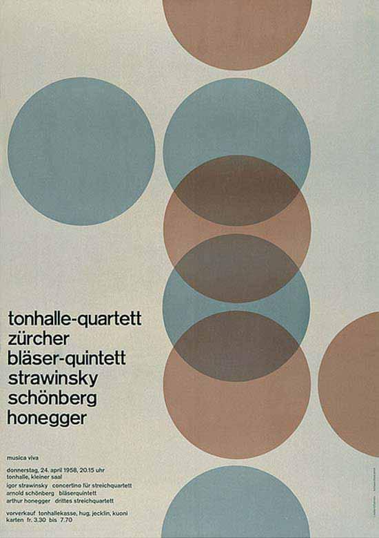
15 DESIGN AXIS n Formal balance is the distribution of equivalent forms photos, type blocks, white space, rules positioned around a design axis down the middle of the page. n Each half of the page is the mirror image of the other have in the way shapes are arranged. n Pages with formal balance are symmetrical. n As the name implies, formal balance can lend a dignified or conservative look to a page, but it doesn t have to be dull.
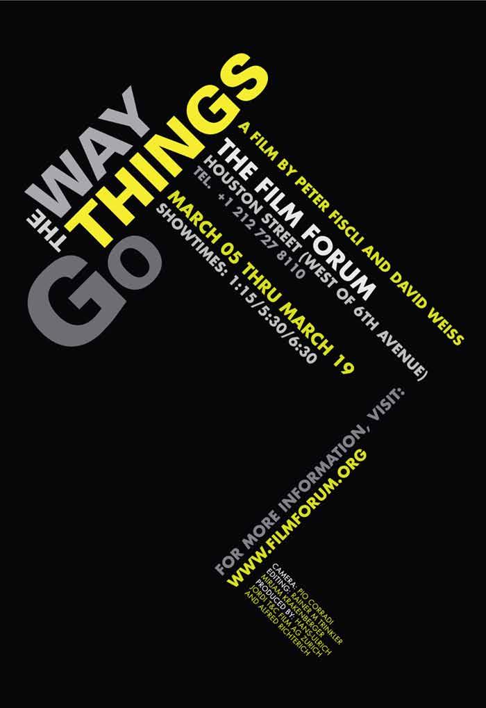
16 n Most designers today seek an informal balance. The design axis is placed off-center. n Pages with informal balance are asymmetrical. n An asymmetrical page often has a feeling of movement. n When done correctly, the asymmetrical page will still feel unified and at rest with itself; it will feel balanced. DESIGN AXIS Center axis of the page

17 Formal balance is useful when the design needs a formal or conservative look, or when equality between two things needs to be emphasized. But it doesn t have to be dull.

18 Formal balance is useful when the design needs a formal or conservative look, or when equality between two things needs to be emphasized. But it doesn t have to be dull.


19 Formal balance is useful in many types of documents.


20 Pages with informal balance rely on the horizontal and vertical axes to bring order and balance to the page.

21 PAGE CENTER Design axis Design axis PAGE CENTER
22 FORMAL OR INFORMAL?


23 FORMAL OR INFORMAL? Design axis PAGE CENTER Design axis PAGE CENTER
24 FORMAL OR INFORMAL?

25 FORMAL OR INFORMAL?
26 FORMAL OR INFORMAL?

27 FORMAL OR INFORMAL?

28 Formal balance works in Web pages, too.

29 Informal balance is more common in Web design.

30 n Hierarchy deals with the importance or significance of a form or space by its size, shape or placement. n Before any elements are positioned, the designer must study the content and decide on a hierarchy. n The hierarchy serves the content
, then to 3 the largest type (2) as the reader seeks more information.")
31 SIZE n Research has shown that the eye is attracted 1? first to the 2 largest photo (1), then to 3 the largest type (2) as the reader seeks more information. n Thus, a large photo always will dominate the hierarchy of a page. n It must be relevant to the remaining content.

32 SIZE n Large photos are an effective way of establishing a starting point 3 1 in the hierarchy. 2 n Large type finishes the task of guiding the eye around the page. n Drop caps are useful for getting the reader to the start of a story.

33 PLACEMENT n In our culture, we see the top left as a starting point. n Hierarchy by definition is a top-down process. n Sometimes the issue is not importance but a logical reading order.

34 n The repetitive elements of any publication create a rhythm, a feeling of regularity. n With asymmetrical balance and a planned variation in placement, rhythm feels syncopated. n Rhythm begins with the body text: ledding, paragraph indents, uniform spacing, consistent bold elements. n Placement of typographical devices large initials, headlines, blurbs, pull quotes break up text and create rhythm.
35 RHYTHM n Repeated elements that take up areas of consistent size and shape, with consistent spacing, and with consistent typography will be seen as related and can create a powerful sense of rhythm. n Edward Tufte calls these elements small multiples.


36 n A page with rhythm has a natural feel, especially in sequences of items. n Uniform design for repetitive elements ties the page together even as it deviates from exact alignment

37 Web pages really need a carefully thoughtout rhythm.

38 Page architecture is usually uniform throughout a document.

39 Page architecture is usually uniform throughout a document.

40 Consistent page architecture combined with consistent typography and color tie multipage spreads together.

41 Consistent page architecture combined with consistent typography and color tie multipage spreads together.

42 Consistent page architecture combined with consistent typography and color tie multipage spreads together.

43 Graphical devices, such as page labels and large drop caps, are part of the architecture.

44 Consistent division of the page brings coherence to a multipage document.

45 Consistent division of the page brings coherence to a multipage document.
WEB PAGE ARCHITECTURE
 The goals of webpage architecture: 1. Bring order to many types of information: text, images, links, navigation. 2. Create movement through the page. 3. Provide centers of visual interest that serve as
STONELAW HIGH GRAPHIC
 GRAPHIC COMMUNICATION Technical Education THE A to Z of DTP Your knowledge of desktop publishing terminology will be expanded as you progress within the subject THE A to Z of DTP ALIGNMENT positions of
Page Layout Design min
 1 of 8 09/11/2011 19:26 Home > Design Tips > Page Layout Design Page Layout Design 15-25 min In this tutorial, we ll explore the design phase of document creation. With the grid as our layout guide, we
Grid. Skeletal framework to organize information making it clear and optimally accessible
 Grid Skeletal framework to organize information making it clear and optimally accessible Space When typographic elements introduced in space > divisions Letterform: centered=motionless; off-center > velocity;
DESIGNING THE PAGE FOUNDATIONS OF DIGITAL DESIGN. Layout composition, the grid and typography. Prof. Eva Machauf
 DESIGNING THE PAGE Layout composition, the grid and typography FOUNDATIONS OF DIGITAL DESIGN Prof. Eva Machauf prof.machauf@gmail.com THE GRID The grid is the foundation of all design. Creating and working
PAGE LAYOUT IN GRAPHIC DESIGN Where do you start when you want to create an attractive and effective design?
 PAGE LAYOUT IN GRAPHIC DESIGN Where do you start when you want to create an attractive and effective design? Aims & Outcomes for this week: Aims: To understand the three main page layout conventions used
Good Publication Design
 Good Publication Design The top ten tips for creating professional print documents How do I create a well-designed print publication? Good publication design is an art form. Attractively presenting written
Part 1 The Elements of Design. Lines
 Part 1 The Elements of Design There are seven elements of graphic design that are the starting point of your design ideas: Line, Shape, Texture, Space, Size, Value and Color. Each of these elements is
COPY/PASTE: Allows any item within a document to be copied and pasted within the same document or within compatible software applications.
 You will need to understand basic terms and techniques used in DTP, as well as file types used within DTP and their advantages and disadvantages. This is separate from Elements and Principles of DTP which
Design Principles. Advanced Higher Graphic Presentation. Professional Graphic Presentations by kind permission of
 Design Principles Advanced Higher Graphic Presentation Professional Graphic Presentations by kind permission of Design Principles:- Balance Balance in Composition Three different types of balance :- *
ASSIGNMENT 5. TYPE & IMAGE POSTER LAYOUT, TYPE, IMAGE, and the use of GRID in single page layout and design.
 ASSIGNMENT 5 TYPE & IMAGE POSTER LAYOUT, TYPE, IMAGE, and the use of GRID in single page layout and design. LAYOUT DEFINED 2 Organization of image, type, and other design elements to emphasize or reinforce,
1. Message. I am Speculative Layout intensifies the message and the identity of the sender
 1. Message 1.1. Layout intensifies the message and the identity of the sender A printed product, for instance a poster, newspaper, magazine or a VDU transmits information, firstly, through the content
Unit 3. Design and the User Interface. Introduction to Multimedia Semester 1
 Unit 3 Design and the User Interface 2018-19 Semester 1 Unit Outline In this unit, we will learn Design Guidelines: Appearance Balanced Layout Movement White Space Unified Piece Metaphor Consistency Template
Principles of Design. Alignment
 Principles of Design Alignment Essential Question: How does alignment affect layout design? Can you imagine how difficult it would be to find your car in a crowded parking lot if everyone ignored the parking
Design Principles. The Four Basic Principles That Underlie Good Page Design
 Design Principles The Four Basic Principles That Underlie Good Page Design Some of the information presented in this video will appear on quizzes and exams. Please be sure to pay attention to key points
GOING IN STYLE (#3): ON TYPOGRAPHY, PART 2
: ON TYPOGRAPHY, PART 2") GOING IN STYLE (#3): ON TYPOGRAPHY, PART 2 Typography is the visual component of the written word. (Matthew Butterick, Typography for Lawyers: Essential Tools for Polished & Persuasive Documents (2nd ed.
GOING IN STYLE (#3): ON TYPOGRAPHY, PART 2 Typography is the visual component of the written word. (Matthew Butterick, Typography for Lawyers: Essential Tools for Polished & Persuasive Documents (2nd ed.
Typographic. Alphabet. Book. Interactive PDF of typographic rules & terms YOU NEED TO KNOW. Home. Table of Contents
 Typographic Alphabet Table of Contents > Rules That Every Typographer Should Know... 2-3 Book Interactive PDF of typographic rules & terms YOU NEED TO KNOW > Baseline... > Gutter... > Hierarchy... > Kerning...
Multimedia Design Guidelines MMP
 Multimedia Design Guidelines MMP 100-141 Metaphor A metaphor is a figurative representation that links the content of your website to an established mental model. Using metaphors in your website allows
Objectives. Appreciate what alignment is and how it improves design. Introduce the use of grids in page design.
 Alignment Objectives Appreciate what alignment is and how it improves design. Introduce the use of grids in page design. Gain a working vocabulary of typical visual elements used in newsletter and magazine
Knightswood Secondary School. Graphic Communication. Desktop Publishing otes. Auto Tracing
 Auto Tracing The process of converting a bit mapped image into a vector image. In a bit-mapped image, each object is represented by a pattern of dots, while in a vector image every object is defined geometrically.
POFT 2301 INTERMEDIATE KEYBOARDING LECTURE NOTES
 INTERMEDIATE KEYBOARDING LECTURE NOTES Be sure that you are reading the textbook information and the notes on the screen as you complete each part of the lessons in this Gregg Keyboarding Program (GDP).
Before & After. Use the Principles Cheatsheet! From The Non-Designer s Design Book, Robin Williams Non-Designer s Design 8
 Before & After Use the Principles Cheatsheet! From The Non-Designer s Design Book, Robin Williams Non-Designer s Design 8 Before & After From The Non-Designer s Design Book, Robin Williams Non-Designer
Word Tutorial 3. Creating a Multiple- Page Report COMPREHENSIVE
 Word Tutorial 3 Creating a Multiple- Page Report COMPREHENSIVE Objectives Format headings with Quick Styles Insert a manual page break Create and edit a table Sort rows in a table Modify a table s structure
How to use styles, lists, columns and table of contents
 Adobe InDesign Guide How to use styles, lists, columns and table of contents Whether you re working with long or short documents, styles can help you keep text formatting consistent. Styles are a collection
Desktop Publishing (Word)
") Desktop Publishing (Word) In addition to word processing, Microsoft Word is a suprisingly capable desktop publishing application. It is no substitute for a professional grade program like Adobe PageMaker
Desktop Publishing (Word) In addition to word processing, Microsoft Word is a suprisingly capable desktop publishing application. It is no substitute for a professional grade program like Adobe PageMaker
Designing Research Posters. College of Art and Design Chris Jackson, Associate Dean Keli DiRisio, Assistant Professor
 Designing Research Posters College of Art and Design Chris Jackson, Associate Dean Keli DiRisio, Assistant Professor Size and Orientation If you are NOT using the poster template: Start is with a 48"
modular design advantages of using mods
 advantages of using mods Modular design prevents visual redundancy. Instead of creating one or two layouts per section and then flipping them, modular design gives the designer a more powerful visual voice
3. Formatting Documents
 69 3. Formatting Documents The document format is the (highest) level of formatting for a Word document. It is important to select an attractive font and arrange the text in a balanced manner. A good page
The Ohio State University, Paul Nini, Instructor
 Typeface Poster: Shaina Meyers (undergraduate) The Ohio State University, Paul Nini, Instructor I always have students prepare a written rationale statement for their projects, along with a process document
Developed by: Beth Gibbs
 Developed by: Beth Gibbs Steps in Organizing Newsletter Plan layout and content Write and format the copy Design the layout Add graphics Produce the newsletter Introduction Keep in touch with parents Inform
Design Elements. Advanced Higher Graphic Presentation. Professional Graphic Presentations by kind permission of
 Design Elements Advanced Higher Graphic Presentation Professional Graphic Presentations by kind permission of Lines can Design Element:- Line Convey a mood or an emotion. Organise the design. Establish
Publisher 2007 Creating Flyers and Brochures
 MS Publisher 2007 User Guide Publisher 2007 Creating Flyers and Brochures THE NATURE OF DESKTOP PUBLISHING - INTRODUCTION Publisher is a desktop publishing program. You can create publications that
Publisher 2007 Creating Flyers and Brochures
 MS Publisher 2007 User Guide Publisher 2007 Creating Flyers and Brochures THE NATURE OF DESKTOP PUBLISHING - INTRODUCTION Publisher is a desktop publishing program. You can create publications that use
2/1/2016. Discuss website usability essentials Explain principles of design Critique a website in terms of usability and design
 Due Tuesday, Feb. 9 upload to Blackboard Locate five HTML (not Flash) websites you believe exhibit good web design, usability and accessibility principles. Each website s critique is worth 10 points (50
COSC 414: The Grid - Arranging Information in Space and Time. Andrew Gin
 COSC 414: The Grid - Arranging Information in Space and Time Andrew Gin 0218625 1 INTRODUCTION 1 1 Introduction Visual media has existed for a long time. In order for a viewer to make sense of what is
Web Design, 5 th Edition
 Planning a Successful Website: Part 2 Web Design, 5 th Edition Chapter Objectives Discuss the relationship between page length, content placement, and usability Complete Step : Specify the s navigation
VISUAL HIERARCHY Explain: Elements are arranged in order of importance in the designs. Such things as size, weight and contrast are used to create a
 VISUAL HIERARCHY Explain: Elements are arranged in order of importance in the designs. Such things as size, weight and contrast are used to create a hierarchical structure. Visual hierarchy naturally creates
Copyright. For more information, please read the Disclosures and Disclaimers section at the end of this ebook. First PDF Edition, February 2013
 Copyright This ebook is Copyright 2013 Teresa Miller (the Author ). All Rights Reserved. Published in the United States of America. The legal notices, disclosures, and disclaimers in the front and back
Principles of Professional Communication 1!! Familiar icons & symbols what do they represent?! Familiar signs!
 Principles of Professional Communication 1!! Lecture 12! Graphics & Visuals a picture paints a thousand words! Familiar icons & symbols what do they represent?! Principles of Professional Communication
GRID-BASED PAGE LAYOUT AND DESIGN
 IDD 370 TYPOGRAPHY II GRID-BASED PAGE LAYOUT AND DESIGN ASSIGNMENT 2 Spring 2013 DESCRIPTION Grid-based layouts, type & image relationships, and working with process color. ASSIGNMENT 1. Using InDesign,
Essentials for Text and Graphic Layout
 5. Essentials for Text and Graphic Layout This section provides specific text and graphic guidelines that will help create a unified series of interpretive signs around Humboldt Bay. Text refers to the
L E S S O N 2 Background
 Flight, Naperville Central High School, Naperville, Ill. No hard hat needed in the InDesign work area Once you learn the concepts of good page design, and you learn how to use InDesign, you are limited
Fundamental of Digital Media Design
 Fundamental of Digital Media Design Chapter 5 Principle of Design by Noraniza Samat Faculty of Computer Systems & Software Engineering noraniza@ump.edu.my OER Fundamental of Digital Media Design by Noraniza
The theme is the main idea around which the yearbook is based.
 The theme is the main idea around which the yearbook is based. 1 To achieve the highest impact, the theme should meet the following criteria: --In addition to having a distinctive visual look, there should
Typography One Project Two
 Typography One Project Two Typographic Systems, Emphasis and Hierarchy An important design problem is to aid reader comprehension of information through carefully considered logic, structure and order.
Repetition is not just naturally consistent; it comes from intentional effort to unify all parts of a design.
 1 REPETITION Introduction The Principle of Repetition states, "Repeat some aspect of the design throughout the entire piece." The repetitive element may be a bold font, a thick rule (line), a certain bullet,
Name: Class: Teacher:..
 Name: Class: Teacher:.. Introduction Desktop publishing (DTP) is the process of designing newspapers, magazines, books, leaflets, booklets and reports on a computer. The industry that produces these items
H A-Z of DTP Features
 A-Z of DTP Features H Alignment One of the principles of design, alignment refers to lining up the top, bottom, sides, or middle of text or graphic elements on a page. See also Text Alignment. Ascender
Downloaded from
 UNIT 2 WHAT IS STATISTICS? Researchers deal with a large amount of data and have to draw dependable conclusions on the basis of data collected for the purpose. Statistics help the researchers in making
Working with grids are an inherent part of the craft of designing. FUNCTIONS OF A GRID
 GRID SYSTEMS Working with grids are an inherent part of the craft of designing. FUNCTIONS OF A GRID Achieves unity amongst all of pieces of a design. Introduces systemic order to a space before anything
Principles of Professional Communication 1!! Lecture 12! Graphics & Visuals a picture paints a thousand words!
 Principles of Professional Communication 1!! Lecture 12! Graphics & Visuals a picture paints a thousand words! Familiar icons & symbols what do they represent?! Principles of Professional Communication
Developing successful posters using Microsoft PowerPoint
 Developing successful posters using Microsoft PowerPoint PRESENTED BY ACADEMIC TECHNOLOGY SERVICES University of San Diego Goals of a successful poster A poster is a visual presentation of your research,
ABOUT RESEARCH POSTERS
 ABOUT RESEARCH POSTERS Research posters summarize information or research concisely and attractively to help publicize it and generate discussion. The poster is usually a mixture of a brief text mixed
Word Tutorial 4 Enhancing Page Layout and Design
 Word Tutorial 4 Enhancing Page Layout and Design Microsoft Office 2013 Objectives Use continuous section break for page layout Format text in columns Insert symbols and special characters Distinguish between
Typographic hierarchy: How to prioritize information
 New York City College of Technology, CUNY Department of Communication Design Typographic Design III Instructor: Professor Childers pchilders1@mac.com Typographic hierarchy: How to prioritize information
Visual Design. Gestalt Principles Creating Organization and Structure Typography. Visual Design 1
 Visual Design Gestalt Principles Creating Organization and Structure Typography Visual Design 1 UI Visual Design Objectives 1. Information communication - Enforce desired relationships (and avoid undesired
New Perspectives on Microsoft Word Module 4: Enhancing Page Layout and Design
 New Perspectives on Microsoft Word 2016 Module 4: Enhancing Page Layout and Design Objectives, Part 1 Use continuous section break for page layout Format text in columns Insert symbols and special characters
Graphic Communication
 Advanced Higher Graphic Communication Graphic Presentation Design Principles Design Principles This section discusses principles and how they can help you. The principles of design will determine how you
Typesetting Tips. Put your best type forward.
 Typesetting Tips Put your best type forward. Do you want your audience to read your document? Improve your chances by making your article easy to read. Make the document difficult to read and To learn
Principles of Design. Proximity & Alignment
 Principles of Design Proximity & Alignment The Purpose of Web Design The Purpose of Web Design 1. Create a clear visual hierarchy of contrast, so you can see at a glance what is important and what is
Creating Page Layouts 25 min
 1 of 10 09/11/2011 19:08 Home > Design Tips > Creating Page Layouts Creating Page Layouts 25 min Effective document design depends on a clear visual structure that conveys and complements the main message.
Typography. is the foundation of good web design
 Typography is the foundation of good web design my name is Samantha Warren I am a web designer for Viget Labs I teach web & graphic design at the Center for Digital Imaging Arts at Boston University &
Putting type on a page without incorporating typographic principles is merely word processing. Terry Rydberg, Author Exploring InDesign 3
 Putting type on a page without incorporating typographic principles is merely word processing. Terry Rydberg, Author Exploring InDesign 3 Typography The study of all elements of type as a means of visual
Our identity. Primary logo
 OUR BRAND BOOK. Our identity. Our identity is more than just our logo. It incorporates our fonts, colors, and photography. When they re used all together, we create our own unique look and feel that reflects
Document and Web design has five goals:
 Document and Web design has five goals: to make a good impression on readers to help readers understand the structure and hierarchy of the information to help readers find the information they need to
Today s Hall of Fame and Shame is a comparison of two generations of Google Advanced Search. This is the old interface.
 1 Today s Hall of Fame and Shame is a comparison of two generations of Google Advanced Search. This is the old interface. 2 And this is the new interface. (If you can t read the image, go to http://www.google.com/advanced_search.)
MS Word Professional Document Alignment
 MS Word Professional Document Alignment Table of Contents CHARACTER VS. PARAGRAPH FORMATTING...5 Character formatting...5 Paragraph Formatting...5 USING SHOW/HIDE TO REVEAL NON-PRINTING CHARACTERS...5
M150 -B / Unit 12. By Wawi. A good user interface design enables the user to effectively interact with the system and perform his tasks.
 A good user interface design enables the user to effectively interact with the system and perform his tasks. (True) HCI: (Human-Computer Interaction) is the study of how humans interact with computers
Overview for Families
 unit: Picturing Numbers Mathematical strand: Data Analysis and Probability The following pages will help you to understand the mathematics that your child is currently studying as well as the type of problems
Mega International Commercial bank (Canada)
") Mega International Commercial bank (Canada) Policy and Procedures for Clear Language and Presentation Est. Sep. 12, 2013 I. Purposes: The Mega ICB (C) distributes a limited range of retail banking services,
Mega International Commercial bank (Canada) Policy and Procedures for Clear Language and Presentation Est. Sep. 12, 2013 I. Purposes: The Mega ICB (C) distributes a limited range of retail banking services,
PLANNING. CAEL Networked Worlds WEEK 2
 PLANNING CAEL5045 - Networked Worlds WEEK 2 WEEK 2 CHOOSING COLOURS CHOOSING FONTS COLLECTING CONTENT PLANNING STRUCTURE WIREFRAMES + MOCKUPS Every colour, including black and white, has implications for
Unit 4. Multimedia Element: Text. Introduction to Multimedia Semester 2
 Unit 4 Multimedia Element: Text 2017-18 Semester 2 Unit Outline In this unit, we will learn Fonts Typography Serif, Sans Serif, Decorative Monospaced vs. Proportional Style Size Spacing Color Alignment
Digital Workshop Center Introduction to Design Fundamentals
 Digital Workshop Center Introduction to Design Fundamentals RELATED CLASSES CONSULTING SERVICES Introduction to Design Fundamentals Digital Workshop Center.com 1 About Digital Workshop Center SKILLS, not
Masthead Byline Font Orientation. White space Contrast Placement Body. Alignment Caption Drop capital Alley
 Appendix A Sample Word Wall Terms Masthead Byline Font Orientation White space Contrast Placement Body Alignment Caption Drop capital Alley 1. Appendix B Word Wall Definitions Masthead Byline Alley Font
Introduction to Digital Communications
 Directions: Fill in the blanks. Defining Digital Communication Segment 1. Digital Communication Is the ability to create and a message using different technological devices, including: radio television
Layout of a Desktop Publishing Document
 Layout of a Desktop Publishing Document 1.03A Demonstrate desktop publishing. Margin Guides Margin guides are lines that indicate the space between the edge of the page and the document contents Margin
Quick Reference Design Guide
 Presentation is everything. At one time or another, you have probably heard the phrase a book is judged by its cover. That s still true and probably even more so today because we live in a very distracted,
Advanced Webpage Design
 Advanced Webpage Design Webmaster Career Skills Webpage Careers Web designer: Responsible for creating the look and feel of a webpage. Average Utah Salary: $81,000 Most work for small businesses or freelance.
Elements and Principles Design
 Elements and Principles Design Design Considerations Excellence in visual communication is founded on experience, cleverness, innate ability and precise execution. The designer begins with a good concept
Magazine Layout Design. and Adobe InDesign basics
 Magazine Layout Design and Adobe InDesign basics Click on Document on the right side of the pink and black box in the center of your screen. To create a document If this box does not pop open, go to the
Paragraphs Indents Initial Caps Tidbits & Tips
 Paragraphs Indents Initial Caps Tidbits & Tips Paragraphs Indentations Standard indents need to be considered in relation to the width of the column The designer had a number of typographic choices for
Error-Bar Charts from Summary Data
 Chapter 156 Error-Bar Charts from Summary Data Introduction Error-Bar Charts graphically display tables of means (or medians) and variability. Following are examples of the types of charts produced by
DOING MORE WITH WORD: MICROSOFT OFFICE 2013
 DOING MORE WITH WORD: MICROSOFT OFFICE 2013 GETTING STARTED PAGE 02 Prerequisites What You Will Learn USING MICROSOFT WORD PAGE 03 Viewing Toolbars Adding and Removing Buttons MORE TASKS IN MICROSOFT WORD
Using Text in Photoshop
 Using Text in Photoshop So, we re going to take a break for a while from talking about photographs and how to manipulate them, and instead focus on some design elements! We re going to spend a while talking
Posters. Fall Mike Foster DUSPviz Department of Urban Studies and Planning Massachusetts Institute of Technology
 Posters Fall 2015 Mike Foster DUSPviz mjfoster@mit.edu - @mjfoster83 Department of Urban Studies and Planning Massachusetts Institute of Technology Today s Agenda Posters Poster Sessions Design Concepts
BUSINESS FORMS. Student Handout. production tips KEYBOARD SHORTCUTS FORMS A TRUE TEST OF ABILITY CHAPTER GOALS TERMINOLOGY PROJECTS
 FORMS A TRUE TEST OF ABILITY Business forms are the true test of a typesetter s skill level. They might not be as exciting as creating a full-page automobile ad for a national magazine, but they require
Readers are wary of out of date content, so it's important to actively manage the information you publish.
 Web Style Guide Important tips for writing for the web People don t usually read for pleasure on the website. They are looking for a specific piece of information, and they don't want extraneous junk to
Visual Design. Simplicity, Gestalt Principles, Organization/Structure
 Visual Design Simplicity, Gestalt Principles, Organization/Structure Many examples are from Universal Principles of Design, Lidwell, Holden, and Butler Why discuss visual design? You need to present the
UNC Eshelman School of Pharmacy
 UNC Eshelman School of Pharmacy Brand Guide FINAL Typography The primary typeface is Fira Sans (Hair, Extra Light, Book, Bold, Extra Bold as well as matching italic equivalents). This has been carefully
4 TRANSFORMING OBJECTS
 4 TRANSFORMING OBJECTS Lesson overview In this lesson, you ll learn how to do the following: Add, edit, rename, and reorder artboards in an existing document. Navigate artboards. Select individual objects,
Visual Design. Gestalt Principles Creating Organization and Structure Typography. UI Visual Design Objectives
 Gestalt Principles Creating Organization and Structure Typography 1 UI Objectives 1. Information communication - Enforce desired relationships (and avoid undesired relationships) 2. Aesthetics - well designed,
Typography in Design The principles of design describe the ways that artists use the elements of art in a work of art.
 Typography in Design The principles of design describe the ways that artists use the elements of art in a work of art. Aims & Outcomes: Aims: to understand typeface categories and how they are used in
CHAPTER 2 Information processing (Units 3 and 4)
") CHAPTER 2 Information processing (Units 3 and 4) Information-processing steps (page 54) a For each of the following information-processing steps, state its purpose and provide two examples of technology
CHAPTER 2 Information processing (Units 3 and 4) Information-processing steps (page 54) a For each of the following information-processing steps, state its purpose and provide two examples of technology
https://syukur16tom.wordpress.com/ LECTURE 13: POWERPOINT If you can't make it good, at least make it look good. Bill Gates
 http://smtom.lecture.ub.ac.id/ Password: https://syukur16tom.wordpress.com/ LECTURE 13: POWERPOINT If you can't make it good, at least make it look good. Bill Gates This lecture is designed to prepare
communication design and the web John Zimmerman HCI Institute and the School of Design, Carnegie Mellon University 17 November 2010
 communication design and the web John Zimmerman HCI Institute and the School of Design, Carnegie Mellon University 17 November 2010 goals for today explore communication design familiar with basic principles
Brand USA. Logo Style Guide. Updated January 29, 2016
 Brand USA Logo Style Guide Updated January 29, 2016 1 Introduction to Brand USA Brand USA is the first ever nationally coordinated effort designed to create economic growth in the USA via increased tourism.
Microsoft Office PowerPoint 2016: Part 1 (Foundations)
") 10441020 Microsoft Office PowerPoint 2016: Part 1 (Foundations) Today's audiences are tech savvy, accustomed to high-impact multimedia content, and stretched for time. By learning how to use the vast array
10441020 Microsoft Office PowerPoint 2016: Part 1 (Foundations) Today's audiences are tech savvy, accustomed to high-impact multimedia content, and stretched for time. By learning how to use the vast array
Technical Case Study. Medieval Studies 1: Beginnings of English Q31207 (School of English Studies) WebCT Interface Design
 WebCT Interface Design") Technical Case Study Medieval Studies 1: Beginnings of English Q31207 (School of English Studies) WebCT Interface Design Nuno Barradas Jorge Rich Media Group, IS Learning Team November 2007 01 1. Introduction:
Technical Case Study Medieval Studies 1: Beginnings of English Q31207 (School of English Studies) WebCT Interface Design Nuno Barradas Jorge Rich Media Group, IS Learning Team November 2007 01 1. Introduction:
Part II: Creating Visio Drawings
 128 Part II: Creating Visio Drawings Figure 5-3: Use any of five alignment styles where appropriate. Figure 5-4: Vertical alignment places your text at the top, bottom, or middle of a text block. You could
C. Proportional D. Tracking 8.Jill is creating a flyer advertising an FBLA fundraiser. Which typeface category is appropriate? A. Ornamental/Decorativ
 1.Sarah is designing invitations for the school's prom. Which typeface is appropriate? A. Ornamental/Decorative B. San Serif C. Script D. Serif 2.Clifton is adding the main heading to the school newspaper.