The Ohio State University, Paul Nini, Instructor
|
|
|
- Vincent Owen
- 5 years ago
- Views:
Transcription
1 Typeface Poster: Shaina Meyers (undergraduate) The Ohio State University, Paul Nini, Instructor I always have students prepare a written rationale statement for their projects, along with a process document (not shown). I find having them address these issues -- and writing about them prior to making a presentation at the final critique -- helps them to better organize their thoughts and explain their intentions. As well, I assign a certain number of book reviews every term, where the students can choose the readings from a list that I supply.
2 Shaina Meyers May 20, 2008 Review of Emil Ruder s Typography: A Manual of Design Arthur Niggli Ltd. In Typography, Ruder uses historical and contemporary pieces of typographic work to illustrate elements and principles of typography. Ruder s introduction sets the tone for the content of the entire book. Ruder rejects the excessively modish and the whims and fancies peculiar to our day and age and argues that the single most important role of typography is to convey information in writing. He explains that typography is concerned with satisfying, formally and functionally, the everyday needs of a craft. According to Ruder, it is the restrictions and practical aims that need to be fulfilled that make the typographer s craft appealing. He states that individuality and emotion have little place in the work of a typographer; a typographer must be able to maintain a critical distance from his work and take the impersonal view. The job of a typographer is to sort out and organize things that have little in common and present them in a logical way to the reader. By the end of the introduction, Ruder s ideas about typography and typographers are quite clear. He finishes off his introduction by introducing the importance of rhythm and the space between and within letterforms. Ruder states that typography is synonymous with design. Just as design has elements and principles, so does typography, and it is the elements and principles of typography that Ruder explains and illustrates throughout his book. The topics he presents include function, form, counter-form, and arrangements; geometrical, optical, and organic aspects; point, line, and surface; color, contrasts, rhythm, spontaneity and fortuity; and kinetics, variation, and integral design. The topics that Ruder presents are similar to those presented by Kane in A Type Primer.
3 However, Ruder s images are larger and more numerous, and his explanations are less objective than Kane s. Ruder uses his examples and explanations to support his idea of good design. I appreciate the insight into his way of thinking, which must also reflect the attitudes and beliefs of Swiss designers in general. I ve enjoyed reading this book because I respect the ideas central to Swiss Design. In addition to gaining deeper insight into the ideas behind Swiss Design, I also expanded my understanding of typographic design in general. I learned about the different contrasts and rhythms that can be achieved with type, and I realized the importance of the shapes created between and within letterforms when it comes to letter recognition and legibility. This book is a good resource for the elements and principles of good design.
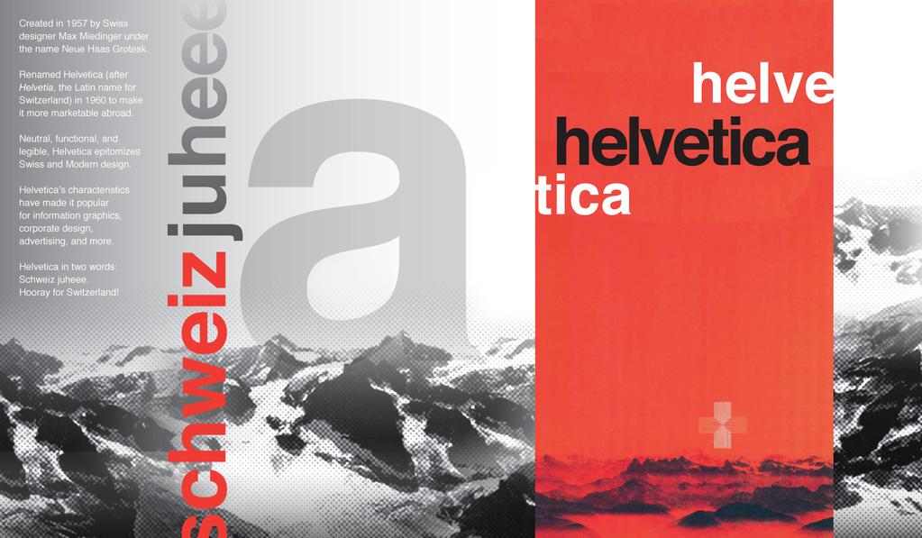
4 Rationale Statement Shaina Meyers Typeface Poster: Helvetica Summary of Intent My intended audience consists of adults with no prior background in typography or history of typography. My goal was to convey the aesthetic qualities and historical background of the typeface Helvetica. Because Helvetica is associated with Switzerland, I chose to make the Swiss Alps a major part of my design. I also incorporated elements of the Swiss Style, including photographic images (adjusted with a halftone filter of large dot size to match the printing technology of the time period), the color red, and unjustified, ragged right type. To convey Helvetica s beautiful simplicity and legibility, I tried to organize the elements in my poster as cleanly as possible. The main text is restricted to the leftmost side of the poster. I used red to emphasize two elements: the title, Helvetica, and schweiz of schweiz juheee. I included an a large enough for its form to be easily seen in detail. The Alps in the background tie together all elements of the foreground. The red highlighting the title Helvetica is actually part of a poster created by Michael Baviera in The Alps in Baviera s poster inspired me to include the Alps in the background of my poster, and I also borrowed from him schweiz juheee, which he placed below the Alps in his poster. Lastly, because Helvetica s curved letterforms are unique in that their strokes terminate either horizontally or vertically, and not diagonally, as is the case for most other major sans serif letterforms, I composed all the elements in my poster either horizontally or vertically. Overview of Design Development The first step of my research involved finding styles, images, colors, forms and shapes, and compositional approaches associated with Helvetica. Two major sources for the information I found were Swiss Graphic Design: The Origins and Growth of an International Style by Richard Hollis and Helvetica: Homage to a Typeface by Lars Müller. I found that Helvetica is associated with the Swiss Style, a revolutionary style in graphic design characterized by the use of sans serif type, asymmetrical layouts, layout grids, white space, areas of flat color, geometric shapes, and photographic images. I also found several images and pieces of information regarding Helvetica s place in the more recent past and today, but I decided to concentrate on Helvetica as it was used in the 1950s and 60s because I felt that that period represents Helvetica at its best, when Helvetica was new and popular and as a result began to spread like wildfire across information graphics, corporate design, advertising, and more. Tempted by so many great resources on Helvetica, my first poster concepts included a lot of images and information. Feedback from my professor and classmates can be summarized as less is more. After several different approaches toward content and composition, I developed my final concept, which is explained in the above Summary of Intent.
5 Analysis of Efforts I feel that I put forth a great amount of effort on this project. My research on Helvetica and the Swiss Style was very thorough. When I began to work on the design of the poster, I felt that I had a solid foundation of knowledge and aesthetic and compositional resources off of which to build. The development of the poster was a very slow process, but I feel that my final design was worth the time and effort. I used what Peter Megert refers to as the potter s method. That is, I developed many very different concepts, chose one I liked, and made several slight variations on the one concept. I believe the potter s method is the right method for me, and this project helped me realize that. Working on this project also reinforced my belief in the power of constant feedback during the design process! I feel that my final outcome is successful. An improvement that I would still make would be to increase the contrast between the white text and gray background. I think it would also be great to make the poster by hand, to more closely match the technology of the time period associated with the Swiss Style.
6
The typography. of order EMIL RUDER
 The typography of order EMIL RUDER 1914-1970 Swiss typographer, born in Zurich He was professor in basel school of design He founded the international center for the typographic arts in New York in 1962
Designing Research Posters. College of Art and Design Chris Jackson, Associate Dean Keli DiRisio, Assistant Professor
 Designing Research Posters College of Art and Design Chris Jackson, Associate Dean Keli DiRisio, Assistant Professor Size and Orientation If you are NOT using the poster template: Start is with a 48"
3/20/16. International Typographic Style. International Typographic Style. International Typographic Style ARTH 4573 HISTORY OF GRAPHIC DESIGN
 ARTH 4573 HISTORY OF GRAPHIC DESIGN Section 9a international typographic style (swiss style) } American Modernism } 1913 } 1930s } The Depression } World War 2 } After the War } } Basel and Zurich, Switzerland
Part 1 The Elements of Design. Lines
 Part 1 The Elements of Design There are seven elements of graphic design that are the starting point of your design ideas: Line, Shape, Texture, Space, Size, Value and Color. Each of these elements is
Chapter 18: The International Typographic Style
 Chapter 18: The International Typographic Style International Typographic Style A graphic design style emphasizing cleanliness, readability and objectivity developed in Switzerland in the 1950s. Specifics
The International Typographic Style
 The International Typographic Style Ernst Keller was one of the pioneers of Swiss design. His work used symbolic imagery, simplified geometric forms and vibrant contrasting color. Poster for the Rietberg
BRAND GUIDE L I N E S
 BRAND GUIDE LINES NETWORK OF COMMUNITY MINISTRIES SIMPLICITY IS THE ULTIMATE FORM OF SOPHISTICATION. Leonardo da Vinci 2 BRAND GUIDELINES THIS IS A GUIDE TO THE BASIC ELEMENTS THAT MAKE UP OUR BRAND. IT
Typography in Design The principles of design describe the ways that artists use the elements of art in a work of art.
 Typography in Design The principles of design describe the ways that artists use the elements of art in a work of art. Aims & Outcomes: Aims: to understand typeface categories and how they are used in
Typography One Project Two
 Typography One Project Two Typographic Systems, Emphasis and Hierarchy An important design problem is to aid reader comprehension of information through carefully considered logic, structure and order.
Digital Design: How to disseminate ideas, research and good practice in a visually stimulating way. Dawne Bell December 2015
 Digital Design: How to disseminate ideas, research and good practice in a visually stimulating way. Dawne Bell December 2015 This workshop has been devised as a direct result of feedback by colleagues
art 118: intro to communication design // FALL 2011
 t y p e specimen Due: Wednesday, November 30 ov e r v i e w A type specimen is a publication, that shows the range of a particular typeface in use. Printers and typographers have produced type specimens
Helvetica Type Specimen Process book
 Helvetica Type Specimen Process book Project Goal Using the history and typeface of Helvetica to inspire my design, the goal of this project was to create a booklet that would essentially sell the type
DESIGNING THE PAGE FOUNDATIONS OF DIGITAL DESIGN. Layout composition, the grid and typography. Prof. Eva Machauf
 DESIGNING THE PAGE Layout composition, the grid and typography FOUNDATIONS OF DIGITAL DESIGN Prof. Eva Machauf prof.machauf@gmail.com THE GRID The grid is the foundation of all design. Creating and working
How we look. Brand Guidelines version 1.1
 How we look. Brand Guidelines version 1.1 TOUCHTUNES Simplicity is the ultimate form of sophistication. Leonardo da Vinci 2 BRAND GUIDELINES This is a guide to the basic elements that make up our brand.
BRAND & LOGO GUIDELINES SOCKET MOBILE. - Logos - Social Media - Web
 BRAND & LOGO GUIDELINES - Logos - Social Media - Web SIMPLICITY IS THE ULTIMATE FORM OF SOPHISTICATION. 2 BRAND GUIDELINES THIS IS A GUIDE TO THE BASIC ELEMENTS THAT MAKE UP OUR BRAND. IT WILL LET YOU
VOICE OF TYPE LECTURE 1
 VOICE OF TYPE LECTURE 1 TYPOGRAPHY II COUNTY COLLEGE OF MORRIS PROFESSOR GAYLE REMBOLD FURBERT VOICE OF TYPE As you look at typefaces, analyze their forms, learn their history and learn how to use them
Our Look Book. BRAND GUIDELINES VERSION 1.0
 Our Look Book. BRAND GUIDELINES VERSION 1.0 SIMPLICITY IS THE ULTIMATE FORM OF SOPHISTICATION. Leonardo da Vinci 2 BRAND GUIDELINES THIS IS A GUIDE TO THE BASIC ELEMENTS THAT MAKE UP OUR BRAND. IT WILL
OCA Graphic Design: Core Concepts 1 Assignment 5 - Penguin Books Jane Braybrook Jane511794
 OCA Graphic Design: Core Concepts 1 Assignment 5 - Penguin Books Jane Braybrook Jane511794 Supporting Blog Post: https://jane511794.wordpress.com/category/assignments/assignment-5/ Critical Evaluation
Unit 4. Multimedia Element: Text. Introduction to Multimedia Semester 2
 Unit 4 Multimedia Element: Text 2017-18 Semester 2 Unit Outline In this unit, we will learn Fonts Typography Serif, Sans Serif, Decorative Monospaced vs. Proportional Style Size Spacing Color Alignment
ADDENDUM. PRINCIPLES OF DESIGN COURSE Topic YouTube link QR Code
 ADDENDUM PRINCIPLES OF DESIGN COURSE Topic YouTube link QR Code Topic 1 Introduction to Graphic Design https://youtu.be/pacrrojlvui This video discussed on essential skills of a graphic design and its
UNIVERSITY HOUSING COMMU- NICATION GUIDE TO DESIGN
 UNIVERSITY HOUSING COMMU- NICATION GUIDE TO DESIGN INTRODUCTION Hello and welcome to the University Housing Communication Guide to Design! In this book, you will find various guides to help you enhance
Typography education in an interdisciplinary program through inclusive projects
 Typography and Diversity http://www.typoday.in Typography education in an interdisciplinary program through inclusive projects Hye-Jin Nae, Rochester Institute of technology, Rochester, USA, hxnfaa@rit.edu
Elements and Principles Design
 Elements and Principles Design Design Considerations Excellence in visual communication is founded on experience, cleverness, innate ability and precise execution. The designer begins with a good concept
Our Brand THIS BOOK SERVES AS A GUIDE TO THE BASIC ELEMENTS THAT MAKE UP LERO. IT WILL HELP YOU TO GET TO KNOW US BETTER.
 Brand Assets & Guidelines 2015 Our Brand THIS BOOK SERVES AS A GUIDE TO THE BASIC ELEMENTS THAT MAKE UP LERO. IT WILL HELP YOU TO GET TO KNOW US BETTER. These guidelines have been designed to show our
Good Publication Design
 Good Publication Design The top ten tips for creating professional print documents How do I create a well-designed print publication? Good publication design is an art form. Attractively presenting written
the streamlining of typography rene koszerowski
 the streamlining of typography 1920 1929 rene koszerowski poster for sixtieth-birthday exhibition of kandinsky herbert bayer 1926 the streamlining of typography 1920 1929 contents pages 1900 1909 1
TYPO GRA PHY THE ANATOMY OF TYPE A BRIEF HISTORY OF TYPOGRAPHY WHAT IS YOUR TYPE ACTUALLY SAYING? OPEN FONT DISCUSSION
 THE ANATOMY OF TYPE A BRIEF HISTORY OF TYPO WHAT IS YOUR TYPE ACTUALLY SAYING? OPEN FONT DISCUSSION THE ANATOMY OF TYPE Typeface Anatomy The upward vertical stem on some lowercase letters, such as h and
O M. O M logo specs. O M O M O M O M
 overview. The useum of odern Art, or oa, is an art museum in anhattan that holds and displays a wide range of modern and contemporary art. oa is considrered to be one of the most influential museums in
BRAND GUIDE JANUARY 2013 PREPARED BY JULIE ZACK GRAPHIC DESIGNER
 BRAND GUIDE JANUARY 2013 PREPARED BY JULIE ZACK GRAPHIC DESIGNER 716.517.6298 BRIEF AERIS Latin word meaning air, atmosphere, ether, or weather. SPECIFICS Asbestos abatement Lead hazard control Mold mitigation
Gujarat Technological University
 COURSE NAME: COMPOSITION 1.RATIONALE: Composition makes a student aware of the art field. The basic elements and principles encompassing sculpture, painting and architecture are explained. The study of
Before & After. Use the Principles Cheatsheet! From The Non-Designer s Design Book, Robin Williams Non-Designer s Design 8
 Before & After Use the Principles Cheatsheet! From The Non-Designer s Design Book, Robin Williams Non-Designer s Design 8 Before & After From The Non-Designer s Design Book, Robin Williams Non-Designer
INTRODUCTION TO TYPOGRAPHY DESIGN
 INTRODUCTION TO TYPOGRAPHY DESIGN Goals of typographic design Typography plays an important role in how audiences perceive your document and its information. Good design is about capturing your audience
Typography 2! HCC 710 2/1 /13. Human&Centered,Compu/ng,at,University,of,Maryland,,Bal/more,County
 Typography 2! HCC 710 2/1 /13 1, Human&Centered,Compu/ng,at,University,of,Maryland,,Bal/more,County Letterform Critiques! 25-30 minutes 2, Wordpress Questions / " Graphic Design Inspirations! 3, Human&Centered,Compu/ng,at,University,of,Maryland,,Bal/more,County
Font Basics. Descender. Serif. With strokes on the extremities of the letters. T Script. Sans-Serif. No strokes on the end of the letters
 Font Basics Ascender Font Size d p x A X-height Cap height Counter The white space within letters Descender Bar A Serif With strokes on the extremities of the letters. T A Sans-Serif No strokes on the
ABOUT RESEARCH POSTERS
 ABOUT RESEARCH POSTERS Research posters summarize information or research concisely and attractively to help publicize it and generate discussion. The poster is usually a mixture of a brief text mixed
Design Elements. Advanced Higher Graphic Presentation. Professional Graphic Presentations by kind permission of
 Design Elements Advanced Higher Graphic Presentation Professional Graphic Presentations by kind permission of Lines can Design Element:- Line Convey a mood or an emotion. Organise the design. Establish
Pre-Venetian or Ancient Humanist or Venetian Transitional Didone Slab Serifs
 Pre-Venetian or Ancient Humanist or Venetian Transitional Didone Slab Serifs 1400 1500 1700 1800 Humanist Sans Serif Transitional Sans Serif Geometric Sans Serif Display Typefaces 1900 2000 Pre-Venetian
Typography Controlling Visual Hierarchy Introduction to Grid Theory Design Consistency
 Typography Controlling Visual Hierarchy Introduction to Grid Theory Design Consistency ART-2413 Fall 2017 Typography Controlling Visual Hierarchy Introduction to Grid Theory Design Consistency ART-2413
Knightswood Secondary School. Graphic Communication. Desktop Publishing otes. Auto Tracing
 Auto Tracing The process of converting a bit mapped image into a vector image. In a bit-mapped image, each object is represented by a pattern of dots, while in a vector image every object is defined geometrically.
LOGO & BRAND STANDARDS GUIDE
 LOGO & BRAND STANDARDS GUIDE INTRODUCTION The SparkPost Brand Standards Guide provides key information needed to accurately and consistently produce external and internal documents and communications.
Design Principles. Advanced Higher Graphic Presentation. Professional Graphic Presentations by kind permission of
 Design Principles Advanced Higher Graphic Presentation Professional Graphic Presentations by kind permission of Design Principles:- Balance Balance in Composition Three different types of balance :- *
Contents. 02 Introducing Sans Forgetica 06 What s wrong with Helvetica? 10 Anatomy 12 The science 14 The design 16 How to use Sans Forgetica
 Sans Forgetica Contents 02 Introducing Sans Forgetica 06 What s wrong with Helvetica? 10 Anatomy 12 The science 14 The design 16 How to use Sans Forgetica 01 Sans Forgetica Character table! # $ % & ( )
BBN ANG 183 Typography Text colour: vertical and horizontal spacing
 BBN ANG 183 Typography Text colour: vertical and horizontal spacing Zoltán G. Kiss & Péter Szigetvári Dept of English Linguistics, Eötvös Loránd University gkz & szp (delg) typo/spacing 1 / 43 outline
Visual Design and Imaging Alignment
 Visual Design and Imaging Alignment This document contains information about four Career-Technical Articulation Numbers (CTANs) for the Visual Design and Imaging Alignment Career-Technical Assurance Guide
Structure of Text. Creating Memory Aids through Typography
 Structure of Text Creating Memory Aids through Typography Edward Rushton MFA Donald Armel PhD Legibility Readability Definitions Legibility Legibility is dependent on the design of the typeface, the letterforms
Enterprise Graphic Design
 Enterprise Graphic Design Courses Overview Color Theory Fundamentals of Design Visualization The Principles of Web Graphic Design Photography Consolidated (Photo Composition) Web Design with Adobe Photoshop
In your lifetime you ve seen billions of letters and millions of words, yet you might never have consciously noticed the typefaces you read.
 In your lifetime you ve seen billions of letters and millions of words, yet you might never have consciously noticed the typefaces you read. Type is important because it is an unconscious persuader. It
Total Responses 13. Please list and explain every single design decision you made in presenting this work.
 Initial Report Total Responses 13 Please write an explanation for the layout of the page -- or email -- that you are turning in today: Why did you choose the typeface(s) you did? Why did you choose the
EMU Galleries Web Site: Design and Process
 Eastern Michigan University DigitalCommons@EMU Senior Honors Theses Honors College 2007 EMU Galleries Web Site: Design and Process Christopher Cameron Kaufman Follow this and additional works at: http://commons.emich.edu/honors
Heuristic Evaluation. An Analysis of The Toronto Public Library Website. By: Chris Dacol
 Heuristic Evaluation An Analysis of The Toronto Public Library Website By: Chris Dacol Global High-level Evaluation After evaluating the Toronto Public Library desktop website I have identified several
> creative résumé. > specifications: save as: Resume_Lastname.ai dimensions: 8.5" x 11" or 11" x 8.5" mode: CMYK
 > creative résumé > objective(s): Students will create an eye-popping, visually impacting résumé using current trends in graphics, color and typography. > curricular focus: This lesson emphasizes the graphic
Objective 203 Apply production methods to plan and create advanced digital media graphics projects. Course Weight : 25%
 Objective 203 Apply production methods to plan and create advanced digital media graphics projects. Course Weight : 25% Objective 203 - Graphics Objectives are broken down into three sub-objectives : pre-production,
Making sense of chaos An evaluation of the current state of information architecture for the Web
 Making sense of chaos An evaluation of the current state of information architecture for the Web Anne de Ridder UW 521 Winter Seminar Series, February 3, 2012 What you ll hear about today A bit about me
Typographic. Alphabet. Book. Interactive PDF of typographic rules & terms YOU NEED TO KNOW. Home. Table of Contents
 Typographic Alphabet Table of Contents > Rules That Every Typographer Should Know... 2-3 Book Interactive PDF of typographic rules & terms YOU NEED TO KNOW > Baseline... > Gutter... > Hierarchy... > Kerning...
Typefaces are character sets based on distinct design characteristics.
 Level 3 WGHS VISUAL ARTS 2011 ART DESIGN Typography An Introduction to Type Type Design Since the first recordings of letterforms the concept of the typographic form has evolved into a seemingly endless
3rd. Space Arts. Graphic Standards
 3rd Space Arts Graphic Standards Tara Burke MTKG:MEDIA:COMM Fall 2014 Table of Contents Introduction Glossary Logo and Logotype Use of Space Typography Business Card 3 4 5 6 7 8 Envelope Letterhead Water
PLANNING. CAEL Networked Worlds WEEK 2
 PLANNING CAEL5045 - Networked Worlds WEEK 2 WEEK 2 CHOOSING COLOURS CHOOSING FONTS COLLECTING CONTENT PLANNING STRUCTURE WIREFRAMES + MOCKUPS Every colour, including black and white, has implications for
SELECTING THE RIGHT TYPE FOR THE JOB
 CHAPTER FOUR SELECTING THE RIGHT TYPE FOR THE JOB ype has the power to make or break a job. Every typeface has a distinct personality and conveys a different mood, message, or feeling. Display typefaces,
PAGE ARCHITECTURE Architecture Coherent: Meaningful: Functional:
 PAGE ARCHITECTURE Architecture deals with form and space. Typographic elements must be organized in ways that are: Coherent: The page and the entire document must hang together make sense as a whole. Meaningful:
PRINT ASSET EXPLORATION 2017_ PREPARED OCT. 31, 2017
 PRINT ASSET EXPLORATION 2017 PREPARED OCT. 31, 2017 What We Do TMF Vol. 01 WE EMPOWER VETERANS AND FAMILIES OF FALLEN HEROES TO DEVELOP CHARACTER IN FUTURE GENERATIONS. What We Do TMF Vol. 01 With a simple
Introduction A global icon needs an iconic logo. Fashion has evolved since 1969, when Gap opened its first store. Our logo has changed with the
 Introduction A global icon needs an iconic logo. Fashion has evolved since 1969, when Gap opened its first store. Our logo has changed with the times, too. One thing that hasn t changed is our mission
HEL HEL HEL HEL VETIC HEL VETIC HEL HEL VETICA HEL HEL ETICA ETIC VETIC HEL VETIC HEL HEL C VETICA ETI- HEL HEL VETI HEL VETICA VETIC HEL HEL VETICA
 CA C C CA C C CA Max Miedinger with Eduard Hoffmann C C CA C CA ETI- ETI- L istory elvetica was developed in 1957 by Max Miedinger with Eduard Hoffmann at the Haas sche Schriftgiesserei of Münchenstein,
STONELAW HIGH GRAPHIC
 GRAPHIC COMMUNICATION Technical Education THE A to Z of DTP Your knowledge of desktop publishing terminology will be expanded as you progress within the subject THE A to Z of DTP ALIGNMENT positions of
Adjust the point size
 Adjust the point size create contrast small and dark Strive for contrast rather than harmony. Mixing typefaces on the same line, designers usually adjust the point size so the x-heights align. Placing
Module 5X Independent Guided Study
 MODULE DESCRIPTOR TITLE Principles of Typography SI MODULE CODE 31-4047 CREDITS 20 LEVEL 4 JACS CODE W210 SUBJECT GROUP Graphic Design DEPARTMET Visual & Performing Arts MODULE LEADER John Young MODULE
Products At Home for Skin, Hair & Body Care: A Step by Step Guide & 70 Simple Recipes for Any Skin Type and Hair Type Designing Type Lettering &
 Designing Type PDF One of the most essential tools of graphic design, typography influences the appearance of visual print materials perhaps more than any other component. This essential book explains
logo 101 A solid logo design intake ensures that no time is wasted, and that you receive targeted logo options as soon as possible. Getting results.
 logo logo 101 2 logo 101 A solid logo design intake ensures that no time is wasted, and that you receive targeted logo options as soon as possible. Getting results. Our goal is to help you communicate
VIVO Identity Guidelines
 VIVO Identity Guidelines May 2010 Version 1.0 00 Contents 01 02 03 04 05 06 Introduction About VIVO VIVO Identity Elements Space Size Color System (web and print) Identity Colors Primary Color Palette
Multimedia Design Principles. Darnell Chance August 2005
 Multimedia Design Principles Darnell Chance August 2005 Home Page Things To Consider Organization Story Board Organization The 3 C s Alignment Proximity Tips/ Techs White Space Contrast Rule of Thumb Typography
Unit 3. Design and the User Interface. Introduction to Multimedia Semester 1
 Unit 3 Design and the User Interface 2018-19 Semester 1 Unit Outline In this unit, we will learn Design Guidelines: Appearance Balanced Layout Movement White Space Unified Piece Metaphor Consistency Template
COPY/PASTE: Allows any item within a document to be copied and pasted within the same document or within compatible software applications.
 You will need to understand basic terms and techniques used in DTP, as well as file types used within DTP and their advantages and disadvantages. This is separate from Elements and Principles of DTP which
Design Development Documentation
 Design Development Documentation Preliminary Logo One For the first logo design in which I created I started off with a clipart image of a clenched fist in which I traced within Photoshop. I chose this
STYLE GUIDE. Introduction. Fresh Tradition
 Fresh Tradition The visual identity is simply one element of the brand. Yet, it s your introduction to the community. Use it thoughtfully to epose a long-standing tradition of ecellence, engaging students
corporate identity guidelines
 Seilevel Corporate Identity Guidelines Introduction 1 Preferred Signature and Components Logo Space and Minimum Size Signature Variations Color Palette Typography Signature Misuse 2 3 4 5 6 7 corporate
Alphabet. elemental visual signs 26 characters frozen sounds
 Alphabet elemental visual signs 26 characters frozen sounds Evolution Handwriting > minimum number of strokes Engraving > lowercase > minimum number of curved lines > capitals Letterforms Appearance of
Edea IDENTITY STYLE GUIDE
 Edea IDENTITY STYLE GUIDE 00 Introduction 01 02 Typography 03Colour Usage The primary goal of this guide is to help ensure that the Edea identity is consistent throughout all communications. Consistency
Wednesday, April 6, 16
 During the 1950s, an important design movement began in Switzerland and Germany. It was known as the SWISS STYLE or INTERNATIONAL STYLE. Wednesday, April 6, 16 The characteristics of this style are: -
GDP113 Syllabus. GDP113 Typography Syllabus. Instructor: Liz Russotti
 GDP113 Syllabus GDP113 Typography Syllabus Instructor: Liz Russotti russotti@sbcc.edu (Please start the Subject line of EACH email to me with GDP113+CRN#). Department Chair, Graphic Design A 176 (Digital
IDENTITIES ARE THE BEGINNING OF EVERYTHING. THEY ARE HOW SOMETHING IS RECOGNIZED AND UNDERSTOOD. WHAT COULD BE BETTER THAN THAT?
 BRAND GUIDELINES IDENTITIES ARE THE BEGINNING OF EVERYTHING. THEY ARE HOW SOMETHING IS RECOGNIZED AND UNDERSTOOD. WHAT COULD BE BETTER THAN THAT? Paula Scher Paula Scher is an American graphic designer,
April 2017 STYLE GUIDE
 April 2017 STYLE GUIDE WHY IS VISUAL IDENTITY IMPORTANT? The Occidental College logo is a symbol of the Oxy community and our set of shared values of excellence, equity, access and service. The logo serves
COURSE SYLLABUS. Course Title: Typography & Design I. Date submitted: Department: Art. Curriculum: Graphic Design
 COURSE SYLLABUS Course Title: Typography & Design I Department: Art Curriculum: Graphic Design Date submitted: Spring 2014 (AAC: 14-23) Course Descriptors: Make certain that the course descriptors are
The Visual Scientist Presents Poster Design
 The Visual Scientist Presents Poster Design layout fonts science! Hailpern & Danilevsky www.thevisualscientist.com Topics Covered This is a how-to-guide for effectively presenting scientific work in the
Synopsis This module introduces calligraphy, the basic principles of typography, and applications of typography.
 8. Typography Synopsis This module introduces calligraphy, the basic principles of typography, and applications of typography. Lectures 8.1 Calligraphy 8.2 Basic Principles of Typography 8.3 Typography
Course Introduction. Objectives and Class Structure. Expectations and Course Policy. Professor Rebecca Leffell Koren rebeccaleffellkoren.
 Course Introduction Graphic Design is a practice of input and output keen observation feeds thoughtful creation. Design begins with sensitive, broad seeing, training the eye for informed making. Building
VISUAL HIERARCHY Explain: Elements are arranged in order of importance in the designs. Such things as size, weight and contrast are used to create a
 VISUAL HIERARCHY Explain: Elements are arranged in order of importance in the designs. Such things as size, weight and contrast are used to create a hierarchical structure. Visual hierarchy naturally creates
Understanding Ethos. The Importance of Incorporating Ethos into Document Design
 McLean 1 Understanding Ethos The Importance of Incorporating Ethos into Document Design To understand any form of document design, one must first be able to understand the audience that they are organizing
ASSIGNMENT 5. TYPE & IMAGE POSTER LAYOUT, TYPE, IMAGE, and the use of GRID in single page layout and design.
 ASSIGNMENT 5 TYPE & IMAGE POSTER LAYOUT, TYPE, IMAGE, and the use of GRID in single page layout and design. LAYOUT DEFINED 2 Organization of image, type, and other design elements to emphasize or reinforce,
Logo. Logo. Symbol. Wordmark
 1725 Windward Concourse, Suite 300 Alpharetta, Georgia 30005 www.thinmanager.com info@thinmanager.com OFFICE 678-990-0945 FAX 678-990-0951 Introduction... 1 Logo... 2 Clear space and minimum size... 3
Georgia Competency-Based Curriculum Frameworks, Career & Technical Education Technology Education, Graphic Arts Technology, Course 21.
 Georgia Competency-Based Curriculum Frameworks, Career & Technical Education, Technology Education, Graphic Arts Technology (Grades 9-12) Georgia Competency-Based Curriculum Frameworks, Career & Technical
INTERNAL COMMUNICATION HOW TO DESIGN A NEWSLETTER
 1. Subject of the workshop. INTERNAL COMMUNICATION HOW TO DESIGN A NEWSLETTER 2. Goal of the workshop. Be able to point out the typical design mistakes en know how to improve the design by using the tips
The brief. D&AD New Blood Awards Brief set by: Monotype. In Collaboration With: Craig Oldham, The Office of Craig Oldham
 Monotype The brief D&AD New Blood Awards 2017 Brief set by: Monotype In Collaboration With: Craig Oldham, The Office of Craig Oldham Deadline: 22 March 2017 5pm GMT Monotype challenges you to embody and
Making a Great Poster. A Great Poster is:
 Making a Great Poster Marilee P. Ogren PhD Ogren@mit.edu Readable A Great Poster is: Unreadable = grammatical problems, complex, passive sentences, misspellings Legible Illegible = small font, fancy font,
The Art of Graphic Designing
 Justin Suarez Lingerfelt/Greene British Comp 18 December 2017 The Art of Graphic Designing Suarez 1 Have you ever wondered how the art of graphic design works? There is a lot to know about what graphic
RIPE NCC Brand Guidelines Communications Department
 1 2015 Brand Guidelines 2 We serve our members by delivering a high quality registry and supporting the core Internet infrastructure. Connecting people within and beyond the technical community through
{ 20 Rules } for good design Adapted from Design Elements: A Graphic Style Manual by Timothy Samara
 { 20 Rules } for good design Adapted from Design Elements: A Graphic Style Manual. 2007 by Timothy Samara Rule no. 1 {Have a concept} It doesn t matter how amazing things look, if there is no message,
CALLUM MCMURRAY DESIGN PORTFOLIO
 CALLUM MCMURRAY DESIGN PORTFOLIO Contents 02 About Me: A short description about who I am, what I can do and what I enjoy. Self-Branding: Logo and Brand: My project to create a brand to represent myself
PRESENTATION BOARD LAYOUT
 NEW YORK CITY COLLEGE OF TECHNOLOGY THE CITY UNIVERSITY OF NEW YORK ARCHITECTURAL TECHNOLOGY DEPARTMENT written by annie boccella spring 2010 1. BEFORE YOU BEGIN... Organize yourself. What is your argument
Assignment 1~ ICONS Grading Assessment
 Assignment 1~ ICONS W18 Section: 10013 9:00 am-11:25 am MW 24 23 22 21 20 19 18 16 15 14 13 12 11 09 08 07 06 05 04 03 02 01 0 17 10 Ability to Design Icon Likeness Images in a Theme as a Stylistic Series
section four typography contents introduction...44 helvetica neue...45 bodoni...46 examples of type usage...47 body text examples...
 section four typography 43 contents introduction...44 helvetica neue...45 bodoni...46 examples of type usage...47 body text examples...48 introduction Consistent application of type fonts and styles allows
InDesign. your. Resumé. a how-to guide for creating a professional resumé using InDesign
 InDesign your Resumé a how-to guide for creating a professional resumé using InDesign Table of Contents p4. Glossary p5. The Importance of Good Design p6. Setting up the Document p10. Creating a Grid p12.