Typography One typeface classification
|
|
|
- Alexis Owens
- 5 years ago
- Views:
Transcription
1 Typography One typeface classification
2 Why classify? Classification helps us describe and navigate type choices
3 Typeface classification helps to: 1. sort type (scholars, historians, type manufacturers), 2. reference type (educators, students, designers, scholars)
4 A rough approximation: about 250,000 typefaces are available today as digital fonts. Even with excellent search engines, a common system of description is a big help.
5 classification systems Many systems have been proposed: they all have strengths and weaknesses, and tend to lean towards an easier system or a wider range of description.

6 Francis Thibaudeau, 1921
7 Maximillian Vox, 1952
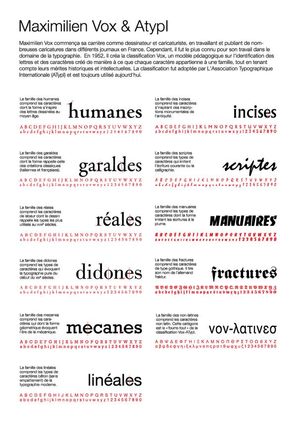
8 Vox-ATypI, 1962
9 Aldo Novarese, 1964
10 Alexander Lawson, 1966 Blackletter Venetian French Dutch-English Transitional Modern Sans Serif Square Serif Script-Cursive Decorative

11 J. Ben Lieberman, 1967

12 Marcel Janco, 1978

13 Catherine Dixon, 1995 (For the Central Lettering Record, an art college s lettering archive)

14 MyFonts.com, launched 2000 User tag system, uses many traditional type classification terms as tags

15 MyFonts.com, launched 2000 top 200 tags (2/25/2015)
16 Ellen Lupton, 2004
17 The system we will learn is not the only system or the best system, because there is no single correct or complete classification system. It has a good balance of simplicity and detail, and contains the most commonly used classifications.
18 The classification system you will learn is a combination of Lawson s and Lupton s systems
19 You will need to classify typefaces in two levels
20 We will classify on two levels. This system can describe about 90% of the typefaces that exist. Text Serif Old Style serif Transitional serif Modern Style serif Slab Serif Text Sans Serif Geometric Sans Grotesque Sans Humanist Sans Display Black Letter Script Decorative
21 Text type vs. Display type Text type is designed to be legible and readable at small sizes. This usually implies fairly clean, consistent, uncomplicated design features; more open spacing than a display face; and thin strokes that hold up at smaller sizes. Display type is designed for large sizes. Legibility and readability are less important, in exchange for a stronger personality, expressive shapes, and a more stylish look.
22 Text: designed for small use, can work at large sizes Handgloves Text type is designed to be legible and readable at small sizes. This usually implies fairly clean, consistent, uncomplicated design features; more open spacing than a display face; and thin strokes that hold up at smaller sizes. Display type is designed for large sizes. Legibility and readability are less important. in exchange for a stronger personality, expressive shapes, and a more stylish look. Handgloves Text type is designed to be legible and readable at small sizes. This usually implies fairly clean, consistent, uncomplicated design features; more open spacing than a display face; and thin strokes that hold up at smaller sizes. Display type is designed for large sizes. Legibility and readability are less important. in exchange for a stronger personality, expressive shapes, and a more stylish look. Display: designed for large use, does not work at small sizes Handgloves Text type is designed to be legible and readable at small sizes. This usually implies fairly clean, consistent, uncomplicated design features; more open spacing than a display face; and thin strokes that hold up at smaller sizes. Display type is designed for large sizes. Legibility and readability are less important. in exchange for a stronger personality, expressive shapes, and a more stylish look. Handgloves Text type is designed to be legible and readable at small sizes. This usually implies fairly clean, consistent, uncomplicated design features; more open spacing than a display face; and thin strokes that hold up at smaller sizes. Display type is designed for large sizes. Legibility and readability are less important. in exchange for a stronger personality, expressive shapes, and a more stylish look.
23 basic characteristics + stress + serifs (or lack thereof) + shape
24 stress: where the thinnest parts of a letter fall diagonal stress Old Style serif (Centaur) vertical stress Transitional serif or Modern Style serif (Baskerville) no stress Slab Serif or Sans Serif (Helvetica) horizontal stress or reverse stress Display & Decorative (Edmunds)
25 serif types bracketed serifs Old Style Serif and Transitional Serif (Baskerville) unbracketed serifs Modern Style Serif (Bodoni) slab serifs Slab Serif or Square Serif or Egyptian (Rockwell/Clarendon) no serif Sans Serif (Helvetica)
26 shape Geometric Sans Serif (Futura) Geometric sans are based on basic shapes like circles, triangles, and rectangles. Grotesk Sans Serif (Helvetica) Grotesk sans look precisely drawn. They have have uniform, symetrical curves Humanist Sans Serif (Gill Sans) Humanist sans are based on human writing. They have asymetrical curves, open apetures, and finials that reach away from the letter.
27 Text Serif Old style serif Introduced in the 1460 s touchstones Caslon: handgloves Garamond: handgloves + diagonal stress in the round strokes + bracketed serifs + Minimal variation of thick and thin strokes + small, coarse serifs, often with concave bases + small x-height + lowercase ascenders often exceed the capital height
28 Text Serif Transitional serif A style introduced in the 1757 by John Baskerville. touchstones Baskerville: handgloves Century Schoolbook: handgloves + vertical stress in rounded strokes + bracketed serifs often with flat bases + greater contrast between thick and thin strokes + larger x-height + lowercase ascenders often match the capital height
29 Text Serif Modern Style serif Introduced in the 1770s by Didot and Bodoni. touchstones Bodoni: handgloves Didot: handgloves + vertical stress in rounded strokes + unbracketed hairline serifs + extreme contrast between thick and thin strokes + small x-height
30 Text Serif Slab Serif (Also called Square Serif or Egyptian) Introduced in the early 1800s. + thick serifs with squared-off ends; serifs are nearly as thick as strokes + slab serifs may be bracketed or unbracketed + minimal variation of thick and thin strokes + often has large x-height + small or no stress in rounded strokes touchstones Rockwell: handgloves Clarendon: handgloves
31 Text Sans Serif Geometric Sans Introduced in the early 20th century touchstones Futura: handgloves Kabel: handgloves + Sans serif constructed with geometric forms: triangles, circles, squares
32 Text Sans Serif Grotesque Sans Sans serif with a precise, mechanical appearance, introduced in the late 19th century touchstones Helvetica: handgloves Univers: handgloves + uniform, symmetrical curves + closed apertures + little to no variation of thick and thin strokes + May also be spelled Grotesk (Lupton refers to this style as Transitional Sans )
33 Text Sans Serif Humanist Sans Sans serif with the shape of human writing touchstones Gill Sans: handgloves Optima: handgloves + asymetrical curves + open apertures + may have some variation of thick and thin strokes
34 Display Black Letter Black letter was developed from the handwritten manuscripts of 1400 s Germany. + upright calligraphic strokes + looks like medieval calligraphy touchstones Fette Fraktur: handgloves Engravers Old English: handgloves
35 Display Script Designed to mimic hand-written text touchstones Snell Roundhand: handgloves Mistral: handgloves + looks like script hand writing + lowercase letters may or may not join + variation between thick and thin strokes + no serifs (often replaced by swashes) + a variety of x-heights
36 Display Decorative Introduced in the 1800s to meet the demands of advertising. + whimsical, stylized, or decorated + only legible at large sizes + wide variation in stroke weight and quality + both serif and sans serif + sometimes has reverse (horizontal) stress touchstones Cottonwood: handgloves Hogarth: handgloves Shuriken: handgloves
37 problem area: stress direction Remember the clock Look at all the round letters diagonal stress Old Style serif (Caslon) 12 & 6: vertical stress 9 & 3: horizonal stress Everything else: diagonal stress vertical stress Transitional serif (Baskerville)
38 problem area: humanist vs. grotesk Grotesk Sans Serif symetrical curves (Helvetica) Humanist Sans Serif asymetrical curves (Gill Sans)
39 type classification quiz: + 20 typefaces to classify (50% from worksheet, 50% new.) + Top-level Classification: 1 point + Second-level Classification: 2 points + Explanation: 2 points You must understand the system and explain your thinking to do well.
40 type classification practice The worksheets are the same format as the quiz. Worksheet 1 together in class. Worksheet 2 homework, to review next session. Worksheet 3 homework next week.
Typography One typeface classification
 Typography One typeface classification Why classify? Classification helps us describe and navigate type choices Typeface classification helps to: 1. sort type (scholars, historians, type manufacturers),
TYPE ANATOMY jtittle
 TYPE ANATOMY TYPE ANATOMY TITTLE j Serif Typefaces Tt HUMANIST (a.k.a. Old Style ) - Modeled after the roman typefaces of 15 th & 16 th centuries - Closely related to calligraphy and hand movement CLASSIC
Font classification review
 Font classification review Taken from Lettering & Type by Bruce Willen Nolen Strals Old Style Transitional Modern Slab Serif Garamond ag Baskerville ag Bodoni ag Cowboys ab Sans Serif Gill Sans ag Decorative
Pre-Venetian or Ancient Humanist or Venetian Transitional Didone Slab Serifs
 Pre-Venetian or Ancient Humanist or Venetian Transitional Didone Slab Serifs 1400 1500 1700 1800 Humanist Sans Serif Transitional Sans Serif Geometric Sans Serif Display Typefaces 1900 2000 Pre-Venetian
TYPOGRAPHY. ascender arm (as on the capital T) descender bar (as on the capital H) counter ear (as on the lower case g and r)
 descender bar (as on the capital H) counter ear (as on the lower case g and r)") TYPOGRAPHY Parts of letters: base line x-height ascender arm (as on the capital T) descender bar (as on the capital H) extenders bowl counter ear (as on the lower case g and r) serif stroke tail (as on
TYPOGRAPHY Parts of letters: base line x-height ascender arm (as on the capital T) descender bar (as on the capital H) extenders bowl counter ear (as on the lower case g and r) serif stroke tail (as on
MODULE CM 2004 / STAGE 2 / SEMESTER 2 / SESSION Module title Design Principles and Context
 MODULE CM 2004 / STAGE 2 / SEMESTER 2 / SESSION 06-07 Module title Design Principles and Context Typography Fonts are classified under the following headings. Old Face fonts make use of contrasting wide
The Evolution of Type. Movable Type: Johannes Gutenberg Early 15th Century
 The Evolution of Type Movable Type: Johannes Gutenberg Early 15th Century Studio on Fire: Minneapolis Anatomy of Type cap height cross bar Anatomy n bowl describes g counter ascender finial stem type eye
Graphic Design. shawacademy LESSON 5. summarynotes INTRODUCTION TO TYPOGRAPHY. For further questions visit us online at:
 shawacademy Graphic Design LESSON 5 INTRODUCTION TO TYPOGRAPHY summarynotes The Diploma in Graphic Design Toolkit For further questions visit us online at: www.shawacademy.com Lesson 5 S shawacademy Lesson
jasonjuwono twentyfifteen TYPEDIA _ Typography Encyclopedia
 TYPEDIA _ Typography Encyclopedia ANATOMY_ Anatomy of a typeface Anatomy of a typeface What is a Font & Typeface? A design for a set of characters. A font is the combination of typeface and other qualities,
In your lifetime you ve seen billions of letters and millions of words, yet you might never have consciously noticed the typefaces you read.
 In your lifetime you ve seen billions of letters and millions of words, yet you might never have consciously noticed the typefaces you read. Type is important because it is an unconscious persuader. It
TYPE. Design Process
 TYPE Design Process 01 Vocabulary 02 Classification 03 Six Classic Typefaces 04 Readability 05 Ten Type Commandments 06 Inspiration 07 Assignment 01 Vocabulary 02 Classification 03 Six Classic Typefaces
LESSON 7 Introduction to Typography
 FOUNDATION IN GRAPHIC DESIGN with ADOBE APPLICATIONS LESSON 7 Introduction to Typography Summary Notes WHAT IS TYPOGRAPHY? Typography is, quite simply, the art and technique of arranging type. Typography
Baskerville. abcdefghijk For fun I like to jump cars while reading a quote by Albert Einstein.
 serif Baskerville page 2 Baskerville page 3 Baskerville Baskerville Regular 26/28 while reading a quote by Baskerville italic 26/28 quote by Baskerville Semi bold 24/30 quote by Baskerville bold 24/26
Goudy Old Style & Garamond. A Type Comparison Book by Brittany Hansard
 Goudy Old Style & Garamond A Type Comparison Book by Brittany Hansard Frederic W. Goudy created this old style typeface in the late 1920s and it is known as one of his most adored typeface alphabets within
How Typography Determines Readability: Serif vs. Sans Serif, and How To Combine Fonts.
 18/03/2018 How Typography Determines Readability: Serif vs. Sans Serif, and How To Combine Fonts. Harshita Arora Follow 16 y/o entrepreneur & programmer. Formerly at Salesforce and MIT Launch. Creator
pokemon starters and the Classification of Type By: Sarah Cornell
 pokemon starters and the Classification of Type By: Sarah Cornell Table of Contents Old Style Type Kanto Starters... 4-7 Transitoinal Type Hoenn Starters... 8-11 Modern Type Alola Starters... 12-15 Slab
Chapter 8: Rococo Graphic Design 18 th century
 Chapter 8: Rococo Graphic Design 18 th century Romain du Roi (French for King s Roman) The first printing of the Romain du Roi at the beginning of the eighteenth century signified a shift to transitional
THINGS YOU NEED TO KNOW
 TYPOGRAPHY THINGS YOU NEED TO KNOW to prevent your work from appearing amateurish. (p. 151) Only one space after punctuation (p. 152) What is monospaced type? (p. 152) Correct Quotation Marks (as soon
HURME GEOMETRIC SANS
 No.1 SHARP No.2 ALTERNATIVE HURME TYPEFACE SPECIMEN PRINT SAMPLES No.3 BLUNT No.4 SWASH Hurme Geometric Sans Typeface Specimen 03/20/2013 2 Page heading: Black. 30pt/30pt. Byline: Regular/Bold SmallCaps.
Font, Typeface, Typeface Family. Selected Typographical Variables
 Font, Typeface, Typeface Family Font: A font is a set of printable or displayable text character in a specific style, weight, and size. E.g. Helvetica Italic 10 Point. Typeface: The type design for a set
Putting type on a page without incorporating typographic principles is merely word processing. Terry Rydberg, Author Exploring InDesign 3
 Putting type on a page without incorporating typographic principles is merely word processing. Terry Rydberg, Author Exploring InDesign 3 Typography The study of all elements of type as a means of visual
VOICE OF TYPE LECTURE 1
 VOICE OF TYPE LECTURE 1 TYPOGRAPHY II COUNTY COLLEGE OF MORRIS PROFESSOR GAYLE REMBOLD FURBERT VOICE OF TYPE As you look at typefaces, analyze their forms, learn their history and learn how to use them
Alphabet. elemental visual signs 26 characters frozen sounds
 Alphabet elemental visual signs 26 characters frozen sounds Evolution Handwriting > minimum number of strokes Engraving > lowercase > minimum number of curved lines > capitals Letterforms Appearance of
Typefaces are character sets based on distinct design characteristics.
 Level 3 WGHS VISUAL ARTS 2011 ART DESIGN Typography An Introduction to Type Type Design Since the first recordings of letterforms the concept of the typographic form has evolved into a seemingly endless
Font Basics. Descender. Serif. With strokes on the extremities of the letters. T Script. Sans-Serif. No strokes on the end of the letters
 Font Basics Ascender Font Size d p x A X-height Cap height Counter The white space within letters Descender Bar A Serif With strokes on the extremities of the letters. T A Sans-Serif No strokes on the
This file includes FILLABLE FORM FIELDS. Enter your answers and then save the form as a PDF with your name to submit. Ex: 4CChrisJohnson.pdf.
 BASIC SKILLS: TYPOGRAPHY This file includes FILLABLE FORM FIELDS. Enter your answers and then save the form as a PDF with your name to submit. Ex: 4CChrisJohnson.pdf Kristy Ryan Name: Overview Complete
serif: the short strokes that finish off the major strokes of the letterform. bracket: a curving joint between the serif and the stroke
 PARTS OF THE LETTER Typography evolved from handwriting, which is created by making a series of marks by hand; therefore, the fundamental element constructing a letterform is the linear stroke (stem).
David Glen Smith. Fonts of Influence
 David Glen Smith Fonts of Influence Charlesworth {Charlemagne}. (THERE ARE NO LOWERCASE CHARACTERS) Poster Bodini Helvetica Neue Gill Sans My intentions are to merge a thick poster font with a thinner
a e yp fi Letterform Anatomy Ascender Shoulder Tittle Bowl Crossbar Stem or Main Stroke Terminal Leg Ascent Line Cap Line Mean Line Baseline
 Letterform Anatomy Tittle Ascender Shoulder Ascent Line Cap Line Mean Line Baseline Crossbar Bowl Stem or Main Stroke HtiQfgxR Terminal Ear Counter Leg Descent Line Crossbar Serif Tail Loop or Bowl Juncture
A Crash Course in Typography: Principles for Combining Typefaces - noupe
 A Crash Course in Typography: Principles for Combining Typefaces Cameron Chapman When combining typefaces, there are a couple of important principles you ll need to keep in mind, namely contrast and mood.
ASerif. AfbcyE TYPE AND LETTERS
 TYPE AND LETTERS Before 1455 books were made by hand. Only the wealthy could afford a book. A book could cost as much as an acre of land. Say! you bought two books for this class that will be $800,000
Typography. is the foundation of good web design
 Typography is the foundation of good web design my name is Samantha Warren I am a web designer for Viget Labs I teach web & graphic design at the Center for Digital Imaging Arts at Boston University &
Project 2 reminders: Hand in your typed book summary/response at end of class today. Make sure to include your name and section.
 Project 2 reminders: Hand in your typed book summary/response at end of class today. Make sure to include your name and section. Project 2 reminders: First book cover critique this Friday. Bring 3 book
typography Typography is what language looks like.
 typography Typography is what language looks like. typography Typography is what language looks like. One thing absolutely necessary for working with type is knowing its history: what came after what and,
SUCCESSFUL TYPE? Interface Aesthetics
 TYPO GR AP HY SUCCESSFUL TYPE? SUCCESSFUL TYPE? TYPOGRAPHY 1 2 TYPOGRAPHY /t 'p gr fi/ n. The art or process of setting and arranging types and printing from them. The style and appearance of printed
Adjust the point size
 Adjust the point size create contrast small and dark Strive for contrast rather than harmony. Mixing typefaces on the same line, designers usually adjust the point size so the x-heights align. Placing
Logos. North Dallas Shared Ministries
 Brand Guidelines Logos The NDSM logo stands at the center of the NDSM brand. For this reason it must be reproduced and applied with consistency in all of our brand communications. It is essential that
Good Typefaces. 680pt Adobe Garamond. Humanist/ Old Style Serif Adobe Garamond Garamond Goudy Hoefler
 30 Good Typefaces 680pt Adobe Garamond Franklin Gothic Demi Humanist/ Old Style Serif Adobe Garamond Garamond Goudy Hoefler Transitional Serif Baskerville Caslon Minion Mrs.Eaves Perpetua Times New Roman
TYPO GRA PHY THE ANATOMY OF TYPE A BRIEF HISTORY OF TYPOGRAPHY WHAT IS YOUR TYPE ACTUALLY SAYING? OPEN FONT DISCUSSION
 THE ANATOMY OF TYPE A BRIEF HISTORY OF TYPO WHAT IS YOUR TYPE ACTUALLY SAYING? OPEN FONT DISCUSSION THE ANATOMY OF TYPE Typeface Anatomy The upward vertical stem on some lowercase letters, such as h and
TYPOGRAPHY. The art of type
 Typography TYPOGRAPHY The art of type TYPE All the letters (abc), Numbers (123) & characters (;? @) of the alphabet. MONOTYPE Trade name for hot metal composition system Monotype Corporation Machine Shop
AA226 Typographical Design II
 Syllabus Instructor: Lewis Franklin Lecture / Lab # : RM.SSH-116 & 116D Tuesday & Thursday 1:00-4:00 Course Description: Continues the study, use and design of letter forms. Emphasizes creating original
BASIC ABOUT TYPE TYPO GRAPHY
 BASIC ABOUT TYPE TYPO GRAPHY TYPOGRAPHY BASIC DESIGN Relative & Absolute measurements Absolute measurements Inche : Millimetres : Points : Pica 3 Inches 76.2 mm 216 Points 18 Picas 1 Inches = 3 Picas A
TYPE BASICS Cartographic Design & Principles Winter 2016
 TYPE BASICS Cartographic Design & Principles Winter 2016 Words on a Map Everything on the Earth has a name Names on a map, make it a map Otherwise it is a picture, photograph or design Assigning names
The evolution of symbols have influenced the letterforms we use today. They played a prominent role in communication from recording information,
 The evolution of symbols have influenced the letterforms we use today. They played a prominent role in communication from recording information, representing ideas, and expressing ourselves. Pictograms
Download Typographic Specimens: The Great Typefaces Kindle
 Download Typographic Specimens: The Great Typefaces Kindle Specimens of 38 of the finest type families in the world are brought together in Typographic Specimens: The Great Typefaces, making it an invaluable
Writing and Document Design Lecture 6 Typography
 Writing and Document Design Lecture 6 Typography Last week We looked at Kress and van Leeuwen s work on composition/layout and considered its usefulness as both an analytic tool (a way of analysing and
GD I // SPRING
 GD I // SPRING 2018 1 PROJECT I : TYPOGRAPHIC COLOR Timothy Samara, author of Typography Workbook, defines typographic color as the visual texture of language. It is similar to chromatic color (like green,
elaborate lettering. Calligraphy along with page layout.
 Just the Ad stuff Middle Ages They used rounded elaborate lettering. Calligraphy along with page layout. www.printmag.com/typography/evolutiontypography-history 15 th century, printing press and development
understanding typography
 understanding typography What is typography?! it is what language looks like! it is the art and technique of modifying type and arranging it on a page What does the arrangement of type mean? the arrangement
art 118: intro to communication design // FALL 2011
 t y p e specimen Due: Wednesday, November 30 ov e r v i e w A type specimen is a publication, that shows the range of a particular typeface in use. Printers and typographers have produced type specimens
BRAND GUIDE Indianapolis Classical Schools
 Indianapolis Classical Schools This guide is designed to assist with the general appearance and application of the Indianapolis Classical Schools (ICS) brand logomark and its related branding elements.
elaborate lettering. Calligraphy along with page layout.
 Just the Ad stuff Middle Ages They used rounded elaborate lettering. Calligraphy along with page layout. www.printmag.com/typography/evolutiontypography-history 15 th century, printing press and development
ALL CAPS Text set completely in UPPERCASE or all capital letters. Also refered to as: Uppercase
 ALIGNMENT Refers to lining up the top, bottom, sides, or middle of text or graphic elements on a page. Horizontal text alignment is referred to as Flush-left, Left-justified or Ragged right Flush-right,
In your lifetime you ve seen billions of letters and millions of words, yet you might never have consciously noticed the typefaces you read.
 In your lifetime you ve seen billions of letters and millions of words, yet you might never have consciously noticed the typefaces you read. Type is important because it is an unconscious persuader. It
Typography One Project Two
 Typography One Project Two Typographic Systems, Emphasis and Hierarchy An important design problem is to aid reader comprehension of information through carefully considered logic, structure and order.
Principles of Typography
 Principles of Typography Different fonts send a different message to the reader. Categories: Sans serif Serif Script Decorative Fonts Sans-serif Fonts Easy to read, especially online Modern and clean Good
PRESENTATION BOARD LAYOUT
 NEW YORK CITY COLLEGE OF TECHNOLOGY THE CITY UNIVERSITY OF NEW YORK ARCHITECTURAL TECHNOLOGY DEPARTMENT written by annie boccella spring 2010 1. BEFORE YOU BEGIN... Organize yourself. What is your argument
Designing Research Posters. College of Art and Design Chris Jackson, Associate Dean Keli DiRisio, Assistant Professor
 Designing Research Posters College of Art and Design Chris Jackson, Associate Dean Keli DiRisio, Assistant Professor Size and Orientation If you are NOT using the poster template: Start is with a 48"
Admin. Midterm 1 on. Oct. 13 th (2 weeks from today) Coursework:
 Coursework:") Midterm 1 on Admin Oct. 13 th (2 weeks from today) Coursework: E1 grade released: please see Karoon (TA) at his office hours (Tues at 12-1pm) E2 due tomorrow E3 posted yesterday; due this Friday 11:59pm
Midterm 1 on Admin Oct. 13 th (2 weeks from today) Coursework: E1 grade released: please see Karoon (TA) at his office hours (Tues at 12-1pm) E2 due tomorrow E3 posted yesterday; due this Friday 11:59pm
INTRODUCING THE Transition family
 INTRODUCING THE Transition family A TYPFACE DESIGNED BY JAN ERASMUS CIRCA 2006 INFORMATION GUIDE RELEASED AND DISTRIBUTED BY: Cybergraphics.bz ALSO DISTRIBUTED BY: Fonts.com Linotype.com ITC.com Transition
anatomy cap height x-height baseline descender ligature finial terminal ascender spine small capital uppercase counter cross bar lowercase
 Type Anatomy anatomy cap height x-height baseline stem bowl serif descender ligature ascender finial terminal ascender spine uppercase small capital cross bar counter lowercase 36 thinking with type cap
WEB TYPOGRAPHY FOR WEB DEVELOPERS. Matej Latin Lead UX/UI Designer at Autotrader.co.uk
 WEB TYPOGRAPHY FOR WEB DEVELOPERS Matej Latin Lead UX/UI Designer at Autotrader.co.uk 1 A MEANINGFUL WEB TYPOGRAPHY STARTER KIT 2 Most people think typography is about fonts. Most designers think typography
BRAND GUIDELINES January 2017 leanconstruction.org
 BRAND GUIDELINES January 2017 leanconstruction.org The Lean Construction Institute (LCI) is a non-profit organization, founded in 1997. The Institute operates as a catalyst to transform the industry through
> Introduction to the Art of Typography: The Invisible Force of Design > Using Typography as a Creative Tool: Introducing Text as Art
 MMA 100 Foundations of Digital Graphic Design Clare Ultimo > Introduction to the Art of Typography: The Invisible Force of Design > Using Typography as a Creative Tool: Introducing Text as Art Typography
User-Centered Website Development: A Human- Computer Interaction Approach
 User-Centered Website Development: A Human- Computer Interaction Approach Daniel D. McCracken City College of New York Rosalee J. Wolfe DePaul University With a foreword by: Jared M. Spool, Founding Principal,
The Visual Scientist Presents Poster Design
 The Visual Scientist Presents Poster Design layout fonts science! Hailpern & Danilevsky www.thevisualscientist.com Topics Covered This is a how-to-guide for effectively presenting scientific work in the
Center for Genome Engineering
 Center for Genome Engineering Contents: Direction 1: Abstract Crop Concept/Inspiration Typography Selection Logo Design Color Palette Application Direction 2: Changing Pattern Concept/Inspiration Typography
Introduction to Multimedia. MMP100 Spring 2016 thiserichagan.com/mmp100
 Introduction to Multimedia MMP100 Spring 2016 profehagan@gmail.com thiserichagan.com/mmp100 Troubleshooting Check your tags! Do you have a start AND end tags? Does everything match? Check your syntax!
Modifying Type: effects of a letter change COLDS
 Modifying Type Modifying Type The goal of good typography is like fabric. It should be evenly woven together where all facets and all parts of the letter forms work together. Sometimes if you have one
DMD DIAMOND, BRAND GUIDE ISSUE 01: DESIGN MANUAL CREATED FOR: DMD DIAMOND DESIGN AND BRAND GUIDELINE BOOK
 DMD DIAMOND, BRAND GUIDE ISSUE 01: DESIGN MANUAL CREATED FOR: DMD DIAMOND DESIGN AND BRAND GUIDELINE BOOK CREATION DATE: FEBRUARY 2018 ISSUE 01: BRAND GUIDELINE CREATED FOR: DMD Diamond www.bit.diamonds
> what is a font? Times New Roman [10 pts] Times New Roman [12 pts] Times New Roman [14 pts] Times New Roman [18 pts] Times New Roman [24 pts]
![> what is a font? Times New Roman [10 pts] Times New Roman [12 pts] Times New Roman [14 pts] Times New Roman [18 pts] Times New Roman [24 pts]](/thumbs/88/117283063.jpg "> what is a font? Times New Roman [10 pts] Times New Roman [12 pts] Times New Roman [14 pts] Times New Roman [18 pts] Times New Roman [24 pts]") > what is a font? > what is a font? A font is set of glyphs (or images) that represent a complete series of alphabetic and numeric characters, punctuations and symbols in a particular size and style (or
> what is a font? > what is a font? A font is set of glyphs (or images) that represent a complete series of alphabetic and numeric characters, punctuations and symbols in a particular size and style (or
What is Accessibility?
 Email Accessibility What is Accessibility? 1. Extent to which a consumer or user can obtain a good or service at the time it is needed. 2. Ease with which a facility or location can be reached from other
INTRODUCTION TO TYPOGRAPHY DESIGN
 INTRODUCTION TO TYPOGRAPHY DESIGN Goals of typographic design Typography plays an important role in how audiences perceive your document and its information. Good design is about capturing your audience
Key Accounts engraving fonts catalogue
 GRAVOTECH GROUP Key Accounts engraving fonts catalogue www.gravograph.com GRAVOGRAPH FONT ASSETS What makes Gravograph engraving fonts premium? TTF font Edwardian Script Gravograph font Balmoral 2L Outstanding
Typography in Design The principles of design describe the ways that artists use the elements of art in a work of art.
 Typography in Design The principles of design describe the ways that artists use the elements of art in a work of art. Aims & Outcomes: Aims: to understand typeface categories and how they are used in
B R A N D GUIDELINES
 BRAND GUIDELINES You never get a second chance to make a first impression. 01 02 03 INTRODUCTION About the City of New Bedford s brand 5 THE LOGO The Logo and usage 7 Color & variations 7 Clearspace &
HOW TO COMBINE TYPE TYPE CLASSIFICATIONS. Find harmony and contrast.
 HOW TO COMBINE TYPE TYPE CLASSIFICATIONS Find harmony and contrast. HOW TO COMBINE TYPE TYPE CLASSIFICATIONS u Single typeface: wide variety of weights styles Taken from The Buried Treasures of Typography
LOGO & BRAND STANDARDS GUIDE
 LOGO & BRAND STANDARDS GUIDE INTRODUCTION The SparkPost Brand Standards Guide provides key information needed to accurately and consistently produce external and internal documents and communications.
25 Systems for Classifying Typography: A Study in Naming Frequency
 GERALDE ITALIC CLASSICALS FAT FACE ROMANS ITALIAN CALLIGRAPHICS S SANS TEXT RENAISSANCE ANTIQUA SCHWABACHER FRAKTURA UNICAL PRIMER S REVERSED BOOK ROMAN ROMAN DIDOT IONIC SLAB LATIN OLD FACE OLD FACE MICS.
Introduction. ThinManager - A Rockwell Automation Technology
 1220 Old Alpharetta Road, Suite 390 Alpharetta, Georgia 30005 www.thinmanager.com info@thinmanager.com OFFICE 678-990-0945 Introduction... 1 Logo... 2 Clear space and minimum size... 3 Primary color palette...
Linotype Univers CD for Mac and PC - containing 63 font weights
 presented in: Eurostile Roman Find further Font Features in our Font Feature Archive. The Univers family of fonts designed by Adrian Frutiger more than forty years ago is one of the most innovative type
UNIVERSITY HOUSING COMMU- NICATION GUIDE TO DESIGN
 UNIVERSITY HOUSING COMMU- NICATION GUIDE TO DESIGN INTRODUCTION Hello and welcome to the University Housing Communication Guide to Design! In this book, you will find various guides to help you enhance
FOUNDATION IN GRAPHIC DESIGN. with ADOBE APPLICATIONS
 FOUNDATION IN GRAPHIC DESIGN with ADOBE APPLICATIONS CAN YOU ALL HEAR ME? SPECIAL ANNOUNCEMENT Win a Lifetime Membership to Shaw Academy The draw will be held live during Lesson 8 * CONDITIONS Attend at
Font size. Tabl:e 2-4 Font Size Examples. Chapter 2.. Page Layout and Design 47. (font si ze="3"> (fo nt s ize="+l"> (font size="-l">
 Chapter 2.. Page Layout and Design 47 There are some limitations to using fonts. Although there are many fonts to choose from, for users to view those fonts, they have to be registered on the user's system.
TYPOGRAPHY 1. letter-form mechanics. letter-form MECHANICS
 letter-form MECHANICS The Anatomy of Letter-forms The letters of all alphabets, whether classical or modern, display the same basic structural characteristics and adhere to similar conventions in drawing
Name: Class: Teacher:..
 Name: Class: Teacher:.. Introduction Desktop publishing (DTP) is the process of designing newspapers, magazines, books, leaflets, booklets and reports on a computer. The industry that produces these items
SELECTING THE RIGHT TYPE FOR THE JOB
 CHAPTER FOUR SELECTING THE RIGHT TYPE FOR THE JOB ype has the power to make or break a job. Every typeface has a distinct personality and conveys a different mood, message, or feeling. Display typefaces,
Franklin Gothic. Seniors: Use larger text that is clear and legible. (Souvenir, Times, Garamond, Helvetica)
") one TYPOGRAPHY LECTURE: Do s and Don t s in Typography Do Build a basic library first. Find out who your audience is. Use appropriate type sizes. Celebrate white space. Use correct alignment. Use correct
one TYPOGRAPHY LECTURE: Do s and Don t s in Typography Do Build a basic library first. Find out who your audience is. Use appropriate type sizes. Celebrate white space. Use correct alignment. Use correct
DESIGNING THE PAGE FOUNDATIONS OF DIGITAL DESIGN. Layout composition, the grid and typography. Prof. Eva Machauf
 DESIGNING THE PAGE Layout composition, the grid and typography FOUNDATIONS OF DIGITAL DESIGN Prof. Eva Machauf prof.machauf@gmail.com THE GRID The grid is the foundation of all design. Creating and working
Engraving fonts catalogue
 GRAVOTECH GROUP Engraving fonts catalogue www.gravograph.com GRAVOGRAPH FONT ASSETS What makes Gravograph engraving fonts premium? TTF font Edwardian Script Gravograph font Balmoral 2L Outstanding definition
ADVERTISEMENTS SUBMISSION GUIDELINES
 Harvard Yearbook Publications Guide to Parent Ads Celebrate your student s graduation by purchasing a parent ad and receive a complimentary embossed yearbook. SUBMISSION GUIDELINES Once we receive your
TEXT MEDIA AND INFORMATION
 TEXT MEDIA AND INFORMATION Objectives Identify the basic elements in creating a text-based presentation. Evaluate the text-based presentation through the design principles and elements. But we know, irl,
logo 101 A solid logo design intake ensures that no time is wasted, and that you receive targeted logo options as soon as possible. Getting results.
 logo logo 101 2 logo 101 A solid logo design intake ensures that no time is wasted, and that you receive targeted logo options as soon as possible. Getting results. Our goal is to help you communicate
Available Font List. Pack 0. Pack 1. Pack 2. Pack 3. Pack 4
 Available Font List Block is the standard font. You may choose an alternative font from this document, which shows a representative sampling of the characters in each font. Pack 0 Pack 0 includes basic
ADVERTISEMENTS PAYMENT OPTIONS DEADLINES. Harvard Yearbook Publications Class of 2018 Parent Ads. JOHN HARVARD Full Page Ad (8x11 )...
...") Harvard Yearbook Publications Class of 2018 Parent Ads Celebrate your student s graduation by purchasing a parent ad and receive a free embossed Class of 2018 Yearbook. SUBMISSION GUIDELINES Once we receive
Harvard Yearbook Publications Class of 2018 Parent Ads Celebrate your student s graduation by purchasing a parent ad and receive a free embossed Class of 2018 Yearbook. SUBMISSION GUIDELINES Once we receive
Word processing. Computer Literacy 2 23 February 2005
 Word processing Computer Literacy 2 23 February 2005 Publications Prints book, newspaper, essay mail, handout, commercial. Editing: text editor, word processor, publishing apps, drawing apps. Readability
the streamlining of typography rene koszerowski
 the streamlining of typography 1920 1929 rene koszerowski poster for sixtieth-birthday exhibition of kandinsky herbert bayer 1926 the streamlining of typography 1920 1929 contents pages 1900 1909 1
InDesign. your. Resumé. a how-to guide for creating a professional resumé using InDesign
 InDesign your Resumé a how-to guide for creating a professional resumé using InDesign Table of Contents p4. Glossary p5. The Importance of Good Design p6. Setting up the Document p10. Creating a Grid p12.
Corporate Identity Style Guide. April 2014
 Corporate Identity Style Guide April 2014 Table of Contents Our Signature 1.0 Restrictions Legibility 2.0 Color 2.1 Usage with Photos 2.2 Color Palette 3.0 Typography Primary Type 4.0 Websafe / Alternate
Friendly Fonts for your Design
 Friendly Fonts for your Design Choosing the right typeface for your website copy is important, since it will affect the way your readers perceive your page (serious and formal, or friendly and casual).