Chapter 8: Rococo Graphic Design 18 th century
|
|
|
- Mabel McDowell
- 5 years ago
- Views:
Transcription

1 Chapter 8: Rococo Graphic Design 18 th century
2
3
4

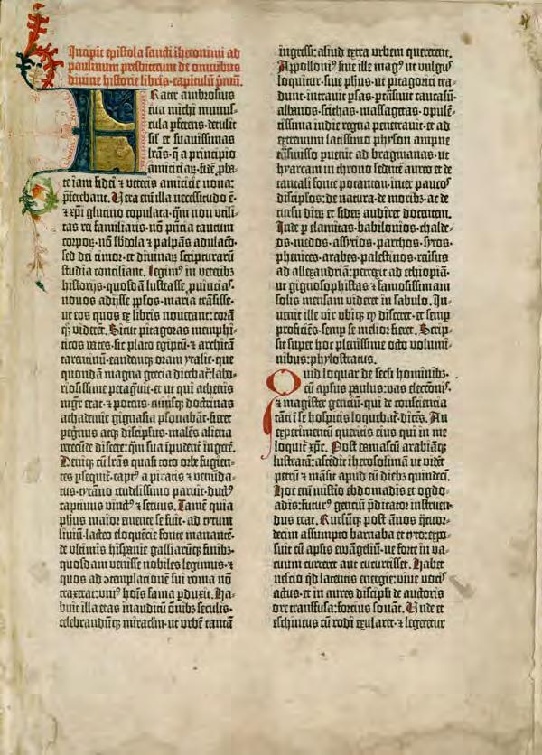
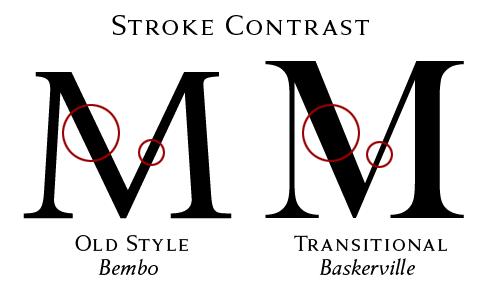
5 Romain du Roi (French for King s Roman) The first printing of the Romain du Roi at the beginning of the eighteenth century signified a shift to transitional roman type design with increased contrast between thick and thin strokes, sharp horizontal serifs, and a more even balance to each letterform.

6 Romain du Roi Compared to earlier roman fonts, the crisp geometric quality and increased contrast of this first transitional typeface are clearly evident.
7

8 Pierre Simon Fournier Presented transitional roman forms based on the Romain du Roi letters from 1702 Title page for his first specimen book, Models of Printing Characters, 1742.

9 Pierre Simon Fournier Vast numbers of floral, curvilinear, and geometric ornaments were needed to construct designs like this, which set the standard of excellence of the rococo period.
10 Pierre Simon Fournier le Jeune The standardization of type measurement The initiation of type families (one face containing various weights and widths, as well as complementary roman and italic versions) The creation of single-, double-, and triple-ruled lines up to 35.5 cm (about 14 inches)

11 In addition to showing the design accomplishments of a lifetime, Fournier s type manual is a masterwork of rococo design.

12 Figure 8-8

13 Englishman John Pine Illustration and text were handengraved upon a copper printing plate and printed in one pass through the press. Horace s Opera (Works), Volume II, 1737

14 Figure 8-13

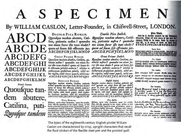
15 John Baskerville Baskerville reduced the design to letterforms symmetrically arranged and letterspaced; he reduced content to author, title, publisher, date, and city of publication. Economy, simplicity, and elegance resulted.


16 John Baskerville Portrait of John Baskerville, by John Millar, circa Starts a printing business at age 44 Hires John Handy as his punch cutter Precise, painstaking work New type found is designed and supervised by Baskerville Sets out to print a new edition of Virgil
17 John Baskerville, Printer Important innovations: Changes in press construction Flatter Studier bed Brass platen Print Ink Blacker More even Quicker drying Ink is aged three years before use
18 John Baskerville, Printer Important innovations: Paper Wove, not laid Smoother Whiter Gloss varnish Hot Pressing Wet sheets pressed between copper plates Smoothes the paper Sets the ink

19 John Baskerville The stately order of Baskerville s page design results from the harmony of elements and the spatial intervals that separate them. Title page from John Milton s Paradise Lost, 1760.

20 Figure 8-16

21 Figure 8-17
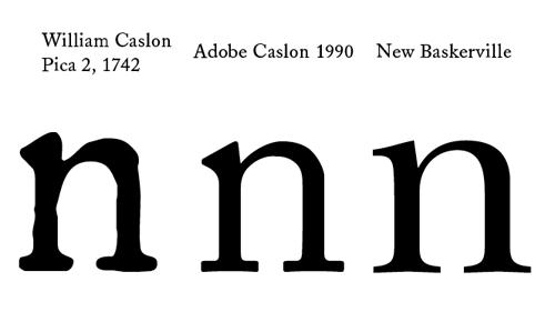
22 William Caslon William Caslon is regarded as the grand-father of the typographic revolution taking place in the 18th century.
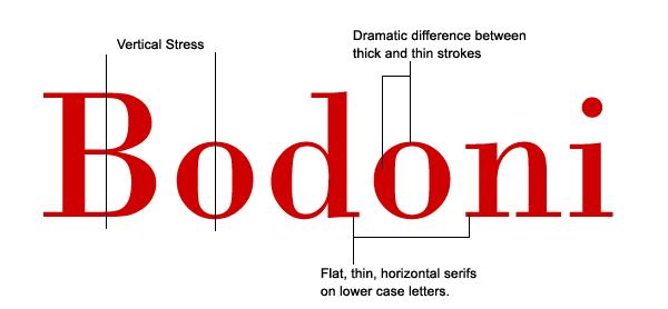
23 The Industrial Revolution Innovations in Typography William Caslon is regarded as the grand-father of the typographic revolution taking place in the 18 th century.

24 William Caslon William Caslon and William Caslon II, title page from A Specimen of Printing Types, His heirs, along with two of his former apprentices, Joseph Jackson and Thomas Cotterell, became successful type designers and founders in their own right. This book was published two years before the death of William Caslon. Leadership of the company would soon pass to his son, William Caslon II.
25
26 English Typography of the mid 1700 s Caslon Old face Calligraphic influence Baskerville Greater contrast between thick and think strokes Pointed serifs Letter wider than other type faces Transitional typeface
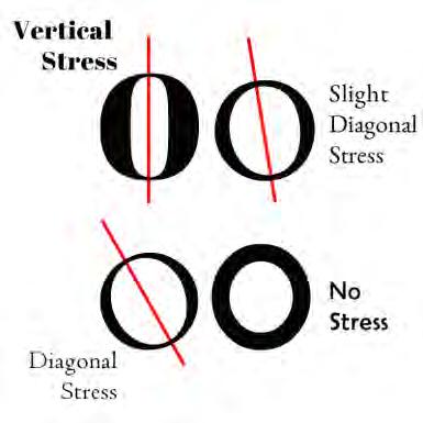
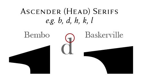
27
28

29 Benjamin Franklin Cato Major is one of the first classics of Latin literature to be translated and printed in the American colonies. Franklin was an avid admirer of Caslon s fonts and used them extensively.

30 Giambattista Bodoni Reflect the contemporary late eighteen-century neoclassical style. Giambattista Bodoni s modern type designs, based on geometry and standardization of measurable units, included extreme contrasts between thin and thick lines.

31 Giambattista Bodoni, page from Manuale tipografico, 1818.

32 Pierre Didot The typeface used in this book is an early presentation of a true modern-style letterform. Straight hairline serifs, extreme contrast between thick and thin strokes, and construction on a vertical axis are characteristics that mark this break with transitional letterforms. Title page for Vergil s Bucolica, Georgica, et Aeneis, 1798

33 Pierre Didot This double-page spread shows the splendid perfection, lavish margins, and cool understatement of neoclassical graphic design.
34 Old Style Developed by Renaissance designers who refined archaic letterforms. Characterized by: Roman proportion Contrasting stroke weight which references right-hand drawn letters Oblique axis in curved forms Relatively short x-height
35
36
37 Transitional Evolved out of the old style faces. Changes in structure include: Stroke contrast that is less derivative of the pen or brush Contrast becomes rhythmic and distinct Greater x-height Move toward upright axis Greater serif definition
38
39
40
41
42
43
44
45 Bracket
46
47 Modern Typeface Strong contrast between thick and thin strokes. Vertical axis. Mechanical appearance constructed rather than drawn. Fine, unbracketed, serifs.
48

49 Romanticism William Blake s illustrations for his poetry are in the style known as, which contrasted with the styles of layout and typography of Giambattista Bodoni and Pierre Didot. William Blake, title page from The Book of Thel, 1789.
TYPOGRAPHY. The art of type
 Typography TYPOGRAPHY The art of type TYPE All the letters (abc), Numbers (123) & characters (;? @) of the alphabet. MONOTYPE Trade name for hot metal composition system Monotype Corporation Machine Shop
Pre-Venetian or Ancient Humanist or Venetian Transitional Didone Slab Serifs
 Pre-Venetian or Ancient Humanist or Venetian Transitional Didone Slab Serifs 1400 1500 1700 1800 Humanist Sans Serif Transitional Sans Serif Geometric Sans Serif Display Typefaces 1900 2000 Pre-Venetian
Baskerville. abcdefghijk For fun I like to jump cars while reading a quote by Albert Einstein.
 serif Baskerville page 2 Baskerville page 3 Baskerville Baskerville Regular 26/28 while reading a quote by Baskerville italic 26/28 quote by Baskerville Semi bold 24/30 quote by Baskerville bold 24/26
GIAM- BAT- TISTA Bodoni BODONI. The Designer and the History of the Typeface He Created. By Peyton Klemm
 BODONI GIAM- BAT- TISTA Bodoni The Designer and the History of the Typeface He Created By Peyton Klemm Giambittista Bodoni was born in 1740 in Saluzzo in northern Italy. Both his father and grandfather
TYPE ANATOMY jtittle
 TYPE ANATOMY TYPE ANATOMY TITTLE j Serif Typefaces Tt HUMANIST (a.k.a. Old Style ) - Modeled after the roman typefaces of 15 th & 16 th centuries - Closely related to calligraphy and hand movement CLASSIC
Typography One typeface classification
 Typography One typeface classification Why classify? Classification helps us describe and navigate type choices Typeface classification helps to: 1. sort type (scholars, historians, type manufacturers),
jasonjuwono twentyfifteen TYPEDIA _ Typography Encyclopedia
 TYPEDIA _ Typography Encyclopedia ANATOMY_ Anatomy of a typeface Anatomy of a typeface What is a Font & Typeface? A design for a set of characters. A font is the combination of typeface and other qualities,
pokemon starters and the Classification of Type By: Sarah Cornell
 pokemon starters and the Classification of Type By: Sarah Cornell Table of Contents Old Style Type Kanto Starters... 4-7 Transitoinal Type Hoenn Starters... 8-11 Modern Type Alola Starters... 12-15 Slab
art 118: intro to communication design // FALL 2011
 t y p e specimen Due: Wednesday, November 30 ov e r v i e w A type specimen is a publication, that shows the range of a particular typeface in use. Printers and typographers have produced type specimens
THINGS YOU NEED TO KNOW
 TYPOGRAPHY THINGS YOU NEED TO KNOW to prevent your work from appearing amateurish. (p. 151) Only one space after punctuation (p. 152) What is monospaced type? (p. 152) Correct Quotation Marks (as soon
The Evolution of Type. Movable Type: Johannes Gutenberg Early 15th Century
 The Evolution of Type Movable Type: Johannes Gutenberg Early 15th Century Studio on Fire: Minneapolis Anatomy of Type cap height cross bar Anatomy n bowl describes g counter ascender finial stem type eye
Font classification review
 Font classification review Taken from Lettering & Type by Bruce Willen Nolen Strals Old Style Transitional Modern Slab Serif Garamond ag Baskerville ag Bodoni ag Cowboys ab Sans Serif Gill Sans ag Decorative
Alphabet. elemental visual signs 26 characters frozen sounds
 Alphabet elemental visual signs 26 characters frozen sounds Evolution Handwriting > minimum number of strokes Engraving > lowercase > minimum number of curved lines > capitals Letterforms Appearance of
VOICE OF TYPE LECTURE 1
 VOICE OF TYPE LECTURE 1 TYPOGRAPHY II COUNTY COLLEGE OF MORRIS PROFESSOR GAYLE REMBOLD FURBERT VOICE OF TYPE As you look at typefaces, analyze their forms, learn their history and learn how to use them
Typography One typeface classification
 Typography One typeface classification Why classify? Classification helps us describe and navigate type choices Typeface classification helps to: 1. sort type (scholars, historians, type manufacturers),
TYPOGRAPHY. ascender arm (as on the capital T) descender bar (as on the capital H) counter ear (as on the lower case g and r)
 descender bar (as on the capital H) counter ear (as on the lower case g and r)") TYPOGRAPHY Parts of letters: base line x-height ascender arm (as on the capital T) descender bar (as on the capital H) extenders bowl counter ear (as on the lower case g and r) serif stroke tail (as on
TYPOGRAPHY Parts of letters: base line x-height ascender arm (as on the capital T) descender bar (as on the capital H) extenders bowl counter ear (as on the lower case g and r) serif stroke tail (as on
Adjust the point size
 Adjust the point size create contrast small and dark Strive for contrast rather than harmony. Mixing typefaces on the same line, designers usually adjust the point size so the x-heights align. Placing
Font, Typeface, Typeface Family. Selected Typographical Variables
 Font, Typeface, Typeface Family Font: A font is a set of printable or displayable text character in a specific style, weight, and size. E.g. Helvetica Italic 10 Point. Typeface: The type design for a set
Linotype Univers CD for Mac and PC - containing 63 font weights
 presented in: Eurostile Roman Find further Font Features in our Font Feature Archive. The Univers family of fonts designed by Adrian Frutiger more than forty years ago is one of the most innovative type
MODULE CM 2004 / STAGE 2 / SEMESTER 2 / SESSION Module title Design Principles and Context
 MODULE CM 2004 / STAGE 2 / SEMESTER 2 / SESSION 06-07 Module title Design Principles and Context Typography Fonts are classified under the following headings. Old Face fonts make use of contrasting wide
LESSON 7 Introduction to Typography
 FOUNDATION IN GRAPHIC DESIGN with ADOBE APPLICATIONS LESSON 7 Introduction to Typography Summary Notes WHAT IS TYPOGRAPHY? Typography is, quite simply, the art and technique of arranging type. Typography
Graphic Design. shawacademy LESSON 5. summarynotes INTRODUCTION TO TYPOGRAPHY. For further questions visit us online at:
 shawacademy Graphic Design LESSON 5 INTRODUCTION TO TYPOGRAPHY summarynotes The Diploma in Graphic Design Toolkit For further questions visit us online at: www.shawacademy.com Lesson 5 S shawacademy Lesson
Synopsis This module introduces calligraphy, the basic principles of typography, and applications of typography.
 8. Typography Synopsis This module introduces calligraphy, the basic principles of typography, and applications of typography. Lectures 8.1 Calligraphy 8.2 Basic Principles of Typography 8.3 Typography
Typographic. Alphabet. Book. Interactive PDF of typographic rules & terms YOU NEED TO KNOW. Home. Table of Contents
 Typographic Alphabet Table of Contents > Rules That Every Typographer Should Know... 2-3 Book Interactive PDF of typographic rules & terms YOU NEED TO KNOW > Baseline... > Gutter... > Hierarchy... > Kerning...
Goudy Old Style & Garamond. A Type Comparison Book by Brittany Hansard
 Goudy Old Style & Garamond A Type Comparison Book by Brittany Hansard Frederic W. Goudy created this old style typeface in the late 1920s and it is known as one of his most adored typeface alphabets within
serif: the short strokes that finish off the major strokes of the letterform. bracket: a curving joint between the serif and the stroke
 PARTS OF THE LETTER Typography evolved from handwriting, which is created by making a series of marks by hand; therefore, the fundamental element constructing a letterform is the linear stroke (stem).
SUCCESSFUL TYPE? Interface Aesthetics
 TYPO GR AP HY SUCCESSFUL TYPE? SUCCESSFUL TYPE? TYPOGRAPHY 1 2 TYPOGRAPHY /t 'p gr fi/ n. The art or process of setting and arranging types and printing from them. The style and appearance of printed
In your lifetime you ve seen billions of letters and millions of words, yet you might never have consciously noticed the typefaces you read.
 In your lifetime you ve seen billions of letters and millions of words, yet you might never have consciously noticed the typefaces you read. Type is important because it is an unconscious persuader. It
Typography. is the foundation of good web design
 Typography is the foundation of good web design my name is Samantha Warren I am a web designer for Viget Labs I teach web & graphic design at the Center for Digital Imaging Arts at Boston University &
HURME GEOMETRIC SANS
 No.1 SHARP No.2 ALTERNATIVE HURME TYPEFACE SPECIMEN PRINT SAMPLES No.3 BLUNT No.4 SWASH Hurme Geometric Sans Typeface Specimen 03/20/2013 2 Page heading: Black. 30pt/30pt. Byline: Regular/Bold SmallCaps.
David Glen Smith. Fonts of Influence
 David Glen Smith Fonts of Influence Charlesworth {Charlemagne}. (THERE ARE NO LOWERCASE CHARACTERS) Poster Bodini Helvetica Neue Gill Sans My intentions are to merge a thick poster font with a thinner
Modifying Type: effects of a letter change COLDS
 Modifying Type Modifying Type The goal of good typography is like fabric. It should be evenly woven together where all facets and all parts of the letter forms work together. Sometimes if you have one
Typefaces are character sets based on distinct design characteristics.
 Level 3 WGHS VISUAL ARTS 2011 ART DESIGN Typography An Introduction to Type Type Design Since the first recordings of letterforms the concept of the typographic form has evolved into a seemingly endless
DMD DIAMOND, BRAND GUIDE ISSUE 01: DESIGN MANUAL CREATED FOR: DMD DIAMOND DESIGN AND BRAND GUIDELINE BOOK
 DMD DIAMOND, BRAND GUIDE ISSUE 01: DESIGN MANUAL CREATED FOR: DMD DIAMOND DESIGN AND BRAND GUIDELINE BOOK CREATION DATE: FEBRUARY 2018 ISSUE 01: BRAND GUIDELINE CREATED FOR: DMD Diamond www.bit.diamonds
Project 2 reminders: Hand in your typed book summary/response at end of class today. Make sure to include your name and section.
 Project 2 reminders: Hand in your typed book summary/response at end of class today. Make sure to include your name and section. Project 2 reminders: First book cover critique this Friday. Bring 3 book
The International Typographic Style
 The International Typographic Style Ernst Keller was one of the pioneers of Swiss design. His work used symbolic imagery, simplified geometric forms and vibrant contrasting color. Poster for the Rietberg
SELECTING THE RIGHT TYPE FOR THE JOB
 CHAPTER FOUR SELECTING THE RIGHT TYPE FOR THE JOB ype has the power to make or break a job. Every typeface has a distinct personality and conveys a different mood, message, or feeling. Display typefaces,
Jenson. Nicolas Jenson ( ) It is said that he was an apprentice to Gutenberg but there is no verifiable evidence to support this.
 It is said that he was an apprentice to Gutenberg but there is no verifiable evidence to support this.") Jenson Nicolas Jenson (1420 1480) French engraver, printing pioneer and type designer Credited with creating the first roman typefaces. In 1470 he opened a printing shop in Venice. It is said that he was
Jenson Nicolas Jenson (1420 1480) French engraver, printing pioneer and type designer Credited with creating the first roman typefaces. In 1470 he opened a printing shop in Venice. It is said that he was
Unit 4. Multimedia Element: Text. Introduction to Multimedia Semester 2
 Unit 4 Multimedia Element: Text 2017-18 Semester 2 Unit Outline In this unit, we will learn Fonts Typography Serif, Sans Serif, Decorative Monospaced vs. Proportional Style Size Spacing Color Alignment
TYPE. Design Process
 TYPE Design Process 01 Vocabulary 02 Classification 03 Six Classic Typefaces 04 Readability 05 Ten Type Commandments 06 Inspiration 07 Assignment 01 Vocabulary 02 Classification 03 Six Classic Typefaces
understanding typography
 understanding typography What is typography?! it is what language looks like! it is the art and technique of modifying type and arranging it on a page What does the arrangement of type mean? the arrangement
PRESENTATION BOARD LAYOUT
 NEW YORK CITY COLLEGE OF TECHNOLOGY THE CITY UNIVERSITY OF NEW YORK ARCHITECTURAL TECHNOLOGY DEPARTMENT written by annie boccella spring 2010 1. BEFORE YOU BEGIN... Organize yourself. What is your argument
PORTFOLIO. Design for Yourself. Commuication Design Julia Choi
 PORTFOLIO Design for Yourself Commuication Design Julia Choi TYPE Jenson Bodoni Gill sans SPECIMEN BOOK 1470 1798 1929 7.5 x 10 TYPE HISTORY SPECIMEN BOOK Type History Specimen Book is designed to have
Introduction A global icon needs an iconic logo. Fashion has evolved since 1969, when Gap opened its first store. Our logo has changed with the
 Introduction A global icon needs an iconic logo. Fashion has evolved since 1969, when Gap opened its first store. Our logo has changed with the times, too. One thing that hasn t changed is our mission
section four typography contents introduction...44 helvetica neue...45 bodoni...46 examples of type usage...47 body text examples...
 section four typography 43 contents introduction...44 helvetica neue...45 bodoni...46 examples of type usage...47 body text examples...48 introduction Consistent application of type fonts and styles allows
Typography One Project Two
 Typography One Project Two Typographic Systems, Emphasis and Hierarchy An important design problem is to aid reader comprehension of information through carefully considered logic, structure and order.
Lost & FOUNDRY ABCDEFGHIJKLMNOPQR STUVWXYZ #$ % _ '".,:;!? &(){}[]/\* ABCDEF GHIJKLMNOPQRSTUV
![Lost & FOUNDRY ABCDEFGHIJKLMNOPQR STUVWXYZ #$ % _ '.,:;!? &(){}[]/\* ABCDEF GHIJKLMNOPQRSTUV](/thumbs/85/92616360.jpg "Lost & FOUNDRY ABCDEFGHIJKLMNOPQR STUVWXYZ #$ % _ '.,:;!? &(){}[]/\* ABCDEF GHIJKLMNOPQRSTUV") Information Guide Volume 1.0 ABCDEFGHIJKLMNOPQR STUVWXYZ0123456789#$ % _ '".,:;!? &(){}[]/\* ABCDEF GHIJKLMNOPQRSTUV Lost & FOUNDRY WXYZ0123456789 ABCDEFGHIJKLMNOPQRSTUV WXYZ0123456789#$ % _ - '".,:;!?
Information Guide Volume 1.0 ABCDEFGHIJKLMNOPQR STUVWXYZ0123456789#$ % _ '".,:;!? &(){}[]/\* ABCDEF GHIJKLMNOPQRSTUV Lost & FOUNDRY WXYZ0123456789 ABCDEFGHIJKLMNOPQRSTUV WXYZ0123456789#$ % _ - '".,:;!?
ASerif. AfbcyE TYPE AND LETTERS
 TYPE AND LETTERS Before 1455 books were made by hand. Only the wealthy could afford a book. A book could cost as much as an acre of land. Say! you bought two books for this class that will be $800,000
Linotype Library GmbH Du-Pont-Straße Bad Homburg Germany T F
 Page 1/6 is in 22 weights available Linotype Finnegan: With this Typeface, Curling Up with a Good Book is Lots of Fun The creation of a new sanserif, monoline font as a text face this was the starting
BBN ANG 183 Typography Text colour: vertical and horizontal spacing
 BBN ANG 183 Typography Text colour: vertical and horizontal spacing Zoltán G. Kiss & Péter Szigetvári Dept of English Linguistics, Eötvös Loránd University gkz & szp (delg) typo/spacing 1 / 43 outline
Download Typographic Specimens: The Great Typefaces Kindle
 Download Typographic Specimens: The Great Typefaces Kindle Specimens of 38 of the finest type families in the world are brought together in Typographic Specimens: The Great Typefaces, making it an invaluable
O M. O M logo specs. O M O M O M O M
 overview. The useum of odern Art, or oa, is an art museum in anhattan that holds and displays a wide range of modern and contemporary art. oa is considrered to be one of the most influential museums in
A Crash Course in Typography: Principles for Combining Typefaces - noupe
 A Crash Course in Typography: Principles for Combining Typefaces Cameron Chapman When combining typefaces, there are a couple of important principles you ll need to keep in mind, namely contrast and mood.
B R A N D GUIDELINES
 BRAND GUIDELINES You never get a second chance to make a first impression. 01 02 03 INTRODUCTION About the City of New Bedford s brand 5 THE LOGO The Logo and usage 7 Color & variations 7 Clearspace &
Designing Research Posters. College of Art and Design Chris Jackson, Associate Dean Keli DiRisio, Assistant Professor
 Designing Research Posters College of Art and Design Chris Jackson, Associate Dean Keli DiRisio, Assistant Professor Size and Orientation If you are NOT using the poster template: Start is with a 48"
communication design and the web John Zimmerman HCI Institute and the School of Design, Carnegie Mellon University 17 November 2010
 communication design and the web John Zimmerman HCI Institute and the School of Design, Carnegie Mellon University 17 November 2010 goals for today explore communication design familiar with basic principles
Chapter 18: The International Typographic Style
 Chapter 18: The International Typographic Style International Typographic Style A graphic design style emphasizing cleanliness, readability and objectivity developed in Switzerland in the 1950s. Specifics
BASIC ABOUT TYPE TYPO GRAPHY
 BASIC ABOUT TYPE TYPO GRAPHY TYPOGRAPHY BASIC DESIGN Relative & Absolute measurements Absolute measurements Inche : Millimetres : Points : Pica 3 Inches 76.2 mm 216 Points 18 Picas 1 Inches = 3 Picas A
Adobe Photoshop CS Design Professional PLACING TYPE IN AN IMAGE
 Adobe Photoshop CS Design Professional PLACING TYPE IN AN IMAGE Chapter Lessons Learn about type and how it is created Change spacing and adjust baseline shift Use the Drop Shadow style Apply anti-aliasing
Ariyaka The early typeface leads modern industrialization of letterpress printing in Thailand.
 Typography in Publication Design Ariyaka The early typeface leads modern industrialization of letterpress printing in Thailand. Chitchai Kuandachakupt, Kyoto Institute of Technology, chitchai.k@gmail.com
Excel Level Three. You can also go the Format, Column, Width menu to enter the new width of the column.
 Introduction Excel Level Three This workshop shows you how to change column and rows, insert and delete columns and rows, how and what to print, and setting up to print your documents. Contents Introduction
User-Centered Website Development: A Human- Computer Interaction Approach
 User-Centered Website Development: A Human- Computer Interaction Approach Daniel D. McCracken City College of New York Rosalee J. Wolfe DePaul University With a foreword by: Jared M. Spool, Founding Principal,
The evolution of symbols have influenced the letterforms we use today. They played a prominent role in communication from recording information,
 The evolution of symbols have influenced the letterforms we use today. They played a prominent role in communication from recording information, representing ideas, and expressing ourselves. Pictograms
DESIGN AND BRAND GUIDELINES
 DESIGN AND BRAND GUIDELINES Address Phone & Fax Online LinkResearchTools GmbH LeonardBernsteinStraße 10/ Floor 7 Saturn Tower 1220, Vienna, Austria, Europe Phone AT: +43 720 116 440 Phone US: +1 866 3473660
Corporate Identity Guidelines
 Corporate Identity Guidelines CONTENTS 1.0 TRADEMARK Watco Companies Logo Logo Clear Space Logo Variations Project Logos Proper Logo Use 03 04 05 06 07 08 2.0 TYPOGRAPHY Type Family 3.0 COLOR Brand Color
TYPOGRAPHY 1. letter-form mechanics. letter-form MECHANICS
 letter-form MECHANICS The Anatomy of Letter-forms The letters of all alphabets, whether classical or modern, display the same basic structural characteristics and adhere to similar conventions in drawing
How Typography Determines Readability: Serif vs. Sans Serif, and How To Combine Fonts.
 18/03/2018 How Typography Determines Readability: Serif vs. Sans Serif, and How To Combine Fonts. Harshita Arora Follow 16 y/o entrepreneur & programmer. Formerly at Salesforce and MIT Launch. Creator
typography Typography is what language looks like.
 typography Typography is what language looks like. typography Typography is what language looks like. One thing absolutely necessary for working with type is knowing its history: what came after what and,
TYPO GRA PHY THE ANATOMY OF TYPE A BRIEF HISTORY OF TYPOGRAPHY WHAT IS YOUR TYPE ACTUALLY SAYING? OPEN FONT DISCUSSION
 THE ANATOMY OF TYPE A BRIEF HISTORY OF TYPO WHAT IS YOUR TYPE ACTUALLY SAYING? OPEN FONT DISCUSSION THE ANATOMY OF TYPE Typeface Anatomy The upward vertical stem on some lowercase letters, such as h and
BRAND GUIDE Indianapolis Classical Schools
 Indianapolis Classical Schools This guide is designed to assist with the general appearance and application of the Indianapolis Classical Schools (ICS) brand logomark and its related branding elements.
LOGO & BRAND STANDARDS GUIDE
 LOGO & BRAND STANDARDS GUIDE INTRODUCTION The SparkPost Brand Standards Guide provides key information needed to accurately and consistently produce external and internal documents and communications.
Krita Vector Tools
 Krita 2.9 05 Vector Tools In this chapter we will look at each of the vector tools. Vector tools in Krita, at least for now, are complementary tools for digital painting. They can be useful to draw clean
EnvSci360 Computer and Analytical Cartography
 EnvSci360 Computer and Analytical Cartography Lecture 5 Working with Type and Labels Key Points Labels are text that locate and identify features on a map Important for readability & communication EnvSci
A BRIEF USER MANUAL FOR. Sutro Deluxe. A Chromatic Slab Serif. Five layers to play with.
 A BRIEF USER MANUAL FOR Sutro A Chromatic Slab Serif. Five layers to play with. parkinson type design 2014 background there was a lot of talk about color s at TypeCon2013 in Portland. Designers have been
> Introduction to the Art of Typography: The Invisible Force of Design > Using Typography as a Creative Tool: Introducing Text as Art
 MMA 100 Foundations of Digital Graphic Design Clare Ultimo > Introduction to the Art of Typography: The Invisible Force of Design > Using Typography as a Creative Tool: Introducing Text as Art Typography
Font Basics. Descender. Serif. With strokes on the extremities of the letters. T Script. Sans-Serif. No strokes on the end of the letters
 Font Basics Ascender Font Size d p x A X-height Cap height Counter The white space within letters Descender Bar A Serif With strokes on the extremities of the letters. T A Sans-Serif No strokes on the
Poster. Contents. Daniel Barndt ~ 10/25/2014 Page 1
 Contents Project 3:... 2 Research... 2 Criteria... 2 Text:... 2 Critique... 3 Final... 3 Century: 100 Years of Type Design... 4 Research:... 4 Thumbnails:... 4 Type Studies:... 5 Color Studies:... 6 Roughs:...
the streamlining of typography rene koszerowski
 the streamlining of typography 1920 1929 rene koszerowski poster for sixtieth-birthday exhibition of kandinsky herbert bayer 1926 the streamlining of typography 1920 1929 contents pages 1900 1909 1
Visual Design. Gestalt Principles Creating Organization and Structure Typography. UI Visual Design Objectives
 Gestalt Principles Creating Organization and Structure Typography 1 UI Objectives 1. Information communication - Enforce desired relationships (and avoid undesired relationships) 2. Aesthetics - well designed,
Design Principles. RCPT 436 Research & Technology Applications. Source: The Non-Designer s Design Book (2 nd Ed) by Robin Williams
 by Robin Williams") Design Principles RCPT 436 Research & Technology Applications Source: The Non-Designer s Design Book (2 nd Ed) by Robin Williams Good Design Is As Easy as 1-2-3 1. Learn the principles. They re simpler
Design Principles RCPT 436 Research & Technology Applications Source: The Non-Designer s Design Book (2 nd Ed) by Robin Williams Good Design Is As Easy as 1-2-3 1. Learn the principles. They re simpler
Beginner s Guide to Baskerville
 Beginner s Guide to Baskerville Having been an early admirer of the beauty of letters, I became insensibly desirous of contributing to the perfection of them. I formed to myself ideas of greater accuracy
GRAPHIC IDENTITY DESIGN GUIDELINES
 GRAPHIC IDENTITY DESIGN GUIDELINES Basic guidelines and the reproduction materials necessary for the consistent and successful implementation of the new graphic identity for the Denver Performing Arts
WCSD Graphic Standards and Logo Use Guide
 SM WCSD Graphic Standards and Logo Use Guide WCSD Logo WCSD logo with slogan SM The WCSD logo should be used on all school district signage and every District-generated publication, website or webpage,
SAMPLE PAGES. Syllabus coverage chart. viii Syllabus coverage chart
 viii Syllabus coverage chart Syllabus coverage chart The chart below shows how each Unit and Topic relates to the ICT syllabus and the Computer Studies syllabus. Computer Unit 11.1 Computer Fundamentals
font pairing FONT PAIRINGS GCEF
 font pairing As the saying goes, type is a beautiful group of letters, not a group of beautiful letters. ~Matthew Carter image as a designer ASSETS and type Two Functions of Type In order for your type
INTRODUCTION TO TYPOGRAPHY DESIGN
 INTRODUCTION TO TYPOGRAPHY DESIGN Goals of typographic design Typography plays an important role in how audiences perceive your document and its information. Good design is about capturing your audience
Visual Design. Gestalt Principles Creating Organization and Structure Typography. Visual Design 1
 Visual Design Gestalt Principles Creating Organization and Structure Typography Visual Design 1 UI Visual Design Objectives 1. Information communication - Enforce desired relationships (and avoid undesired
The making of Beautiful A method for designing type for Jordanian students
 Beauty, Form and Function in Typography http://www.typoday.in The making of Beautiful A method for designing type for Jordanian students Rejan, Ashour, School of Architecture and Built Environment, German
Our Brand THIS BOOK SERVES AS A GUIDE TO THE BASIC ELEMENTS THAT MAKE UP LERO. IT WILL HELP YOU TO GET TO KNOW US BETTER.
 Brand Assets & Guidelines 2015 Our Brand THIS BOOK SERVES AS A GUIDE TO THE BASIC ELEMENTS THAT MAKE UP LERO. IT WILL HELP YOU TO GET TO KNOW US BETTER. These guidelines have been designed to show our
This file includes FILLABLE FORM FIELDS. Enter your answers and then save the form as a PDF with your name to submit. Ex: 4CChrisJohnson.pdf.
 BASIC SKILLS: TYPOGRAPHY This file includes FILLABLE FORM FIELDS. Enter your answers and then save the form as a PDF with your name to submit. Ex: 4CChrisJohnson.pdf Kristy Ryan Name: Overview Complete
8/19/2018. Web Development & Design Foundations with HTML5. Learning Objectives (1 of 2) Learning Objectives (2 of 2)
 Learning Objectives (2 of 2)") Web Development & Design Foundations with HTML5 Ninth Edition Chapter 3 Configuring Color and Text with CSS Slides in this presentation contain hyperlinks. JAWS users should be able to get a list of links
Web Development & Design Foundations with HTML5 Ninth Edition Chapter 3 Configuring Color and Text with CSS Slides in this presentation contain hyperlinks. JAWS users should be able to get a list of links
Identification Style Guide
 Identification Style Guide This manual outlines the proper uses for the new logo and wordmark and should serve as a guide as you help us present the school. While it is impossible to identify every situation
C L A S S 2 T Y P O G R A P H Y. FOUNDATIONS OF GRAPHIC DESIGN MW 8 a.m.
 C L A S S 2 T Y P O G R A P H Y FOUNDATIONS OF GRAPHIC DESIGN MW 8 a.m. Typography Typography separates graphic design from visual art. In every piece of type you see, somebody has considered how the letters,
AW Conqueror. PRO STD FREE Sans Light Didot Light Inline Regular Slab Regular Carved Regular Carved One Carved Two Carved Three Carved Four
 PRO STD FREE Sans Light Didot Light Inline Regular Slab Regular Carved Regular Carved One Carved Two Carved Three Carved Four available on this format not available on this format aa Sans Light Didot Light
RIPE NCC Brand Guidelines Communications Department
 1 2015 Brand Guidelines 2 We serve our members by delivering a high quality registry and supporting the core Internet infrastructure. Connecting people within and beyond the technical community through
Primary Logo. Corporate logo - primary. The centered logo is only to be used when the length of the common logo is problematic for an application.
 Primary Logo Corporate logo - primary The elements of the logo may be arranged in two predetermined configurations: the primary logo (which also has a small version and the centered logo. The centered
WEB TYPOGRAPHY FOR WEB DEVELOPERS. Matej Latin Lead UX/UI Designer at Autotrader.co.uk
 WEB TYPOGRAPHY FOR WEB DEVELOPERS Matej Latin Lead UX/UI Designer at Autotrader.co.uk 1 A MEANINGFUL WEB TYPOGRAPHY STARTER KIT 2 Most people think typography is about fonts. Most designers think typography
Writing and Document Design Lecture 6 Typography
 Writing and Document Design Lecture 6 Typography Last week We looked at Kress and van Leeuwen s work on composition/layout and considered its usefulness as both an analytic tool (a way of analysing and
Objectives In Lesson 60, you will: C Create and name OneNote folders, sections, and page headers. C Enter notes into OneNote containers.
 Lesson 60 Using OneNote Objectives In Lesson 60, you will: C Create and name OneNote folders, sections, and page headers. C Enter notes into OneNote containers. OneNote Basics OneNote is a program that
Good Typefaces. 680pt Adobe Garamond. Humanist/ Old Style Serif Adobe Garamond Garamond Goudy Hoefler
 30 Good Typefaces 680pt Adobe Garamond Franklin Gothic Demi Humanist/ Old Style Serif Adobe Garamond Garamond Goudy Hoefler Transitional Serif Baskerville Caslon Minion Mrs.Eaves Perpetua Times New Roman