In your lifetime you ve seen billions of letters and millions of words, yet you might never have consciously noticed the typefaces you read.
|
|
|
- Leo Nelson
- 6 years ago
- Views:
Transcription
1 In your lifetime you ve seen billions of letters and millions of words, yet you might never have consciously noticed the typefaces you read. Type is important because it is an unconscious persuader. It attracts attention, sets the style and tone of a document, colors how readers interpret the words, and defines the feeling of a page usually without the reader realizing. In short, the best typography goes often unnoticed. The art of typography illuminates the meaning of the copy. The basic rules of page layout help the designer to express the content visually.
2 Type is your personality on paper. Change your typeface and you go from casual to formal, silly to serious, staid to stylish, old-fashioned to modern. Type is image. You d dress your best if you were going to an important meeting, and your documents need to be well-dressed, too. Type can reinforce your image as a company or an individual. If you use it consistently enough, people will start to associate you with certain typefaces. They might find themselves thinking of you when they see that typeface, without knowing why.
3 Type is power. Type has an effect on you even if you don t consciously notice it. You can use this power to your advantage to attract attention, strengthen message, and improve your image, or you can overlook it and work against yourself saying one message with your text while conveying another with your font. Type is communication. Communication means relaying information about our logic and emotions to others. The better you learn to communicate, the better others will know your message. Type is important. The right typeface can encourage people to read your message. The wrong typeface or wrong typography (type usage) can make your message go unread.
4 Two most important things to remember: Type is on the page to serve the text. It should make the words easy to read and provide a suitable background. Type should not overpower the text. Type can be beautiful and decorative but if it calls undue attention to itself or makes it more difficult to read the text then it becomes self-conscious and distracting like bad movie direction. There are not good or bad typefaces, there are appropriate and inappropriate typefaces. Think about your reader and the feeling you want to convey, then choose a typeface that fits.
5 What s Appropriate? Type is emotional on subliminal level because of the connotations it conveys. For example, Helvetica is used on tax forms. Now, how do you think you re going to feel when you read something in Helvetica? You may not consciously realize it is the same typeface, you may not even know it is Helvetica. What matters is that you ve seen the typeface before and not under the most pleasant circumstances.
6 If your business is one that needs to be taken seriously, such as banking, don t choose a whimsical such as University Roman or you ll loose credibility. If you have a fun business, don t use serious typeface such as Helvetica or you ll come across as boring. With that in mind, find the most appropriate typeface, not the prettiest, not the most spaceefficient but the most appropriate. University Roman Helvetica
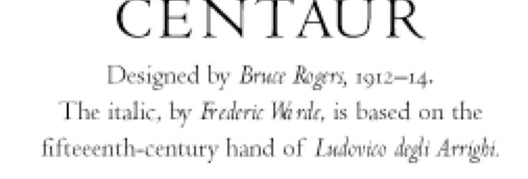
7 If the absolutely most important thing about your document is that it has to be easy to read by anyone of any age with any kind of eyesight under any kind of lighting conditions, than the typeface you choose must fit those criteria and you will probably end up with something that has large x-height such as Cheltenham, Melior, or Serifa. If the most important thing is that it looks traditional, then you ll choose a typeface such as Centaur, Bembo, Bodoni, Gilliard, Palatino, or Weiss. If you want something casual and friendly, you ll choose something like Souvenir or Cooper. Serifa Palatino Souvenir
8 How do you tell which font is formal or informal? Look at it and decide for yourself or hand out samples to your friends and ask them what it reminds them off. Think about the reader and what you want to convey. See how different typefaces convey different feelings. At least 80% of typography is common sense.
9 Which faces work best together? The answer is usually simple: serif faces work best with sans serif faces. This means that if your body text is in Goudy Old Style, a serif face, you should use a sans serif as a companion. Don t use Garamond with Goudy (they re both serif faces). It will look sloppy if you do. Goudy Garamond Goudy Frutiger
10 Avoid the overused. Most people turn first to the default fonts in their computer when they are choosing type. While this is convenient it is not necessarily effective because these typefaces are overused and have lost some of their impact. Helvetica, Arial and Times Roman are the most overused ones. When you use them, you are looking like everyone else. There are thousands of typefaces to choose from so choose wisely.
11 Type Terms and Fundamentals Fonts are the electronic files that contain typefaces. A single typeface is made up of the upper and lowercase letters of the alphabet, the numbers, punctuation marks, and special characters, all in particular style, such as Garamond. Type size is always measured in points. There are approximately 72 points per inch. Body text is generally set from 10 to 12 points.
12 Serif or Sans Serif Typefaces. A serif is the small crossbar (or finishing stroke) that ends the main stroke of letters. Sans (French for without ) serif typefaces don t have serifs. Classic serif: Goudy, Garamond, Caslon, Palatino, Bodoni, Times, Baskerville, Cheltenham Classic sans serif: Helvetica, Folio, Impact, Futura, Frutiger, Gill Sans, Univers, Optima Serif
13 Weights. Typefaces generally come in several weights such as regular, italic, bold and bold italic. Different weights of the same typeface are called a family. Faces designed for headings and headlines may have only one weight but body text face usually have four, with professional fonts offering as many as 16 or so, from very light to very black.
14
15 Kerning involves moving letters closer together or farther apart so that they appear evenly spaced which in turn makes them easier to read. Most fonts include kerning pairs (To, Tr, We and so on) that adjust their spacing automatically when typed consecutively. These are all you need for body text but sometimes you need to kern large type manually.
16
17 Tracking involves the spacing within a whole word, sentence or paragraph. Too loose > letters do not relate Too tight > letters collide
18

19 Classification of typefaces Humanist Transitional Modern Egyptian Humanist Sans Transitional Sans Geometric Sans

20 Few good fonts

21
22
23
24
25
26
27
28 HIERARCHY A typographic hierarchy expresses an organizational system for content, emphasizing some data and diminishing others. A hierarchy helps readers scan a text, knowing where to enter and exit and how to pick and choose among its offerings. Each level of the hierarchy should be signaled by one or more cues, applied consistently across a body of text. A cue can be spatial (indent, line spacing, placement on page) or graphic (size, style, color of typeface). Infinite variations are possible.
29
30 II Text
In your lifetime you ve seen billions of letters and millions of words, yet you might never have consciously noticed the typefaces you read.
 In your lifetime you ve seen billions of letters and millions of words, yet you might never have consciously noticed the typefaces you read. Type is important because it is an unconscious persuader. It
Font, Typeface, Typeface Family. Selected Typographical Variables
 Font, Typeface, Typeface Family Font: A font is a set of printable or displayable text character in a specific style, weight, and size. E.g. Helvetica Italic 10 Point. Typeface: The type design for a set
MODULE CM 2004 / STAGE 2 / SEMESTER 2 / SESSION Module title Design Principles and Context
 MODULE CM 2004 / STAGE 2 / SEMESTER 2 / SESSION 06-07 Module title Design Principles and Context Typography Fonts are classified under the following headings. Old Face fonts make use of contrasting wide
Font classification review
 Font classification review Taken from Lettering & Type by Bruce Willen Nolen Strals Old Style Transitional Modern Slab Serif Garamond ag Baskerville ag Bodoni ag Cowboys ab Sans Serif Gill Sans ag Decorative
TYPE ANATOMY jtittle
 TYPE ANATOMY TYPE ANATOMY TITTLE j Serif Typefaces Tt HUMANIST (a.k.a. Old Style ) - Modeled after the roman typefaces of 15 th & 16 th centuries - Closely related to calligraphy and hand movement CLASSIC
TYPOGRAPHY. ascender arm (as on the capital T) descender bar (as on the capital H) counter ear (as on the lower case g and r)
 descender bar (as on the capital H) counter ear (as on the lower case g and r)") TYPOGRAPHY Parts of letters: base line x-height ascender arm (as on the capital T) descender bar (as on the capital H) extenders bowl counter ear (as on the lower case g and r) serif stroke tail (as on
TYPOGRAPHY Parts of letters: base line x-height ascender arm (as on the capital T) descender bar (as on the capital H) extenders bowl counter ear (as on the lower case g and r) serif stroke tail (as on
Typography One typeface classification
 Typography One typeface classification Why classify? Classification helps us describe and navigate type choices Typeface classification helps to: 1. sort type (scholars, historians, type manufacturers),
Graphic Design. shawacademy LESSON 5. summarynotes INTRODUCTION TO TYPOGRAPHY. For further questions visit us online at:
 shawacademy Graphic Design LESSON 5 INTRODUCTION TO TYPOGRAPHY summarynotes The Diploma in Graphic Design Toolkit For further questions visit us online at: www.shawacademy.com Lesson 5 S shawacademy Lesson
LESSON 7 Introduction to Typography
 FOUNDATION IN GRAPHIC DESIGN with ADOBE APPLICATIONS LESSON 7 Introduction to Typography Summary Notes WHAT IS TYPOGRAPHY? Typography is, quite simply, the art and technique of arranging type. Typography
Putting type on a page without incorporating typographic principles is merely word processing. Terry Rydberg, Author Exploring InDesign 3
 Putting type on a page without incorporating typographic principles is merely word processing. Terry Rydberg, Author Exploring InDesign 3 Typography The study of all elements of type as a means of visual
Typesetting Tips. Put your best type forward.
 Typesetting Tips Put your best type forward. Do you want your audience to read your document? Improve your chances by making your article easy to read. Make the document difficult to read and To learn
Download Typographic Specimens: The Great Typefaces Kindle
 Download Typographic Specimens: The Great Typefaces Kindle Specimens of 38 of the finest type families in the world are brought together in Typographic Specimens: The Great Typefaces, making it an invaluable
Unit 4. Multimedia Element: Text. Introduction to Multimedia Semester 2
 Unit 4 Multimedia Element: Text 2017-18 Semester 2 Unit Outline In this unit, we will learn Fonts Typography Serif, Sans Serif, Decorative Monospaced vs. Proportional Style Size Spacing Color Alignment
BETTER LOOKING S
 BETTER LOOKING EMAILS First impressions matter. So if you want a positive response to your email campaign you need to make a positive first impression. Here are some simple design strategies to help you
A Crash Course in Typography: Principles for Combining Typefaces - noupe
 A Crash Course in Typography: Principles for Combining Typefaces Cameron Chapman When combining typefaces, there are a couple of important principles you ll need to keep in mind, namely contrast and mood.
Unit 3 : Attracting the Reader
 Attracting the Reader Unit 3 : Attracting the Reader A great deal of your success as a desktop publisher depends on your ability to create attractive, easy-to-read headlines and logos. Headlines are the
User-Centered Website Development: A Human- Computer Interaction Approach
 User-Centered Website Development: A Human- Computer Interaction Approach Daniel D. McCracken City College of New York Rosalee J. Wolfe DePaul University With a foreword by: Jared M. Spool, Founding Principal,
How Typography Determines Readability: Serif vs. Sans Serif, and How To Combine Fonts.
 18/03/2018 How Typography Determines Readability: Serif vs. Sans Serif, and How To Combine Fonts. Harshita Arora Follow 16 y/o entrepreneur & programmer. Formerly at Salesforce and MIT Launch. Creator
The Evolution of Type. Movable Type: Johannes Gutenberg Early 15th Century
 The Evolution of Type Movable Type: Johannes Gutenberg Early 15th Century Studio on Fire: Minneapolis Anatomy of Type cap height cross bar Anatomy n bowl describes g counter ascender finial stem type eye
The 12 most common newsletter design mistakes
 The 12 most common newsletter design mistakes www.targetmarketingnetwork.com By: Roger C. Parker Your newsletter s success depends on its design. An attractive, easy to read newsletter encourages readers
Typography. is the foundation of good web design
 Typography is the foundation of good web design my name is Samantha Warren I am a web designer for Viget Labs I teach web & graphic design at the Center for Digital Imaging Arts at Boston University &
C L A S S 2 T Y P O G R A P H Y. FOUNDATIONS OF GRAPHIC DESIGN MW 8 a.m.
 C L A S S 2 T Y P O G R A P H Y FOUNDATIONS OF GRAPHIC DESIGN MW 8 a.m. Typography Typography separates graphic design from visual art. In every piece of type you see, somebody has considered how the letters,
Font Basics. Descender. Serif. With strokes on the extremities of the letters. T Script. Sans-Serif. No strokes on the end of the letters
 Font Basics Ascender Font Size d p x A X-height Cap height Counter The white space within letters Descender Bar A Serif With strokes on the extremities of the letters. T A Sans-Serif No strokes on the
PRESENTATION BOARD LAYOUT
 NEW YORK CITY COLLEGE OF TECHNOLOGY THE CITY UNIVERSITY OF NEW YORK ARCHITECTURAL TECHNOLOGY DEPARTMENT written by annie boccella spring 2010 1. BEFORE YOU BEGIN... Organize yourself. What is your argument
TEXT MEDIA AND INFORMATION
 TEXT MEDIA AND INFORMATION Objectives Identify the basic elements in creating a text-based presentation. Evaluate the text-based presentation through the design principles and elements. But we know, irl,
VOICE OF TYPE LECTURE 1
 VOICE OF TYPE LECTURE 1 TYPOGRAPHY II COUNTY COLLEGE OF MORRIS PROFESSOR GAYLE REMBOLD FURBERT VOICE OF TYPE As you look at typefaces, analyze their forms, learn their history and learn how to use them
section four typography contents introduction...44 helvetica neue...45 bodoni...46 examples of type usage...47 body text examples...
 section four typography 43 contents introduction...44 helvetica neue...45 bodoni...46 examples of type usage...47 body text examples...48 introduction Consistent application of type fonts and styles allows
Typefaces are character sets based on distinct design characteristics.
 Level 3 WGHS VISUAL ARTS 2011 ART DESIGN Typography An Introduction to Type Type Design Since the first recordings of letterforms the concept of the typographic form has evolved into a seemingly endless
TYPE BASICS Cartographic Design & Principles Winter 2016
 TYPE BASICS Cartographic Design & Principles Winter 2016 Words on a Map Everything on the Earth has a name Names on a map, make it a map Otherwise it is a picture, photograph or design Assigning names
Friendly Fonts for your Design
 Friendly Fonts for your Design Choosing the right typeface for your website copy is important, since it will affect the way your readers perceive your page (serious and formal, or friendly and casual).
WEB TYPOGRAPHY FOR WEB DEVELOPERS. Matej Latin Lead UX/UI Designer at Autotrader.co.uk
 WEB TYPOGRAPHY FOR WEB DEVELOPERS Matej Latin Lead UX/UI Designer at Autotrader.co.uk 1 A MEANINGFUL WEB TYPOGRAPHY STARTER KIT 2 Most people think typography is about fonts. Most designers think typography
The Visual Scientist Presents Poster Design
 The Visual Scientist Presents Poster Design layout fonts science! Hailpern & Danilevsky www.thevisualscientist.com Topics Covered This is a how-to-guide for effectively presenting scientific work in the
This file includes FILLABLE FORM FIELDS. Enter your answers and then save the form as a PDF with your name to submit. Ex: 4CChrisJohnson.pdf.
 BASIC SKILLS: TYPOGRAPHY This file includes FILLABLE FORM FIELDS. Enter your answers and then save the form as a PDF with your name to submit. Ex: 4CChrisJohnson.pdf Kristy Ryan Name: Overview Complete
INTRODUCTION TO TYPOGRAPHY DESIGN
 INTRODUCTION TO TYPOGRAPHY DESIGN Goals of typographic design Typography plays an important role in how audiences perceive your document and its information. Good design is about capturing your audience
Writing and Document Design Lecture 6 Typography
 Writing and Document Design Lecture 6 Typography Last week We looked at Kress and van Leeuwen s work on composition/layout and considered its usefulness as both an analytic tool (a way of analysing and
font pairing FONT PAIRINGS GCEF
 font pairing As the saying goes, type is a beautiful group of letters, not a group of beautiful letters. ~Matthew Carter image as a designer ASSETS and type Two Functions of Type In order for your type
Baskerville. abcdefghijk For fun I like to jump cars while reading a quote by Albert Einstein.
 serif Baskerville page 2 Baskerville page 3 Baskerville Baskerville Regular 26/28 while reading a quote by Baskerville italic 26/28 quote by Baskerville Semi bold 24/30 quote by Baskerville bold 24/26
Project 2 reminders: Hand in your typed book summary/response at end of class today. Make sure to include your name and section.
 Project 2 reminders: Hand in your typed book summary/response at end of class today. Make sure to include your name and section. Project 2 reminders: First book cover critique this Friday. Bring 3 book
jasonjuwono twentyfifteen TYPEDIA _ Typography Encyclopedia
 TYPEDIA _ Typography Encyclopedia ANATOMY_ Anatomy of a typeface Anatomy of a typeface What is a Font & Typeface? A design for a set of characters. A font is the combination of typeface and other qualities,
Typography One typeface classification
 Typography One typeface classification Why classify? Classification helps us describe and navigate type choices Typeface classification helps to: 1. sort type (scholars, historians, type manufacturers),
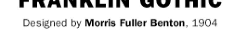
Franklin Gothic. Seniors: Use larger text that is clear and legible. (Souvenir, Times, Garamond, Helvetica)
") one TYPOGRAPHY LECTURE: Do s and Don t s in Typography Do Build a basic library first. Find out who your audience is. Use appropriate type sizes. Celebrate white space. Use correct alignment. Use correct
one TYPOGRAPHY LECTURE: Do s and Don t s in Typography Do Build a basic library first. Find out who your audience is. Use appropriate type sizes. Celebrate white space. Use correct alignment. Use correct
THINGS YOU NEED TO KNOW
 TYPOGRAPHY THINGS YOU NEED TO KNOW to prevent your work from appearing amateurish. (p. 151) Only one space after punctuation (p. 152) What is monospaced type? (p. 152) Correct Quotation Marks (as soon
Designing Research Posters. College of Art and Design Chris Jackson, Associate Dean Keli DiRisio, Assistant Professor
 Designing Research Posters College of Art and Design Chris Jackson, Associate Dean Keli DiRisio, Assistant Professor Size and Orientation If you are NOT using the poster template: Start is with a 48"
OCA Graphic Design: Core Concepts 1 Assignment 5 - Penguin Books Jane Braybrook Jane511794
 OCA Graphic Design: Core Concepts 1 Assignment 5 - Penguin Books Jane Braybrook Jane511794 Supporting Blog Post: https://jane511794.wordpress.com/category/assignments/assignment-5/ Critical Evaluation
Accessible Documents & Presentations. By Amy Maes, DNOM
 Accessible Documents & Presentations By Amy Maes, DNOM 1 Overview Accessibility: What am I required to do? Disability Characteristics Creating an Accessible Word Document & PowerPoint Presentation v2010
> what is a font? Times New Roman [10 pts] Times New Roman [12 pts] Times New Roman [14 pts] Times New Roman [18 pts] Times New Roman [24 pts]
![> what is a font? Times New Roman [10 pts] Times New Roman [12 pts] Times New Roman [14 pts] Times New Roman [18 pts] Times New Roman [24 pts]](/thumbs/88/117283063.jpg "> what is a font? Times New Roman [10 pts] Times New Roman [12 pts] Times New Roman [14 pts] Times New Roman [18 pts] Times New Roman [24 pts]") > what is a font? > what is a font? A font is set of glyphs (or images) that represent a complete series of alphabetic and numeric characters, punctuations and symbols in a particular size and style (or
> what is a font? > what is a font? A font is set of glyphs (or images) that represent a complete series of alphabetic and numeric characters, punctuations and symbols in a particular size and style (or
elaborate lettering. Calligraphy along with page layout.
 Just the Ad stuff Middle Ages They used rounded elaborate lettering. Calligraphy along with page layout. www.printmag.com/typography/evolutiontypography-history 15 th century, printing press and development
Before & After. Use the Principles Cheatsheet! From The Non-Designer s Design Book, Robin Williams Non-Designer s Design 8
 Before & After Use the Principles Cheatsheet! From The Non-Designer s Design Book, Robin Williams Non-Designer s Design 8 Before & After From The Non-Designer s Design Book, Robin Williams Non-Designer
Principles of Typography
 Principles of Typography Different fonts send a different message to the reader. Categories: Sans serif Serif Script Decorative Fonts Sans-serif Fonts Easy to read, especially online Modern and clean Good
TYPE. Design Process
 TYPE Design Process 01 Vocabulary 02 Classification 03 Six Classic Typefaces 04 Readability 05 Ten Type Commandments 06 Inspiration 07 Assignment 01 Vocabulary 02 Classification 03 Six Classic Typefaces
BASIC ABOUT TYPE TYPO GRAPHY
 BASIC ABOUT TYPE TYPO GRAPHY TYPOGRAPHY BASIC DESIGN Relative & Absolute measurements Absolute measurements Inche : Millimetres : Points : Pica 3 Inches 76.2 mm 216 Points 18 Picas 1 Inches = 3 Picas A
OUR TYPOGRAPHY APPROVED UNIVERS FONTS. Univers 65 Bold Univers 65 Bold Oblique Univers 75 Black Univers 75 Black Oblique
 BRAND TYPOGRAPHY For Internal Use Only Not For Use With The Public. For help and guidance on our brand standards, contact marketinginbox@firstcommand.com. 63 OUR TYPOGRAPHY Typography is a powerful extension
BRAND. For Internal Use Only Not For Use With The Public. For help and guidance on our brand standards, contact
 BRAND TYPOGRAPHY. 1 OUR TYPOGRAPHY. Typography is a powerful extension of our brand s personality. It plays an important role in creating a consistent look for First Command across all communications and
PLANNING. CAEL Networked Worlds WEEK 2
 PLANNING CAEL5045 - Networked Worlds WEEK 2 WEEK 2 CHOOSING COLOURS CHOOSING FONTS COLLECTING CONTENT PLANNING STRUCTURE WIREFRAMES + MOCKUPS Every colour, including black and white, has implications for
Modifying Type: effects of a letter change COLDS
 Modifying Type Modifying Type The goal of good typography is like fabric. It should be evenly woven together where all facets and all parts of the letter forms work together. Sometimes if you have one
BBN ANG 183 Typography Text colour: vertical and horizontal spacing
 BBN ANG 183 Typography Text colour: vertical and horizontal spacing Zoltán G. Kiss & Péter Szigetvári Dept of English Linguistics, Eötvös Loránd University gkz & szp (delg) typo/spacing 1 / 43 outline
Wissenschaftliche Poster-Präsentation
 Wissenschaftliche Poster-Präsentation Assoc. Prof. Mathias Lux This work is licensed under a Creative Commons Attribution 4.0 International License. DIY Flipchart. What can a scientific poster achieve?
understanding typography
 understanding typography What is typography?! it is what language looks like! it is the art and technique of modifying type and arranging it on a page What does the arrangement of type mean? the arrangement
communication design and the web John Zimmerman HCI Institute and the School of Design, Carnegie Mellon University 17 November 2010
 communication design and the web John Zimmerman HCI Institute and the School of Design, Carnegie Mellon University 17 November 2010 goals for today explore communication design familiar with basic principles
InDesign. your. Resumé. a how-to guide for creating a professional resumé using InDesign
 InDesign your Resumé a how-to guide for creating a professional resumé using InDesign Table of Contents p4. Glossary p5. The Importance of Good Design p6. Setting up the Document p10. Creating a Grid p12.
CREATING CONTENT WITH MICROSOFT POWERPOINT
 CREATING CONTENT WITH MICROSOFT POWERPOINT Simple Tips And Tricks Presented by TABLE OF CONTENTS Introduction... 2 Design Tips... 3 Advanced Tips... 4 ShortCut Keys for Microsoft PowerPoint... 5 How-Tos...
Graphic Standards 1/28/13
 Graphic Standards 1/28/13 All electronic logo files can be downloaded at: www.brentredmond.com/art Logo Application Guidelines The Brent Redmond Transportation, INC Logo The Brent Redmond Transportation,
Logos. North Dallas Shared Ministries
 Brand Guidelines Logos The NDSM logo stands at the center of the NDSM brand. For this reason it must be reproduced and applied with consistency in all of our brand communications. It is essential that
TYPOGRAPHY. The art of type
 Typography TYPOGRAPHY The art of type TYPE All the letters (abc), Numbers (123) & characters (;? @) of the alphabet. MONOTYPE Trade name for hot metal composition system Monotype Corporation Machine Shop
Chapter 7 Typography, Style Sheets, and Color. Mrs. Johnson
 Chapter 7 Typography, Style Sheets, and Color Mrs. Johnson Typography Typography refers to the arrangement, shape, size, style, and weight of text. Affects the navigation and usability of a web site and
Multimedia for the Web: Creating Digital Excitement. Multimedia Element Text
 : Creating Digital Excitement Multimedia Element Text Chapter Concepts Discuss Fonts Understand Fonts Define Cascading Style Sheets (CSS) Explain Additional Options for Implementing Text on the Web Chapter
The Poster Presentation
 Posters Joan M. Lakoski, Ph.D. University of Pittsburgh The Poster Presentation Presenting Data at a Scientific Meeting Characteristics of effective presentations: Organized Rehearsed Visual appeal Relevant
laurengregory laurengregorydesign.com
 THSPA November 25, 2013 Topic: Basic Design Tips and Photoshop Helps 1. Layout Page layout is one of the most important graphic design disciplines. laurengregory lauren@briererows.com laurengregorydesign.com
Microsoft PowerPoint 2013 Module
 Microsoft PowerPoint 2013 Module Signing your name below means the work you are turning in is your own work and you haven t given your work to anyone else. Name Period Seat Completed Activity Points Poss.
> Introduction to the Art of Typography: The Invisible Force of Design > Using Typography as a Creative Tool: Introducing Text as Art
 MMA 100 Foundations of Digital Graphic Design Clare Ultimo > Introduction to the Art of Typography: The Invisible Force of Design > Using Typography as a Creative Tool: Introducing Text as Art Typography
Typography in Design The principles of design describe the ways that artists use the elements of art in a work of art.
 Typography in Design The principles of design describe the ways that artists use the elements of art in a work of art. Aims & Outcomes: Aims: to understand typeface categories and how they are used in
ClearOne Style Guide 1
 1 Contents Overview 3 Brand Personality/Tone Specifics 4 Logo 5 Logo Sizing and Color 6 Logo with Taglines 7 Incorrect Logo Usage 8 Color Palette 9 Typography Style 10 Illustration Style 11 Logo - with
Typographic hierarchy: How to prioritize information
 New York City College of Technology, CUNY Department of Communication Design Typographic Design III Instructor: Professor Childers pchilders1@mac.com Typographic hierarchy: How to prioritize information
Typography Manual. Edition Number 02, 2016 by Chris Do 2016 Chris Do
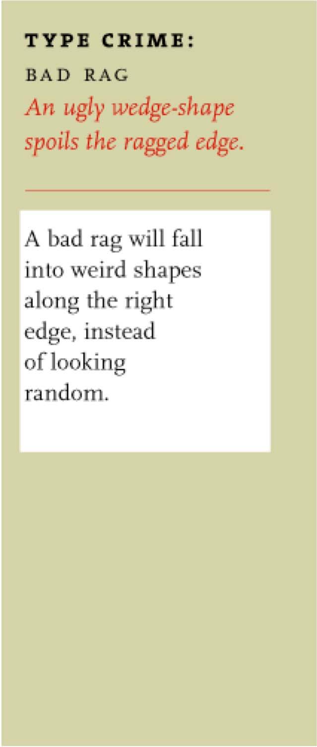
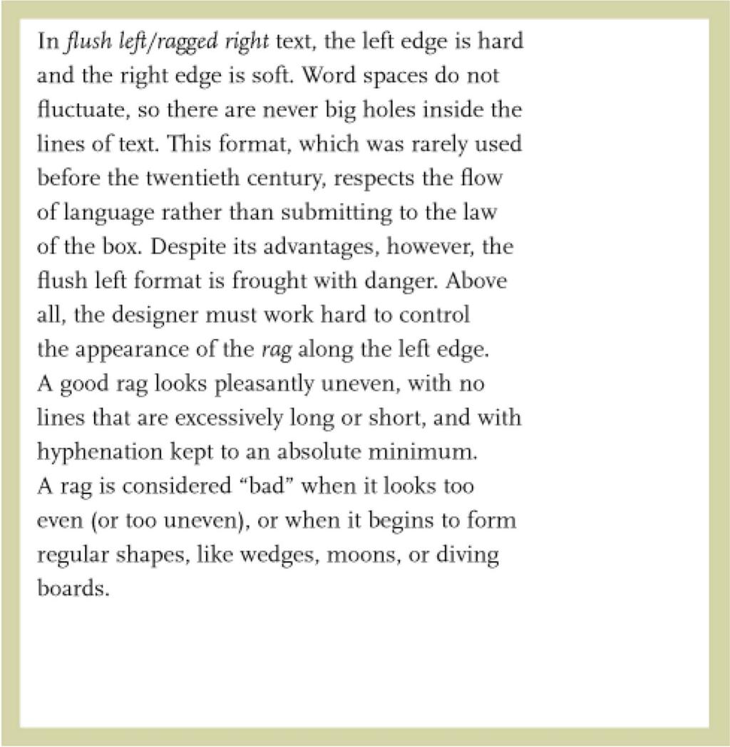
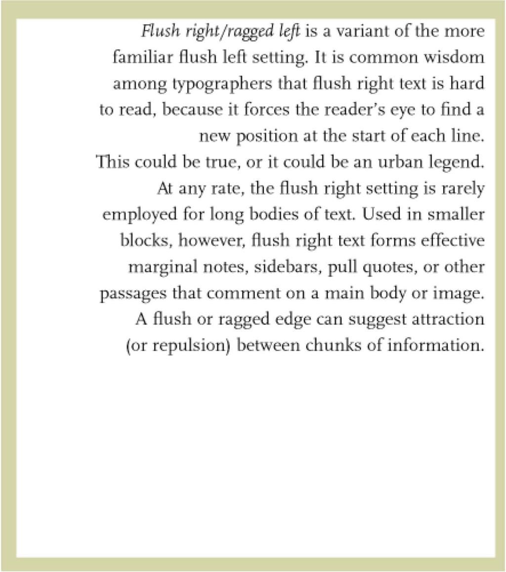
 Typography Manual Edition Number 02, 2016 by Chris Do 2016 Chris Do 01 Justify Left When in doubt, set your type justify left rag right. Why? In western culture, people read from top to bottom, left to
The building block of a CSS stylesheet. A rule consists of a selector and a declaration block (one or more declarations).
.") WDI Fundamentals Unit 4 CSS Cheat Sheet Rule The building block of a CSS stylesheet. A rule consists of a selector and a declaration block (one or more declarations). Declaration A declaration is made
WDI Fundamentals Unit 4 CSS Cheat Sheet Rule The building block of a CSS stylesheet. A rule consists of a selector and a declaration block (one or more declarations). Declaration A declaration is made
Design that Enhances Readability
 Working to ensure that all Americans get enrolled and stay enrolled in our nation s health care system Design that Enhances Readability By Eva Anderson Nicole Donnelly Joan Winchester Penny Lane MAXIMUS
Quick Reference Design Guide
 Presentation is everything. At one time or another, you have probably heard the phrase a book is judged by its cover. That s still true and probably even more so today because we live in a very distracted,
Document and Web design has five goals:
 Document and Web design has five goals: to make a good impression on readers to help readers understand the structure and hierarchy of the information to help readers find the information they need to
Graphical Screen Design
 1 Graphical Screen Design Grids are an essential tool for graphical design Important graphical design concepts include visual consistency visual relationships visual organization legibility and readability
Introduction. ThinManager - A Rockwell Automation Technology
 1220 Old Alpharetta Road, Suite 390 Alpharetta, Georgia 30005 www.thinmanager.com info@thinmanager.com OFFICE 678-990-0945 Introduction... 1 Logo... 2 Clear space and minimum size... 3 Primary color palette...
Developing successful posters using Microsoft PowerPoint
 Developing successful posters using Microsoft PowerPoint PRESENTED BY ACADEMIC TECHNOLOGY SERVICES University of San Diego Goals of a successful poster A poster is a visual presentation of your research,
Brand Guidelines Solano County Transit (SolTrans)
") Brand Guidelines Solano County Transit (SolTrans) May 2018 Table of Contents The SolTrans Story... 1 Brand Elements... 2 Logo Usage... 3 Color Palette... 7 Typography.... 8 Photography.... 9 The SolTrans
Brand Guidelines Solano County Transit (SolTrans) May 2018 Table of Contents The SolTrans Story... 1 Brand Elements... 2 Logo Usage... 3 Color Palette... 7 Typography.... 8 Photography.... 9 The SolTrans
Introduction to Multimedia. MMP100 Spring 2016 thiserichagan.com/mmp100
 Introduction to Multimedia MMP100 Spring 2016 profehagan@gmail.com thiserichagan.com/mmp100 Troubleshooting Check your tags! Do you have a start AND end tags? Does everything match? Check your syntax!
Character Formatting. Formatting the Text in Text Frames
 FIGURE 4-1 Formatting the Text in Text Frames CHAPTER 4. TYPE 199 Use the Selection tool to select the text frames you want to format and apply formatting. InDesign applies the formatting to all of the
Natalie Olson - Kisscut design Typography and Internal Book Design
 Natalie Olson - Kisscut design Typography and Internal Book Design www.kisscutdesign.com/blog Typography and the art of setting type in books hasn t changed a lot since the 1500s. The methods have changed.
HURME GEOMETRIC SANS
 No.1 SHARP No.2 ALTERNATIVE HURME TYPEFACE SPECIMEN PRINT SAMPLES No.3 BLUNT No.4 SWASH Hurme Geometric Sans Typeface Specimen 03/20/2013 2 Page heading: Black. 30pt/30pt. Byline: Regular/Bold SmallCaps.
Design Principles. The Four Basic Principles That Underlie Good Page Design
 Design Principles The Four Basic Principles That Underlie Good Page Design Some of the information presented in this video will appear on quizzes and exams. Please be sure to pay attention to key points
Alphabet. elemental visual signs 26 characters frozen sounds
 Alphabet elemental visual signs 26 characters frozen sounds Evolution Handwriting > minimum number of strokes Engraving > lowercase > minimum number of curved lines > capitals Letterforms Appearance of
BRAND GUIDELINES January 2017 leanconstruction.org
 BRAND GUIDELINES January 2017 leanconstruction.org The Lean Construction Institute (LCI) is a non-profit organization, founded in 1997. The Institute operates as a catalyst to transform the industry through
Typography One Project Two
 Typography One Project Two Typographic Systems, Emphasis and Hierarchy An important design problem is to aid reader comprehension of information through carefully considered logic, structure and order.
Total Responses 13. Please list and explain every single design decision you made in presenting this work.
 Initial Report Total Responses 13 Please write an explanation for the layout of the page -- or email -- that you are turning in today: Why did you choose the typeface(s) you did? Why did you choose the
Helvetica Type Specimen Process book
 Helvetica Type Specimen Process book Project Goal Using the history and typeface of Helvetica to inspire my design, the goal of this project was to create a booklet that would essentially sell the type
BRAND GUIDELINES JANUARY 15,
 BRAND GUIDELINES JANUARY 15, 2015 1 THIS IS WORLDCARE Trusted, reassuring, knowledgeable and globally connected. To us, a brand is more than just a name, logo or tagline. It is a shared set of values and
Designing Communications for a Poster Fair. Tips for Success
 Designing Communications for a Poster Fair Tips for Success 2005 The Pennsylvania State University This publication was developed by the graphic designers of Teaching and Learning with Technology for the
Document Design Chunking Similar Information Together
 Document Design Dieter Rams, a famous German designer whose work has influenced Apple s design aesthetic, is noted for his formula: Good design is as little design as possible (Rams). As a document designer,
Typographic. Alphabet. Book. Interactive PDF of typographic rules & terms YOU NEED TO KNOW. Home. Table of Contents
 Typographic Alphabet Table of Contents > Rules That Every Typographer Should Know... 2-3 Book Interactive PDF of typographic rules & terms YOU NEED TO KNOW > Baseline... > Gutter... > Hierarchy... > Kerning...
Principles of Professional Communication 1!! Familiar icons & symbols what do they represent?! Familiar signs!
 Principles of Professional Communication 1!! Lecture 12! Graphics & Visuals a picture paints a thousand words! Familiar icons & symbols what do they represent?! Principles of Professional Communication
LECTURE 4 THE USES OF TEXT IN MULTIMEDIA
 LECTURE 4 THE USES OF TEXT IN MULTIMEDIA 1 Objective Media Types What text is How text is created and stored in the computer How text is used in Multimedia Systems Advantages and Disadvantages of using
corporate identity guidelines
 Seilevel Corporate Identity Guidelines Introduction 1 Preferred Signature and Components Logo Space and Minimum Size Signature Variations Color Palette Typography Signature Misuse 2 3 4 5 6 7 corporate
Part 1 The Elements of Design. Lines
 Part 1 The Elements of Design There are seven elements of graphic design that are the starting point of your design ideas: Line, Shape, Texture, Space, Size, Value and Color. Each of these elements is