FOUNDATION IN GRAPHIC DESIGN. with ADOBE APPLICATIONS
|
|
|
- Nathan Palmer
- 6 years ago
- Views:
Transcription
1 FOUNDATION IN GRAPHIC DESIGN with ADOBE APPLICATIONS

2 CAN YOU ALL HEAR ME?
3 SPECIAL ANNOUNCEMENT Win a Lifetime Membership to Shaw Academy The draw will be held live during Lesson 8 * CONDITIONS Attend at least 4 lessons before lesson 8
4 LESSON 7 Introduction to Typography
5 WHAT IS TYPOGRAPHY? Typography is, quite simply, the art and technique of arranging type.


6 Friendly Feminine Modern AGGRESSIVE Chaotic Masculine Calm Traditional WHY TYPOGRAPHY IS IMPORTANT

7 WHY TYPOGRAPHY IS IMPORTANT
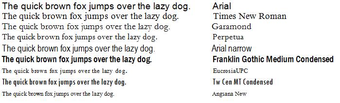
8 TYPEFACES V FONTS TYPEFACE FONT = Franklin Gothic Book Franklin Gothic Medium Franklin Gothic Demi Franklin Gothic Book Franklin Gothic Heavy Franklin Gothic Medium Condensed Franklin Gothic Demi Condensed
9
10 BASIC FORMS Serif Sans-Serif
11 BASIC FORMS Serif Serif

12 BASIC FORMS Serif
13 BASIC FORMS Serif Bracketed Un-bracketed
14 BASIC FORMS Serif Slab Serif

15 BASIC FORMS Serif Slab Serif
16 BASIC FORMS Sans-Serif Sans-Serif

17 BASIC FORMS Sans-Serif Sans-Serif
18 TEXT TYPE v DISPLAY TYPE
19 TEXT TYPE
20 DISPLAY TYPE
21 TYPE CLASSIFICATION
22 TYPE CLASSIFICATION Serif
23 TYPE CLASSIFICATION Serif
24 TYPE CLASSIFICATION Serif
25 TYPE CLASSIFICATION Serif
26 TYPE CLASSIFICATION Serif
27 Sans Serif
28 TYPE CLASSIFICATION Sans-Serif
29 TYPE CLASSIFICATION Sans-Serif
30 TYPE CLASSIFICATION Sans-Serif
31 TYPE CLASSIFICATION Sans-Serif
32 TYPE CLASSIFICATION
33 TYPE CLASSIFICATION Others
34 TYPE CLASSIFICATION Others
35 TYPE CLASSIFICATION Others
36 TYPE CLASSIFICATION Others
37 WEIGHTS & STYLES
38 UPPERCASE v lowercase
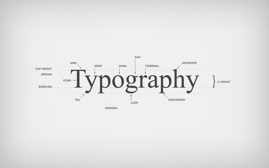
39 ANATOMY
40 SIZE & MEASUREMENT Not allallcreated created equal Not all equal Not created equal
41 SIZE & MEASUREMENT
42 SIZE & MEASUREMENT Type Ascender line Descender line Font Size
43 SIZE & MEASUREMENT
44 KERNING Kerning is the adjustment of space between two specific letters.
45 TRACKING Tracking is the spacing of a group of characters.
46 LEADING Baseline Leading describes the vertical space Baseline between each line of type.
47 MEASURE Measure is an important thing to get right in typography as it can be crucial to the readability of Measure is an important Measure thing to get is an right important in typography thing toasget it can rightbeincrucial typography to theas readability of the text. the text. If it is too narrow If the measure is too wideitthe cantext be crucial may betodifficult the readability to read as ofthe theeye text.has to move a lot more after each it can also be tiring on the line is read. eye to read, as the eye is abcdefghijklmnopqrstuvwxyzabcdefghijklmnopqrstuvwxyz constantly moving back and forth. A narrow abcdefghijklmnopqrstuvwxyzabcdefghijklmnopqrstuvwxyzabcdefghijklmnopqrstuvwxyzabcdefghijklmn measure will also lead to a lot of hyphenation. abcdefghijklmnopqrstuvw
48 HIERARCHY & SCALE Headings are Headings areusually usuallylarge large Sub-headings are smaller Sub-headings are smaller Body type is smaller still Body type is smaller still
49 COMBINING TYPE
50 FACTORS FOR COMBINING TYPE Most projects don t need more than two Typefaces. When combining Typefaces consider their basic characteristics: Similar Historical Period with different features may work well. Maybe choose very opposite Typefaces, one traditional and sober, the other, friendly and warm. Typefaces with similar Body Height can work well as long as their styles are contrasting.
51 COMBINING TYPE Contrast & Mood
52 WEIGHT
53 STYLE & DECORATION
54 SCALE & HIERARCHY
55 CLASSIFICATION
56 STRUCTURE
57 EXTREME CONTRAST
58 MOOD
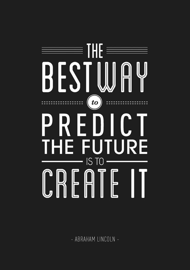
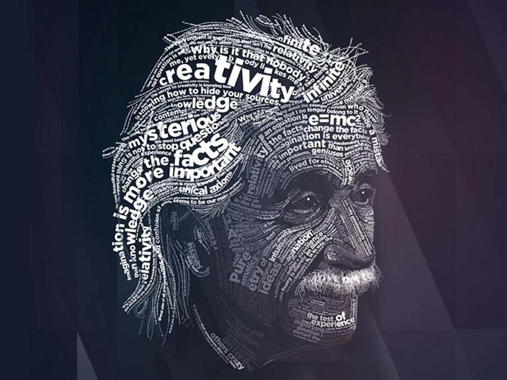
59 RECAP 5 Rules to become a better Typographer
60 RECAP 1: Concentrate on how the Body Text looks
61 RECAP 2: Point Size Point
62 RECAP 3: Line Spacing % of Point Size
63 RECAP 4: Line Length characters per line
64 RECAP 5: Font Choice Use Professional Fonts
65 TYPOGRAPHY What is Typography Why it is important Typefaces v Fonts Basic forms Text Type v Display Type Type Classifications Factors for Combining Type Recap
66 Create a TYPOPGRAPHIC IMAGE

67 { { OF M AY T HE FO R CE T Y P OG R A P H Y BE WITH YOU
68
69
70 COMING UP IN THE NEXT LESSON
71 SPECIAL ANNOUNCEMENT Win a Lifetime Membership to Shaw Academy The draw will be held live during Lesson 8 * CONDITIONS Attend at least 4 lessons before lesson 8
72 ELEMENTS For Web LINE SHAPE (FORM) COLOUR TEXTURE MASS (SIZE) SPACE
73 PRINCIPLES For Web ALIGNMENT BALANCE CONTRAST PROXIMITY REPETITION
74
75 SHARE YOUR WORK! #shawgraphic

76 FOUNDATION IN GRAPHIC DESIGN with ADOBE APPLICATIONS


77 CONTACT facebook.com/shawacademy twitter.com/shawacademy +353 (0) graphic.design@shawacademy.com
78 THANK YOU FOR BEING HERE
LESSON 7 Introduction to Typography
 FOUNDATION IN GRAPHIC DESIGN with ADOBE APPLICATIONS LESSON 7 Introduction to Typography Summary Notes WHAT IS TYPOGRAPHY? Typography is, quite simply, the art and technique of arranging type. Typography
Graphic Design. shawacademy LESSON 5. summarynotes INTRODUCTION TO TYPOGRAPHY. For further questions visit us online at:
 shawacademy Graphic Design LESSON 5 INTRODUCTION TO TYPOGRAPHY summarynotes The Diploma in Graphic Design Toolkit For further questions visit us online at: www.shawacademy.com Lesson 5 S shawacademy Lesson
Diploma in GRAPHIC DESIGN. - Part 1 LESSON 1
 Diploma in GRAPHIC DESIGN - Part 1 LESSON 1 Can you hear me? Type Yes or No ? WEBINAR How it Works Questions are posted in the Question Box. Student Microphones are Muted. Q&A s are left until the end
Shaw Academy Lifetime Membership. Winner will be announced at the end of the lesson
 Shaw Academy Lifetime Membership Winner will be announced at the end of the lesson FOUNDATION IN GRAPHIC DESIGN with ADOBE APPLICATIONS CAN YOU ALL HEAR ME? LESSON 8 Graphic Design for Web ELEMENTS LINE
FOUNDATION IN GRAPHIC DESIGN. with ADOBE APPLICATIONS
 FOUNDATION IN GRAPHIC DESIGN with ADOBE APPLICATIONS CAN YOU ALL HEAR ME? LESSON 8 Graphic Design for Web ELEMENTS LINE SHAPE (FORM) COLOUR TEXTURE MASS (SIZE) SPACE PRINCIPLES ALIGNMENT BALANCE CONTRAST
DESIGNING THE PAGE FOUNDATIONS OF DIGITAL DESIGN. Layout composition, the grid and typography. Prof. Eva Machauf
 DESIGNING THE PAGE Layout composition, the grid and typography FOUNDATIONS OF DIGITAL DESIGN Prof. Eva Machauf prof.machauf@gmail.com THE GRID The grid is the foundation of all design. Creating and working
VOICE OF TYPE LECTURE 1
 VOICE OF TYPE LECTURE 1 TYPOGRAPHY II COUNTY COLLEGE OF MORRIS PROFESSOR GAYLE REMBOLD FURBERT VOICE OF TYPE As you look at typefaces, analyze their forms, learn their history and learn how to use them
MODULE CM 2004 / STAGE 2 / SEMESTER 2 / SESSION Module title Design Principles and Context
 MODULE CM 2004 / STAGE 2 / SEMESTER 2 / SESSION 06-07 Module title Design Principles and Context Typography Fonts are classified under the following headings. Old Face fonts make use of contrasting wide
Font Basics. Descender. Serif. With strokes on the extremities of the letters. T Script. Sans-Serif. No strokes on the end of the letters
 Font Basics Ascender Font Size d p x A X-height Cap height Counter The white space within letters Descender Bar A Serif With strokes on the extremities of the letters. T A Sans-Serif No strokes on the
Unit 4. Multimedia Element: Text. Introduction to Multimedia Semester 2
 Unit 4 Multimedia Element: Text 2017-18 Semester 2 Unit Outline In this unit, we will learn Fonts Typography Serif, Sans Serif, Decorative Monospaced vs. Proportional Style Size Spacing Color Alignment
Typographic. Alphabet. Book. Interactive PDF of typographic rules & terms YOU NEED TO KNOW. Home. Table of Contents
 Typographic Alphabet Table of Contents > Rules That Every Typographer Should Know... 2-3 Book Interactive PDF of typographic rules & terms YOU NEED TO KNOW > Baseline... > Gutter... > Hierarchy... > Kerning...
C L A S S 2 T Y P O G R A P H Y. FOUNDATIONS OF GRAPHIC DESIGN MW 8 a.m.
 C L A S S 2 T Y P O G R A P H Y FOUNDATIONS OF GRAPHIC DESIGN MW 8 a.m. Typography Typography separates graphic design from visual art. In every piece of type you see, somebody has considered how the letters,
TYPO GRA PHY THE ANATOMY OF TYPE A BRIEF HISTORY OF TYPOGRAPHY WHAT IS YOUR TYPE ACTUALLY SAYING? OPEN FONT DISCUSSION
 THE ANATOMY OF TYPE A BRIEF HISTORY OF TYPO WHAT IS YOUR TYPE ACTUALLY SAYING? OPEN FONT DISCUSSION THE ANATOMY OF TYPE Typeface Anatomy The upward vertical stem on some lowercase letters, such as h and
A Crash Course in Typography: Principles for Combining Typefaces - noupe
 A Crash Course in Typography: Principles for Combining Typefaces Cameron Chapman When combining typefaces, there are a couple of important principles you ll need to keep in mind, namely contrast and mood.
Font classification review
 Font classification review Taken from Lettering & Type by Bruce Willen Nolen Strals Old Style Transitional Modern Slab Serif Garamond ag Baskerville ag Bodoni ag Cowboys ab Sans Serif Gill Sans ag Decorative
jasonjuwono twentyfifteen TYPEDIA _ Typography Encyclopedia
 TYPEDIA _ Typography Encyclopedia ANATOMY_ Anatomy of a typeface Anatomy of a typeface What is a Font & Typeface? A design for a set of characters. A font is the combination of typeface and other qualities,
INTRODUCTION TO TYPOGRAPHY DESIGN
 INTRODUCTION TO TYPOGRAPHY DESIGN Goals of typographic design Typography plays an important role in how audiences perceive your document and its information. Good design is about capturing your audience
Document and Web design has five goals:
 Document and Web design has five goals: to make a good impression on readers to help readers understand the structure and hierarchy of the information to help readers find the information they need to
How Typography Determines Readability: Serif vs. Sans Serif, and How To Combine Fonts.
 18/03/2018 How Typography Determines Readability: Serif vs. Sans Serif, and How To Combine Fonts. Harshita Arora Follow 16 y/o entrepreneur & programmer. Formerly at Salesforce and MIT Launch. Creator
TYPOGRAPHY. ascender arm (as on the capital T) descender bar (as on the capital H) counter ear (as on the lower case g and r)
 descender bar (as on the capital H) counter ear (as on the lower case g and r)") TYPOGRAPHY Parts of letters: base line x-height ascender arm (as on the capital T) descender bar (as on the capital H) extenders bowl counter ear (as on the lower case g and r) serif stroke tail (as on
TYPOGRAPHY Parts of letters: base line x-height ascender arm (as on the capital T) descender bar (as on the capital H) extenders bowl counter ear (as on the lower case g and r) serif stroke tail (as on
Putting type on a page without incorporating typographic principles is merely word processing. Terry Rydberg, Author Exploring InDesign 3
 Putting type on a page without incorporating typographic principles is merely word processing. Terry Rydberg, Author Exploring InDesign 3 Typography The study of all elements of type as a means of visual
How to use text. Adding a text frame
 How to use text Because Adobe InDesign CS6 is a page layout tool, working with text is an important skill. With InDesign, you add all text (and all content) into frames. Frames are shapes (called paths)
understanding typography
 understanding typography What is typography?! it is what language looks like! it is the art and technique of modifying type and arranging it on a page What does the arrangement of type mean? the arrangement
BASIC ABOUT TYPE TYPO GRAPHY
 BASIC ABOUT TYPE TYPO GRAPHY TYPOGRAPHY BASIC DESIGN Relative & Absolute measurements Absolute measurements Inche : Millimetres : Points : Pica 3 Inches 76.2 mm 216 Points 18 Picas 1 Inches = 3 Picas A
Format and Layout 8/31/2012. Using Visuals to Inform and Persuade
 ENG112 Prof. Katherine Delhagen *No sound read every slide of the presentation carefully Using Visuals to Inform and Persuade Effective technical communication integrates textual and visual elements: o
anatomy cap height x-height baseline descender ligature finial terminal ascender spine small capital uppercase counter cross bar lowercase
 Type Anatomy anatomy cap height x-height baseline stem bowl serif descender ligature ascender finial terminal ascender spine uppercase small capital cross bar counter lowercase 36 thinking with type cap
BBN ANG 183 Typography Text colour: vertical and horizontal spacing
 BBN ANG 183 Typography Text colour: vertical and horizontal spacing Zoltán G. Kiss & Péter Szigetvári Dept of English Linguistics, Eötvös Loránd University gkz & szp (delg) typo/spacing 1 / 43 outline
TYPE ANATOMY jtittle
 TYPE ANATOMY TYPE ANATOMY TITTLE j Serif Typefaces Tt HUMANIST (a.k.a. Old Style ) - Modeled after the roman typefaces of 15 th & 16 th centuries - Closely related to calligraphy and hand movement CLASSIC
DIGITAL PRINT DESIGN (568 )
") DESCRIPTION Create and produce digital print projects that communicates and promotes graphic communication. Develop knowledge and skills relative to the graphic design & printing industries. Includes:
DESCRIPTION Create and produce digital print projects that communicates and promotes graphic communication. Develop knowledge and skills relative to the graphic design & printing industries. Includes:
Visual Design. Gestalt Principles Creating Organization and Structure Typography. Visual Design 1
 Visual Design Gestalt Principles Creating Organization and Structure Typography Visual Design 1 UI Visual Design Objectives 1. Information communication - Enforce desired relationships (and avoid undesired
Typefaces are character sets based on distinct design characteristics.
 Level 3 WGHS VISUAL ARTS 2011 ART DESIGN Typography An Introduction to Type Type Design Since the first recordings of letterforms the concept of the typographic form has evolved into a seemingly endless
Alphabet. elemental visual signs 26 characters frozen sounds
 Alphabet elemental visual signs 26 characters frozen sounds Evolution Handwriting > minimum number of strokes Engraving > lowercase > minimum number of curved lines > capitals Letterforms Appearance of
This file includes FILLABLE FORM FIELDS. Enter your answers and then save the form as a PDF with your name to submit. Ex: 4CChrisJohnson.pdf.
 BASIC SKILLS: TYPOGRAPHY This file includes FILLABLE FORM FIELDS. Enter your answers and then save the form as a PDF with your name to submit. Ex: 4CChrisJohnson.pdf Kristy Ryan Name: Overview Complete
Writing and Document Design Lecture 6 Typography
 Writing and Document Design Lecture 6 Typography Last week We looked at Kress and van Leeuwen s work on composition/layout and considered its usefulness as both an analytic tool (a way of analysing and
Visual Design. Gestalt Principles Creating Organization and Structure Typography. UI Visual Design Objectives
 Gestalt Principles Creating Organization and Structure Typography 1 UI Objectives 1. Information communication - Enforce desired relationships (and avoid undesired relationships) 2. Aesthetics - well designed,
Principles of Typography
 Principles of Typography Different fonts send a different message to the reader. Categories: Sans serif Serif Script Decorative Fonts Sans-serif Fonts Easy to read, especially online Modern and clean Good
Project 2 reminders: Hand in your typed book summary/response at end of class today. Make sure to include your name and section.
 Project 2 reminders: Hand in your typed book summary/response at end of class today. Make sure to include your name and section. Project 2 reminders: First book cover critique this Friday. Bring 3 book
Font, Typeface, Typeface Family. Selected Typographical Variables
 Font, Typeface, Typeface Family Font: A font is a set of printable or displayable text character in a specific style, weight, and size. E.g. Helvetica Italic 10 Point. Typeface: The type design for a set
LECTURE 4 THE USES OF TEXT IN MULTIMEDIA
 LECTURE 4 THE USES OF TEXT IN MULTIMEDIA 1 Objective Media Types What text is How text is created and stored in the computer How text is used in Multimedia Systems Advantages and Disadvantages of using
font pairing FONT PAIRINGS GCEF
 font pairing As the saying goes, type is a beautiful group of letters, not a group of beautiful letters. ~Matthew Carter image as a designer ASSETS and type Two Functions of Type In order for your type
TYPOGRAPHY. The art of type
 Typography TYPOGRAPHY The art of type TYPE All the letters (abc), Numbers (123) & characters (;? @) of the alphabet. MONOTYPE Trade name for hot metal composition system Monotype Corporation Machine Shop
TYPE. Design Process
 TYPE Design Process 01 Vocabulary 02 Classification 03 Six Classic Typefaces 04 Readability 05 Ten Type Commandments 06 Inspiration 07 Assignment 01 Vocabulary 02 Classification 03 Six Classic Typefaces
Type on the Web: Dos, Don ts and Maybes Ilene Strizver
 Type on the Web: Dos, Don ts and Maybes Ilene Strizver What exactly is Type on the Web? How does it differ from print? Type in print Fixed Predictable Controllable Appearance varies depending on: Operating
Graphic Design Starter Pack
 Graphic Design Starter Pack Graphic Design Contact Us// E-mail: graphic.design@shawacademy.com www.shawacademy.com Hello This Starter Pack aims to give you a better understanding of what Graphic Design
Fundamental of Digital Media Design
 Fundamental of Digital Media Design Chapter 5 Principle of Design by Noraniza Samat Faculty of Computer Systems & Software Engineering noraniza@ump.edu.my OER Fundamental of Digital Media Design by Noraniza
Franklin Gothic. Seniors: Use larger text that is clear and legible. (Souvenir, Times, Garamond, Helvetica)
") one TYPOGRAPHY LECTURE: Do s and Don t s in Typography Do Build a basic library first. Find out who your audience is. Use appropriate type sizes. Celebrate white space. Use correct alignment. Use correct
one TYPOGRAPHY LECTURE: Do s and Don t s in Typography Do Build a basic library first. Find out who your audience is. Use appropriate type sizes. Celebrate white space. Use correct alignment. Use correct
Before & After. Use the Principles Cheatsheet! From The Non-Designer s Design Book, Robin Williams Non-Designer s Design 8
 Before & After Use the Principles Cheatsheet! From The Non-Designer s Design Book, Robin Williams Non-Designer s Design 8 Before & After From The Non-Designer s Design Book, Robin Williams Non-Designer
Designing Research Posters. College of Art and Design Chris Jackson, Associate Dean Keli DiRisio, Assistant Professor
 Designing Research Posters College of Art and Design Chris Jackson, Associate Dean Keli DiRisio, Assistant Professor Size and Orientation If you are NOT using the poster template: Start is with a 48"
a e yp fi Letterform Anatomy Ascender Shoulder Tittle Bowl Crossbar Stem or Main Stroke Terminal Leg Ascent Line Cap Line Mean Line Baseline
 Letterform Anatomy Tittle Ascender Shoulder Ascent Line Cap Line Mean Line Baseline Crossbar Bowl Stem or Main Stroke HtiQfgxR Terminal Ear Counter Leg Descent Line Crossbar Serif Tail Loop or Bowl Juncture
Multimedia for the Web: Creating Digital Excitement. Multimedia Element Text
 : Creating Digital Excitement Multimedia Element Text Chapter Concepts Discuss Fonts Understand Fonts Define Cascading Style Sheets (CSS) Explain Additional Options for Implementing Text on the Web Chapter
Multimedia Design Principles
 By: Chelsea East Things to Consider Organization Form & Content Basic Design Principles Design Rules of Thumb Things to Consider Time/Cost Skills Audience Equipment Things to Consider Time/Cost How much
WEB TYPOGRAPHY FOR WEB DEVELOPERS. Matej Latin Lead UX/UI Designer at Autotrader.co.uk
 WEB TYPOGRAPHY FOR WEB DEVELOPERS Matej Latin Lead UX/UI Designer at Autotrader.co.uk 1 A MEANINGFUL WEB TYPOGRAPHY STARTER KIT 2 Most people think typography is about fonts. Most designers think typography
5. Text CHAPTER HIGHLIGHTS 10/12/2016 CHAPTER. Text tradition. Codes for computer text. t. Font technologies. Multimedia text.
 CHAPTER 5. Text CHAPTER HIGHLIGHTS Text tradition. Codes for computer text. t Font technologies. Multimedia text. Guidelines for use of text in multimedia. 2 1 POWERS OF TEXT Multimedia developers value
In this lesson: Line height, type size and line width are the three aspects of shaping a perfect paragraph. Lesson 2
 In this lesson: Line height, type size and line width are the three aspects of shaping a perfect paragraph. Lesson 2 The reader should be able to read the message of a text easily and comfortably. This
Web Design, 5 th Edition
 Typography and Images Web Design, th Edition Chapter Objectives Explain webpage typography issues Discuss effective use of webpage images Describe image file formats Discuss how to prepare web-ready images
Build websites that suit the needs and abilities of users
 Goal 1 Build websites that suit the needs and abilities of users The main goal of many websites is to display information users need. 2 Tools for indicating importance in the visual information hierarchy
Adjust the point size
 Adjust the point size create contrast small and dark Strive for contrast rather than harmony. Mixing typefaces on the same line, designers usually adjust the point size so the x-heights align. Placing
Chapter 7 Typography, Style Sheets, and Color. Mrs. Johnson
 Chapter 7 Typography, Style Sheets, and Color Mrs. Johnson Typography Typography refers to the arrangement, shape, size, style, and weight of text. Affects the navigation and usability of a web site and
Elements of typographic design
 Type Terminology Serif fonts Sans serif fonts Elements of typographic design Times News Roman Ariel Verdana Calligrapher 24 pt 20 pt 14 pt 10 pt Univers 45 Light Univers 45 condensed light Univers 55 Univers
> what is a font? Times New Roman [10 pts] Times New Roman [12 pts] Times New Roman [14 pts] Times New Roman [18 pts] Times New Roman [24 pts]
![> what is a font? Times New Roman [10 pts] Times New Roman [12 pts] Times New Roman [14 pts] Times New Roman [18 pts] Times New Roman [24 pts]](/thumbs/88/117283063.jpg "> what is a font? Times New Roman [10 pts] Times New Roman [12 pts] Times New Roman [14 pts] Times New Roman [18 pts] Times New Roman [24 pts]") > what is a font? > what is a font? A font is set of glyphs (or images) that represent a complete series of alphabetic and numeric characters, punctuations and symbols in a particular size and style (or
> what is a font? > what is a font? A font is set of glyphs (or images) that represent a complete series of alphabetic and numeric characters, punctuations and symbols in a particular size and style (or
Modifying Type: effects of a letter change COLDS
 Modifying Type Modifying Type The goal of good typography is like fabric. It should be evenly woven together where all facets and all parts of the letter forms work together. Sometimes if you have one
ASerif. AfbcyE TYPE AND LETTERS
 TYPE AND LETTERS Before 1455 books were made by hand. Only the wealthy could afford a book. A book could cost as much as an acre of land. Say! you bought two books for this class that will be $800,000
Corporate Identity Style Guide. April 2014
 Corporate Identity Style Guide April 2014 Table of Contents Our Signature 1.0 Restrictions Legibility 2.0 Color 2.1 Usage with Photos 2.2 Color Palette 3.0 Typography Primary Type 4.0 Websafe / Alternate
> album art. > objective(s): Students will create a album art design for an existing artist's "next" release that utilizes imagery and text
: Students will create a album art design for an existing artist's next release that utilizes imagery and text") > album art > objective(s): Students will create a album art design for an existing artist's "next" release that utilizes imagery and text > curricular focus: This lesson emphasizes thematic design (design
> album art > objective(s): Students will create a album art design for an existing artist's "next" release that utilizes imagery and text > curricular focus: This lesson emphasizes thematic design (design
SELECTING THE RIGHT TYPE FOR THE JOB
 CHAPTER FOUR SELECTING THE RIGHT TYPE FOR THE JOB ype has the power to make or break a job. Every typeface has a distinct personality and conveys a different mood, message, or feeling. Display typefaces,
UNIVERSITY HOUSING COMMU- NICATION GUIDE TO DESIGN
 UNIVERSITY HOUSING COMMU- NICATION GUIDE TO DESIGN INTRODUCTION Hello and welcome to the University Housing Communication Guide to Design! In this book, you will find various guides to help you enhance
Project Justification
 Project Justification This unit of instruction is based on typography and the creative use of letterforms to visually communicate a message through images rather than just the printed word. Type manipulation
serif: the short strokes that finish off the major strokes of the letterform. bracket: a curving joint between the serif and the stroke
 PARTS OF THE LETTER Typography evolved from handwriting, which is created by making a series of marks by hand; therefore, the fundamental element constructing a letterform is the linear stroke (stem).
Objective 203 Apply production methods to plan and create advanced digital media graphics projects. Course Weight : 25%
 Objective 203 Apply production methods to plan and create advanced digital media graphics projects. Course Weight : 25% Objective 203 - Graphics Objectives are broken down into three sub-objectives : pre-production,
> objective(s): Students will create a text-only design in either Adobe Illustrator or Photoshop
: Students will create a text-only design in either Adobe Illustrator or Photoshop") > word art > objective(s): Students will create a text-only design in either Adobe Illustrator or Photoshop > curricular focus: This lesson emphasizes the creative use of typography as the dominant artistic
> word art > objective(s): Students will create a text-only design in either Adobe Illustrator or Photoshop > curricular focus: This lesson emphasizes the creative use of typography as the dominant artistic
A Message from the Vice President Marketing & Communications
 A Message from the Vice President Mareting & Communications The impact of any logo depends on consistent use resulting in a large number of impressions not read as words, but processed by the brain visually.
Crimes Against Typography. Shela Vang 13 images Collaborative Partner: Daha Lee 12 images
 13 images Collaborative Partner: Daha Lee 12 images Table of Contents 1 Alignment 3 Dashes 4 Hierarchy 5 Kerning 6 Line Spacing 7 Scale 8 Tracking 9 Widow 10 Thumbnail Images alignment alignment Poorly
DESIGN & BRAND GUIDELINES
 VINGA DESIGN & BRAND GUIDELINES CREATING MEMORIES The Design Guidelines These guidelines describe the visual and verbal elements that represent Vinga s corporate identitiy. This includes our name, logo
TEMPLATE ORDER GUIDE /
 TEMPLATE ORDER GUIDE / Our template order guide is filled with guidelines to help you complete the template order form. We want this to be a super easy and fun process for you! In order to prevent any
Name: Class: Teacher:..
 Name: Class: Teacher:.. Introduction Desktop publishing (DTP) is the process of designing newspapers, magazines, books, leaflets, booklets and reports on a computer. The industry that produces these items
Using Text in Photoshop
 Using Text in Photoshop So, we re going to take a break for a while from talking about photographs and how to manipulate them, and instead focus on some design elements! We re going to spend a while talking
PRESENTATION BOARD LAYOUT
 NEW YORK CITY COLLEGE OF TECHNOLOGY THE CITY UNIVERSITY OF NEW YORK ARCHITECTURAL TECHNOLOGY DEPARTMENT written by annie boccella spring 2010 1. BEFORE YOU BEGIN... Organize yourself. What is your argument
Digital Print Design DESCRIPTION. EXAM INFORMATION Items
 EXAM INFORMATION Items 75 Points 79 Prerequisites GRAPHIC COMMUNICATIONS, INTERMEDIATE Course Length ONE SEMESTER DESCRIPTION Create and produce digital print projects that communicates and promotes graphic
& Typography... A Brief History of
 A Brief History of Graphic Design & Typography... http://www.timetoast.com/timelines/53704 The Anatomy of Type + Letterforms, its personality and important things to understand about Type and it s Terminology...Elements
communication design and the web John Zimmerman HCI Institute and the School of Design, Carnegie Mellon University 17 November 2010
 communication design and the web John Zimmerman HCI Institute and the School of Design, Carnegie Mellon University 17 November 2010 goals for today explore communication design familiar with basic principles
Sorenson Media, Inc. Style Guide
 Sorenson Media, Inc. Style Guide Table of Content Logo Treatments Definitions 1 Sorenson Media 2 Sorenson Media - reversed 3 Sorenson Squeeze 4 Sorenson 360 5 Sorenson Squish 6 Sorenson SparkSDK 7 Sorenson
Typography in Design The principles of design describe the ways that artists use the elements of art in a work of art.
 Typography in Design The principles of design describe the ways that artists use the elements of art in a work of art. Aims & Outcomes: Aims: to understand typeface categories and how they are used in
Creating Large Format Posters Using PowerPoint TIP SHEET. Before you begin working in PowerPoint, sketch out your poster on paper.
 Creating Large Format Posters Using PowerPoint TIP SHEET INTRODUCTION The ideal poster is designed to: o Tell a story o Provide a brief overview of your work o Initiate discussion o Stand alone when you
The making of Beautiful A method for designing type for Jordanian students
 Beauty, Form and Function in Typography http://www.typoday.in The making of Beautiful A method for designing type for Jordanian students Rejan, Ashour, School of Architecture and Built Environment, German
Helvetica Type Specimen Process book
 Helvetica Type Specimen Process book Project Goal Using the history and typeface of Helvetica to inspire my design, the goal of this project was to create a booklet that would essentially sell the type
TYPE BASICS Cartographic Design & Principles Winter 2016
 TYPE BASICS Cartographic Design & Principles Winter 2016 Words on a Map Everything on the Earth has a name Names on a map, make it a map Otherwise it is a picture, photograph or design Assigning names
Good Publication Design
 Good Publication Design The top ten tips for creating professional print documents How do I create a well-designed print publication? Good publication design is an art form. Attractively presenting written
In your lifetime you ve seen billions of letters and millions of words, yet you might never have consciously noticed the typefaces you read.
 In your lifetime you ve seen billions of letters and millions of words, yet you might never have consciously noticed the typefaces you read. Type is important because it is an unconscious persuader. It
The Fresno EOC logo includes the box symbol and wordmarks
 Brand Guidelines box symbol wordmarks The Fresno EOC logo includes the box symbol and wordmarks Introduction The foundation of our graphic identity system, the Fresno EOC logo, represents the most concise
typography.net Redisturbed eyecatching, unique, unicase
 typography.net Redisturbed eyecatching, unique, unicase typography.net Introduction abcdeffghijklmnopqrstuvwxyz About Redisturbed families Features Language support Further information Redisturbed is a
Brand Manual THE NEW CORPORATE DESIGN GUIDELINES FOR ARABRENEUR COMPANY CORPORATE DESIGN MANUAL V1 PREPARED FOR
 Davinci Digital Agency +2 010 2000 99 32 Brand Manual THE NEW CORPORATE DESIGN GUIDELINES FOR ARABRENEUR COMPANY CORPORATE DESIGN MANUAL V1 PREPARED FOR Address Phone & Fax Online Arabreneur Company City
Corporate Identity Guidelines
 Corporate Identity Guidelines CONTENTS 1.0 TRADEMARK Watco Companies Logo Logo Clear Space Logo Variations Project Logos Proper Logo Use 03 04 05 06 07 08 2.0 TYPOGRAPHY Type Family 3.0 COLOR Brand Color
WATER (No kerning) WATER (Automatic Kerning) WATER (Manual Kerning).
 WATER (Automatic Kerning) WATER (Manual Kerning).") Styles Learning to use styles is a very effective way to save time and improve the consistency of publications. A style is a group of attributes that can be applied at once, to one or more paragraphs,
Styles Learning to use styles is a very effective way to save time and improve the consistency of publications. A style is a group of attributes that can be applied at once, to one or more paragraphs,
EnvSci360 Computer and Analytical Cartography
 EnvSci360 Computer and Analytical Cartography Lecture 5 Working with Type and Labels Key Points Labels are text that locate and identify features on a map Important for readability & communication EnvSci
POOJA GOND S DESIGN WORK pg. 1
 POOJA GOND S DESIGN WORK pg. 1 INDEX SERIAL NO. ACTIVITY PAGE NUMBER 1 LOGO 3 DESCRIPTION 2 KEYFORM 4 3 LETTER 6 4 SLOGAN (BLACK &WHITE) 8 5 SLOGAN (COLOR) 10 6 SLOGAN (KERNING EFFECT) 13 7 ORDER SHEET
Barbican Identity Guidelines
 Guidelines Contents Guidelines 1 5 1 Logo pp. 7 15 2 Lock-up pp. 17 25 3 Grid pp. 27 37 4 Typeface pp. 39 51 5 Typography pp. 53 69 Contents Core Guidelines Elements 6 11 XX Art XX Forms 6 Theatre pp.
SUCCESSFUL TYPE? Interface Aesthetics
 TYPO GR AP HY SUCCESSFUL TYPE? SUCCESSFUL TYPE? TYPOGRAPHY 1 2 TYPOGRAPHY /t 'p gr fi/ n. The art or process of setting and arranging types and printing from them. The style and appearance of printed
Bardax. Process GD350 ADVANCED TYPOGRAPHY REFLECTION ON PRACTICE ERSAN ÇELİKTAŞ
 1 1. Turkish tea glass is called ince belli bardak in Turkish, which means thin waisted glass. 2. Adobe Illustrator is a computer software that enables users to design, modify and edit vector graphics
Cartographic Principles: Map design
 MSc GIS: GIS Algorithms and Data Structures Cartographic Principles: Map design Martin Dodge (m.dodge@ucl.ac.uk) With Changes by Dan Ryan http://www.casa.ucl.ac.uk/martin/msc_gis/ some (scientific) rules
Typography One typeface classification
 Typography One typeface classification Why classify? Classification helps us describe and navigate type choices Typeface classification helps to: 1. sort type (scholars, historians, type manufacturers),