The 3 C s of Design COMPOSITION COMPONENTS CONCEPT
|
|
|
- Silvia King
- 5 years ago
- Views:
Transcription


1 The 3 C s of Design
2 The 3 C s of Design COMPOSITION COMPONENTS CONCEPT
3 COMPOSITION (Principles of Design) The way in which the components of a design are visually combined and arranged. COMPONENTS (Elements of Design) The visual elements used within a design COMPONENTS The visual elements used within a design. Photos Illustrations Icons Color Typography Linework Decoration Borders & Backgrounds CONCEPT Abstract elements of theme, connotation, message and style. All critical to its visual presentation and delivery of message.
4 Placement: Unequal Spacing, Line(s) placement, Horizon line (Rule of thirds), Dynamic Spacing & Static Placement Grouping: Simple association, Visual & Thematic Association, Disconnect Harmony: Agreement between elements Repetition, Visual Echo, Thematic Reference Emphasis: Visual Hierarchy, Relativity, Size Relationships, Decisive Presentation, Dimension, Color & Value Accent, Softening Contrast Alignment: Visual connection to unify and organize a layout Basic purpose, Alignment Don ts & what to avoid, Strict & Loosened Alignment, Opportunist Placement, Grid System Visual Flow: Directing the Eye, Flowing Across the Gutter, Poor Gutter Jumping, Circular Flow - Bridging Elements, Trapped Space. COMPOSITION The way in which the components of a design are visually combined and arranged.
5 When several items are in close PROXIMITY to each other, they become one visual unit rather than separate units. Group related items together, move them physically close to each other so the related items are seen as one cohesive group rather than a bunch of unrelated bits Items or group of information that are not related to each other should not be in close proximity to the other elements.
6 When several items are in close PROXIMITY to each other, they become one visual unit rather than separate units. The basic purpose of proximity is to ORGANIZE Group related items together, move them physically close to each other so the related items are seen as one cohesive group rather than a bunch of unrelated bits Items or group of information that are not related to each other should not be in close proximity to the other elements.
7 Avoid too many separate elements on a page Avoid leaving equal amount of white space between elements unless each group is part of a subset Do not create relationship with elements that don t belong together. If they are not related, move them apart from each other. Do not put thing around with out any though. White space is GOOD.
8 When designing, do not allow the spacing between elements to just happen. Develop an active awareness of the spatial relationship that are occurring between the components of a layout or image. Practiced consciously, this awareness quickly becomes second nature to a designer or artist Jim Krauser

9

10

11


12 And what if I confuse the issue even further

13

14
15
16

17

18

19

20
21
22 Photos Illustrations Icons Color Typography Line work Decoration Borders & Backgrounds COMPONENTS The visual elements used within a design. Elements of Design
23 INTRODUCTION: Fonts have character! They have emotions. They have something to say. Every time you use a font in your design you should ask yourself, How does this font feel? Is it, for example, a happy font? Do you really want a happy font for your design? Look at the fonts used in designs you see in newspapers, magazines, or on television; What do these fonts have to say? Notice how the shape and weight of the fonts support what the designer wants to say. After this assignment you should be aware of a font's feelings. You should begin to notice how designers use the shape and weight of the fonts to convey emotion. OBJECTIVES: To learn to manipulate text using Illustrator CS5 as our main digital program. Students will practice manipulating the text. Text is a fundamental design element. Student will learn to think about the relationships between the words, the fonts, and styles they choose to use.
24 Conveyance Theme Creative Process Concept Evaluation CONCEPT Abstract elements of theme, connotation, message and style. All critical to its visual presentation and delivery of message.
25 Lorem ipsum In publishing and graphic design, lorem ipsum is placeholder text (filler text) commonly used to demonstrate the graphics elements of a document or visual presentation, such as font, typography, and layout. The lorem ipsum text is typically a section of a Latin text by Cicero with words altered, added and removed that make it nonsensical in meaning and not proper Latin. Even though "lorem ipsum" may arouse curiosity because of its resemblance to classical Latin, it is not intended to have meaning. Where text is comprehensible in a document, people tend to focus on the textual content rather than upon overall presentation, so publishers use lorem ipsum when displaying a typeface or design elements and page layout in order to direct the focus to the publication style and not the meaning of the text. In spite of its basis in Latin, use of lorem ipsum is often referred to as greeking, from the phrase "it's all Greek to me" which indicates that this is not meant to be readable text.

26 There are four basic typographic alignments: flush left the text is aligned along the left margin or gutter, also known as left-aligned or ragged right; flush right the text is aligned along the right margin or gutter, also known as right-aligned or ragged left; justified text is aligned along the left margin, and letter- and word-spacing is adjusted so that the text falls flush with both margins, also known as fully justified or full justification; centered text is aligned to neither the left nor right margin; there is an even gap on each side of each line. COMPOSITION The way components are visually combined and arranged. Principles of Design
27 Test Vocabulary Kerning Spacing between letters Tracking Spacing between words Rivers in Justified Text unsightly large space between words due to letter size, length of justified text Widows A word that sits on a line by itself at end of a paragraph Orphans Last line of a paragraph that sits along at the top of column or page Leading Line spacing Serif A type of font that has exaggerated strokes or details at the end of it s letters (unlike san serif typefaces). Sans-serif A kind of font type that is void of the strokes on the end of letters that can be found on a serif typeface (see serif ). flush right the text is aligned along the right margin or gutter, also known as right-aligned or ragged left; justified text is aligned along the left margin, and letter- and word-spacing is adjusted so that the text falls flush with both margins, also known as fully justified or full justification; centered text is aligned to neither the left nor right margin; there is an even gap on each side of each line. Typography the selection and arrangement of typefaces, sizes, and spacing on a printed publication or web page. Typography has a major impact on the overall look and image of your page and its overall quality. COMPOSITION The visual elements used within a design.. Principles of Design

28 DPI: DPI (dots per inch): represents the resolution of an output device such as a printer. The higher the DPI, the more pixels (dots) fit into each inch of the image. In other words, the higher the DPI, the better an image will look in print. 300 dpi is sufficient for many print jobs, but it s all dependent on the detail required and the material being printed on CMYK: a very common color mode used for printing, also known as process colors. The CMYK stands for the colors cyan, magenta, yellow, and black. The letter K represents black as a way to not confuse with blue. JPG: (also spelled JPEG ) this image format is the most commonly used web format when it comes to photos or detailed imagery. JPGS are a lossy format, meaning some quality is lost to achieve their smaller file size. Resolution: The detail of an image is based on how many pixels (dots) are included in 1 square inch of space. The more pixels (see pixels ) included in that space, the higher the resolution. Computer monitors use no more than 72 pixels (dots) per inch, so going higher is pointless. However a minimum of 300 dots per inch is usually recommended for printing. San Serif: A kind of font type that is void of the strokes on the end of letters that can be found on a serif typeface (see serif ). Serif: A type of font that has exaggerated strokes or details at the end of it s letters (unlike san serif typefaces). Typography: the study and process of typefaces; how to select, size, arrange, and use them in general. In modern terms. typography includes computer display and output. Traditionally, typography was the use of metal types with raised letterforms that were inked and then pressed onto paper The visual elements used within a design. Elements of Design

29 henever you get projects for designing graphics for different media materials, there are certain rules you need to know before venturing to the complexities and elaborate world of graphic design. One of the elements considered in graphic design is typography. This is how you utilize and create your text to come out with a result that complements your images and design of the whole media material, whether it's for print or web. For typography, here are five of the basic rules to follow (or to break, whichever suits your creativity at the moment): The visual elements used within a design. Elements of Design
30 1- DO NOT use all the fonts in one document. Every designer has his or her own collection of fonts, which he or she uses for each design project. As one designer would say: "If you're a designer, it almost goes without saying that you own fonts- Lots of fonts. Aside from the existing fonts in the software program being used, most designers have their own lists that were added to the already existing list. And because of the availability of so many fonts, one may be tempted to use as many, if not all of the fonts that he or she owns. Always remember that simplicity is more attractive than disarray and confusion. When you start using many fonts in one document, the message most often get lost in the jumble. In addition, too many fonts can distract the reader from the original intent of the design- to get a message across. Nevertheless, this doesn't mean that you have to be dull and boring by sticking to the conventional "two-font rule", which states that you had to have one font for headings and another for text. So where's the creativity in that? Just make sure to have a reason why you want to deviate from the rule and chose to use the fonts. 2- "Serif type is easier to the eyes than sans serif. There's an old principle in the graphics world that goes "Serif type is easier to read because the serifs draws your eye from character to character." Hence, sans serif type is oftentimes used for headings and short quantities of text. Truth to tell, all fonts can be made readable (except, well, maybe for Wingdings) with the ideal design. With sans serif, although it needs more leading than serif type, it can give your documents a very modern look, and is the popular body text in Europe. The visual elements used within a design. Elements of Design
31 3- Putting two spaces after a period is a no-no. In the olden times, when using typewriters, typing two spaces after a period was the rule to indicate the end of a sentence. With the onset of technology, fonts have characters of their own, with different widths, that putting two spaces after a period is no longer needed. Sometimes, this rule can create a rather annoying flaw that creates a stop rather than help you pinpoint the end of every sentence. 4- DO NOT use all capital letters. One designer said that when using all capitals in the text, there are no ascenders or descenders. The two are what makes it easy to identify the shape of a word. "The shape of almost every word becomes a rectangle, and it's harder to read. But this doesn't also mean that you cannot use capital letters. Where can you use capital letters? Short phrases or headings do look attractive in all caps. Sans serif also works better in all caps. The visual elements used within a design. Elements of Design
32 5- DO NOT center large quantities of text. The eyes go from left to right when reading. It's the way to go. It rapidly scans one line, then goes from the right side of the page back to the left side of the page. When text is centered, it makes it harder for the eyes to be told to find where the next text begins again on the left side of the page, and makes it easy for the reader to skip down lines of text. This time, it's not too easy to bend the rules. The best way is still to save centering to headings that don't run more than several lines deep. The visual elements used within a design. Elements of Design

33 5- DO NOT center large quantities of text. The eyes go from left to right when reading. It's the way to go. It rapidly scans one line, then goes from the right side of the page back to the left side of the page. When text is centered, it makes it harder for the eyes to be told to find where the next text begins again on the left side of the page, and makes it easy for the reader to skip down lines of text. This time, it's not too easy to bend the rules. The best way is still to save centering to headings that don't run more than several lines deep. The visual elements used within a design. Elements of Design
34 OBJECTIVES: To learn to manipulate photos using Photoshop CS5 as our main digital program. To be able to apply emotions by selecting a theme prior to starting the project and the ability to use colors to convey a message. Learn to apply perspective as picture will no be only on the top of background but also going in to the background objects. Student will learn about light and shadows and elements of design as well as principles. GRAPHIC DESIGN PROCEDURES: 5-7 Warp Pictures following tutorial. Students are allowed to use pictures from the internet. Small warp picture size Avg. : 3 x5 or 4 x6 Resolution DPI. Background: needs to be 8x10 Resolution DPI. It is very important that background picture conveys the same emotion as the warp pictures. COMPOSITION: Contrast: Font, Color, Size. Alignment: Center, Flush Left/Right or Justified. Emphasis or Focal Point, Visual Flow and Proximity/Grouping The way in which the components of a design are visually combined and arranged.
35 OBJECTIVES: How to use each of the tools to its full potential. From the interface to the intricacies of the drawing tools, from transforming, editing, and positioning objects to applying filters and live effects Learn the difference between Vector and Rasterized images. When to use Photoshop and when to use Illustrator. Create Media Player Play Button 8 media player buttons : 20 pts. Students are allowed to use pictures from the internet for background 20pts; High resolution CREATIVITY: Students need to create their own design. Buttons should not resemble tutorial done in class. Tutorials are only for students to become familiar with program Illustrator 20pts DESIGN Consistency: Buttons are part of a family and they should look like they belong together. 30pts Background: needs to be 8x10 Resolution : NONE Vector image. 10pts COMPOSITION: Contrast: Color, Size. Alignment: Center, Flush Left/Right or Justified. The way in which the components of a design are visually combined and arranged.
36 OBJECTIVES: How to use each of the tools to its full potential. From the interface to the intricacies of the drawing tools, from transforming, editing, and positioning objects to applying filters and live effects Learn the difference between Vector and Rasterized images. When to use Photoshop and when to use Illustrator. Multiple layers in Photoshop 3D Flowery Text COMPOSITION: Creative 3D Text: 15 pts. COMPOSITION: Students are allowed to use pictures from the internet for background 15pts; High resolution COMPOSITION: Download, upload, install and application of brushes: different layers in Photoshop. 10pts CREATIVITY: Students need to create their own design. Design should not resemble tutorial done in class. Tutorials are only for students to become familiar with program Illustrator/Photoshop 20pts DESIGN COMPOSITION-Consistency: Creativity: depth, space, movements, color, alignment, proximity, contrast & colors20pts Background: Needs to be 8x10 Resolution : DPI. 20pts The way in which the components of a design are visually combined and arranged.
37 Whenever you get projects for designing graphics for different media materials, there are certain rules you need to know before venturing to the complexities and elaborate world of graphic design. One of the elements considered in graphic design is typography. This is how you utilize and create your text to come out with a result that complements your images and design of the whole media material, whether it's for print or web. For typography, here are five of the basic rules to follow (or to break, whichever suits your creativity at the moment): 1- DO NOT use all the fonts in one document. 2- "Serif type is easier to the eyes than sans serif. 3- Putting two spaces after a period is a no-no. 4- DO NOT use all capital letters. 5- DO NOT center large quantities of text. Factor that affect Legibility: Font Choice & Size Color: (Selection of color scheme); warm vs. cool colors. Complementary colors etc. Letter spacing (Too condense or extremely expanded Faces) Upper vs. Lower Cases (lower cases are easier to read) Background Colors affects legibility; create contrast Alignment (Alignment between element can create a sense of agreement and unity/harmony) Objectives: To create a Typography Poster using Typography and Creativity as our main tools. Learn application of rules and its limitation and when to break them according to message intended Application of Concepts & Components INSTRUCTIONS/REQUIREMENTS/RUBIC: Size: 8.5x11 Resolution: 250 DPI/photoshop Software: Illustrator & Photoshop for art manipulation Use of Graphic/Pictures to a minimum Computer Color Mode: CMYK Use of color/font to create a mood, ambience or reaction from the viewer Proper use of Elements/Components: Font, Color, Shapes, Texture, Space Proper use of Principles/Concepts: Balance, Focal Point, Contrast & Movement/visual flow
38 INSTRUCTIONS: Size: 8.5x11 Resolution: 200 DPI Software: Photoshop or Illustrator Use of Graphic/Pictures to a minimum Colors: RGB or CMYK Objectives: To create a Typography Poster using Typography and Creativity as our main tools Use of above QUOTE required. Student might use additional words from paragraph or any that relates to the invention of press and/or typography
39 INSTRUCTIONS: Size: 8.5x11 Resolution: Vector Image Software: Illustrator Use of Graphic/Frog or organic (curves) Please include: Title, subtitles, first paragraph is never indented GET CREATIVE!!!! Colors: RGB or CMYK Objectives: To learn basic layout using WRAP TEXT. Learn to use the PEN tool in illustrator to create a path Use of Greeking as a tool to finish a layout with out original text - The visual elements used within a design. Elements of Design


40 RUBRIC-INSTRUCTIONS: Size: 8.5x11 Resolution: Vector Image Software: Illustrator Colors: CMYK Use of Graphic/Artwork related to ad. Please include: Title, subtitles, first paragraph is never indented GET CREATIVE!!!! Watch out for widows and orphans. Column text baselines need to align. TEXT WRAP NEEDS TO BE INCLUDED. Objectives: To learn basic layout using WRAP TEXT as well as linking text columns. Text wrap needs to be use in a creative way. Learn to use the PEN tool in illustrator to create a path Use of Greeking as a tool to finish a layout with out original text The visual elements used within a design. Elements of Design


41 INSTRUCTIONS/Rubic: Size: 8.5x11 or 11x8.5 Resolution MUST use both programs: Illustrator=Vector Image Photoshop=250 DPI Use of Graphic: Skateboard PSD used in our previous tutorial and any additions Quantity: 4-5 Skateboards Colors: CMYK (print outside) Layout: Balanced: symmetrical or asymmetrical Contrast: Color, text or size, Space Use of TYPOGRAPHY: Company name/logo. Use of text to create images/design Objectives: To learn to download brushes and install. Multiple layers in illustrator vs. Photoshop To convert text to image or OUTLINE TEXT Import to Photoshop for final touches/effects. Abstract elements of theme, connotation, message and style. All critical to its visual presentation and delivery of message.

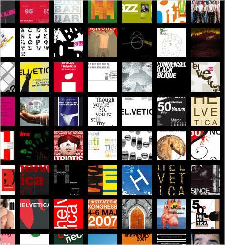
42 Helvetica was developed in 1957 by Max Miedinger with Eduard Hoffmann at the Haas'sche Schriftgiesserei (Haas type foundry) of Münchenstein, Switzerland. Haas set out to design a new sans-serif typeface that could compete with the successful Akzidenz-Grotesk in the Swiss market. Originally called Neue Haas Grotesk, its design was based on Schelter-Grotesk and Haas Normal Grotesk. The aim of the new design was to create a neutral typeface that had great clarity, no intrinsic meaning in its form, and could be used on a wide variety of signage. In 1960, the typeface's name was changed by Haas' German parent company Stempel to Helvetica in order to make it more marketable internationally. It was initially suggested that the type be called 'Helvetia' which is the original Latin name for Switzerland. This was ignored by Eduard Hoffmann as he decided it wouldn't be appropriate to name a type after a country. He then decided on 'Helvetica' as this meant 'Swiss' as opposed to 'Switzerland'. INSTRUCTIONS: Paper: 3 paragraphs NO PLAGERISM=0. Will count as a project and homework Images Due Next Class: 10 logos, Ad or Street Signs Size: 8.x10 Resolution: Vector Software: Illustrator Use of Graphic/10 logos, Ad or Street Signs Objectives: Learn about fonts and typography To display information about Helvetica in a Graphic Way The visual elements used within a design. Elements of Design

43
44

45

46

47

48 Musical instrument of your choice Diverse images related to an event of your choice Photoshop Brushes of your choice Use of effective Typography Elements: Contrast of : color images, font etc. INSTRUCTIONS: Images: Any image related to a musical event Size: 8.x10 Resolution: 250 DPI Color Mode: CMYK Objectives: Learn about Photoshop brushes and installation Use of different brushes to create contrast Photoshop Manipulation Event should include: Event name, Date event, Address/location Phone # and sponsors. The visual elements used within a design. Elements of Design
49 Graphic Design Mrs. Mayorga Est. Time 3-4 Weeks OBJECTIVES: To learn to manipulate photos using Photoshop CS5 as our main digital program. Students will learn the use typography and color theory as a powerful tool to convey a message. Project theme: WW2 History (Holocaust). Student will learn about WWII and will be able to apply emotions to their poster by researching the internet as it is our only digital image source available to us. To show understanding of the Four Basic Principles of Design: Contrast, Repetition, Alignment, and Proximity GRAPHIC DESIGN PROCEDURES: FOLLOW TUTORIALS: Typographic Portrait and Ghost Scene Search internet for portrait pictures at high resolution. Crop picture if necessary Document Size: 10 x15 Resolution: 200 or higher Color Setting: RGB is not a press job

50 Choose a character of your choice High resolution portrait; printed and in USB. 5 images of possible ghosts printed and in USB. A list of 10 words related/describing this person typed and printed.
51
52 OBJECTIVES: To learn to manipulate photos using Photoshop CS5 as our main digital program. Students will learn about the surrealism movement and its application in real life To show understanding of advance Photoshop Techniques INTRODUCTION GRAPHIC DESIGN PROCEDURES: Graphic Design II Mrs. Mayorga Est. Time 3-4 Weeks Surrealism is a style in which fantastical visual imagery from the subconscious mind is used with no intention of making the work logically comprehensible. Founded by Andre Breton in 1924, it was a primarily European movement that attracted many members of the chaotic Dada movement. It was similar in some elements to the mystical 19th-century Symbolist movement, but was deeply influenced by the psychoanalytic work of Freud and Jung. The Surrealist circle was made up of many of the great artists of the 20th century, including Max Ernst, Giorgio de Chirico, Jean Arp, Man Ray, Joan Miro, and Rene Magritte. Salvador Dali, probably the single best-known Surrealist artist, broke with the group due to his right-wing politics (during this period leftism was the fashion among Surrealists, and in fact in almost all intellectual circles). Sigmund Freud - Austrian neurologist who founded psychoanalysis Psychoanalysis - a method of analyzing psychic phenomena and treating emotional disorders that emphasizes the importance of the patient's talking freely about himself while under treatment, especially about early childhood experiences and about his dreams inter-war movement - between World War I and World War II AFTER FOLLOWING TUTORIAL: Search internet for pictures at high resolution. Final Document Size: 10 x12 or 12 x10 Resolution: 200 or higher Color Setting: CMYK Press Job Project need to convey a surrealist them or dream world scenery
Designing Research Posters. College of Art and Design Chris Jackson, Associate Dean Keli DiRisio, Assistant Professor
 Designing Research Posters College of Art and Design Chris Jackson, Associate Dean Keli DiRisio, Assistant Professor Size and Orientation If you are NOT using the poster template: Start is with a 48"
C L A S S 2 T Y P O G R A P H Y. FOUNDATIONS OF GRAPHIC DESIGN MW 8 a.m.
 C L A S S 2 T Y P O G R A P H Y FOUNDATIONS OF GRAPHIC DESIGN MW 8 a.m. Typography Typography separates graphic design from visual art. In every piece of type you see, somebody has considered how the letters,
Putting type on a page without incorporating typographic principles is merely word processing. Terry Rydberg, Author Exploring InDesign 3
 Putting type on a page without incorporating typographic principles is merely word processing. Terry Rydberg, Author Exploring InDesign 3 Typography The study of all elements of type as a means of visual
Using Text in Photoshop
 Using Text in Photoshop So, we re going to take a break for a while from talking about photographs and how to manipulate them, and instead focus on some design elements! We re going to spend a while talking
ABOUT RESEARCH POSTERS
 ABOUT RESEARCH POSTERS Research posters summarize information or research concisely and attractively to help publicize it and generate discussion. The poster is usually a mixture of a brief text mixed
HEL HEL HEL HEL VETIC HEL VETIC HEL HEL VETICA HEL HEL ETICA ETIC VETIC HEL VETIC HEL HEL C VETICA ETI- HEL HEL VETI HEL VETICA VETIC HEL HEL VETICA
 CA C C CA C C CA Max Miedinger with Eduard Hoffmann C C CA C CA ETI- ETI- L istory elvetica was developed in 1957 by Max Miedinger with Eduard Hoffmann at the Haas sche Schriftgiesserei of Münchenstein,
Typographic. Alphabet. Book. Interactive PDF of typographic rules & terms YOU NEED TO KNOW. Home. Table of Contents
 Typographic Alphabet Table of Contents > Rules That Every Typographer Should Know... 2-3 Book Interactive PDF of typographic rules & terms YOU NEED TO KNOW > Baseline... > Gutter... > Hierarchy... > Kerning...
Font Basics. Descender. Serif. With strokes on the extremities of the letters. T Script. Sans-Serif. No strokes on the end of the letters
 Font Basics Ascender Font Size d p x A X-height Cap height Counter The white space within letters Descender Bar A Serif With strokes on the extremities of the letters. T A Sans-Serif No strokes on the
COPY/PASTE: Allows any item within a document to be copied and pasted within the same document or within compatible software applications.
 You will need to understand basic terms and techniques used in DTP, as well as file types used within DTP and their advantages and disadvantages. This is separate from Elements and Principles of DTP which
STONELAW HIGH GRAPHIC
 GRAPHIC COMMUNICATION Technical Education THE A to Z of DTP Your knowledge of desktop publishing terminology will be expanded as you progress within the subject THE A to Z of DTP ALIGNMENT positions of
Digital Signage Content Creation Guidelines
 A NEW era of Digital Advertising 2017 Digital Signage Content Creation Guidelines DIGITAL BILLBOARD CONTENTS GUIDELINES & TIPS Introdution 01 Intro Maximize the Potential Text, graphics and backgrounds
laurengregory laurengregorydesign.com
 THSPA November 25, 2013 Topic: Basic Design Tips and Photoshop Helps 1. Layout Page layout is one of the most important graphic design disciplines. laurengregory lauren@briererows.com laurengregorydesign.com
DESIGNING THE PAGE FOUNDATIONS OF DIGITAL DESIGN. Layout composition, the grid and typography. Prof. Eva Machauf
 DESIGNING THE PAGE Layout composition, the grid and typography FOUNDATIONS OF DIGITAL DESIGN Prof. Eva Machauf prof.machauf@gmail.com THE GRID The grid is the foundation of all design. Creating and working
PLANNING. CAEL Networked Worlds WEEK 2
 PLANNING CAEL5045 - Networked Worlds WEEK 2 WEEK 2 CHOOSING COLOURS CHOOSING FONTS COLLECTING CONTENT PLANNING STRUCTURE WIREFRAMES + MOCKUPS Every colour, including black and white, has implications for
Document Design Chunking Similar Information Together
 Document Design Dieter Rams, a famous German designer whose work has influenced Apple s design aesthetic, is noted for his formula: Good design is as little design as possible (Rams). As a document designer,
Typography/ Layout and Design
 Typography/ Layout and Design What is typography? It s the study and science of fonts. Using typography is almost an art, and it takes practice to learn to use it correctly. Type is not just text that
Design Elements. Advanced Higher Graphic Presentation. Professional Graphic Presentations by kind permission of
 Design Elements Advanced Higher Graphic Presentation Professional Graphic Presentations by kind permission of Lines can Design Element:- Line Convey a mood or an emotion. Organise the design. Establish
Typography in Design The principles of design describe the ways that artists use the elements of art in a work of art.
 Typography in Design The principles of design describe the ways that artists use the elements of art in a work of art. Aims & Outcomes: Aims: to understand typeface categories and how they are used in
Objective 203 Apply production methods to plan and create advanced digital media graphics projects. Course Weight : 25%
 Objective 203 Apply production methods to plan and create advanced digital media graphics projects. Course Weight : 25% Objective 203 - Graphics Objectives are broken down into three sub-objectives : pre-production,
Essentials for Text and Graphic Layout
 5. Essentials for Text and Graphic Layout This section provides specific text and graphic guidelines that will help create a unified series of interpretive signs around Humboldt Bay. Text refers to the
Design Principles. Advanced Higher Graphic Presentation. Professional Graphic Presentations by kind permission of
 Design Principles Advanced Higher Graphic Presentation Professional Graphic Presentations by kind permission of Design Principles:- Balance Balance in Composition Three different types of balance :- *
Introduction A global icon needs an iconic logo. Fashion has evolved since 1969, when Gap opened its first store. Our logo has changed with the
 Introduction A global icon needs an iconic logo. Fashion has evolved since 1969, when Gap opened its first store. Our logo has changed with the times, too. One thing that hasn t changed is our mission
PROJECT THREE - EMPHASIS
 PROJECT THREE - EMPHASIS INSTRUCTIONS Before you begin this assignment: 1. Read Design Basics, on the two topics of Emphasis and Color. Study the Introduction to Emphasis, the PowerPoint presentation,
TYPOGRAPHY. ascender arm (as on the capital T) descender bar (as on the capital H) counter ear (as on the lower case g and r)
 descender bar (as on the capital H) counter ear (as on the lower case g and r)") TYPOGRAPHY Parts of letters: base line x-height ascender arm (as on the capital T) descender bar (as on the capital H) extenders bowl counter ear (as on the lower case g and r) serif stroke tail (as on
TYPOGRAPHY Parts of letters: base line x-height ascender arm (as on the capital T) descender bar (as on the capital H) extenders bowl counter ear (as on the lower case g and r) serif stroke tail (as on
Printing & Prepress Basics
 Brandi Stanley 18 May 2009 While art and design schools do an impressive job of teaching the importance of form, function, and how to use flashy Photoshop techniques, it's rare that designers have been
understanding typography
 understanding typography What is typography?! it is what language looks like! it is the art and technique of modifying type and arranging it on a page What does the arrangement of type mean? the arrangement
Name: Class: Teacher:..
 Name: Class: Teacher:.. Introduction Desktop publishing (DTP) is the process of designing newspapers, magazines, books, leaflets, booklets and reports on a computer. The industry that produces these items
DTP Theory Notes. Arbroath Academy - Technology Department - National 5 Graphic Communication
 DTP Theory Notes What is Desktop Publishing? Desktop Publishing (DTP) is the process of using software to create different publications, e.g, magazines, brochures, posters, booklets,newspapers. Who makes
Good Publication Design
 Good Publication Design The top ten tips for creating professional print documents How do I create a well-designed print publication? Good publication design is an art form. Attractively presenting written
Graphic Design Starter Pack
 Graphic Design Starter Pack Graphic Design Contact Us// E-mail: graphic.design@shawacademy.com www.shawacademy.com Hello This Starter Pack aims to give you a better understanding of what Graphic Design
Part 1 The Elements of Design. Lines
 Part 1 The Elements of Design There are seven elements of graphic design that are the starting point of your design ideas: Line, Shape, Texture, Space, Size, Value and Color. Each of these elements is
> objective(s): Students will create a text-only design in either Adobe Illustrator or Photoshop
: Students will create a text-only design in either Adobe Illustrator or Photoshop") > word art > objective(s): Students will create a text-only design in either Adobe Illustrator or Photoshop > curricular focus: This lesson emphasizes the creative use of typography as the dominant artistic
> word art > objective(s): Students will create a text-only design in either Adobe Illustrator or Photoshop > curricular focus: This lesson emphasizes the creative use of typography as the dominant artistic
Visual Design and Imaging Alignment
 Visual Design and Imaging Alignment This document contains information about four Career-Technical Articulation Numbers (CTANs) for the Visual Design and Imaging Alignment Career-Technical Assurance Guide
Introduction to Digital Communications
 Directions: Fill in the blanks. Defining Digital Communication Segment 1. Digital Communication Is the ability to create and a message using different technological devices, including: radio television
LOGO USE GUIDELINES BRAND GUIDELINES PUBLISHED ON FEBRUARY 17,
 LOGO USE GUIDELINES BRAND GUIDELINES PUBLISHED ON FEBRUARY 17, 2014 1 LOGO USE GUIDELINES LOGO USAGE GUIDELINES 13 LOGO USAGE GUIDELINES The Gardner-Webb logo is the centerpiece of the University's visual
proj 5 A/B kerning & introduction to the grid
 art 2413 typography fall 14 proj 5 A/B kerning & introduction to the grid problem objectives Many people assume a computer will create perfectly balanced spacing between letters, words, and lines. Such
Design Principles. The Four Basic Principles That Underlie Good Page Design
 Design Principles The Four Basic Principles That Underlie Good Page Design Some of the information presented in this video will appear on quizzes and exams. Please be sure to pay attention to key points
PAGE LAYOUT IN GRAPHIC DESIGN Where do you start when you want to create an attractive and effective design?
 PAGE LAYOUT IN GRAPHIC DESIGN Where do you start when you want to create an attractive and effective design? Aims & Outcomes for this week: Aims: To understand the three main page layout conventions used
Type on the Web: Dos, Don ts and Maybes Ilene Strizver
 Type on the Web: Dos, Don ts and Maybes Ilene Strizver What exactly is Type on the Web? How does it differ from print? Type in print Fixed Predictable Controllable Appearance varies depending on: Operating
TYPE BASICS Cartographic Design & Principles Winter 2016
 TYPE BASICS Cartographic Design & Principles Winter 2016 Words on a Map Everything on the Earth has a name Names on a map, make it a map Otherwise it is a picture, photograph or design Assigning names
In your lifetime you ve seen billions of letters and millions of words, yet you might never have consciously noticed the typefaces you read.
 In your lifetime you ve seen billions of letters and millions of words, yet you might never have consciously noticed the typefaces you read. Type is important because it is an unconscious persuader. It
Brand Guidelines Solano County Transit (SolTrans)
") Brand Guidelines Solano County Transit (SolTrans) May 2018 Table of Contents The SolTrans Story... 1 Brand Elements... 2 Logo Usage... 3 Color Palette... 7 Typography.... 8 Photography.... 9 The SolTrans
Brand Guidelines Solano County Transit (SolTrans) May 2018 Table of Contents The SolTrans Story... 1 Brand Elements... 2 Logo Usage... 3 Color Palette... 7 Typography.... 8 Photography.... 9 The SolTrans
Font classification review
 Font classification review Taken from Lettering & Type by Bruce Willen Nolen Strals Old Style Transitional Modern Slab Serif Garamond ag Baskerville ag Bodoni ag Cowboys ab Sans Serif Gill Sans ag Decorative
Adobe Illustrator CS4
 Adobe Illustrator CS4 COURSE DESCRIPTION This course examines the basic features that have made Adobe Illustrator virtually Indispensable to today's graphics designer. Topics include drawing and shape
Typographic hierarchy: How to prioritize information
 New York City College of Technology, CUNY Department of Communication Design Typographic Design III Instructor: Professor Childers pchilders1@mac.com Typographic hierarchy: How to prioritize information
Typography One Project Two
 Typography One Project Two Typographic Systems, Emphasis and Hierarchy An important design problem is to aid reader comprehension of information through carefully considered logic, structure and order.
A Step-by-step guide to creating a Professional PowerPoint Presentation
 Quick introduction to Microsoft PowerPoint A Step-by-step guide to creating a Professional PowerPoint Presentation Created by Cruse Control creative services Tel +44 (0) 1923 842 295 training@crusecontrol.com
ARTWORK REQUIREMENTS Artwork Submission
 Artwork Submission GRAPHICS APPLICATIONS AND ACCEPTED FILE TYPES Submitting your artwork as a print ready PDF file is preferred (MAC or PC). We will also accept files created in Adobe Illustrator, Photoshop,
Typesetting Tips. Put your best type forward.
 Typesetting Tips Put your best type forward. Do you want your audience to read your document? Improve your chances by making your article easy to read. Make the document difficult to read and To learn
Unit 4. Multimedia Element: Text. Introduction to Multimedia Semester 2
 Unit 4 Multimedia Element: Text 2017-18 Semester 2 Unit Outline In this unit, we will learn Fonts Typography Serif, Sans Serif, Decorative Monospaced vs. Proportional Style Size Spacing Color Alignment
MODULE CM 2004 / STAGE 2 / SEMESTER 2 / SESSION Module title Design Principles and Context
 MODULE CM 2004 / STAGE 2 / SEMESTER 2 / SESSION 06-07 Module title Design Principles and Context Typography Fonts are classified under the following headings. Old Face fonts make use of contrasting wide
WEB PAGE ARCHITECTURE
 The goals of webpage architecture: 1. Bring order to many types of information: text, images, links, navigation. 2. Create movement through the page. 3. Provide centers of visual interest that serve as
Knightswood Secondary School. Graphic Communication. Desktop Publishing otes. Auto Tracing
 Auto Tracing The process of converting a bit mapped image into a vector image. In a bit-mapped image, each object is represented by a pattern of dots, while in a vector image every object is defined geometrically.
Designing a Web Site. Michelle Hulett
 0 Designing a Web Site Michelle Hulett 1 Table of Contents Designing a Web Site... 0 Table of Figures... 2 Proximity and Balance... 3 Contrast and Focus... 4 Consistency... 4 Appropriate Background...
Visual Design. Gestalt Principles Creating Organization and Structure Typography. Visual Design 1
 Visual Design Gestalt Principles Creating Organization and Structure Typography Visual Design 1 UI Visual Design Objectives 1. Information communication - Enforce desired relationships (and avoid undesired
Digital Design: How to disseminate ideas, research and good practice in a visually stimulating way. Dawne Bell December 2015
 Digital Design: How to disseminate ideas, research and good practice in a visually stimulating way. Dawne Bell December 2015 This workshop has been devised as a direct result of feedback by colleagues
On the Web sun.com/aboutsun/comm_invest STAROFFICE 8 DRAW
 STAROFFICE 8 DRAW Graphics They say a picture is worth a thousand words. Pictures are often used along with our words for good reason. They help communicate our thoughts. They give extra information that
Fundamental of Digital Media Design
 Fundamental of Digital Media Design Chapter 5 Principle of Design by Noraniza Samat Faculty of Computer Systems & Software Engineering noraniza@ump.edu.my OER Fundamental of Digital Media Design by Noraniza
F PROT. Sub-brands FILE SERVER SECURITY
 BRANDING MANUAL Logo The F PROT Circle Icon was designed by Ágúst Gunnarsson and was introduced in 2006. We consider it very strong and it is at the focal point of a lot of our material. The latest update
Design Style Guide. Tips & Tricks for Designing Outstanding Yearbook Pages.
 Design Style Guide. Tips & Tricks for Designing Outstanding Yearbook Pages. TIPS & TRICKS FOR DESIGNING OUTSTANDING YEARBOOK PAGES INFOGRAPHIC GUIDE Designing your yearbook with YBLive should be fun and
proj 3B intro to multi-page layout & interactive pdf
 art 2413 typography fall 17 proj 3B intro to multi-page layout & interactive pdf objectives Students introduced to pre-made layered mockups that utilized smart art by placing vector artwork into the Photoshop
H A-Z of DTP Features
 A-Z of DTP Features H Alignment One of the principles of design, alignment refers to lining up the top, bottom, sides, or middle of text or graphic elements on a page. See also Text Alignment. Ascender
A Crash Course in Typography: Principles for Combining Typefaces - noupe
 A Crash Course in Typography: Principles for Combining Typefaces Cameron Chapman When combining typefaces, there are a couple of important principles you ll need to keep in mind, namely contrast and mood.
JABRA CORPORATION GRAPHIC STANDARDS MANUAL
 JABRA CORPORATION GRAPHIC STANDARDS MANUAL A simple reference guide for how to use the JABRA Corporation logo in real-world communications applications. INTRODUCTION Corporate image is a valuable asset,
Accessible Documents & Presentations. By Amy Maes, DNOM
 Accessible Documents & Presentations By Amy Maes, DNOM 1 Overview Accessibility: What am I required to do? Disability Characteristics Creating an Accessible Word Document & PowerPoint Presentation v2010
Essential Graphics/Design Concepts for Non-Designers
 Essential Graphics/Design Concepts for Non-Designers presented by Ana Henke Graphic Designer and Publications Supervisor University Communications and Marketing Services New Mexico State University Discussion
Welcome to TechComm Fundamentals Bootcamp, Session 6 THE SESSION WILL START IN A FEW MINUTES. MUTE YOUR PHONE, PLEASE!
 Welcome to TechComm Fundamentals Bootcamp, Session 6 THE SESSION WILL START IN A FEW MINUTES. MUTE YOUR PHONE, PLEASE! If you do not have a mute button on your phone, use the green phone handset button
The 12 most common newsletter design mistakes
 The 12 most common newsletter design mistakes www.targetmarketingnetwork.com By: Roger C. Parker Your newsletter s success depends on its design. An attractive, easy to read newsletter encourages readers
Lesson 1 Introduction to PowerPoint
 Lesson 1 Introduction to PowerPoint What It Is-- Presentation tool that allows you to view slides Can include text, graphics, animation, sound, video, charts, and transitions Can create handouts, speaker
Visual Design. Gestalt Principles Creating Organization and Structure Typography. UI Visual Design Objectives
 Gestalt Principles Creating Organization and Structure Typography 1 UI Objectives 1. Information communication - Enforce desired relationships (and avoid undesired relationships) 2. Aesthetics - well designed,
Identity Guidelines 2018
 Identity Guidelines 2018 Table of Contents The Signature Clear Space Minimum Size Color Formats Signature Misuses Color Palette Primary Color Palette Secondary Color Palette Support Typography: Sans Serif
Develop great research posters using Microsoft PowerPoint
 www.qps.qut.edu.au Develop great research posters using Microsoft PowerPoint A step-by-step guide QUT PRINTING SERVICES A step-by-step guide This step-by-step guide will assist you to understand the purpose
FLEET LOGO USAGE AND STANDARDS INNOVA BRANDING STANDARDS 2015 GUIDE
 FLEET LOGO USAGE AND STANDARDS INNOVA BRANDING STANDARDS 2015 GUIDE INNOVA BRANDING STANDARDS 2015 GUIDE 2 TABLE OF CONTENTS The Innova Brand 3 Branding Elements Logo Colors Typography 4 8 10 INNOVA BRANDING
Format and Layout 8/31/2012. Using Visuals to Inform and Persuade
 ENG112 Prof. Katherine Delhagen *No sound read every slide of the presentation carefully Using Visuals to Inform and Persuade Effective technical communication integrates textual and visual elements: o
LOGO & BRAND STANDARDS GUIDE
 LOGO & BRAND STANDARDS GUIDE INTRODUCTION The SparkPost Brand Standards Guide provides key information needed to accurately and consistently produce external and internal documents and communications.
CHAPTER 2 Information processing (Units 3 and 4)
") CHAPTER 2 Information processing (Units 3 and 4) Information-processing steps (page 54) a For each of the following information-processing steps, state its purpose and provide two examples of technology
CHAPTER 2 Information processing (Units 3 and 4) Information-processing steps (page 54) a For each of the following information-processing steps, state its purpose and provide two examples of technology
Fast Company Homepage This ad is very distracting and grabs the viewer attention more than the logo and navigation. It could cause the user to overloo
 Competitive Review Fast Company Homepage Doing well: It has a bold and modern feel that appeals to the internet audience. Doing poorly: The layout is confusing as to which elements match up and it's unclear
Contents. 3 About These Guidelines. 4 Why is a Brand Important? 5 Overview. 6 Resources. 7 Logo/Signature. 8 Clear Space. 9 Color Variations
 Brand Guidelines Contents 3 About These Guidelines 4 Why is a Brand Important? 5 Overview 6 Resources 7 Logo/Signature 8 Clear Space 9 Color Variations 10 Logo Misuse Examples 11 Background Control 12
Guiding Principles for PowerPoint Presentations
 Guiding Principles for PowerPoint Presentations Karen Fujii Media Services Manager Center for Instructional Support Office Faculty Development & Academic Support October 12, 2017 History Developed 30 years
BRAND & LOGO GUIDELINES SOCKET MOBILE. - Logos - Social Media - Web
 BRAND & LOGO GUIDELINES - Logos - Social Media - Web SIMPLICITY IS THE ULTIMATE FORM OF SOPHISTICATION. 2 BRAND GUIDELINES THIS IS A GUIDE TO THE BASIC ELEMENTS THAT MAKE UP OUR BRAND. IT WILL LET YOU
Text. Text metrics. There are some important metrics that we must consider when working with text. Figure 4-1 shows the basics.
 Text Drawing text has some special properties and thus is treated in a separate chapter. We first need to talk about the sizing of text. Then we discuss fonts and how text is actually drawn. There is then
Design Justification Assignment 2 Kawther Alsaffar
 Assignment 2 Kawther Alsaffar Bahrain Polytechnic Table of Contents Color Scheme... 3 Pictures... 4 Typography... 4 Quotes... 5 Textures... 6 Buttons Style... 6 References... 7 2 In the following points,
communication design and the web John Zimmerman HCI Institute and the School of Design, Carnegie Mellon University 17 November 2010
 communication design and the web John Zimmerman HCI Institute and the School of Design, Carnegie Mellon University 17 November 2010 goals for today explore communication design familiar with basic principles
GRAPHIC COMMUNICATIONS TECHNOLOGY 10
 GRAPHIC COMMUNICATIONS TECHNOLOGY 10 Description This course introduces students to many careers associated with graphic communications. Areas which will be explored are desktop publishing, scanning, page
Industrial Marking and Labeling, Inc. with all fonts converted to outlines or
 11490 South 1 53r d Street O maha, N E 681 3 8 create a high quality label from what you can supply us. If you have any questions or concerns feel free to contact us and we will help you with what will
Adobe Illustrator. Quick Start Guide
 Adobe Illustrator Quick Start Guide 1 In this guide we will cover the basics of setting up an Illustrator file for use with the laser cutter in the InnovationStudio. We will also cover the creation of
Developing successful posters using Microsoft PowerPoint
 Developing successful posters using Microsoft PowerPoint PRESENTED BY ACADEMIC TECHNOLOGY SERVICES University of San Diego Goals of a successful poster A poster is a visual presentation of your research,
Wissenschaftliche Poster-Präsentation
 Wissenschaftliche Poster-Präsentation Assoc. Prof. Mathias Lux This work is licensed under a Creative Commons Attribution 4.0 International License. DIY Flipchart. What can a scientific poster achieve?
InDesign. your. Resumé. a how-to guide for creating a professional resumé using InDesign
 InDesign your Resumé a how-to guide for creating a professional resumé using InDesign Table of Contents p4. Glossary p5. The Importance of Good Design p6. Setting up the Document p10. Creating a Grid p12.
Franklin Gothic. Seniors: Use larger text that is clear and legible. (Souvenir, Times, Garamond, Helvetica)
") one TYPOGRAPHY LECTURE: Do s and Don t s in Typography Do Build a basic library first. Find out who your audience is. Use appropriate type sizes. Celebrate white space. Use correct alignment. Use correct
one TYPOGRAPHY LECTURE: Do s and Don t s in Typography Do Build a basic library first. Find out who your audience is. Use appropriate type sizes. Celebrate white space. Use correct alignment. Use correct
Part II: Creating Visio Drawings
 128 Part II: Creating Visio Drawings Figure 5-3: Use any of five alignment styles where appropriate. Figure 5-4: Vertical alignment places your text at the top, bottom, or middle of a text block. You could
Enterprise Graphic Design
 Enterprise Graphic Design Courses Overview Color Theory Fundamentals of Design Visualization The Principles of Web Graphic Design Photography Consolidated (Photo Composition) Web Design with Adobe Photoshop
1. New document, set to 5in x 5in, no bleed. Color Mode should be default at CMYK. If it s not, changed that when the new document opens.
 art 2413 typography fall 17 software review This exercise will reacquaint students with Adobe Illustrator, Photoshop, and InDesign. These are the three main design programs used by the industry. There
SETTING UP A. chapter
 1-4283-1960-3_03_Rev2.qxd 5/18/07 8:24 PM Page 1 chapter 3 SETTING UP A DOCUMENT 1. Create a new document. 2. Create master pages. 3. Apply master pages to document pages. 4. Place text and thread text.
Graphic Elements Style Guide
 Graphic Elements Style Guide 1.26.2012 In partnership with Thermo Scientific Brand Specifications 1/2012 Table of Contents 1 Logo Usage and Standards 2 Typography 3 Color Palette 4 Messaging Hierarchy
SAMPLE PAGES. Syllabus coverage chart. viii Syllabus coverage chart
 viii Syllabus coverage chart Syllabus coverage chart The chart below shows how each Unit and Topic relates to the ICT syllabus and the Computer Studies syllabus. Computer Unit 11.1 Computer Fundamentals
PRODUCTION GUIDELINES
 PRODUCTION GUIDELINES 1 CONTENTS Contents...2 General advice for producers...3 Computer access...3 Templates...4 Page layout...4 Main text...4 First paragraph...4 Widows and orphans...4 Author details...4
VOICE OF TYPE LECTURE 1
 VOICE OF TYPE LECTURE 1 TYPOGRAPHY II COUNTY COLLEGE OF MORRIS PROFESSOR GAYLE REMBOLD FURBERT VOICE OF TYPE As you look at typefaces, analyze their forms, learn their history and learn how to use them
Adobe InDesign CS6 Tutorial
 Adobe InDesign CS6 Tutorial Adobe InDesign CS6 is a page-layout software that takes print publishing and page design beyond current boundaries. InDesign is a desktop publishing program that incorporates
DTP with MS Publisher
 DTP with MS Publisher ICT Curriculum Team 2004 Getting Going Basics desktop publishing a system for producing printed materials that consists of a PERSONAL COMPUTER or COMPUTER workstation, a high-resolution