Guiding Principles for PowerPoint Presentations
|
|
|
- Vivien Wheeler
- 6 years ago
- Views:
Transcription

1
2 Guiding Principles for PowerPoint Presentations Karen Fujii Media Services Manager Center for Instructional Support Office Faculty Development & Academic Support October 12, 2017
3 History Developed 30 years ago Originally created for flip charts and overhead transparencies Most common slide-based presentation application Compatible across PC and Apple platforms
4 Guiding Principles 7x7 Rule Audio/Sound Background Contrast Bullets & Numbers Colors Font Sizes Graphics Images Safe Zone Serif/San Serif Fonts Spelling & Grammar Templates Titles Transitions Upper and Lower Case
5 Safe Zone
6 Safe Zone What is a safe zone?
7 Safe Zone 80% title safe area
8 Safe Zone To avoid cutting off your text, keep a space of approximately 10% around all the edges

9 Safe Zone To avoid cutting off your text, keep a space of approximately 10% around all the edges Good Example: Don t put text next to the edge

10 Safe Zone This is an example of going outside the safe zone. This text is NOT placed correctly within the title safe zone. Bad Example: Text will be cut off
11 Safe Zone PowerPoint Slides Keynote
12 Aspect Ratios 4:3 / 4x3 aspect ratio 16:9 / 16x9 aspect ratio Both show safe zones
13 Presentation Mode 4:3
14 Presentation Mode 16:9
15 Presentation Mode 16:10
16 Comparisons 16:9 and 16:10
17 Comparisons 16:9 and 16:10
18 4:3 Safe
19 Titles
20 Titles Title Text, Arial 40 pt., bold, centered Every slide should have its own title
21 Typography
22 Typography Serif fonts vs. Sans Serif fonts
23 Serif fonts Little tails and curls on the tip and base of each letter Industry standard for newspapers, magazines, and books Easier to read, makes the letters flow together and subsequently easier on the eyes
24 Serif fonts Examples of Serif fonts: Times Roman AaBbCcDdEeFfGg12345 Typewriter AaBbCcDdEeFfGg12345 Garamond AaBbCcDdEeFfGg12345 Georgia AaBbCcDdEeFfGg12345 Palatino AaBbCcDdEeFfGg12345
25 Sans Serif Fonts with no little tails and curls on the tip and base of each letter Often used as a headline font Good for legibility as serif fonts are good for readability
26 Sans Serif Examples of Sans Serif fonts: Arial AaBbCcDdEeFfGg12345 Century Gothic Futura AaBbCcDdEeFfGg12345 AaBbCcDdEeFfGg12345 Geneva AaBbCcDdEeFfGg12345 Trebuchet MS AaBbCcDdEeFfGg12345
27 Typography Difference This is a Serif font This is a San Serif font Times Roman Arial
28 Typography - Example This is 40 point font This is 36 point font This is 32 point font This is 28 point font This is 24 point font This is 20 point font This is 18 point font This is 167 point font This is 14 point font This is 12 point font
29 Typography - Example This is 40 point font This is 36 point font This is 32 point font This is 28 point font This is 24 point font This is 20 point font This is 18 point font This is 167 point font This is 14 point font This is 12 point font
30 Typography For clarity and distance, use a minimum of 28 point font size

31 Crawford Hall
32 Typography - Recap For clarity and distance, use a minimum of 28 point font size For ease of reading, use san serif font Use common fonts This is a 32 point size
33 7x7 Rule
34 7x7 Rule The 7 x 7 rule is simple: No more than 7 lines of text This includes sub-bullets No more than 7 words per line This one line has nine words in it, breaking the 7 lines of text rule
35 7x7 Rule When you have too much information on a slide, it becomes too cluttered. Summarize your thoughts. Do not write in complete sentences. Avoid full and partial paragraphs. Keep it simple. When you have too much information on a slide, it becomes too cluttered. Summarize your thoughts. Do not write in complete sentences. Avoid full and partial paragraphs. Keep it simple. When you have too much information on a slide, it becomes too cluttered. Summarize your thoughts. Do not write in complete sentences. Avoid full and partial paragraphs. Keep it simple. When you have too much information on a slide, it becomes too cluttered. Summarize your thoughts. Do not write in complete sentences. Avoid full and partial paragraphs. Keep it simple. No more than 7 words per line

36 7x7 Rule Try and use phrases instead of complete sentences on your slides. Wri6ng complete sentences will distract your audience. They will lose focus on what you are saying as they try and read the PowerPoint. Complete sentences should only be used when it is absolutely necessary. Bad Example: No slides full of text No more than 7 words per line
37 7x7 Rule Recap No complete sentences No paragraphs Includes sub-bullets Avoid clutter No more than 7 words per line
38 Graphics & Images
39 Images Common file formats: *.jpg, *.tif, *.gif, *.png Makes sure images have enough resolution Ideally, at least 300 dpi/ppi at full size Generally, web-based images will not project well Usually only 72 dpi and use for on-screen
40 Images
41 Overlapping Images
42 Overlapping Images
43 Overlapping Images
44 Overlapping Images


45 Overlapping Images Bad Example
46 Graphics Scale Don t Stretch
47 Graphics Keep your photographs and illustrations in the correct proportions Hold the shift key while resizing
48 Graphics Vector-based Pixel-based 4.8% 1.7% 26.8% 17.1% 49.8% 20 years old 30 years old 40 years old 50 years old 60 years old
49 Graphics Vector-based Pixel-based 4.8% 1.7% 26.8% 17.1% 49.8% 20 years old 30 years old 40 years old 50 years old 60 years old Good Example Bad Example


50 Graphics 4.8% 1.7% 26.8% 17.1% 49.8% 20 years old 30 years old 40 years old 50 years old 60 years old
51 Graphics 4.8% 1.7% 20 years old 26.8% 17.1% 49.8% 30 years old 40 years old 50 years old 60 years old
52 Graphics
53 Graphics

54 Tables & Figures
55 Clean Icons Use clean icons Easy to recognize Visually appealing Keep it simple


56 Clean Icons Examples
57 Graphics Media Production Department (Office of External Affairs & University Relations) Graphic Standards Manual The How to use and Do s and Dont s Print Quality Official UH Logos and Seals
58 UH Logos & Trademarks Use for any material that reflects UH s mission, including printed materials and presentations Use for formal applications, e.g., diplomas, presidential letters


59 UH Logos & Trademarks Discourages the use of individual college, school and department logos If you must use your college/school logo, always use in conjunction with the official UH logo


60 UH Logos & Trademarks - Example
61 Colors
62 Color Sensitivity Refrain from color combinations that may connote something other than the topic of your presentation Orange and black = Halloween Red and green = Christmas Lavender and pink = Juvenile
63 Color Contrast The highest contrast for legibility is black text on white background (and visa versa) When coloring type, choose a color that has a high contrast with the background and can be easily read suggest that only headings, bullets, borders be colored; main textual material should remain black
64 Cool & Warm Colors Cool colors blues, greens tend to be calmer green is popular since it is UHM s color Warm colors reds, oranges tend to be louder studies have shown words with red typeset tend to agitate readers

65 Neon Colors Do not use Neon colors
66 Using Color How well can you read this? How well can you read this? How well can you read this? How well can you read this? How well can you read this? How well can you read this?
67 Using Color Most see this: Christmas Around the World Color blind people see this: Christmas Around the World
68 Using Color Too many colors The quick brown fox jumps over the lazy dog The quick brown fox jumps over the lazy dog The quick brown fox jumps over the lazy dog One or Two Colors The quick brown fox jumps over the lazy dog The quick brown fox jumps over the lazy dog The quick brown fox jumps over the lazy dog No more than three colors per slide


69 Using Color Too many colors The quick brown fox jumps over the lazy dog The quick Bad brown fox jumps Example over the lazy dog The quick brown fox jumps over the lazy dog One or Two Colors The quick brown fox jumps over the lazy dog The quick Good brown fox jumps over Example the lazy dog The quick brown fox jumps over the lazy dog No more than three colors per slide


70 Color Icons Bad Example Good Example
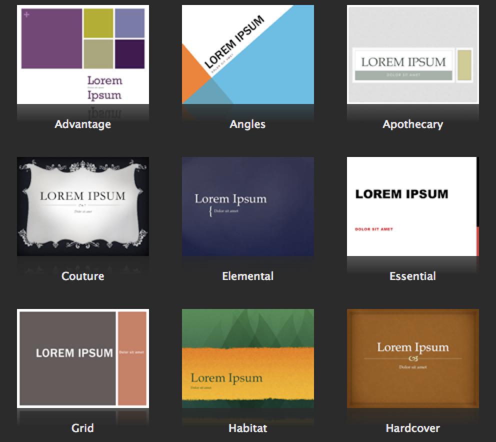
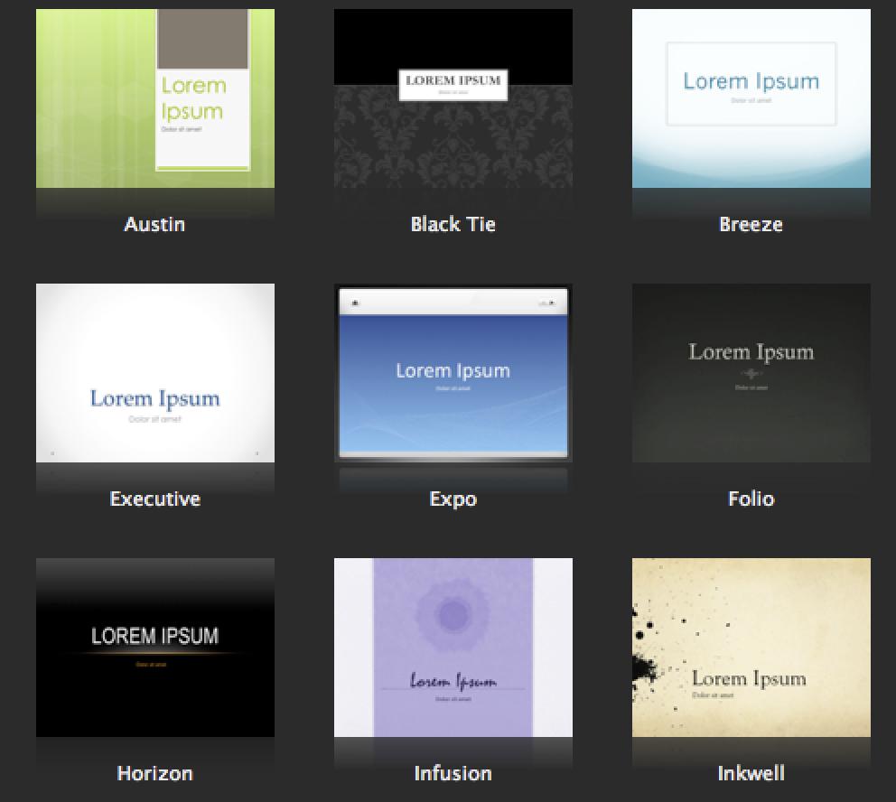
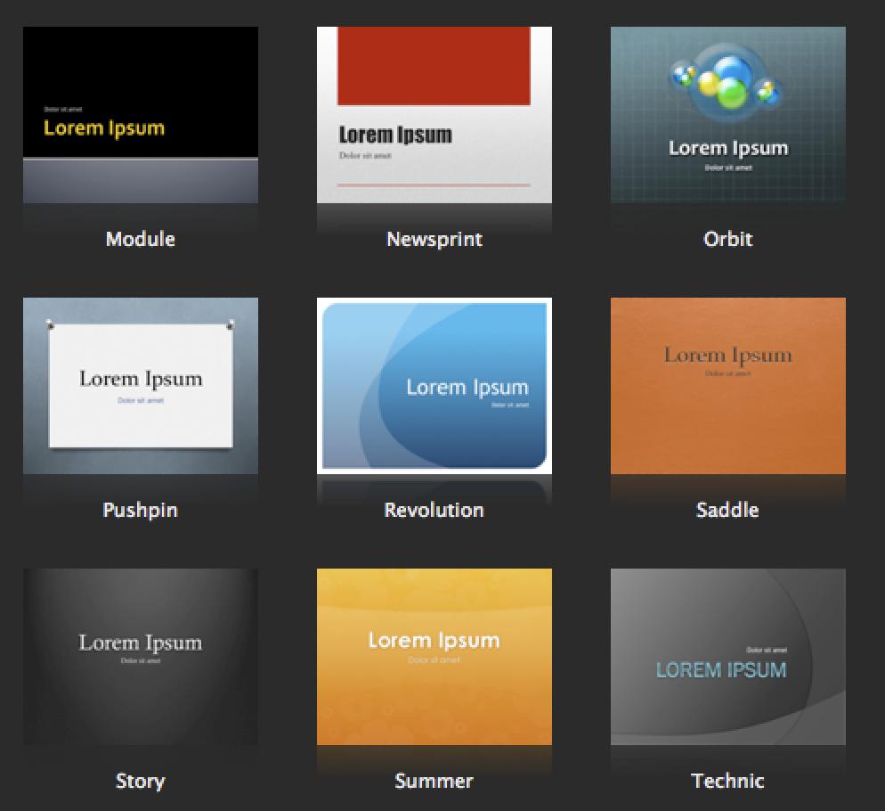
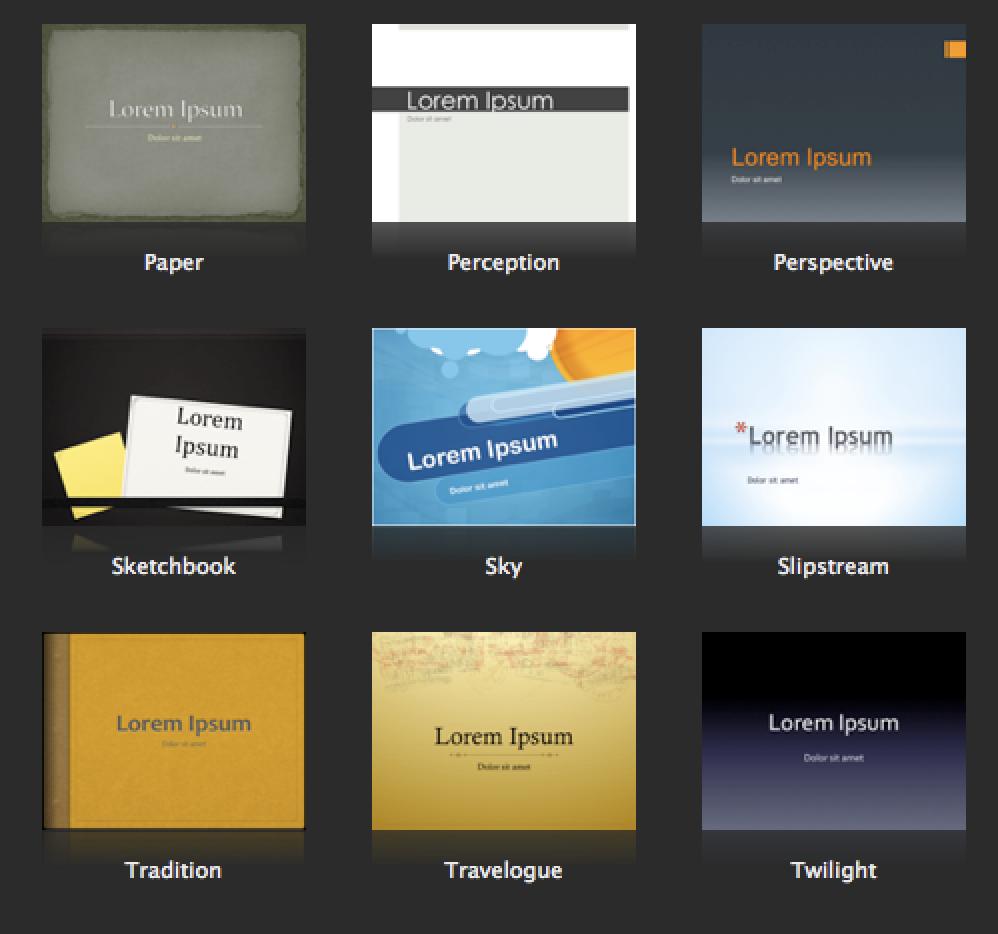
71 Background Contrast
72 Background Contrast Use dark text on a light background
73 Background Contrast Use light text on a dark background
74 Background Contrast Use dark text on a light background Use light text on a dark background

75 Images as Background Using images in the background is fine if it doesn t overpower the text in the foreground

76 Images as Background Transparent overlays on images for text contrast Using images in the background is fine if it doesn t overpower the text in the foreground
77 Color Recap Color backgrounds + Contrast + Color sensitivity
78 Templates
79 Templates
80 Templates
81 Templates
82 Templates
83 Templates
84 Templates Avoid using templates Background colors / fonts Choose high contrast colors Avoid white backgrounds and bright colors
85 Transitions & Animations
86 Transitions & Animations No annoying animation No annoying sounds No or simple transitions Keep it simple Use it sparingly
87 Uppercase & Lowercase
88 Uppercase & Lowercase TRY TO REFRAIN FROM USING ALL UPPERCASE
89 Uppercase & Lowercase TRY TO REFRAIN FROM USING ALL UPPERCASE try to refrain from using all lowercase
90 Uppercase & Lowercase TRY TO REFRAIN FROM USING ALL UPPERCASE try to refrain from using all lowercase User both Uppercase and Lowercase Bad Example Good Example
91 Spelling
92 Spelling Use upper and lower case Visually appealing Check grammar Check spelling Four eye theory
93 Bullet Points and Numbers
94 Bullet Points Bullet points should be aligned left Numbers align left Read left to right Keeps continuity Natural flow Easy to follow along
95 Numbers Numbers should be aligned left 1. Numbers align left 2. Read left to right 3. Keeps continuity 4. Natural flow 5. Easy to follow along
96 Audio
97 Audio Embed the A/V Test the link Check audio levels Check the audio/video files Test the USB Allow additional time Possible back-up on desktop
98 Conference Setting Find the audio/video engineers Download USB to desktop used for presentation Check audio/video levels on embedded links Rehearse to understand the room acoustics
99 Conference Setting Know the size of the room beforehand 16x9 or 4x3 screen Check if there is delay screen/s Adjust the text to accommodate the room Arrive early and test it
100 Mahalo Q&A
Basic PowerPoint Guidelines. Tips for Creating Great Presentations
 Basic PowerPoint Guidelines Tips for Creating Great Presentations Fonts No more than 2 fonts per slide Serif fonts- fonts with curves - Times New Roman Sans Serif fonts- clean, block fonts- Arial Script-
The following slides present guidelines and suggestions for the use of fonts, colors, and graphics when preparing PowerPoint presentations.
 PowerPoint Presentation Guidelines The following slides present guidelines and suggestions for the use of fonts, colors, and graphics when preparing PowerPoint presentations. This media (PPT) is designed
Principles of Typography
 Principles of Typography Different fonts send a different message to the reader. Categories: Sans serif Serif Script Decorative Fonts Sans-serif Fonts Easy to read, especially online Modern and clean Good
Computer Projection Presentation Guide HPS Midyear Meeting Bethesda, MD
 Computer Projection Presentation Guide 2017 HPS Midyear Meeting Bethesda, MD This Presentation Provides: Information about the computers used at the HPS meeting Guidelines for developing a presentation
CREATING A POWERPOINT PRESENTATION BASIC INSTRUCTIONS
 CREATING A POWERPOINT PRESENTATION BASIC INSTRUCTIONS By Carolyn H. Brown This document is created with PowerPoint 2013/15 which includes a number of differences from earlier versions of PowerPoint. GETTING
Designing and Creating an Academic Poster using PowerPoint
 Designing and Creating an Academic Poster using PowerPoint About your poster and the presentation Poster presentations are used at professional conferences to communicate information about your project
Step by Step: Scientific Poster Making Using PowerPoint 2010
 Step by Step: Scientific Poster Making Using PowerPoint 2010 Nursing Research Office 1161 21 st Avenue South S-2413 MCN Nashville, TN 37232-2424 Telephone: 615.343.2992 www.vanderbiltnursingebp.com Table
Teaching with Primary Sources
 Teaching with Primary Sources Joining Educators and Students with Library of Congress Resources Creating a Presentation with PowerPoint 2007 Benefits of using PowerPoint in lectures: PowerPoint encourages
Computer Projection Presentation Guide
 Computer Projection Presentation Guide 2007 HPS Midyear Topical Meeting Knoxville, TN 05/02/05 This Presentation Provides: Information about the computers used at the HPS meeting. Guidelines for developing
Instructions for Presenting & Preparing PowerPoint Presentations
 Instructions for Presenting & Preparing PowerPoint Presentations Every speaker must visit the Speaker Ready Room to upload and/or check his or her presentation at least 24 hours prior to the start of the
Enhancing Presentations with Slides and Other Visuals. Prentice Hall, 2008 Business Communication Today, 9e Chapter 17-1
 Enhancing Presentations with Slides and Other Visuals Prentice Hall, 2008 Business Communication Today, 9e Chapter 17-1 Structure of Presentation 1. Role of Visuals 2. Steps to Write Content 3. Design
INTRODUCTION TO TYPOGRAPHY DESIGN
 INTRODUCTION TO TYPOGRAPHY DESIGN Goals of typographic design Typography plays an important role in how audiences perceive your document and its information. Good design is about capturing your audience
BETTER LOOKING S
 BETTER LOOKING EMAILS First impressions matter. So if you want a positive response to your email campaign you need to make a positive first impression. Here are some simple design strategies to help you
Developing successful posters using Microsoft PowerPoint
 Developing successful posters using Microsoft PowerPoint PRESENTED BY ACADEMIC TECHNOLOGY SERVICES University of San Diego Goals of a successful poster A poster is a visual presentation of your research,
Designing Research Posters. College of Art and Design Chris Jackson, Associate Dean Keli DiRisio, Assistant Professor
 Designing Research Posters College of Art and Design Chris Jackson, Associate Dean Keli DiRisio, Assistant Professor Size and Orientation If you are NOT using the poster template: Start is with a 48"
OUR TYPOGRAPHY APPROVED UNIVERS FONTS. Univers 65 Bold Univers 65 Bold Oblique Univers 75 Black Univers 75 Black Oblique
 BRAND TYPOGRAPHY For Internal Use Only Not For Use With The Public. For help and guidance on our brand standards, contact marketinginbox@firstcommand.com. 63 OUR TYPOGRAPHY Typography is a powerful extension
BRAND. For Internal Use Only Not For Use With The Public. For help and guidance on our brand standards, contact
 BRAND TYPOGRAPHY. 1 OUR TYPOGRAPHY. Typography is a powerful extension of our brand s personality. It plays an important role in creating a consistent look for First Command across all communications and
Visual Identity Standards
 Visual Identity Standards 12.0 Presentations Information and inquiries: University Relations brand@ucalgary.ca Visual Identity Standards 2 12.0 Presentations 12.01 Introduction 12.01 Introduction 12.02
WHAT IS A POSTER SESSION?
 WHAT IS A POSTER SESSION? GENERAL OVERVIEW A SUCCESSFUL POSTER Conveys a clear message and presents highimpact visual information with minimum text Readable use clear language and correct grammar in
Style Guide August 1, 2012
 Style Guide August 1, 2012 Introduction and Purpose Pitt Public Health provides a clear identity for the Graduate School of Public Health. This updated identity will help us market ourselves regionally,
Designing Effective Presentations
 Designing Effective Presentations Prof. Dr. Hasan AMCA Electrical and Electronic Engineering Department Eastern Mediterranean University 24-th May 2018 1. You are the Star of the Show Slides are designed
Introduction. Microsoft PowerPoint.
 Introduction to Microsoft PowerPoint www.ascension.lib.la.us/apl Getting Started Introduction to Microsoft PowerPoint PowerPoint allows you to create professional presentations that can include text, graphics,
How to Make a Poster Using PowerPoint
 How to Make a Poster Using PowerPoint 1997 2010 Start PowerPoint: Make a New presentation a blank one. When asked for a Layout, choose a blank one one without anything even a title. Choose the Size of
Guidelines to Creating a PowerPoint Presentation. Things you should and should not do!
 Guidelines to Creating a PowerPoint Presentation. Things you should and should not do! Colors Text should stand out from the background, but not contrast too highly. Colors should fit together in a recognizable
Preparing a Technical Session Presentation
 Preparing a Technical Session Presentation PART A: Session Format and Presentation Style 1. The presentation should be limited to 20-minutes maximum with 10-minutes discussion period. A total of 30-minutes
RAD Posters & Preparation Overview. Research Appreciation Day Education Session February 2017
 RAD Posters & Preparation Overview Research Appreciation Day Education Session February 2017 By this point December 19 January 23 February 14 February 23 February 28 March 23 March 30 Abstract Submission
Preparing an eposter Presentation
 Preparing an eposter Presentation PART A: Session Format and Presentation Style Session eposters are PowerPoint presentations at stations outside the technical session rooms. Author/Speaker will deliver
Basic PowerPoint Guidelines. Some tips to make your presentations presentable!
 Basic PowerPoint Guidelines Some tips to make your presentations presentable! Basic Rules - Fonts No more than 2 fonts per slideshow Use San Serif font (like Arial) Easier to read than serif fonts At least
We asked the following questions about having fun at TESOL (24 point, Arial)
") Preparation Guidelines for Poster Sessions TESOL Convention Your poster session is scheduled for 1 hour and 15 minutes. During that time, attendees will come and go, but they should be able to understand
Preparation Guidelines for Poster Sessions TESOL Convention Your poster session is scheduled for 1 hour and 15 minutes. During that time, attendees will come and go, but they should be able to understand
Making PowerPoint Slides. Avoiding the Pitfalls of Bad Slides
 Making PowerPoint Slides Avoiding the Pitfalls of Bad Slides Tips to be Covered Outline Slide Structure Fonts Colour Background Graphs Spelling and Grammar Conclusion References Questions Outline Make
BDA Dyslexia Style Guide
 BDA Dyslexia Style Guide This Guide is in three parts: 1. Dyslexia Friendly Text 2. Accessible Formats 3. Website design 1. Dyslexia Friendly Text. The aim is to ensure that written material takes into
2
 1 2 3 4 5 Miracle Lawn Care 6 Lovely Lawn Care 7 8 9 Graphics Research 10 Question 1 11 Text vs. Graphic Question 2 12 13 14 Same Information But Different Emotional Responses Why Should You Care? 15 Graphic
The Wonderful World of DKG Websites
 The Wonderful World of DKG Websites (Or, Using Weebly to Create a Stylish and Standards- Compliant Website) What is Weebly? Weebly.com is a website where anyone with basic word processing skills can create
RAD Posters & Preparation Overview. Research Appreciation Day Education Session February & March 2018
 RAD Posters & Preparation Overview Research Appreciation Day Education Session February & March 2018 By this point December 18 January 23 February 13 February 22 February 26 March 6 March 27 March 29 Abstract
2017 SPE/IATMI ASIA PACIFIC OIL & GAS CONFERENCE AND EXHIBITION OCTOBER 2017 BALI, INDONESIA TECHNICAL SESSION PRESENTATION GUIDELINES
 2017 SPE/IATMI ASIA PACIFIC OIL & GAS CONFERENCE AND EXHIBITION 17 19 OCTOBER 2017 BALI, INDONESIA TECHNICAL SESSION PRESENTATION GUIDELINES PART A: Session Format and Presentation Style 1. The presentation
Brand Manual THE NEW CORPORATE DESIGN GUIDELINES FOR ARABRENEUR COMPANY CORPORATE DESIGN MANUAL V1 PREPARED FOR
 Davinci Digital Agency +2 010 2000 99 32 Brand Manual THE NEW CORPORATE DESIGN GUIDELINES FOR ARABRENEUR COMPANY CORPORATE DESIGN MANUAL V1 PREPARED FOR Address Phone & Fax Online Arabreneur Company City
Making PowerPoint Slides. Avoiding the Pitfalls of Bad Slides
 Making PowerPoint Slides Avoiding the Pitfalls of Bad Slides Tips to be Covered Outlines Slide Structure Fonts Colour Background Graphs Spelling and Grammar Conclusions Questions Outline Make your 1 st
User-Centered Website Development: A Human- Computer Interaction Approach
 User-Centered Website Development: A Human- Computer Interaction Approach Daniel D. McCracken City College of New York Rosalee J. Wolfe DePaul University With a foreword by: Jared M. Spool, Founding Principal,
JEFFERSON PARISH PUBLIC SCHOOL SYSTEM STYLE GUIDE. (Last updated December 6, 2012)
") JEFFERSON PARISH PUBLIC SCHOOL SYSTEM STYLE GUIDE (Last updated December 6, 2012) Introduction As employees of a school district, all staff members of the Jefferson Parish Public School System (JPPSS)
JEFFERSON PARISH PUBLIC SCHOOL SYSTEM STYLE GUIDE (Last updated December 6, 2012) Introduction As employees of a school district, all staff members of the Jefferson Parish Public School System (JPPSS)
What is PowerPoint Good For? Using PowerPoint. What is PowerPoint Not So Good For? What is PowerPoint Terrible At? Modifying the Layout
 What is PowerPoint Good For? Highlights Using PowerPoint Dynamic information some style issues Visual information What is PowerPoint Not So Good For? Textual information - Long sentences take time to read
POWERPOINT PRESENTATIONS: PRO TIPS
 POWERPOINT PRESENTATIONS: PRO TIPS Design and Prepare an Effective PowerPoint Presentation Microsoft PowerPoint is a well-known tool for putting together presentations. Whether you re speaking at a conference,
Accessible Documents & Presentations. By Amy Maes, DNOM
 Accessible Documents & Presentations By Amy Maes, DNOM 1 Overview Accessibility: What am I required to do? Disability Characteristics Creating an Accessible Word Document & PowerPoint Presentation v2010
Gian Maria Greco. Guidelines for an Accessible Presentation
 Gian Maria Greco Guidelines for an Accessible Presentation Version update: version 3.1 Release date: 19 March 2018 Summary Introduction Release versions General Tips Layout Colours Colours: General Layout...
Graphic Design Tips for PowerPoint
 Graphic Design Tips for PowerPoint And Other Pubs Environmental Interpretation S.K. Jacobson Topics Color and contrast Lettering size and case combinations Lettering styles and fonts Editing text Layout
Essential Component 2:
 Essential Component 2: Apply Course Design Methods EC 2: Apply Course Design Methods After the course settings are selected, it is time to develop the course based on student-engagement strategies using
Lesson 1 Introduction to PowerPoint
 Lesson 1 Introduction to PowerPoint What It Is-- Presentation tool that allows you to view slides Can include text, graphics, animation, sound, video, charts, and transitions Can create handouts, speaker
Poster-making 101 for 1 PowerPoint slide
 Poster-making 101 for 1 PowerPoint slide Essential information for preparing a poster for the poster printer 1. Poster size: You will be creating a single large slide in PowerPoint. 2. Before adding any
BRAND GUIDELINES + UPDATED
 + UPDATED NOVEMBER 2015 Primary Mark Guidelines Vertical Lockup is the primary style and should be used across all applications. Do not change the color unless using one of the alternate logos provided
JEFFERSON PARISH PUBLIC SCHOOL SYSTEM COMMUNICATIONS DEPARTMENT DISTRICT STYLE GUIDE. (As of March 27, 2018)
") JEFFERSON PARISH PUBLIC SCHOOL SYSTEM COMMUNICATIONS DEPARTMENT DISTRICT STYLE GUIDE (As of March 27, 2018) TABLE OF CONTENTS INTRODUCTION... 3 GRAMMAR & PUNCTUATION... 4 REFERENCING JPPSS... 4 TYPOGRAPHY...
JEFFERSON PARISH PUBLIC SCHOOL SYSTEM COMMUNICATIONS DEPARTMENT DISTRICT STYLE GUIDE (As of March 27, 2018) TABLE OF CONTENTS INTRODUCTION... 3 GRAMMAR & PUNCTUATION... 4 REFERENCING JPPSS... 4 TYPOGRAPHY...
BRAND BOOK. for Chapters PREPARED BY NOVEMBER 2016
 BRAND BOOK for Chapters PREPARED BY NOVEMBER 2016 WWW.MISSION-MINDED.COM OUR NAME INTRODUCTION This is an exciting time for AALL. Our new brand the entirety of the Think logo, of visuals, brand as messaging
Communicating through PowerPoint. Megan O Byrne CLEAR 3 Sept 09
 Communicating through PowerPoint Megan O Byrne CLEAR 3 Sept 09 Overview Three Laws of Technical Communication Building PowerPoint Presentations PowerPoint Gone Bad Three Laws of Tech Comm 1) Adapt First
Microsoft PowerPoint 2013 Module
 Microsoft PowerPoint 2013 Module Signing your name below means the work you are turning in is your own work and you haven t given your work to anyone else. Name Period Seat Completed Activity Points Poss.
> what is a font? Times New Roman [10 pts] Times New Roman [12 pts] Times New Roman [14 pts] Times New Roman [18 pts] Times New Roman [24 pts]
![> what is a font? Times New Roman [10 pts] Times New Roman [12 pts] Times New Roman [14 pts] Times New Roman [18 pts] Times New Roman [24 pts]](/thumbs/88/117283063.jpg "> what is a font? Times New Roman [10 pts] Times New Roman [12 pts] Times New Roman [14 pts] Times New Roman [18 pts] Times New Roman [24 pts]") > what is a font? > what is a font? A font is set of glyphs (or images) that represent a complete series of alphabetic and numeric characters, punctuations and symbols in a particular size and style (or
> what is a font? > what is a font? A font is set of glyphs (or images) that represent a complete series of alphabetic and numeric characters, punctuations and symbols in a particular size and style (or
TYPE BASICS Cartographic Design & Principles Winter 2016
 TYPE BASICS Cartographic Design & Principles Winter 2016 Words on a Map Everything on the Earth has a name Names on a map, make it a map Otherwise it is a picture, photograph or design Assigning names
PowerPoint 2010 Quick Start to a Presentation
 PowerPoint 2010 Quick Start to a Presentation Backstage View Button Similar to old File button 1 On opening a new presentation, from Slides choose a Layout for a particular template, e.g. a title page.
TASC CONFERENCES & TRAINING EVENTS
 TASC is sponsored by the Administration on Developmental Disabilities (ADD), the Center for Mental Health Services (CMHS), the Rehabilitation Services Administration (RSA), the Social Security Administration
TASC CONFERENCES & TRAINING EVENTS
 TASC is sponsored by the Administration on Developmental Disabilities (ADD), the Center for Mental Health Services (CMHS), the Rehabilitation Services Administration (RSA), the Social Security Administration
Tips and Techniques for Creating Effective Posters in PowerPoint
 Tips and Techniques for Creating Effective Posters in PowerPoint -Message -Planning -Layout -Content -Color and Style -Peer Editing -Resources https://biomed.med.wayne.edu/ https://projects.ncsu.edu/project/posters/
Designing a Web Site. Michelle Hulett
 0 Designing a Web Site Michelle Hulett 1 Table of Contents Designing a Web Site... 0 Table of Figures... 2 Proximity and Balance... 3 Contrast and Focus... 4 Consistency... 4 Appropriate Background...
Document and Web design has five goals:
 Document and Web design has five goals: to make a good impression on readers to help readers understand the structure and hierarchy of the information to help readers find the information they need to
Develop great research posters using Microsoft PowerPoint
 www.qps.qut.edu.au Develop great research posters using Microsoft PowerPoint A step-by-step guide QUT PRINTING SERVICES A step-by-step guide This step-by-step guide will assist you to understand the purpose
Accessible Presentation Guide
 Text Have a descriptive and informative page title Use a san-serif font when possible for readability Large text - at least 18 point (24px) or 14 point(18.66px) and bold Aa 18pt san-serif Contrast ratio
TOOLKIT for Making Written Material Clear and Effective. SECTION 2: Detailed guidelines for writing and design
 TOOLKIT for Making Written Material Clear and Effective SECTION 2: Detailed guidelines for writing and design PART 5 Understanding and using the Toolkit Guidelines for Graphic Design Chapter 4 Guidelines
Multimedia Design Principles. Darnell Chance August 2005
 Multimedia Design Principles Darnell Chance August 2005 Home Page Things To Consider Organization Story Board Organization The 3 C s Alignment Proximity Tips/ Techs White Space Contrast Rule of Thumb Typography
TYPOGRAPHY. ascender arm (as on the capital T) descender bar (as on the capital H) counter ear (as on the lower case g and r)
 descender bar (as on the capital H) counter ear (as on the lower case g and r)") TYPOGRAPHY Parts of letters: base line x-height ascender arm (as on the capital T) descender bar (as on the capital H) extenders bowl counter ear (as on the lower case g and r) serif stroke tail (as on
TYPOGRAPHY Parts of letters: base line x-height ascender arm (as on the capital T) descender bar (as on the capital H) extenders bowl counter ear (as on the lower case g and r) serif stroke tail (as on
Creating Accessible PowerPoint Presentations. John Slatin AccessU Austin, Texas May 15, 2018
 Creating Accessible PowerPoint Presentations John Slatin AccessU Austin, Texas May 15, 2018 Introduction Mike Zapata Accessibility Specialist with Texas Health and Human Services Student and teacher of
Session 3.1 Objectives Review the history and concepts of CSS Explore inline styles, embedded styles, and external style sheets Understand style
 Session 3.1 Objectives Review the history and concepts of CSS Explore inline styles, embedded styles, and external style sheets Understand style precedence and style inheritance Understand the CSS use
Projected Message Design Principles
 Projected Message Design Principles General Message Display Guidelines [G] G1. Screen display should follow the horizontal-vertical and left-right organization that is common to the culture of the intended
VISUAL STYLE GUIDE Table of contents
 VISUAL STYLE GUIDE Table of contents Introduction...3 Color...4 Typefaces...5 The Colleges logo...6 Color variations...7 School logos...8 Unacceptable use...9 The college seal...10 Athletics logo...11
Typesetting Tips. Put your best type forward.
 Typesetting Tips Put your best type forward. Do you want your audience to read your document? Improve your chances by making your article easy to read. Make the document difficult to read and To learn
IGCSE ICT Section 16 Presentation Authoring
 IGCSE ICT Section 16 Presentation Authoring Mr Nicholls Cairo English School P a g e 1 Contents Importing text to create slides Page 4 Manually creating slides.. Page 5 Removing blank slides. Page 5 Changing
Chapter 7 Typography, Style Sheets, and Color. Mrs. Johnson
 Chapter 7 Typography, Style Sheets, and Color Mrs. Johnson Typography Typography refers to the arrangement, shape, size, style, and weight of text. Affects the navigation and usability of a web site and
BRAND ASSETS AND GUIDELINES
 BRAND ASSETS AND GUIDELINES PAS Brand Guidelines 2 The PAS Brand The PAS visual style uses a bold, energetic aesthetic. The focus is on personality and good vibes allowing for a deeper connection with
Instructions for. Science. Oral. a large. Presentations. If your file. but in this. Thursday, August to. How to. number) ).
 ).") Presentation Guidelines Instructionss for Oral Presentations 69 tht Annual Meeting of the European Federation of Animal Science Dubrovnik, Croatia - 27 th to 31 st August A 2018 Presentation Guidelines
Presentation Guidelines Instructionss for Oral Presentations 69 tht Annual Meeting of the European Federation of Animal Science Dubrovnik, Croatia - 27 th to 31 st August A 2018 Presentation Guidelines
USE OF AUDIO VISUAL AIDS. Shital Moktan
 1 USE OF AUDIO VISUAL AIDS Shital Moktan 2 I hear, I forget I see, I remember I do, I understand Audio Visual Aids 3 Any device which can be used to make the learning more effective more concrete more
PowerPoint: Basic to Intermediate
 PowerPoint: Basic to Intermediate Email: training@vpha.ufl.edu Web Page: http://itctraining.health.ufl.edu This is a beginning to intermediate workshop. Topics include the basics of PowerPoint, presentation
Choose a title that captures the interest of an audience and orients the audience to the poster s content.
 Poster presentations are a fun way to discuss research with interested parties. The audience at a conference moves through the poster displays to inquire and learn about the information presented on the
CHAPTER 2 Information processing (Units 3 and 4)
") CHAPTER 2 Information processing (Units 3 and 4) Information-processing steps (page 54) a For each of the following information-processing steps, state its purpose and provide two examples of technology
CHAPTER 2 Information processing (Units 3 and 4) Information-processing steps (page 54) a For each of the following information-processing steps, state its purpose and provide two examples of technology
Part 1. Large Format Printing. How to create an effective poster 2/26/2009
 2/26/2009 WHAT IS A RESEARCH POSTER: Form of COMMUNICATION Large Format Printing with AICT Shows off your RESEARCH in a clear and well ordered fashion Journal article translated into GRAPHIC forms AVOID
Corporate Identity Guidelines
 Corporate Identity Guidelines CONTENTS 1.0 TRADEMARK Watco Companies Logo Logo Clear Space Logo Variations Project Logos Proper Logo Use 03 04 05 06 07 08 2.0 TYPOGRAPHY Type Family 3.0 COLOR Brand Color
Beyond Captioning: Tips and Tricks for Accessible Course Design
 Minnesota elearning Summit 2017 Aug 2nd, 3:00 PM - 4:00 PM Beyond Captioning: Tips and Tricks for Accessible Course Design Jenessa L. Gerling Hennepin Technical College, JGerling@hennepintech.edu Karen
Putting type on a page without incorporating typographic principles is merely word processing. Terry Rydberg, Author Exploring InDesign 3
 Putting type on a page without incorporating typographic principles is merely word processing. Terry Rydberg, Author Exploring InDesign 3 Typography The study of all elements of type as a means of visual
Brand Identity Guide. September 2017
 Brand Identity Guide September 2017 Welcome At Canada Drives our goal is to be the number one consumer lending company in Canada by making financing simple and accessible to every Canadian while maintaining
BRANDING & STYLE GUIDE CONTACT INFORMATION : CTL 203/204, , uco.edu/stlr UPDATED APRIL 2017
 BRANDING & STYLE GUIDE CONTACT INFORMATION : CTL 203/204, 405.974.5570, stlr@uco.edu, uco.edu/stlr UPDATED APRIL 2017 UPDATED APRIL 2017 TABLE OF CONTENTS Introduction... 2 Logo Explanation and Usage
Typographic hierarchy: How to prioritize information
 New York City College of Technology, CUNY Department of Communication Design Typographic Design III Instructor: Professor Childers pchilders1@mac.com Typographic hierarchy: How to prioritize information
Friendly Fonts for your Design
 Friendly Fonts for your Design Choosing the right typeface for your website copy is important, since it will affect the way your readers perceive your page (serious and formal, or friendly and casual).
Text. Text metrics. There are some important metrics that we must consider when working with text. Figure 4-1 shows the basics.
 Text Drawing text has some special properties and thus is treated in a separate chapter. We first need to talk about the sizing of text. Then we discuss fonts and how text is actually drawn. There is then
PART 1 BRAND VISUAL IDENTITY
 PART 1 BRAND VISUAL IDENTITY Colored version «hei» corporate mark has two components: Symbol -«hei» symbol; -«hei» wordmark. The two elements always have to be used together without interventions of any
Clear language and design. Joan Acosta
 Clear language and design Joan Acosta What is clear writing? Clear writing involves thinking about your readers and writing for them. It does not mean simply replacing difficult words with easier words
MODULE CM 2004 / STAGE 2 / SEMESTER 2 / SESSION Module title Design Principles and Context
 MODULE CM 2004 / STAGE 2 / SEMESTER 2 / SESSION 06-07 Module title Design Principles and Context Typography Fonts are classified under the following headings. Old Face fonts make use of contrasting wide
Association of Power Producers of Ontario Graphic Standards Guide
 Association of Power Producers of Ontario Graphic Standards Guide SEPTEMBER, 2003 Association of Power Producers of Ontario Graphic Standards Guide CONTENT AND PURPOSE OF THIS GUIDE This Standards Guide
This presenter information page provides you with some assistance and guidance on planning for your presentation.
 Introduction Thank you for accepting our offer to present at the upcoming Australian Institute of Family Studies Conference, 25 27 July 2018 at the Melbourne Convention and Exhibition Centre, Melbourne.
01: The Digital Explorer Identity
 Brand Guidelines Brand Guidelines 01: The Digital Explorer Identity 02: Use of the Identity 03: Color Palette 04: Logo Colour Usage 05: Use of the Digital Graphic 06: Typeface 07: File Formats 08: Sample
6. RESEARCH POSTERS II
 Geomorphology 6. Research Posters II 6. RESEARCH POSTERS II 100 Points As explained in lab exercise two, communication of scientific experimental results is a critical part of the scientific method. As
Multimedia Design Principles
 Multimedia By Tansa Ayazgok February 2018 Multimedia Things To Your Audience Time Cost Skill level Equipment Click here to view a link to the Best Portable Projectors for Presentations Click the image
LECTURE 4 THE USES OF TEXT IN MULTIMEDIA
 LECTURE 4 THE USES OF TEXT IN MULTIMEDIA 1 Objective Media Types What text is How text is created and stored in the computer How text is used in Multimedia Systems Advantages and Disadvantages of using
Getting Started with Microsoft PowerPoint 2003
 Getting Started with Microsoft PowerPoint 2003 Overview: This handout provides basic introductory information about Microsoft PowerPoint and its application in the classroom. Audience: All instructional
Make Your Course Content Accessible using Microsoft Office and Windows.
 Make Your Course Content Accessible using Microsoft Office and Windows. CTE WORKSHOP 2017 CTE WORKSHOP 2017 Learning Objectives Why do we need accessible instructional materials? In the United States,
SUBSURFACE INSTRUMENTS, INC.
 1 BRAND GUIDELINES B R A N D G U I D E L I N E S 01 / 2015 2 BRAND GUIDELINES CONTENTS Intro Our Name & Trademarks Stationery Colors Misuses of Logos File Types & Usage Corporate Fonts What is a Logo?
Design that Enhances Readability
 Working to ensure that all Americans get enrolled and stay enrolled in our nation s health care system Design that Enhances Readability By Eva Anderson Nicole Donnelly Joan Winchester Penny Lane MAXIMUS