2016 Illustrator: Virginie Egger
|
|
|
- Patricia O’Brien’
- 5 years ago
- Views:
Transcription

1 2016 Illustrator: Virginie Egger d n a Br rimer p


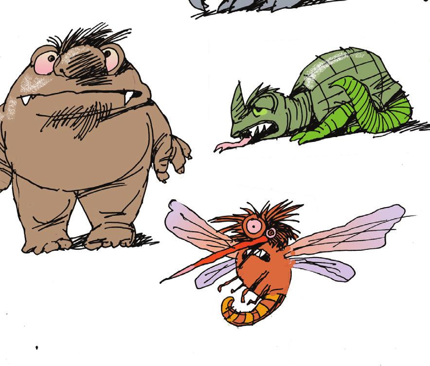
2 Contents 3 Welcome 4 Creating our brand 5 Our story / About the 6 Our story / Our character / Sample messaging 7 Our logo 8 Our logo 9 Our logo: Usage / Minimum size / Alternate versions 10 Our logo: Usage / Clearspace 11 Our logo: Usage / Backgrounds 12 Our colours 13 Our fonts 14 Our brand components 15 Our brand components / Header / The box system / Program Partners and Sponsors 16 Our brand components 17 Using our brand components / How the templates work Working with our templates Working with our templates / Flyer templates / Postcard templates / T-shirt templates Working with our templates / Print ad templates Working with our templates / Digital ad templates For more information Note: Our cover, the contents page and the divider pages feature illustrations created for the past 5 programs Illustrator: Josée Bisaillon 2
3 Welcome! is Canada s biggest, bilingual summer reading program for kids of all ages, all interests, and all abilities. This free program is co-created and delivered by over 2,000 public libraries across Canada. It celebrates Canadian authors, illustrators and stories. It s designed to inspire kids to explore the fun of reading their way the key to building a lifelong love of reading. Whether you re a long-time participant or new to the program, this primer will help you create the best kids summer reading experience ever! Our Brand: Reading fun for everyone With a great story and fresh look, s brand messaging, materials and look are all designed to encourage more kids to join the summer reading fun. Our brand is more than a logo. It s about the perceptions and experiences kids, their families and caregivers associate with the. We ve created a robust brand platform for the TD Summer Reading Club to help meet our program goals. Our brand ingredients include: OUR STORY Key messages about what the program is, who it s for, and how to participate. PROGRAM SUPPORT TOOLS Processes and tools to support national and local program delivery. IDENTITY SYSTEM The elements logo, colours, typefaces, and graphic devices that are designed to make the TD Summer Reading Club highly visible and memorable. VISUAL ASSETS, TEMPLATES AND GUIDELINES Easy-to-use resources to make delivering and promoting the program easier than ever. 3
4 Creating our brand We had great contributions in creating our brand platform. Our story and messages, program name and identity options were all tested and validated with input from: 20+ interviews with key partners, influencers and participating library staff 2 national surveys Over 900 responses total Participation from all TDSRC provinces and territories 3 National Committee meetings and updates 5+ Partners Group meetings and updates The principles that guided our work included: GROW ACCESS: Make the program easy to understand and recognize. SIMPLICITY MATTERS: Make the program easy to use for everyone, from kids and their families to librarians and program creators. LINK NATIONALLY, ACT LOCALLY: Create more continuity. DESIGN FOR FLEXIBILITY: Respect diverse needs and contexts. CO-CREATE: Encourage effective collaboration. BUILD CAPACITY: Share best practices across libraries. LEARN AND ADAPT: Evolve with the environment. 4
5 Our story Children and parents across the country experience the in many different ways, and they love it for many different reasons. The core value we deliver, though, and the way we hope to be understood and experienced is the same across the country. As you promote and deliver the program, here s a good reminder of how to think about, and talk about, the program. OUR AUDIENCES All kids across Canada, their families and caregivers WHAT TD SUMMER READING CLUB IS Canada s biggest, bilingual summer reading program for kids of all ages, all interests, and all abilities. WHY IT S DIFFERENT It s free! It celebrates Canadian authors, illustrators and stories. It s designed to inspire kids to explore the fun of reading their way the key to building a lifelong love of reading. Developed and delivered by over 2,000 public libraries across Canada, this flexible program can be a part of everyone s summer plans. HOW IT WORKS Kids (and their caregivers) can participate anytime, anywhere at local public libraries across Canada as well as at home, online, on the road or wherever their summer takes them. Participants explore recommended reads; track their own reading; connect and share with others across the country; read books online; join in activities; collect reading incentives; write jokes, stories and book reviews, and more. There are great resources for kids with print disabilities as well as for pre-readers and their families. 5
6 Our story OUR CHARACTER communications and experiences should reflect these brand character traits: Accessible Engaging Welcoming Fun Inclusive Inspiring Flexible SAMPLE MESSAGING Reading fun for kids, from Canada s public libraries Join the fun! Reading recommendations and free activities for all kids, all summer long! Participate anytime, anywhere at your public library, at home, online, or wherever your summer takes you. Program Partners Co-created and delivered by 2,000 public libraries across Canada, development of this national, bilingual program is led by Toronto Public Library in partnership with Library and Archives Canada. Sponsorship is generously provided by TD Bank Group. 6

7 Our logo 2014 Illustrator: John Martz 7
8 Our logo Note: all versions of the logo are available in French. The logo is the identifier for the. It symbolizes the fun of reading. The relationship between the elements should never change and never be taken apart. The four colours in the logo must always appear in the order shown. Whenever possible, the logo should appear in full colour, and always at full saturation and not lightened in any way. However, in some scenarios the greyscale or black versions can be used. These should only be in those rare situations where colour isn t available. Program and promotional materials feature the specific year under the logo. This can be omitted for materials not related to a particular year. Note: To view and download EPS, JPEG and PNG versions of the logos and to access the French versions, please visit: tdsummerreadingclub.ca/ staff/resources/images Colour logo with the year Colour logo without the year Greyscale logo with the year Black logo with the year White logo with the year 8
9 Our logo: usage Note: To view and download EPS, JPEG and PNG versions of the alternate logos and to access the French versions, please visit: tdsummerreadingclub.ca/ staff/resources/images Minimum Size This is the minimum size that the logo may appear. If it appears any smaller, its readability will be impaired. This measurement is based on the height of the symbol and is given in inches and pixels / 27 pixels 0.3 / approximately 22 pixels Minimum size with the year Minimum size without the year Alternate versions For situations where the logo has to be used at a size smaller than the minimum size or the space allocated for it is very horizontal, this optional version has been created. We have also created a simplified version that can be used as a social media icon. This version can be used where the allocated space is very horizontal or the symbol is smaller than the minimum size. This symbol-only version can be used as an icon for social media such as Twitter and Facebook or a favicon (the tiny symbol in a browser address bar). 9
10 Our logo: usage Clearspace Clearspace helps maintain the strength and clarity of the brand. The clearspace is identified by the solid grey keyline, the minimum space that must be free from any graphics that might interfere with the integrity of the logo and appear to be part of it. The clearspace zone around the logo is defined by the height of one of the books. The logo can still be placed over coloured backgrounds and illustrations but always ensure the logo is clearly visible (see the next page for more details.) Clear space is defined as the height of one of the books Note: If there is no year, then use the book at the bottom to establish the lower clearspace. 10


11 Our logo: usage Using the logo on coloured backgrounds The logo uses four different colours which means that it may not work on every background. It is best to avoid very dark backgrounds where the purple may get lost. Never alter the saturation of the colours on the logo to compensate for darker backgrounds. The rule of thumb is to make sure the logo and its colours are always clearly seen. Avoid dark backgrounds where any of the colours have low contrast. If there are no other options for the background then use the greyscale or white version as shown here. Avoid using any of the logo colours as the background. Note: On the previous page, the clearspace has been established to avoid any graphic elements being too near to our logo and becoming mistaken as being part of it. However, simple images or parts of images behind the logo are OK as long as the logo is clearly visible. The illustrations can go behind the logo as long as they are not too busy. The example shown above right shows an acceptable solution. It s fine to use tints of one of the colours as a background. 11
12 Our colours The colours used in the logo are shown below. These colours can be used on any of the marketing materials. The colours are defined as Pantone (ink), process (CMYK), digital (RGB) and web (HEX). Lighter shades (tints) of these colours can be used as backgrounds for text that is printed in black. However, for acceptable legibility, a tint value of 40% or 20% of the colour is recommended. These tints, each with black text on them, are shown on the lower row. Teal Special Ink: Pantone 326 CMYK: 81c 0m 39y 0k RGB: 0R 178G 169B HEX: 00B2A9 Pink Special Ink: Pantone 213 CMYK: 0c 92m 18y 0k RGB: 226R 23G 118B HEX: E21776 Blue Special Ink: Pantone 299 CMYK: 86c 8m 0y 0k RGB: 0R 161G 222B HEX: 00A1DE Purple Special Ink: Pantone 267 CMYK: 82c 97m 0y 0k RGB: 82R 35G 152B HEX: % 20% 40% 20% 40% 20% 40% 20% If black text is placed on one of the colours, tint values of 40% or 20% are required as shown here. Gradient A background gradient has been created for use on digital ads (see page 17) and on limited approved applications such as a pull-up banner where only text and the logo appear. The gradient starts with 34% cyan + 7% yellow blending to 0%. 12
13 Our fonts The font used in the logo and TDSRC materials is called Mikado. This font has a large family of weights and styles that will address all typographic needs. As a general guide, Light or Regular should be used for body text and heavier weights for headlines. A few of the style samples are shown below. Mikado Light Mikado Light Italic Mikado Regular Mikado Regular Italic Mikado Medium Mikado Medium Italic Mikado Bold Mikado Bold Italic Mikado Black Mikado Black Italic Mikado Ultra Mikado Ultra Italic If Mikado isn t available or Word/Powerpoint documents have to be shared with other people who don t have Mikado, use Verdana as a substitute. This font is pre-loaded on both PC and Macs. Verdana Regular Verdana Italic Verdana Bold Verdana Bold Italic 13


14 Our brand components 2012 Illustrator: Dušan Petričić 14


15 Our brand components Note: To view and download the brand component artwork and to access the French versions, please visit: tdsummerreadingclub.ca/ staff/resources/images Header The header is shown with and without the year. The Box System A system that uses text boxes has been developed as part of the design platform. These are useful when smaller headings or text need to be contained and not lost within an illustration. The colours that are tinted are shown at 40% with black text on top of them. Footer/Partner Recognition Developing, promoting, and delivering the TD Summer Reading Club is a collaborative effort, and we must ensure that our key partners and sponsor, as well as individual libraries, are recognized for their contributions. This footer has built-in flexibility so that libraries are able to add their own logo and URL when appropriate. The following pages detail specifically how that usage will work. The partner credits and logos should be used like this on all materials and in this position except where space is prohibitive to do so. Note: size and spacing of logos must be adhered to. Please refer to the next few pages for more specific guidance on using the footer and adding your own logo and URL. Primary combinations Secondary combinations Purple Light Blue Purple Pink Purple Light Pink Pink Purple This is our standard footer with the TDSRC URL. Purple Light Teal Pink Light Teal Purple Light Purple Pink Light Purple We are committed to ensuring our material is compliant with the latest accessibility standards. This applies to both print and online. The colour combinations above all meet WCAG 2.0 AA accessibility standards. If you are unsure about what is acceptable please refer to 15 This is an editable footer where you can add your own logo and URL. Here is our partner copy: Co-created and delivered by 2,000 public libraries across Canada, development of this national, bilingual program is led by Toronto Public Library in partnership with Library and Archives Canada. Sponsorship is generously provided by TD Bank Group. On pieces that are 8.5 x 11 inches or bigger, this copy should appear on the light teal box (see next page for an example).

16 Our brand components Note: The partner credits and logos (both English and French versions) are provided as ready-to-use images at: tdsummerreadingclub.ca/ staff/resources/images The spacing has been pre-determined and must not be altered. The basic visual elements for the design platform are the logo, the font, the colours and the text box treatment. In terms of text, there is a tagline and website address that should be used on all material, as well as recognition copy that should appear where there is room for it. On larger pieces, the partner credits and logos should appear in the lower right in the exact order and size relationship shown here. The rules for how to use all of these are quite simple. This is because the elements have to be flexible enough to work in an enormous number of sizes and media. They also have to work with a variety of illustration styles which are commissioned each year. The logo should be in the top left corner and use the clear space guideline to establish its position from an edge. This is the tagline and should be used adjacent to the logo, near the top or in a position where it is clear and easily read. Throughout these guidelines and on the templates you will see a few other accetable positions for the tagline for reference. The illustrations for each year would go in this area and can go behind the logo, the tagline and headlines as long as they all remain strong and legible. Messaging has to be sized and positioned appropriately in order to communicate effectively. As a general rule, use our purple for text. In some materials this is where your logo and URL can appear. Please refer to pages 13 and 15 for more explicit instructions. The text on the right is the recognition copy. It should be used at a legible size and can be on a light tinted box (see box system section) or on white. The partner credits and logos should be used like this on all materials and in this position except where space is prohibitive to do so. Note: size and spacing must be adhered to. The website address should be typeset in bold. 16

17 Our brand components Note: To view and download the templates and to access the French versions, please visit: tdsummerreadingclub.ca/ staff/resources/images Working with Our Brand With the introduction of our new brand, we are making marketing and promoting the TDSRC easier than ever. We have provided guidance on how to create new materials of your own, as well as how to work with the starter suite of templates that we are providing. We have introduced you to the core brand components, but there are just a few more tips that you ll find helpful when developing your own materials. These are shown to the right and on the pages that follow. All of the templates that have been developed are available for download under the Resources tab on the Staff TDSRC website. Some of the templates are ready-to-use image files, and others are fully customizable design files (InDesign). We know that you require materials to promote the program both during, and outside of, the campaign year. Some templates use only the brand graphics and will be appropriate to use year-round, whereas other templates include the include the year, annual theme and illustrations, and are most appropriate to use leading up to, and during, the TDSRC summer campaign. It will be helpful if we all use a common vocabulary, so there are just a few terms we would like to introduce. Standard templates that DO NOT reference any specific year. They will not have the year (e.g. 2016) locked up with the logo, and they will not include illustrations. Annual templates that DO reference the year and/or include illustrations. Fixed templates that DO NOT permit editing. These are ready-to-use image files that can be inserted directly into a publication or used online. Library logos and/or URLs CANNOT be added to these templates. Custom templates that DO permit editing. Certain elements, like the logo placement, header and footer will remain fixed in place, but these files permit adding custom content (headlines, messaging), library logos and/or library URL. 17 When creating materials or working with templates, the following principles should be followed: 1. If you are promoting the TDSRC with the current year s illustrations (Annual), use the logo that includes the year. 3. If you are promoting your own library, use the heading that includes the TDSRC URL, so that you may include your own URL and/or logo on the footer If you are promoting the TDSRC but not referencing any specific year and not using the current year s illustrations (Standard), use the logo that does not include the year. This is an editable footer where you can add your own logo and URL 4. In situations where a 3rd party partner logo (or multiple logos) will be added to materials, please ensure that it does not appear in the space designated for your library logo. It should not appear in-line with the logos for the Toronto Public Library, Library and Archives Canada and the TD Bank Group. In most situations, 3rd party partner logos should appear somewhere above the standard TDSRC footer.

18 March 2016 v1 Working with our templates 2013 Illustrator: Matt James 18


 These t-shirts are illustrative examples, but may be recreated")
 This postcard template should be used to promote the TDSRC at a local level")
19 Working with our templates Flyer Templates Flyer (Annual + Custom) This 8.5x11 flyer template should be used to promote in-branch programs and other TDSRC activities. It is provided as a Microsoft Word file. You may add your logo, URL, custom content and any 3rd party partner or sponsor logos. Postcard Templates Postcard (Standard + Custom) This postcard template should be used to promote the TDSRC at a national level outside of a campaign year. It is provided as an InDesign file. You may add custom messaging to the back of the postcard. Back T-shirt Templates T-shirt (Annual + Fixed) These t-shirts are illustrative examples, but may be recreated using the images provided on the staff website. To be used for outreach and promotion during the campaign year. Front Postcard (Annual + Custom) This postcard template should be used to promote the TDSRC at a local level during the campaign year. It is provided as an InDesign file. You may add your logo, URL, illustrations and custom messaging. Back T-shirt (Standard + Fixed) To be used for outreach and promotion outside of the campaign year. 19 Front
 Standard + Fixed These ½ page and ¼ page print ad templates should be used to advertise the TDSRC at a national level outside of the campaign year.")


20 Working with our templates Print Ad Templates These ads can be used in publications and other print materials. (All shown here at a reduced size.) Standard + Fixed These ½ page and ¼ page print ad templates should be used to advertise the TDSRC at a national level outside of the campaign year. They cannot be edited and are provided as ready-to-use, camera-ready image files. Available sizes: ½ page, ¼ page. Annual + Custom These full-page, ½ page and ¼ page print ad templates should be used to advertise the TDSRC at a local level during the campaign year. They are provided as InDesign files. You may add your logo, URL, custom messaging, illustrations and any 3rd party partner or sponsor logos. Available sizes: full page, ½ page, ¼ page. Full page 8.5 x 11 inches ½ page 8.5 x 5.5 inches Standard + Custom These ½ page and ¼ page print ad templates should be used to advertise the TDSRC at a local level outside of the campaign year. They are provided as InDesign files. You may add your logo, URL and custom messaging. Available sizes: ½ page, ¼ page. ¼ page 4.25 x 5.5 inches 20
21 Working with our templates Digital Ad Templates These ads can be used on websites and other digital properties to promote the TDSRC. (All shown here at a reduced size.) Standard + Fixed These banner ad templates should be used to advertise the TDSRC at a national level, outside of the TDSRC campaign year. They cannot be edited and are provided as ready-to-use, camera-ready images. They should link to the TDSRC website. Available sizes: Leaderboard, Skyscraper, Rectangle. Leaderboard 728 x 90 pixels Standard + Custom These banner ads should be used to advertise the TDSRC at a local level, outside of the TDSRC campaign year. You can add your own message and logo, and link to your website. Available sizes: Leaderboard, Skyscraper, Rectangle. Rectangle 300 x 250 pixels Skyscraper 160 x 600 pixels Annual + Fixed These banner ad templates should be used to advertise the TDSRC at a national level, during the TDSRC campaign year. They cannot be edited and are provided as ready-to-use, cameraready image files. They should link to the TDSRC website. Available sizes: Leaderboard, Skyscraper, Rectangle. Annual + Custom These banner ad templates should be used to advertise the TDSRC at a local level, during the TDSRC campaign year. You can add your own message and logo, and link to your website. Available sizes: Leaderboard, Skyscraper, Rectangle. 21
22 Jan 2019 v3 For more information, contact: Jessica Roy Manager
LOGO & BRAND STANDARDS GUIDE
 LOGO & BRAND STANDARDS GUIDE INTRODUCTION The SparkPost Brand Standards Guide provides key information needed to accurately and consistently produce external and internal documents and communications.
Branding Policy 2015
 Branding Policy November 2015 Archery NZ Inc. Style Guide Table of Contents Use of the Archery NZ Inc. Brand...4 The Archery NZ Inc. Logo - General Use...5 The Archery NZ Inc. Logo - Reverse Use...6 The
IDENTITY SYSTEM GUIDELINES
 IDENTITY SYSTEM GUIDELINES Whether you re starting out, moving up or starting again WE RE READY WHEN YOU ARE August 2014. Version 1.5 Contents 02 CONTENTS 03 Our brand 04 Our Identity 04 Our logo 05 Logo
01: The Digital Explorer Identity
 Brand Guidelines Brand Guidelines 01: The Digital Explorer Identity 02: Use of the Identity 03: Color Palette 04: Logo Colour Usage 05: Use of the Digital Graphic 06: Typeface 07: File Formats 08: Sample
BRANDING AND STYLE GUIDE MAY 2017
 BRANDING AND STYLE GUIDE MAY 2017 INTRODUCTION This branding and style guide is intended to provide staff with tools they need to represent the CAPSLO brand consistently across all types of visual communication.
FAMILY RESOURCE NETWORK BRANDING STYLE GUIDE FIRST THINGS FIRST FAMILY RESOURCE NETWORK MARCH 2014 VERSION 1.2
 BRANDING STYLE GUIDE FIRST THINGS FIRST MARCH 2014 VERSION 1.2 CONTENTS Introduction 3 Logo Files 4 Clear Space / Logo Sizing 5 Co-Branding 6 Things to Avoid 7 Color Palette 8 Branding Approval 9 2 INTRODUCTION
Brand Guidelines HOAR PROGRAM MANAGEMENT. All rights reserved. Copyright 2014.
 Brand Guidelines 2014 0.1 Table of Contents Table of Contents 0.1 Contact Information Hoar Program Management Andi Sims Marketing Director asims@ (205) 423-2395 (office) (205) 213-7955 (cell) 1.0 Introduction
Apple News Identity Guidelines
 Apple News Identity Guidelines The following guidelines include information for using Apple News assets. Use the Apple News badges, text lockups, or icon whenever you promote content on Apple News, whether
UNITED WAY FOR GREATER AUSTIN PARTNER BRAND GUIDELINES
 Version 1.0 UNITED WAY FOR GREATER AUSTIN PARTNER BRAND GUIDELINES LETTER FROM THE PRESIDENT Dear Partner, As an important business partner for, we want to be sure you are equipped with all the necessary
UN Women. Branding Guidelines and Identity Standards. First Edition 25 February 2011
 UN Women Branding Guidelines and Identity Standards First Edition 25 February 2011 Contents 1. About the UN Women Logo 2. UN Women Logo with Full-Name Tagline 3. UN Women Logo with Full-Name Tagline, Small
Workplace Safety Certificate of Recognition
 Brand Standards Guide TABLE OF CONTENTS Logo Guidelines...... 1 Logo and Safety Seal Rationale...... 2 Logo and Wordmark...... 3 Brand Colours......4 Brand Fonts... 6 Logo Space Requirements...... 7. Positioning
GCU Students Association Brand Guidelines
 GCU Students Association Brand Guidelines December 2014 Our Identity It is essential for our organisation to deliver its corporate identity in a coherent manner at all times. The brand is the focal point
Branding Guidelines - gather, grow, go
 Branding Guidelines - gather, grow, go Heartland Community Church, June 2008 Brand Attributes 1 2 The Heartland gather, grow, go logos are made up of 2 different elements 1. Symbol - Each g logo has a
THE BRAND BOOK. LAZ Parking Branding Guidelines V2.02
 THE BRAND BOOK LAZ Parking Branding Guidelines V2.02 TABLE OF CONTENTS Introduction... 03 LAZ Parking Corporate Logo... 05 Design... 06 Colors... 07 Monochrome... 08 Clear Space... 09 Minimum Size... 10
LOGO USE GUIDELINES BRAND GUIDELINES PUBLISHED ON FEBRUARY 17,
 LOGO USE GUIDELINES BRAND GUIDELINES PUBLISHED ON FEBRUARY 17, 2014 1 LOGO USE GUIDELINES LOGO USAGE GUIDELINES 13 LOGO USAGE GUIDELINES The Gardner-Webb logo is the centerpiece of the University's visual
1. Introduction GRAPHIC STANDARDS
 1. Introduction GRAPHIC STANDARDS This Graphic Standards Manual covers the basic guidelines for Northern Credit Union s new identity. Graphic standards began in the early part of the last century to communicate
The Fresno EOC logo includes the box symbol and wordmarks
 Brand Guidelines box symbol wordmarks The Fresno EOC logo includes the box symbol and wordmarks Introduction The foundation of our graphic identity system, the Fresno EOC logo, represents the most concise
Odin BRAND GUIDELINES
 Odin BRAND GUIDELINES Updated January 2016 Table of Contents 2 3 3 3 4 4 5 5 5 6 6 6 7 7 8 8 8 8 9 9 9 10 Odin Brand Guidelines The Odin Logo Clear Space Minimum Sizes Improper Use of Logo Improper Examples
Brand Identity Standards
 Brand Identity Standards A strong organization identity is an important element in building a positive, globally recognized and respected brand. This identity standards guide will be your key resource
B R A N D GUIDELINES
 BRAND GUIDELINES You never get a second chance to make a first impression. 01 02 03 INTRODUCTION About the City of New Bedford s brand 5 THE LOGO The Logo and usage 7 Color & variations 7 Clearspace &
Graphic Standards Guide. September 2014 PREPARED BY:
 Graphic Standards Guide September 2014 PREPARED BY: Graphic Standards Guide Visual communications play an important role in how an organization is perceived. An organization s promotional materials, stationery,
GÉANT CORPORATE IDENTITY GUIDELINES FOR USE. connect communicate collaborate
 GÉANT CORPORATE IDENTITY GUIDELINES FOR USE connect communicate collaborate THE LOGO The GÉANT logo is the core element within the brand. From printed brochures and datasheets through PowerPoint presentations
DESIGN GUIDELINES. Davis Technical College. DAVIS TECHNICAL COLLEGE 550 East 300 South Kaysville, UT Phone: Web: davistech.
 DESIGN GUIDELINES Davis Technical College DAVIS TECHNICAL COLLEGE 550 East 300 South Kaysville, UT 84037 Phone: 801.593.2500 Web: davistech.edu About this brand This identity guideline is a tool designed
Brand Identity Guide. September 2017
 Brand Identity Guide September 2017 Welcome At Canada Drives our goal is to be the number one consumer lending company in Canada by making financing simple and accessible to every Canadian while maintaining
Brand Guidelines. Have questions or need help? Contact us at
 Brand Guidelines Have questions or need help? Contact us at hello@startupcan.ca v 2.0 November 2018 Table of Contents Entrepreneurship Empowers Everyone In Writing...3 Logo...4 Alternate Versions...5 Colours...6
Raspberry Pi. Visual identity guidelines. Version
 Raspberry Pi Visual identity guidelines Version 3.1 2018-02-20 Contents... Logo 1... Minimum height 2... Spacing 2... Restrictions 3 Colour... 4... Core palette 4... Alternative palette 5... Decorative
1. The Logo. 2. Other Design Considerations. Overview Logo Components Logo Colors and File Names... 5
 Brand Identity Guidelines July 2017 1. The Logo Overview.... 3 Logo Components... 4 Logo Colors and File Names... 5 NECC Abu Dhabi Logo Colors and File Names... 6 Minimum Size.... 7 Clear Space.... 8 Incorrect
FLEET LOGO USAGE AND STANDARDS INNOVA BRANDING STANDARDS 2015 GUIDE
 FLEET LOGO USAGE AND STANDARDS INNOVA BRANDING STANDARDS 2015 GUIDE INNOVA BRANDING STANDARDS 2015 GUIDE 2 TABLE OF CONTENTS The Innova Brand 3 Branding Elements Logo Colors Typography 4 8 10 INNOVA BRANDING
Logo and Visual Standards Guide
 OUR IDENTITY This prescribes how the district s name, logo and logo marks are to be used. San Benito Schools recognizes that the district s name, logo and logo marks, when used as prescribed, are an invaluable
Our identity. Primary logo
 OUR BRAND BOOK. Our identity. Our identity is more than just our logo. It incorporates our fonts, colors, and photography. When they re used all together, we create our own unique look and feel that reflects
20 _. 14 _ Visual Identity. 03 _ Brand Message. 24 _ Brand Consistency 04 _. 10 _ Color Palette. 02 _ Our Mission. Our Logo. Our.
 brand guidelines 02 Our Mission 03 Brand Message 04 Our Logo 06 Construction & Clearspace 07 Using Our Logo 08 Logo Don ts 09 On Photographs 10 Color Palette 12 Primary Colors 13 Complimentary Colors 14
Introduction. ThinManager - A Rockwell Automation Technology
 1220 Old Alpharetta Road, Suite 390 Alpharetta, Georgia 30005 www.thinmanager.com info@thinmanager.com OFFICE 678-990-0945 Introduction... 1 Logo... 2 Clear space and minimum size... 3 Primary color palette...
BRAND & LOGO GUIDELINES SOCKET MOBILE. - Logos - Social Media - Web
 BRAND & LOGO GUIDELINES - Logos - Social Media - Web SIMPLICITY IS THE ULTIMATE FORM OF SOPHISTICATION. 2 BRAND GUIDELINES THIS IS A GUIDE TO THE BASIC ELEMENTS THAT MAKE UP OUR BRAND. IT WILL LET YOU
IDENTITIES ARE THE BEGINNING OF EVERYTHING. THEY ARE HOW SOMETHING IS RECOGNIZED AND UNDERSTOOD. WHAT COULD BE BETTER THAN THAT?
 BRAND GUIDELINES IDENTITIES ARE THE BEGINNING OF EVERYTHING. THEY ARE HOW SOMETHING IS RECOGNIZED AND UNDERSTOOD. WHAT COULD BE BETTER THAN THAT? Paula Scher Paula Scher is an American graphic designer,
Brand Standards Guide. DiscoveryKidslv.org
 Brand Standards Guide Brand Standards Guide DiscoveryKidslv.org CONTENT Brand Standards: Why Do We Need Them? (Introduction)...1 Brand Personality...2 The Logo The New Logo...3 Logo Colors...4 Approved
Introduction A global icon needs an iconic logo. Fashion has evolved since 1969, when Gap opened its first store. Our logo has changed with the
 Introduction A global icon needs an iconic logo. Fashion has evolved since 1969, when Gap opened its first store. Our logo has changed with the times, too. One thing that hasn t changed is our mission
Brand Guidelines. version
 Brand Guidelines version 2017.1 Primary Logo The OPSWAT logo is a universal signature spanning all of our communications. Because it is such a recognizable and highly visible asset, it s important that
ACS Brand Guidelines Logo Use. September 2014
 ACS Brand Guidelines Logo Use September 2014 1.0 Logo The ACS logo has been uniquely designed to reflect both the history of the ACS as the guardians of the ICT profession and its commitment to inspire
Corporate identity guidelines. Use of the Corporate Mark and colours
 Corporate identity guidelines Use of the Corporate Mark and colours 1 1. Introduction and background This guide is intended for anyone producing communications using the Ordnance Survey Corporate Mark
Visual Identity Guidelines
 Visual Identity Guidelines Contents 1.00 Introduction 2.00 Corporate Master Brand 2.01 Corporate Master Brand 2.03 Corporate Master Brand Logo Placement 2.04 Master Brand with Tagline Horizontal Format
Scottish Mountain Rescue 2018 Brand Guide
 Scottish Mountain Rescue 2018 Brand Guide A route map for branding V6 - October 2018 Contents The purpose of this document is to provide guidance for the use of the Scottish Mountain Rescue (SMR) logo
Fun for everyone. Share. Live. Go.
 Fun for everyone. Share. Live. Go. Index Please note this is an interactive (so clickable) guideline. Visual identity Logo Visual elements Imagery Visual identity Visual identity Logo Visual elements Imagery
USE OF THIS GUIDE. Sally Mapley England Hockey Player Pathway Manager
 BRAND GUIDELINES USE OF THIS GUIDE The England Hockey Player Pathway uses a wide range of communications to interact with its stakeholder and users. As a Volunteer, Administrator or Coach, every piece
STEP IN. STAND UP. Campaign Guidelines
 STEP IN. STAND UP. Campaign Guidelines March 2017 PURPOSE PURPOSE OF THESE GUIDELINES With the launch of the new marketing campaign, it is important to maintain the integrity of communications across all
FileMaker Corporate Style Guide
 ilemaker Corporate Style Guide General guidelines for logo usage and corporate identity 5201 Patrick Henry Drive Santa Clara, CA 95054, USA Tel: (408) 987.7000 Welcome Our identity is one of our most valuable
2018 Brand Guidelines
 2018 Brand Guidelines Logo Final Logo Our logo mark is the benchmark of our brand and one of our most valuable assets. Logo Versions Full Version - Linear A. Full Color The preferred way to use the Kinesics
Graphic Standards Guide
 Graphic Standards Guide Welcome to the. We have developed these standards to assist you in creating consistent and correct usage of the logo for both internal and external communications. Our goal is to
Delivering Efficiency to Healthcare. Brand Standards Guide
 Delivering Efficiency to Healthcare Brand Standards Guide 2 Delivering Efficiency to Healthcare THE NDC Difference: OUR BRAND PROMISE NDC will enable our supply chain partners to deliver efficiency to
STYLE AND USAGE GUIDELINES
 STYLE AND USAGE GUIDELINES Meet. Play. Celebrate. Syracuse Logo OFFICIAL LOGO FOR The Oncenter logo must always be presented as above, with the icon placed at left and with equidistant spacing between
EBW 2016 BRAND IDENTITY GUIDE V
 EBW 2016 BRAND IDENTITY GUIDE V10.02.16 TABLE OF CONTENTS Introduction... Page 01 Logo Usage... Page 02 Typefaces... Page 06 Color Usage... Page 07 Email Signature... Page 08 Social Media Templates...
BRAND. To access logos in various formats, please visit northforge.ca/media
 GRAPHIC STANDARDS BRAND North Forge Technology Exchange accelerates innovation and commercialization, promotes entrepreneurship and stimulates access to capital through mentorship, training, events and
Contents. 3 About These Guidelines. 4 Why is a Brand Important? 5 Overview. 6 Resources. 7 Logo/Signature. 8 Clear Space. 9 Color Variations
 Brand Guidelines Contents 3 About These Guidelines 4 Why is a Brand Important? 5 Overview 6 Resources 7 Logo/Signature 8 Clear Space 9 Color Variations 10 Logo Misuse Examples 11 Background Control 12
ONE K CREATIVE. tools for social impact storytelling: CREATING A CONSISTENT BRand
 ONE K CREATIVE tools for social impact storytelling: CREATING A CONSISTENT BRand key elements to define for brand consistency DEFINING THE BASIC ELEMENTS OF YOUR BRAND ALLOWS YOUR TEAM - STAFF, BOARD MEMBERS,
Part 01: Logo, Typography & Colours. Brand Identity Guidelines 2015
 Part 01: Logo, Typography & Colours Brand Identity Guidelines 2015 At a glance Logo Typography ITC Caslon No. 224 Univers Georgia Arial The core elements of the Arts Council identity makes our brand instantly
INTRODUCTION. These guidelines consists of colour palettes, typographic style and graphic elements which combine to create a distinctive framework.
 BRAND GUIDELINES INTRODUCTION These guidelines explain how to use the elements of the identity correctly and with confidence. They have been designed to ensure consistency within whilst developing strong,
Black Country Brand Guidelines version 1.0
 Black Country 2017 version 1.0 Contents Fleximark 3 Fleximark - exclusion zone & size 4 Fleximark - colour breakdown 5 Fleximark - mono version 6 Corporate Typeface 7 Fleximark - division variants 8 Page
Visual Style Guide. April 2016
 Visual Style Guide April 2016 Page 2 Contents Introduction to the Logo 3 Safe Area and Size 4 Incorrect Usage 5 Color Palette 6 Typography 7 Tone and Style of Photography 9 Print Examples 10 Screen Examples
Branding Guidelines. April
 Branding Guidelines April 2015 HOW WE CO-ORDINATE OUR MES SAGE Contents SECTION 1 Introducing the Table Tennis England brand 1.1 Welcome to our brand 1.2 Our vision, values and strategy 1.3 Tone of voice
INTRODUCTION. Please respect the integrity of the brand and the careful thought and craft that has gone into it.
 BRAND STANDARDS MAY 2017 INTRODUCTION The Intelligent Office brand is more than a name. It is a complete system of color, typography and artwork that reflects the true spirit of the organization. Using
Brand Standards & Style Guide
 Brand Standards & Style Guide Table of Contents 3 About This Guide 4 Color Palette Specifications 5 Logo - Correct Usage 7 Logo - Surrounding Space 8 Logo - Size Restrictions 9 Logo - Incorrect Usage 10
STYLE GUIDE. CONTENTS: Logo Usage...2 Logo Placement...4 Color Palette...5 Typography...6 Additional Logos...7 Logo Reference Library...
 STYLE GUIDE The Mended Hearts and Mended Little Hearts style guide is a tool to ensure that all communications materials, both internal and external, adhere to a cohesive style and brand standard. The
Our Brand THIS BOOK SERVES AS A GUIDE TO THE BASIC ELEMENTS THAT MAKE UP LERO. IT WILL HELP YOU TO GET TO KNOW US BETTER.
 Brand Assets & Guidelines 2015 Our Brand THIS BOOK SERVES AS A GUIDE TO THE BASIC ELEMENTS THAT MAKE UP LERO. IT WILL HELP YOU TO GET TO KNOW US BETTER. These guidelines have been designed to show our
Content. Logo Logo Variations and Usage Logo Spacing Incorrect Logo Usage Typography Colors Tagline...
 Style Guide Content Logo........................................................................................ 1 Logo Variations and Usage.....................................................................
Our brand guidelines. Our photography
 1 brand guidelines photography Hello. We re the Motor Ombudsman. Please give this document your full attention. It should help you get to know more about us and our corporate guidelines. 2 This section
V 1.0. This is Bell. A guide to using the Bell identity.
 V 1.0 This is Bell. A guide to using the Bell identity. 1 Table of Contents TABLE OF CONTENTS 1 2 3 4 5 6 7 The Logo - page 5 Colours - page 10 Typography - page 13 Iconography - page 17 Brand Add-ons
Logo & Brand Identity Guidelines. Media Sonar Technologies
 Technologies Logo & Brand Identity Guidelines 0 Contents 1.0 Logo Specifics 2.0 Typeface Details 3.0 Icons 4.0 Colour Specifications 5.0 Logo Styles (lock-ups) 5.1 Logo Best Practices Logo Construction
Ferrysavers Brand Guidelines
 2 Contents 3 4 5 6 7 8 9 10 11 12 13 Introduction The Ferrysavers Logo Protecting Our Master Logo Incorrect Master Logo Application Ferrysavers Family Logos Typography Print Typography Digital Typography
CALM BRAND BIBLE / CONTENTS
 BRAND BIBLE 1 03 / LOGO & USAGE 11 / COLOUR PALETTE 23 / LOCKUPS 27 / PLACING THE LOGO ON A BACKGROUND 31 / TYPEFACE & TYPOGRAPHY 39 / WRITING CONSIDERATIONS 41 / APPLICATIONS CALM BRAND BIBLE / CONTENTS
STACKS BRAND GUIDELINES
 The New Library Experience STACKS BRAND GUIDELINES v 3.0 STACKS BRANDING The Stacks brand is more than just a logo. It is a collection of our ideas, our designs and our goals it is our identity. This guide
Identity Standards Guide A guide to consistent use of brand elements
 08.01.04 A guide to consistent use of brand elements Contents 1 Introduction A cohesive identity system increases and strengthens our visibility to all audiences customers, partners, and prospects. Applying
DESIGN AND BRAND GUIDELINES
 2N TELEKOMUNIKACE a.s. DESIGN AND BRAND GUIDELINES CONTACT Address Phone & Fax Online 2N TELEKOMUNIKACE a.s. Modřanská 621/72 143 01 Prague 4 Czech Republic Phone: (+420) 225 271 111 Fax: (+420) 225 271
GESTALT COMMUNITY SCHOOLS BRANDING AND DESIGN GUIDELINES
 GESTALT COMMUNITY SCHOOLS BRANDING AND DESIGN GUIDELINES BRAND GUIDELINE V.2 2016 WELCOME IT S THE GESTALT COMMUNITY SCHOOLS BRANDING GUIDE TO THE GALAXY This guideline will help you determine the best
Somerston Estate Identity Guidelines
 Somerston Estate Identity Guidelines MARCH 2016 Somerston Estate Introduction Your brand identity is an extremely valuable and important asset. Its use, distribution, and implementation must be carefully
Visual style guidance
 Visual style guidance H 36 H Introduction to the Logo Visual style guidance outlines how to use the program logo, color palette, typography and imagery in print and electronic communication products. The
AHSN North East & North Cumbria. Identity Guidelines
 AHSN North East & North Cumbria Version 2.1 1 Identity Guidelines Guidelines / Contents Version 2.1 2 Page No. 3 4 5 6 7 8 9-13 Contents Introduction Logo Colours Usage & Positioning What Not to Do Typefaces
Corporate Identity At-A-Glance. Abbreviated Version
 Corporate Identity At-A-Glance Abbreviated Version Corporate Signature The Corporate Signature is the key component of s visual identity. It s the primary expression that graphically represents across
BRAND GUIDELINES XL PT Brand XL Guidelines Axiata. All rights reserved
 BRAND GUIDELINES 1 2017 XL PT Brand XL Guidelines Axiata. All rights reserved Brandmark Brandmark Consistent and scalable Whilst optimising the previous brandmark s meaning and recognition, our new brandmark
Mobil 1 TM 40th Anniversary
 01 Introduction 40 years young Throughout this document are guidelines for the application of the logo, which has been designed for use in print, digital, social media and on merchandise. This logo has
April 2017 STYLE GUIDE
 April 2017 STYLE GUIDE WHY IS VISUAL IDENTITY IMPORTANT? The Occidental College logo is a symbol of the Oxy community and our set of shared values of excellence, equity, access and service. The logo serves
The MMA master logo. The MMA master logo consists of two elements: the MMA graphic and the company name.
 Logo guidelines The MMA master logo The MMA master logo consists of two elements: the MMA graphic and the company name. The MMA graphic Each of these elements have been specially spaced and positioned,
Graphic Standards Guide
 Graphic Standards Guide Atlas Tissue 2017 CONTENTS Introduction 3 Identity Overview 4 Logo 5 - Logo Configuration 5 - Sizing Requirements 6 - Logo Colors 7 Color 8 Typography 9 ATLAS TISSUE GRAPHIC STANDARDS
+ + = LOGO RATIONALE. Connective Negative space Teamwork Sharing. Collaborative Innovative. Nectar The perfect mix to enable pollination
 STYLE GUIDE LOGO RATIONALE 01 + + = Connective Negative space Teamwork Sharing Collaborative Innovative Nectar The perfect mix to enable pollination LOGO GUIDELINES NECTAR 02 PRIMARY LOGO ON WHITE NECTAR_LOGO_HOR_ONWHITE_CMYK
L O G O S T A N D A R D S
 LOGO STANDARDS Apex Logo Standards Logo + Colors...-6 Logo Family...7-17 Logo Usage...18-19 Typefaces... 20 Logo Files: Applications & Use...21 Prepared by: 27 CENTRAL PARK BLVD. STE 204 DENVER, CO 8028
BRAND GUIDELINES Last modified: April 9, 2018
 BRAND GUIDELINES CONTENTS Logos Logos on Dark and Light Secondary Logos Icon and Social Media Implementation Guidelines How not to use the logo Typography Typeface and Hierarchy Promotional Materials Suggestions
HSE DIVISIONS HOSPITAL GROUPS COMMUNITY HEALTH ORGANISATIONS HEALTH CAMPAIGNS #ourhealthservice
 BRAND HANDBOOK FOR HEALTH SERVICE COMMUNICATIONS TEAMS HSE DIVISIONS HOSPITAL GROUPS COMMUNITY HEALTH ORGANISATIONS HEALTH CAMPAIGNS #ourhealthservice WHY ARE THESE GUIDELINES IMPORTANT? 55% of the public
Our Look Book. BRAND GUIDELINES VERSION 1.0
 Our Look Book. BRAND GUIDELINES VERSION 1.0 SIMPLICITY IS THE ULTIMATE FORM OF SOPHISTICATION. Leonardo da Vinci 2 BRAND GUIDELINES THIS IS A GUIDE TO THE BASIC ELEMENTS THAT MAKE UP OUR BRAND. IT WILL
THE ORIGINAL HOME IMPROVEMENT SPECIALISTS SM STANDARDS OF USE GUIDELINES
 THE ORIGINAL HOME IMPROVEMENT SPECIALISTS SM STANDARDS OF USE GUIDELINES LOGO INTRODUCTION The Handyman Connection logo is a marketing communication property owned by Handyman Connection. To strengthen
VIVO Identity Guidelines
 VIVO Identity Guidelines May 2010 Version 1.0 00 Contents 01 02 03 04 05 06 Introduction About VIVO VIVO Identity Elements Space Size Color System (web and print) Identity Colors Primary Color Palette
CIMA Development Partner logo guidelines
 CIMA Development Partner logo guidelines A guide to using the CIMA Development Partner logo 1. About the brand CIMA is recognised across the world as the authority on management accounting. The CIMA brand
BRAND GUIDE L I N E S
 BRAND GUIDE LINES NETWORK OF COMMUNITY MINISTRIES SIMPLICITY IS THE ULTIMATE FORM OF SOPHISTICATION. Leonardo da Vinci 2 BRAND GUIDELINES THIS IS A GUIDE TO THE BASIC ELEMENTS THAT MAKE UP OUR BRAND. IT
AFerry Brand Guidelines
 2 Contents Introduction 3 The AFerry Logo 4 Protecting Our Master Logo 5 Incorrect Master Logo Application 6 AFerry Family Logos 7 Typography 8 Print Typography 9 Digital Typography 10 Colour 11 Responsive
GRAPHIC S TANDARDS M ANUAL
 GRAPHIC S TANDARDS M ANUAL 9 x12 Folder PENN-HARRIS-MADISON GRAPHIC STANDARDS THE BRAND A BRAND IS MORE THAN JUST A LOGO. It is a consistent look. It is a consistent feel. It is a consistent voice. Founded
Canadian Chiropractic. Association. Visual Identity and Logo Guidelines. Canadian Chiropractic Association. Association. chiropratique canadienne
 chiropratique canadienne Canadian Chiropractic TM/MC Canadian Chiropractic Visual Identity and Logo Guidelines Last updated: May 20th, 2014 Table of Contents Introduction 3 The CCA logo 4 Acceptable Uses
UK NATIONAL QUANTUM TECHNOLOGIES PROGRAMME. Identity Guidelines
 Identity Guidelines Contents Background 02 Logo 04 Primary version 05 Other versions 06 Protection area 07 Sizing and positioning 08 Logo in use 09 Use with other logos 10 Colour palette 12 Typeface 13
Capital Region ESD 113 Logo and Design Standards. My Partner for Learning Solutions
 Logo and Design Standards My Partner for Learning Solutions Logo and Design Standards The logo was developed and approved by a committee of employees, the board of directors and school district superintendents.
This document describes the basic elements of our identity system and provides guidelines for their correct use.
 STYLE GUIDE CONTENT 3 INTRODUCTION 4 APPROVED PRIMARY LOGO 5 USE OF THE PRIMARY LOGO 10 APPROVED BRAND LOGOS 11 CLEAR SPACE 13 INCORRECT LOGO USAGE 14 FONTS 15 WEBSITE 16 SUMMARY Welcome to the EPIC style
corporate identity guidelines
 Seilevel Corporate Identity Guidelines Introduction 1 Preferred Signature and Components Logo Space and Minimum Size Signature Variations Color Palette Typography Signature Misuse 2 3 4 5 6 7 corporate
Graphic Standards Manual
 Graphic Standards Manual Welcome Welcome to the official University of Arkansas - Fort Smith Graphic Standards Manual. The members of Marketing & Communications have created this document with you in mind.
2 December NCFE Corporate Guidelines. Introduction
 Introduction Introduction How we connect with people through our brand is essential to who we are, and plays a big part in the NCFE experience. We created this document (which is simpler than it looks)
Dublin Castle, Co. Dublin DUBLIN BRAND IDENTITY QUICK GUIDE
 B R AN D I D ENTIT Y ES S ENTIALS G U I D E Dublin Castle, Co. Dublin 1 DUBLIN BRAND IDENTITY QUICK GUIDE WELCOME This guide provides you with a quick overview of the Dublin brand identity and its relevant