Jenson. Nicolas Jenson ( ) It is said that he was an apprentice to Gutenberg but there is no verifiable evidence to support this.
|
|
|
- Tracy Richard
- 6 years ago
- Views:
Transcription


1 Jenson Nicolas Jenson ( ) French engraver, printing pioneer and type designer Credited with creating the first roman typefaces. In 1470 he opened a printing shop in Venice. It is said that he was an apprentice to Gutenberg but there is no verifiable evidence to support this. roman style The design of Jenson s typefaces marked the beginning of a 100-year shift away from the gothic blackletter typefaces to a more humanistic, or roman, style which would be used throughout Europe. 100 year shift

2 An example of Jenson s printed text
3 Garamond The word Garamond can be used both as a noun or as an adjective. Garmond (noun) is the name of a typeface designed by Claude Garamond in the mid-1500s. Garamond (adjective) is the name given to a group of old-style serif typefaces named after the punch-cutter Claude Garamond (c ) Claude Garamond was a French publisher from Paris. He was one of the leading type designers of his time, and is credited with the introduction of the apostrophe, the accent and the cedilla to the French language.
4 Adobe Garamond by Robert Slimbach I Love Typography Sabon by Jan Tschichold I Love Typography Granjon by George W. Jones
5 Garamond s letterforms convey a sense of fluidity and consistency. Some unique characteristics in his letters are: The small bowl of the a The small eye of the e Long extenders and top serifs have a downward slope. downward slope bowl eye a e Adobe Garamond M a e Bodoni Book M

6 Garamond is considered to be among the most legible and readable serif typefaces for use in print applications. It has also been noted to be one of the most eco-friendly major fonts when it comes to ink usage.


7 1541 Claude Garamond Claude Garamond was commissioned to create a Greek typeface for the French King Francis I to be used in a series of books by Robert Estienne. Garamond based his type on the handwriting of Angelo Vergecio, the King s Librarian at Fontainbleau as well as that of his ten-year-old pupil, Henri Estienne. According to Arthur Tilley, the resulting books are, among the most finished specimens of typography that exist. Shortly thereafter Garamond created the Roman types for which he would be remembered and his influence rapidly spread throughout and beyond France during the 1540s. Fontainbleau


8 1561 RIP Claude Garamond Christophe Plantin Claude Garamond dies this year. His punches and matrices were sold to Christophe Plantin, in Antwerp, which enabled the Garamond fonts to be used on many printers throughout Europe.

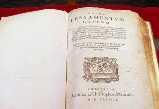
9 Antwerp, Belgium

10 Museum Plantin-Moretus Antwerp, Belgium *The only complete set of the original Garamond punches and matrices is at the Plantin-Moretus Museum in Antwerp, Belgium.


11 1621 Jean Jannon French printer Jean Jannon ( ) created a type specimen with very similar attributes to Garamond s typefaces. Jannon s letterforms were more asymmetrical and had a slightly different slope and axis.


12 1825 Jannon s typefaces were discovered at the National Printing Office of France. However, they were wrongly attributed to Claude Garamond! National Printing Office of France


13 1900 A revival of the Garamond type based on the work of Jean Jannon was introduced at the Paris World s Fair as the, Original Garamond. Paris World s Fair


14 abcd efghijk 1919 lmno Thomas Maitland Cleland pqrstu vwxyz Garamond 3 Thomas Maitland Cleland and Morris Fuller Benton produced the first 20th-century commercial Garamond, based on Jannon s design, called Garamond #3. Morris Fuller Benton

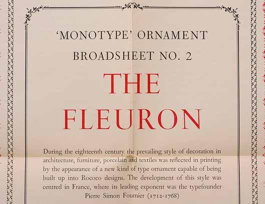
15 1927 Jannon s Garamond typefaces were correctly credited to him on the basis of scholarly research by Beatrice Warde.* Warde revealed that many of the revivals said to be based on Claude Garamond s designs were originally designed by Jean Jannon, despite this, the name, Garamond, stuck. We may hope now to become familiar, in various forms, with a revival of one of the finest old-styles ever cut: that of Claude Garamond Beatrice Warde *As a young woman Beatrice Warde spent time investigating the origins of the Garamond design of type. Realizing they had been wrongly attributed to Jean Jannon she published her results in the typography journal, The Fleuron, under the pen-name Paul Beaujon. When asked, Beatrice Warde described Paul Beaujon as a man of long grey beard, four grandchildren, a great interest in antique furniture and a rather vague address in Montparnasse. After publishing her discovery of Garamond s origin, Paul Beaujon was, in 1927, offered the part-time post of editor of the Monotype Recorder, and Warde accepted to the astonishment of Lanston Monotype Corporation executives in London, who were expecting a man. She was promoted to publicity manager in about 1929, a post she retained until her retirement in 1960 on her 60th birthday.
16

17

18 Beatrice Warde/Paul Beaujon

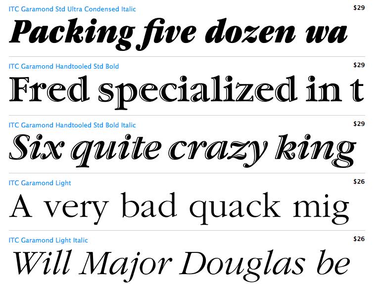
19 1977 Tony Stan designs a version of Garamond called: ITC Garamond Further altering the integrity of the original Garamond typeface designs a version called ITC Garamond, designed by Tony Stan was released. This version took liberties with the original design increasing the x-height and creating a wide range of weights from light to ultra bold and a condensed width also in weights from light to ultra bold.

20
21 Typefaces to use. Typefaces to stay away from. (just saying) Based on designs by Claude Garamond: Stempel Garamond Adobe Garamond Sabon Garamond Premier Garamond Antiqua Based on designs by Jean Jannon: Monotype Garamond Simoncini Garamond Linotype Granjon Garamond #3 LTC Garamont Storm Jannon Antiqua Garamond Glassico Zero integrity new designs: ITC Garamond Apple Garamond
22 Adobe Garamond Pro Garamond Premier Pro Garamond 3 Garamond

23 Garamond in the world today Text font for large Dr. Seuss books A form of Garamond was used for this logo

24 Text font for all Harry Potter books is 12 point Adobe Garamond except for this one which was set in 11.5 Adobe Garamond because the text was longer than the other books.

25 Text font for the Hunger Games trilogy is Adobe Garamond Pro

26 Garamond is the name of a character in the Wii game Super Paper Mario

27 Kristi Norgaard NYU Typography Class Timothy McSweeney s Quarterly Concern
Baskerville. abcdefghijk For fun I like to jump cars while reading a quote by Albert Einstein.
 serif Baskerville page 2 Baskerville page 3 Baskerville Baskerville Regular 26/28 while reading a quote by Baskerville italic 26/28 quote by Baskerville Semi bold 24/30 quote by Baskerville bold 24/26
Goudy Old Style & Garamond. A Type Comparison Book by Brittany Hansard
 Goudy Old Style & Garamond A Type Comparison Book by Brittany Hansard Frederic W. Goudy created this old style typeface in the late 1920s and it is known as one of his most adored typeface alphabets within
typography Typography is what language looks like.
 typography Typography is what language looks like. typography Typography is what language looks like. One thing absolutely necessary for working with type is knowing its history: what came after what and,
Evolution of Garamond: An Interactive Timeline Demonstrating the Evolution of Garamond
 Rochester Institute of Technology RIT Scholar Works Theses Thesis/Dissertation Collections 10-2018 Evolution of Garamond: An Interactive Timeline Demonstrating the Evolution of Garamond Yeseul Son ys4842@rit.edu
TYPOGRAPHY. The art of type
 Typography TYPOGRAPHY The art of type TYPE All the letters (abc), Numbers (123) & characters (;? @) of the alphabet. MONOTYPE Trade name for hot metal composition system Monotype Corporation Machine Shop
TYPE ANATOMY jtittle
 TYPE ANATOMY TYPE ANATOMY TITTLE j Serif Typefaces Tt HUMANIST (a.k.a. Old Style ) - Modeled after the roman typefaces of 15 th & 16 th centuries - Closely related to calligraphy and hand movement CLASSIC
THINGS YOU NEED TO KNOW
 TYPOGRAPHY THINGS YOU NEED TO KNOW to prevent your work from appearing amateurish. (p. 151) Only one space after punctuation (p. 152) What is monospaced type? (p. 152) Correct Quotation Marks (as soon
PORTFOLIO. Design for Yourself. Commuication Design Julia Choi
 PORTFOLIO Design for Yourself Commuication Design Julia Choi TYPE Jenson Bodoni Gill sans SPECIMEN BOOK 1470 1798 1929 7.5 x 10 TYPE HISTORY SPECIMEN BOOK Type History Specimen Book is designed to have
Chapter 8: Rococo Graphic Design 18 th century
 Chapter 8: Rococo Graphic Design 18 th century Romain du Roi (French for King s Roman) The first printing of the Romain du Roi at the beginning of the eighteenth century signified a shift to transitional
Pre-Venetian or Ancient Humanist or Venetian Transitional Didone Slab Serifs
 Pre-Venetian or Ancient Humanist or Venetian Transitional Didone Slab Serifs 1400 1500 1700 1800 Humanist Sans Serif Transitional Sans Serif Geometric Sans Serif Display Typefaces 1900 2000 Pre-Venetian
art 118: intro to communication design // FALL 2011
 t y p e specimen Due: Wednesday, November 30 ov e r v i e w A type specimen is a publication, that shows the range of a particular typeface in use. Printers and typographers have produced type specimens
jasonjuwono twentyfifteen TYPEDIA _ Typography Encyclopedia
 TYPEDIA _ Typography Encyclopedia ANATOMY_ Anatomy of a typeface Anatomy of a typeface What is a Font & Typeface? A design for a set of characters. A font is the combination of typeface and other qualities,
section four typography contents introduction...44 helvetica neue...45 bodoni...46 examples of type usage...47 body text examples...
 section four typography 43 contents introduction...44 helvetica neue...45 bodoni...46 examples of type usage...47 body text examples...48 introduction Consistent application of type fonts and styles allows
Font, Typeface, Typeface Family. Selected Typographical Variables
 Font, Typeface, Typeface Family Font: A font is a set of printable or displayable text character in a specific style, weight, and size. E.g. Helvetica Italic 10 Point. Typeface: The type design for a set
Font classification review
 Font classification review Taken from Lettering & Type by Bruce Willen Nolen Strals Old Style Transitional Modern Slab Serif Garamond ag Baskerville ag Bodoni ag Cowboys ab Sans Serif Gill Sans ag Decorative
B R A N D GUIDELINES
 BRAND GUIDELINES You never get a second chance to make a first impression. 01 02 03 INTRODUCTION About the City of New Bedford s brand 5 THE LOGO The Logo and usage 7 Color & variations 7 Clearspace &
TYPE. Design Process
 TYPE Design Process 01 Vocabulary 02 Classification 03 Six Classic Typefaces 04 Readability 05 Ten Type Commandments 06 Inspiration 07 Assignment 01 Vocabulary 02 Classification 03 Six Classic Typefaces
MODULE CM 2004 / STAGE 2 / SEMESTER 2 / SESSION Module title Design Principles and Context
 MODULE CM 2004 / STAGE 2 / SEMESTER 2 / SESSION 06-07 Module title Design Principles and Context Typography Fonts are classified under the following headings. Old Face fonts make use of contrasting wide
SUCCESSFUL TYPE? Interface Aesthetics
 TYPO GR AP HY SUCCESSFUL TYPE? SUCCESSFUL TYPE? TYPOGRAPHY 1 2 TYPOGRAPHY /t 'p gr fi/ n. The art or process of setting and arranging types and printing from them. The style and appearance of printed
The Evolution of Type. Movable Type: Johannes Gutenberg Early 15th Century
 The Evolution of Type Movable Type: Johannes Gutenberg Early 15th Century Studio on Fire: Minneapolis Anatomy of Type cap height cross bar Anatomy n bowl describes g counter ascender finial stem type eye
LOGO & BRAND STANDARDS GUIDE
 LOGO & BRAND STANDARDS GUIDE INTRODUCTION The SparkPost Brand Standards Guide provides key information needed to accurately and consistently produce external and internal documents and communications.
Unit 4. Multimedia Element: Text. Introduction to Multimedia Semester 2
 Unit 4 Multimedia Element: Text 2017-18 Semester 2 Unit Outline In this unit, we will learn Fonts Typography Serif, Sans Serif, Decorative Monospaced vs. Proportional Style Size Spacing Color Alignment
TYPOGRAPHY. ascender arm (as on the capital T) descender bar (as on the capital H) counter ear (as on the lower case g and r)
 descender bar (as on the capital H) counter ear (as on the lower case g and r)") TYPOGRAPHY Parts of letters: base line x-height ascender arm (as on the capital T) descender bar (as on the capital H) extenders bowl counter ear (as on the lower case g and r) serif stroke tail (as on
TYPOGRAPHY Parts of letters: base line x-height ascender arm (as on the capital T) descender bar (as on the capital H) extenders bowl counter ear (as on the lower case g and r) serif stroke tail (as on
VOICE OF TYPE LECTURE 1
 VOICE OF TYPE LECTURE 1 TYPOGRAPHY II COUNTY COLLEGE OF MORRIS PROFESSOR GAYLE REMBOLD FURBERT VOICE OF TYPE As you look at typefaces, analyze their forms, learn their history and learn how to use them
Graphic Standards Manual
 Graphic Standards Manual Welcome Welcome to the official University of Arkansas - Fort Smith Graphic Standards Manual. The members of Marketing & Communications have created this document with you in mind.
Good Typefaces. 680pt Adobe Garamond. Humanist/ Old Style Serif Adobe Garamond Garamond Goudy Hoefler
 30 Good Typefaces 680pt Adobe Garamond Franklin Gothic Demi Humanist/ Old Style Serif Adobe Garamond Garamond Goudy Hoefler Transitional Serif Baskerville Caslon Minion Mrs.Eaves Perpetua Times New Roman
History of Typography. (History of Digital Font)
") History of Typography (History of Digital Font) 1 What is Typography? The art and technique of printing The study and process of typefaces Study Legibility or readability of typefaces and their layout
History of Typography (History of Digital Font) 1 What is Typography? The art and technique of printing The study and process of typefaces Study Legibility or readability of typefaces and their layout
David Glen Smith. Fonts of Influence
 David Glen Smith Fonts of Influence Charlesworth {Charlemagne}. (THERE ARE NO LOWERCASE CHARACTERS) Poster Bodini Helvetica Neue Gill Sans My intentions are to merge a thick poster font with a thinner
The A - Z of Typeface Design
 -1- ROCKWELL Typefaces have been the subject of ongoing development since the invention of the printed word. is a geometric slab serif that like many typefaces has been influenced many designers. It was
Synopsis This module introduces calligraphy, the basic principles of typography, and applications of typography.
 8. Typography Synopsis This module introduces calligraphy, the basic principles of typography, and applications of typography. Lectures 8.1 Calligraphy 8.2 Basic Principles of Typography 8.3 Typography
understanding typography
 understanding typography What is typography?! it is what language looks like! it is the art and technique of modifying type and arranging it on a page What does the arrangement of type mean? the arrangement
User-Centered Website Development: A Human- Computer Interaction Approach
 User-Centered Website Development: A Human- Computer Interaction Approach Daniel D. McCracken City College of New York Rosalee J. Wolfe DePaul University With a foreword by: Jared M. Spool, Founding Principal,
HURME GEOMETRIC SANS
 No.1 SHARP No.2 ALTERNATIVE HURME TYPEFACE SPECIMEN PRINT SAMPLES No.3 BLUNT No.4 SWASH Hurme Geometric Sans Typeface Specimen 03/20/2013 2 Page heading: Black. 30pt/30pt. Byline: Regular/Bold SmallCaps.
Bardax. Process GD350 ADVANCED TYPOGRAPHY REFLECTION ON PRACTICE ERSAN ÇELİKTAŞ
 1 1. Turkish tea glass is called ince belli bardak in Turkish, which means thin waisted glass. 2. Adobe Illustrator is a computer software that enables users to design, modify and edit vector graphics
Graphic Standards 1/28/13
 Graphic Standards 1/28/13 All electronic logo files can be downloaded at: www.brentredmond.com/art Logo Application Guidelines The Brent Redmond Transportation, INC Logo The Brent Redmond Transportation,
Publishing Conventions
 Publishing Conventions Monica Johnstone, PhD Dir. of CLAS Communications & Advancement Better Newsletters Have Approved GVSU logo Masthead and Table of Contents Page Numbers and End Signs Appropriate Fonts
Teach Yourself Microsoft Word Topic 2 Selection and Formatting Techniques
 Teach Yourself Microsoft Word Topic 2 Selection and Formatting Techniques http://www.gerrykruyer.com In this lesson you will revise last week s work and learn a few new tricks whilst completing this exercise.
Writing and Document Design Lecture 6 Typography
 Writing and Document Design Lecture 6 Typography Last week We looked at Kress and van Leeuwen s work on composition/layout and considered its usefulness as both an analytic tool (a way of analysing and
please save the date saturday, 31st january 2015 PLEASE SAVE THE DATE SATURDAY, 31ST JANUARY 2015
 centaur family Designers: Nicolas Jenson, Bruce Rogers, Frederic Warde for Monotype A classic humanist serif font with calligraphic influences. It works well in sentence case or small capitals. The italic
Download Typographic Specimens: The Great Typefaces Kindle
 Download Typographic Specimens: The Great Typefaces Kindle Specimens of 38 of the finest type families in the world are brought together in Typographic Specimens: The Great Typefaces, making it an invaluable
WEB TYPOGRAPHY FOR WEB DEVELOPERS. Matej Latin Lead UX/UI Designer at Autotrader.co.uk
 WEB TYPOGRAPHY FOR WEB DEVELOPERS Matej Latin Lead UX/UI Designer at Autotrader.co.uk 1 A MEANINGFUL WEB TYPOGRAPHY STARTER KIT 2 Most people think typography is about fonts. Most designers think typography
font pairing FONT PAIRINGS GCEF
 font pairing As the saying goes, type is a beautiful group of letters, not a group of beautiful letters. ~Matthew Carter image as a designer ASSETS and type Two Functions of Type In order for your type
HEL HEL HEL HEL VETIC HEL VETIC HEL HEL VETICA HEL HEL ETICA ETIC VETIC HEL VETIC HEL HEL C VETICA ETI- HEL HEL VETI HEL VETICA VETIC HEL HEL VETICA
 CA C C CA C C CA Max Miedinger with Eduard Hoffmann C C CA C CA ETI- ETI- L istory elvetica was developed in 1957 by Max Miedinger with Eduard Hoffmann at the Haas sche Schriftgiesserei of Münchenstein,
HomeNet Automotive Visual Identity Guide
 HomeNet Automotive Visual Identity Guide Official Care and Feeding of the HomeNet Automotive Brand Version 1.2 September 3, 21 Table of Contents HomeNet Automotive s Branding Mission - A letter from Jesse
Linotype Matrix 4.2 the legend continues.
 Mergenthaler Edition releases second issue of the new Linotype Matrix Linotype Matrix 4.2 the legend continues. Bad Homburg, 16 May 2006. Following its highly successful relaunch of Linotype Matrix in
Brandbook. Wright State University Institutional Identity Standards Manual JUNE 2017 WRIGHT STATE UNIVERSITY ATHLETICS BRANDBOOK
 Brandbook Wright State University Institutional Identity Standards Manual JUNE 2017 WRIGHT STATE UNIVERSITY ATHLETICS BRANDBOOK Visual Identity Assets ATHLETICS MARKS All university athletics marks are
Putting type on a page without incorporating typographic principles is merely word processing. Terry Rydberg, Author Exploring InDesign 3
 Putting type on a page without incorporating typographic principles is merely word processing. Terry Rydberg, Author Exploring InDesign 3 Typography The study of all elements of type as a means of visual
LESSON 7 Introduction to Typography
 FOUNDATION IN GRAPHIC DESIGN with ADOBE APPLICATIONS LESSON 7 Introduction to Typography Summary Notes WHAT IS TYPOGRAPHY? Typography is, quite simply, the art and technique of arranging type. Typography
A Brief History of Fontesque. By Nick Shinn Druk Fall 2001
 A Brief History of Fontesque By Nick Shinn Druk Fall 2001 A Brief History of Fontesque With the release of his new Fontesque Sans, Nick Shinn surveys the Fontesque years 1618 This wobbly type, which wasn
Investigating the Effects of User Age on Readability
 Investigating the Effects of User Age on Readability Kyung Hoon Hyun, Ji-Hyun Lee, and Hwon Ihm Korea Advanced Institute of Science and Technology, Korea {hellohoon,jihyunl87,raccoon}@kaist.ac.kr Abstract.
Contents. 3 About These Guidelines. 4 Why is a Brand Important? 5 Overview. 6 Resources. 7 Logo/Signature. 8 Clear Space. 9 Color Variations
 Brand Guidelines Contents 3 About These Guidelines 4 Why is a Brand Important? 5 Overview 6 Resources 7 Logo/Signature 8 Clear Space 9 Color Variations 10 Logo Misuse Examples 11 Background Control 12
ASerif. AfbcyE TYPE AND LETTERS
 TYPE AND LETTERS Before 1455 books were made by hand. Only the wealthy could afford a book. A book could cost as much as an acre of land. Say! you bought two books for this class that will be $800,000
GD I // SPRING
 GD I // SPRING 2018 1 PROJECT I : TYPOGRAPHIC COLOR Timothy Samara, author of Typography Workbook, defines typographic color as the visual texture of language. It is similar to chromatic color (like green,
Graphic Design. shawacademy LESSON 5. summarynotes INTRODUCTION TO TYPOGRAPHY. For further questions visit us online at:
 shawacademy Graphic Design LESSON 5 INTRODUCTION TO TYPOGRAPHY summarynotes The Diploma in Graphic Design Toolkit For further questions visit us online at: www.shawacademy.com Lesson 5 S shawacademy Lesson
The following slides present guidelines and suggestions for the use of fonts, colors, and graphics when preparing PowerPoint presentations.
 PowerPoint Presentation Guidelines The following slides present guidelines and suggestions for the use of fonts, colors, and graphics when preparing PowerPoint presentations. This media (PPT) is designed
This file includes FILLABLE FORM FIELDS. Enter your answers and then save the form as a PDF with your name to submit. Ex: 4CChrisJohnson.pdf.
 BASIC SKILLS: TYPOGRAPHY This file includes FILLABLE FORM FIELDS. Enter your answers and then save the form as a PDF with your name to submit. Ex: 4CChrisJohnson.pdf Kristy Ryan Name: Overview Complete
BRAND IDENTITY STANDARDS GUIDE
 BRAND IDENTITY STANDARDS GUIDE JANUARY 2015 TABLE OF CONTENTS This brand identity standards guide was created to help establish the BCIU s visual brand image and bring consistency to all visual representations
Alphabet. elemental visual signs 26 characters frozen sounds
 Alphabet elemental visual signs 26 characters frozen sounds Evolution Handwriting > minimum number of strokes Engraving > lowercase > minimum number of curved lines > capitals Letterforms Appearance of
How Typography Determines Readability: Serif vs. Sans Serif, and How To Combine Fonts.
 18/03/2018 How Typography Determines Readability: Serif vs. Sans Serif, and How To Combine Fonts. Harshita Arora Follow 16 y/o entrepreneur & programmer. Formerly at Salesforce and MIT Launch. Creator
The Fresno EOC logo includes the box symbol and wordmarks
 Brand Guidelines box symbol wordmarks The Fresno EOC logo includes the box symbol and wordmarks Introduction The foundation of our graphic identity system, the Fresno EOC logo, represents the most concise
DESIGN AND BRAND GUIDELINES
 DESIGN AND BRAND GUIDELINES Address Phone & Fax Online LinkResearchTools GmbH LeonardBernsteinStraße 10/ Floor 7 Saturn Tower 1220, Vienna, Austria, Europe Phone AT: +43 720 116 440 Phone US: +1 866 3473660
Developing successful posters using Microsoft PowerPoint
 Developing successful posters using Microsoft PowerPoint PRESENTED BY ACADEMIC TECHNOLOGY SERVICES University of San Diego Goals of a successful poster A poster is a visual presentation of your research,
Logos. North Dallas Shared Ministries
 Brand Guidelines Logos The NDSM logo stands at the center of the NDSM brand. For this reason it must be reproduced and applied with consistency in all of our brand communications. It is essential that
Project 2 reminders: Hand in your typed book summary/response at end of class today. Make sure to include your name and section.
 Project 2 reminders: Hand in your typed book summary/response at end of class today. Make sure to include your name and section. Project 2 reminders: First book cover critique this Friday. Bring 3 book
BBN ANG 183 Typography Text colour: vertical and horizontal spacing
 BBN ANG 183 Typography Text colour: vertical and horizontal spacing Zoltán G. Kiss & Péter Szigetvári Dept of English Linguistics, Eötvös Loránd University gkz & szp (delg) typo/spacing 1 / 43 outline
Typography Main typography EC Square Sans Pro
 1.4 Typography 33 Main typography EC Square Sans Pro EC Square Sans Pro is the mandatory font for the Commission s logo, images incorporating texts and for professional publications. Three main weights
Navis Pack & Ship Style Guide
 Navis Pack & Ship Style Guide * The following booklet contains the style guide for the Navis Pack & Ship brand only. If you have questions regarding style guides for the PostalAnnex+, Handle With Care
Graphic Standards Manual. Athletics
 Graphic Standards Manual Athletics 63 GRAPHIC STANDARDS MANUAL ATHLETICS FLAGS 64 HAS TWO ATHLETICS FLAGS. Athletics Flags Monmouth College has two athletics flags, and they are routinely displayed during
Typefaces are character sets based on distinct design characteristics.
 Level 3 WGHS VISUAL ARTS 2011 ART DESIGN Typography An Introduction to Type Type Design Since the first recordings of letterforms the concept of the typographic form has evolved into a seemingly endless
1. Our Brand Defined
 BRAND GUIDELINES 1. Our Brand Defined 1.1 What is a brand s personality? Just like every person has a personality, every organization has a brand. You can t not have one. But, a brand is more than a logo;
The Visual Scientist Presents Poster Design
 The Visual Scientist Presents Poster Design layout fonts science! Hailpern & Danilevsky www.thevisualscientist.com Topics Covered This is a how-to-guide for effectively presenting scientific work in the
Bank Gothic. LowerCase. Bank Gothic Condensed. plus. Updated In 4 Versions by. newly devised. also with lowercase
 Bank Gothic Updated In 4 Versions by Michael Doret from the Morris Fuller Benton Original Featuring newly devised LowerCase c h a r a c t e r s plus Bank Gothic also with lowercase f r o m Bank Regular
> Introduction to the Art of Typography: The Invisible Force of Design > Using Typography as a Creative Tool: Introducing Text as Art
 MMA 100 Foundations of Digital Graphic Design Clare Ultimo > Introduction to the Art of Typography: The Invisible Force of Design > Using Typography as a Creative Tool: Introducing Text as Art Typography
BASIC ABOUT TYPE TYPO GRAPHY
 BASIC ABOUT TYPE TYPO GRAPHY TYPOGRAPHY BASIC DESIGN Relative & Absolute measurements Absolute measurements Inche : Millimetres : Points : Pica 3 Inches 76.2 mm 216 Points 18 Picas 1 Inches = 3 Picas A
INTRODUCING THE Transition family
 INTRODUCING THE Transition family A TYPFACE DESIGNED BY JAN ERASMUS CIRCA 2006 INFORMATION GUIDE RELEASED AND DISTRIBUTED BY: Cybergraphics.bz ALSO DISTRIBUTED BY: Fonts.com Linotype.com ITC.com Transition
The American Legion. Visual Style Guide
 The American Legion Visual Style Guide 04.15.2015 Table of Contents Communicating the American Legion Brand 3 The Legion Emblem 4 Emblem 5 Logo Type 6 Standard Typefaces 7 Myriad Pro 8 Minion Pro 9 Color
Typography One typeface classification
 Typography One typeface classification Why classify? Classification helps us describe and navigate type choices Typeface classification helps to: 1. sort type (scholars, historians, type manufacturers),
Typographic. Alphabet. Book. Interactive PDF of typographic rules & terms YOU NEED TO KNOW. Home. Table of Contents
 Typographic Alphabet Table of Contents > Rules That Every Typographer Should Know... 2-3 Book Interactive PDF of typographic rules & terms YOU NEED TO KNOW > Baseline... > Gutter... > Hierarchy... > Kerning...
The use of eye-tracker technology to evaluate typefaces, Greek fonts and publication design for screen.
 Typography in Publication Design The use of eye-tracker technology to evaluate typefaces, Greek fonts and publication design for screen. Evripides Zantides, Cyprus University of Technology, Lemesos, Cyprus,
NEWSLETTER. December 2012 SPECCY BUYING REFURBISHED?
 NEWSLETTER December 2012 As we approach the festive season I have expanded the content to cover lots of interesting but probably useless information! I hope you enjoy it and have a great time during the
STYLE GUIDE UPDATED AUGUST 2017
 STYLE GUIDE UPDATED AUGUST 2017 GENERAL GUIDELINES Purpose of the guide.... 3 Brenau University logo usage guidelines.... 4 Typography guidelines.... 12 Color palette and usage guidelines.... 13 Stationery
Third Party Identity Guidelines
 Third Party Identity Guidelines Introduction Introduction This document has been developed to provide anyone using The Wolfson Foundation logotype with clear guidelines on how the brand identity can be
Square of jaw and strong of limb
 Square of jaw and strong of limb Burlingame Extra Bold 1 Burlingame Burlingame Burlingame is a multi-purpose font family that started out as a single typeface with a more specialist purpose. There s a
VIVO Identity Guidelines
 VIVO Identity Guidelines May 2010 Version 1.0 00 Contents 01 02 03 04 05 06 Introduction About VIVO VIVO Identity Elements Space Size Color System (web and print) Identity Colors Primary Color Palette
Graphic Standards Manual
 Graphic Standards Manual Visual Identity Guidelines for U.S. Foodservice Message from the Corporate Marketing Department To all persons producing visual materials for U.S. Foodservice : The purpose of
Concepts and Terms. production assignment 01 review V. Different Typefaces Same Name. I. Vector vs Raster Graphics
 production assignment 01 review 01.0 Concepts and Terms I. Vector vs Raster Graphics A. Vector graphics (aka object graphics) are resolution independent. Illustrator is vector- or object-based drawing
MINI BRAND GUIDELINES
 MINI BRAND GUIDELINES 9.18.17 TABLE OF CONTENTS SECTION 1 Introduction 3 SECTION 4 The Hamline Logo(s) & Seal 5 SECTION 5 Colors 16 SECTION 6 Typography 20 Questions about how to use this brand guide?
Corporate Identity Guide
 Corporate Identity Guide Prepared by Primary logo elements The primary logo is designed to be bright, colourful, clean and contemporary. It is horizontal or landscape in format. It consists of four interlocking
BRAND GUIDELINES USES
 1 Brand Guidelines TABLE OF CONTENTS 3 BRAND GUIDELINES USES 4 HORSEWARE IRELAND 5 LOGO 6 - Primary version 7 - Clear space 8 - Minimum size 9 - Correct uses 10 - Incorrect uses 11 - Co-branded 12 CORPORATE
The evolution of symbols have influenced the letterforms we use today. They played a prominent role in communication from recording information,
 The evolution of symbols have influenced the letterforms we use today. They played a prominent role in communication from recording information, representing ideas, and expressing ourselves. Pictograms
Sunshine Pack & Ship Style Guide
 Sunshine Pack & Ship Style Guide * The following booklet contains the style guide for the Sunshine Pack & Ship brand only. If you have questions regarding style guides for the PostalAnnex+, Handle With
Experimental Typography: Process Documentation 1
 New School University Parsons School of Design Communication Design Department Experimental Typography: Process Documentation 1 01:11:02:00 First Proposal Despite a very unstable start of this semester,
Visual Style Guide. April 2016
 Visual Style Guide April 2016 Page 2 Contents Introduction to the Logo 3 Safe Area and Size 4 Incorrect Usage 5 Color Palette 6 Typography 7 Tone and Style of Photography 9 Print Examples 10 Screen Examples
EmpowHER Brand Standards
 EmpowHER 2 Introduction 3 EmpowHER Vocabulary 4 Logo & Slogan 6 HER Icon 7 Colors 8 Fonts 9 Contents 3 EmpowHER s provide a foundation for clear and consistent communication of the EmpowHER identity. This
Isabella: Braveheart Of France By Colin Falconer
 Isabella: Braveheart Of France By Colin Falconer Isabella: Braveheart of France by Colin Falconer. pbobey your husband. Make him love you. This is your duty to me and to France. /b/ppwith these words,
The 2011 rupeeequipped. from jy&a Fonts.
 The 2011 rupeeequipped fonts from jy&a Fonts. A jack ya n & associ afs In July 2010, the Indian cabinet approved the design of a rupee symbol. This marked India s importance in the global economy and the
Factettes. A collection of mildly interesting facts about the little symbols we communicate with.
 Typographic Factettes A collection of mildly interesting facts about the little symbols we communicate with. Helvetica The horizontal bars of a letter are almost always thinner than the vertical bars.
Type on the Web: Dos, Don ts and Maybes Ilene Strizver
 Type on the Web: Dos, Don ts and Maybes Ilene Strizver What exactly is Type on the Web? How does it differ from print? Type in print Fixed Predictable Controllable Appearance varies depending on: Operating
MINNETONKA BRAND IDENTITY GUIDE
 MINNETONKA BRAND IDENTITY GUIDE CONTENTS I INTRODUCTION 03 OUR HISTORY 04-05 OUR BRAND ESSENCE 06 II LOGO GUIDELINES 07 LOGOTYPE 08 LOGO CLEARANCE 09 ARROWHEAD ICON 10 ICON CLEARANCE 11 III INCORRECT USAGE
Name: Class: Teacher:..
 Name: Class: Teacher:.. Introduction Desktop publishing (DTP) is the process of designing newspapers, magazines, books, leaflets, booklets and reports on a computer. The industry that produces these items