Graphing Single Subject Research Data. AAC Colloquium October 18 th, 2017
|
|
|
- Duane Wood
- 5 years ago
- Views:
Transcription
1 Graphing Single Subject Research Data AAC Colloquium October 18 th, 2017
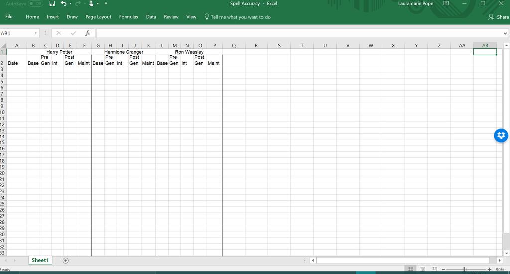
2 Set up the spreadsheet
3 Input the data

, so all graphs have the same x-axis Click on Insert>Line or Area Chart>Line with Markers* *Where to go to select Line")
4 Graph Harry s data Click and hold, then drag to select Harry s data Just for the top graph (i.e., Harry), select the phase names as well (e.g., baseline, intervention, etc.), in order to create the legend Make sure to select the cells down to the last session for the last participant in that leg (i.e., Ron), so all graphs have the same x-axis Click on Insert>Line or Area Chart>Line with Markers* *Where to go to select Line with Markers may vary by Excel version/operating system. You re looking for Charts


5 Graph Hermione s and Ron s data Use the same procedures to graph Hermione s and Ron s data (except you don t need to select the phase names, as you only need one legend) The graph for each will pop up to the right of the data

6 Change the graph dimensions Select all three graphs (hold shift as you click on each one), then click Format Change height to 2.8 and width to 6 (if you have a second leg, set width to 3 )


7 Selected data is always highlighted
 Choose Select Data from the dropdown menu")
8 Ron s Graph Connect data points Right click on one data series (e.g., Intervention) Choose Select Data from the dropdown menu


9 Ron s Graph Connect data points Click Hidden and Empty Cells>Connect data points with line

10 Ron s Graph Delete gridlines Click on a grid line blue dots will appear at the ends Hit Delete or Backspace to delete them
11 Ron s Graph Format phases lines Right click on one data series (e.g., Intervention) Choose Format Data Series from the dropdown menu Click the paint can Change the color to black for baseline and intervention, and grey for generalization and maintenance
12 Ron s Graph Format phases markers Click on Marker, Marker Options, and Fill Click Built-in to change the Type (circle for baseline and intervention, triangle for generalization, square for maintenance) Change Border and Fill color to black for baseline and intervention, and grey for generalization and maintenance
13 Ron s Graph Format the other phases You can either make both intervention and baseline black lines with black markers, as well as both generalizations grey lines with grey markers (see below), or mix and match different greys/black combos for lines and markers, to make each phase unique
14 Ron s Graph Format Axes Click on each axis to adjust the minimum/maximum and units these should be the same across all graphs in each leg (i.e., for Harry, Hermione, and Ron)
15 Ron s Graph Delete (or add!) tick marks If there are automatically tick marks on the x axis and you do not want them, set Major type to None If there are not tick marks and you want to add them, set Major type to some other value (e.g., cross, above)
16 Ron s Graph Delete the key/chart title Delete the key at the bottom of each graph (except for Harry s key!) by clicking on it to select it and then hitting Delete or Backspace You can either delete the Chart Title in the same way, or click on it and edit to be the participant ID/pseudonymn

17 Ron s Graph Remove background and border Right click in the chart area (click near the perimeter of the graph) and select Format Chart Area Select No fill and No line Do the same for the plot area (click near the graphed data)

 and going to Insert>See All")
18 Save the graph as a template To save this chart design as a template, right click in the chart area and select Save as template Name your template, and hit save You can then use this template for another graph by clicking on the chart area of a graph (say, Harry s or Hermione s) and going to Insert>See All Charts>Templates


19 Group graphs together Use the template you created to format the graphs for the other participants you may still need to do some minor formatting (e.g., change the chart titles) Align them vertically, then select all three graphs by holding Shift + clicking Click on Drawing Tools>Format>Align>Align Left to line up the graphs Click on Drawing Tools>Format>Group>Group to group the graphs together into one unit

20 Change the legend names If you want to change the names of the legends (e.g., if you have formatted baseline, intervention, and maintenance the same, and the two generalization phases the same, and just want to have the labels probe and generalization ), you can right click on the legend and select Select data Within the window that opens, click on the phase name you want to edit and click Edit
 by double clicking on the item and hitting backspace or delete")
21 Format the legend Format the legend (on Harry s graph) by right clicking on it and selecting Format legend You can now change the location of the legend You also want to be sure to uncheck Show the legend without overlapping the chart, otherwise the legend will impact the size of the first graph s chart area You can also delete particular items from the legend (e.g., if you only want probe and generalization ) by double clicking on the item and hitting backspace or delete
22 Exporting the graph Percent Accurate Spells Harry Baseline Pre Generalization Intervention Post Generalization Maintenance Hermione Ron Baseline Intervention Maintenance Copy and paste from Excel into the final location (e.g., Word, Powerpoint) To insert phase lines, click on Insert>Shapes>Connector:Elbow Copy and paste the elbow and match two (or more) up to cover all participant graphs, and to separate intervention from maintenance Change the lines to black under Format Move the phase lines pixel by pixel using the arrow keys Add axis titles and phase titles as text boxes using Insert>Text Box Session
Scottish Improvement Skills
 Scottish Improvement Skills Creating a run chart on MS Excel 2007 Create and save a new Excel worksheet. Some of the details of steps given below may vary slightly depending on how Excel has been used
Introduction to Excel Workshop
 Introduction to Excel Workshop Empirical Reasoning Center June 6, 2016 1 Important Terminology 1. Rows are identified by numbers. 2. Columns are identified by letters. 3. Cells are identified by the row-column
Tricking it Out: Tricks to personalize and customize your graphs.
 Tricking it Out: Tricks to personalize and customize your graphs. Graphing templates may be used online without downloading them onto your own computer. However, if you would like to use the templates
Tier III Data Collection
 Tier III Data Collection What is it? The Tier III Data Collection tool is designed to measure progress for individual students before and during interventions. The tool can measure several different types
Spreadsheet and Graphing Exercise Biology 210 Introduction to Research
 1 Spreadsheet and Graphing Exercise Biology 210 Introduction to Research There are many good spreadsheet programs for analyzing data. In this class we will use MS Excel. Below are a series of examples
Open a new Excel workbook and look for the Standard Toolbar.
 This activity shows how to use a spreadsheet to draw line graphs. Open a new Excel workbook and look for the Standard Toolbar. If it is not there, left click on View then Toolbars, then Standard to make
Technology Assignment: Scatter Plots
 The goal of this assignment is to create a scatter plot of a set of data. You could do this with any two columns of data, but for demonstration purposes we ll work with the data in the table below. You
Introduction to Excel Workshop
 Introduction to Excel Workshop Empirical Reasoning Center September 9, 2016 1 Important Terminology 1. Rows are identified by numbers. 2. Columns are identified by letters. 3. Cells are identified by the
Creating a Histogram Creating a Histogram
 Creating a Histogram Another great feature of Excel is its ability to visually display data. This Tip Sheet demonstrates how to create a histogram and provides a general overview of how to create graphs,
How to Make a Line Graph with Phase Lines in Excel 2007
 How to Make a Line Graph with Phase Lines in Excel 2007 Performance Aid Purpose The purpose of this document is to provide you with instructions to reference as you create a line graph in Excel 2007. It
Chemistry 30 Tips for Creating Graphs using Microsoft Excel
 Chemistry 30 Tips for Creating Graphs using Microsoft Excel Graphing is an important skill to learn in the science classroom. Students should be encouraged to use spreadsheet programs to create graphs.
Working with Charts Stratum.Viewer 6
 Working with Charts Stratum.Viewer 6 Getting Started Tasks Additional Information Access to Charts Introduction to Charts Overview of Chart Types Quick Start - Adding a Chart to a View Create a Chart with
Making Tables and Graphs with Excel. The Basics
 Making Tables and Graphs with Excel The Basics Where do my IV and DV go? Just like you would create a data table on paper, your IV goes in the leftmost column and your DV goes to the right of the IV Enter
9 POINTS TO A GOOD LINE GRAPH
 NAME: PD: DATE: 9 POINTS TO A GOOD LINE GRAPH - 2013 1. Independent Variable on the HORIZONTAL (X) AXIS RANGE DIVIDED BY SPACES and round up to nearest usable number to spread out across the paper. LABELED
Charts in Excel 2003
 Charts in Excel 2003 Contents Introduction Charts in Excel 2003...1 Part 1: Generating a Basic Chart...1 Part 2: Adding Another Data Series...3 Part 3: Other Handy Options...5 Introduction Charts in Excel
SAMLab Tip Sheet #5 Creating Graphs
 Creating Graphs The purpose of this tip sheet is to provide a basic demonstration of how to create graphs with Excel. Excel can generate a wide variety of graphs, but we will use only two as primary examples.
SAMLab Tip Sheet #4 Creating a Histogram
 Creating a Histogram Another great feature of Excel is its ability to visually display data. This Tip Sheet demonstrates how to create a histogram and provides a general overview of how to create graphs,
Creating and Modifying Charts
 Creating and Modifying Charts Introduction When you re ready to share data with others, a worksheet might not be the most effective way to present the information. A page full of numbers, even if formatted
WORD Creating Objects: Tables, Charts and More
 WORD 2007 Creating Objects: Tables, Charts and More Microsoft Office 2007 TABLE OF CONTENTS TABLES... 1 TABLE LAYOUT... 1 TABLE DESIGN... 2 CHARTS... 4 PICTURES AND DRAWINGS... 8 USING DRAWINGS... 8 Drawing
Chemistry Excel. Microsoft 2007
 Chemistry Excel Microsoft 2007 This workshop is designed to show you several functionalities of Microsoft Excel 2007 and particularly how it applies to your chemistry course. In this workshop, you will
Dealing with Data in Excel 2013/2016
 Dealing with Data in Excel 2013/2016 Excel provides the ability to do computations and graphing of data. Here we provide the basics and some advanced capabilities available in Excel that are useful for
MICROSOFT EXCEL Working with Charts
 MICROSOFT EXCEL 2010 Working with Charts Introduction to charts WORKING WITH CHARTS Charts basically represent your data graphically. The data here refers to numbers. In Excel, you have various types of
HOUR 12. Adding a Chart
 HOUR 12 Adding a Chart The highlights of this hour are as follows: Reasons for using a chart The chart elements The chart types How to create charts with the Chart Wizard How to work with charts How to
0 Graphical Analysis Use of Excel
 Lab 0 Graphical Analysis Use of Excel What You Need To Know: This lab is to familiarize you with the graphing ability of excels. You will be plotting data set, curve fitting and using error bars on the
Excel 2003 Tutorial II
 This tutorial was adapted from a tutorial by see its complete version at http://www.fgcu.edu/support/office2000/excel/index.html Excel 2003 Tutorial II Charts Chart Wizard Chart toolbar Resizing a chart
Better Histograms Using Excel. Michael R. Middleton School of Business and Management, University of San Francisco
 Better s Using Excel Michael R. Middleton School of Business and Management, University of San Francisco A histogram is usually shown in Excel as a Column chart type (vertical bars). The labels of a Column
SUM - This says to add together cells F28 through F35. Notice that it will show your result is
 COUNTA - The COUNTA function will examine a set of cells and tell you how many cells are not empty. In this example, Excel analyzed 19 cells and found that only 18 were not empty. COUNTBLANK - The COUNTBLANK
Desktop Studio: Charts. Version: 7.3
 Desktop Studio: Charts Version: 7.3 Copyright 2015 Intellicus Technologies This document and its content is copyrighted material of Intellicus Technologies. The content may not be copied or derived from,
COMPUTER TECHNOLOGY SPREADSHEETS BASIC TERMINOLOGY. A workbook is the file Excel creates to store your data.
 SPREADSHEETS BASIC TERMINOLOGY A Spreadsheet is a grid of rows and columns containing numbers, text, and formulas. A workbook is the file Excel creates to store your data. A worksheet is an individual
Excel Spreadsheets and Graphs
 Excel Spreadsheets and Graphs Spreadsheets are useful for making tables and graphs and for doing repeated calculations on a set of data. A blank spreadsheet consists of a number of cells (just blank spaces
The American University in Cairo. Academic Computing Services. Excel prepared by. Maha Amer
 The American University in Cairo Excel 2000 prepared by Maha Amer Spring 2001 Table of Contents: Opening the Excel Program Creating, Opening and Saving Excel Worksheets Sheet Structure Formatting Text
Desktop Studio: Charts
 Desktop Studio: Charts Intellicus Enterprise Reporting and BI Platform Intellicus Technologies info@intellicus.com www.intellicus.com Working with Charts i Copyright 2011 Intellicus Technologies This document
BusinessObjects Frequently Asked Questions
 BusinessObjects Frequently Asked Questions Contents Is there a quick way of printing together several reports from the same document?... 2 Is there a way of controlling the text wrap of a cell?... 2 How
Microsoft Office PowerPoint 2013 Courses 24 Hours
 Microsoft Office PowerPoint 2013 Courses 24 Hours COURSE OUTLINES FOUNDATION LEVEL COURSE OUTLINE Using PowerPoint 2013 Opening PowerPoint 2013 Opening a Presentation Navigating between Slides Using the
HPOG RoundTable: How to Manipulate PAGES Data with Excel
 HPOG RoundTable: How to Manipulate PAGES Data with Excel This document describes how to create a basic table shell, populate it, and generate a chart in Excel 2016. Other versions of Excel will have corresponding
Rockefeller College MPA Excel Workshop: Clinton Impeachment Data Example
 Rockefeller College MPA Excel Workshop: Clinton Impeachment Data Example This exercise is a follow-up to the MPA admissions example used in the Excel Workshop. This document contains detailed solutions
Understand and plan a chart Create a chart Move and resize charts and chart objects Apply chart layouts and styles
 Working with Charts Objectives Understand and plan a chart Create a chart Move and resize charts and chart objects Apply chart layouts and styles 2 Objectives Customize chart elements Enhance a chart Create
Pre-Lab Excel Problem
 Pre-Lab Excel Problem Read and follow the instructions carefully! Below you are given a problem which you are to solve using Excel. If you have not used the Excel spreadsheet a limited tutorial is given
SciGraphica. Tutorial Manual - Tutorials 1and 2 Version 0.8.0
 SciGraphica Tutorial Manual - Tutorials 1and 2 Version 0.8.0 Copyright (c) 2001 the SciGraphica documentation group Permission is granted to copy, distribute and/or modify this document under the terms
3.2 Circle Charts Line Charts Gantt Chart Inserting Gantt charts Adjusting the date section...
 / / / Page 0 Contents Installation, updates & troubleshooting... 1 1.1 System requirements... 2 1.2 Initial installation... 2 1.3 Installation of an update... 2 1.4 Troubleshooting... 2 empower charts...
Microsoft Excel 2007
 Microsoft Excel 2007 1 Excel is Microsoft s Spreadsheet program. Spreadsheets are often used as a method of displaying and manipulating groups of data in an effective manner. It was originally created
EXCEL SKILLS. Selecting Cells: Step 1: Click and drag to select the cells you want.
 Selecting Cells: Step 1: Click and drag to select the cells you want. Naming Cells: Viewlet available Step 2: To select different cells that are not next to each other, hold down as you click and
SAMLab Handout #5 Creating Graphs
 Creating Graphs The purpose of this tip sheet is to provide a basic demonstration of how to create graphs with Excel. Excel can generate a wide variety of graphs, but we will use only two as primary examples.
Entering Data in the Spreadsheet
 Excel How To Parts of the Spreadsheet Tiffany Davis, Briggs Elementary School A, B, C, etc. are the heads of the columns. 1, 2, 3, etc. are the heads of the rows. A cell is created by the intersection
Excel 2016 Charts and Graphs
 Excel 2016 Charts and Graphs training@health.ufl.edu Excel 2016: Charts and Graphs 2.0 hours This workshop assumes prior experience with Excel, Basics I recommended. Topics include data groupings; creating
Chapter 2 Surfer Tutorial
 Chapter 2 Surfer Tutorial Overview This tutorial introduces you to some of Surfer s features and shows you the steps to take to produce maps. In addition, the tutorial will help previous Surfer users learn
MICROSOFT EXCEL TUTORIAL
 MICROSOFT EXCEL TUTORIAL G E T T I N G S T A R T E D Microsoft Excel is one of the most popular spreadsheet applications that helps you manage data, create visually persuasive charts, and thought-provoking
Microsoft Excel 2002 M O D U L E 2
 THE COMPLETE Excel 2002 M O D U L E 2 CompleteVISUAL TM Step-by-step Series Computer Training Manual www.computertrainingmanual.com Copyright Notice Copyright 2002 EBook Publishing. All rights reserved.
Three-Dimensional (Surface) Plots
 Plots") Three-Dimensional (Surface) Plots Creating a Data Array 3-Dimensional plots (surface plots) are often useful for visualizing the behavior of functions and identifying important mathematical/physical features
Three-Dimensional (Surface) Plots Creating a Data Array 3-Dimensional plots (surface plots) are often useful for visualizing the behavior of functions and identifying important mathematical/physical features
BioFuel Graphing instructions using Microsoft Excel 2003 (Microsoft Excel 2007 instructions start on page mei-7)
") BioFuel Graphing instructions using Microsoft Excel 2003 (Microsoft Excel 2007 instructions start on page mei-7) Graph as a XY Scatter Chart, add titles for chart and axes, remove gridlines. A. Select
BioFuel Graphing instructions using Microsoft Excel 2003 (Microsoft Excel 2007 instructions start on page mei-7) Graph as a XY Scatter Chart, add titles for chart and axes, remove gridlines. A. Select
Excellence with Excel: Quiz Questions Module 6 Graphs and Charts
 Excellence with Excel: Quiz Questions Module 6 Graphs and Charts 1. Suppose that you have a company s annual revenue by year. How could you create a simple column chart for this data? a. Select all the
Microsoft Excel 2016 / 2013 Basic & Intermediate
 Microsoft Excel 2016 / 2013 Basic & Intermediate Duration: 2 Days Introduction Basic Level This course covers the very basics of the Excel spreadsheet. It is suitable for complete beginners without prior
MOVING FROM CELL TO CELL
 VCAE: EXCEL Lesson 1 Please send comments to Author: Zahra Siddiqui at zed_ess@hotmail.com Concepts Covered: Cell Address; Cell Pointer; Moving across Cells Constants: Entering, Editing, Formatting Using
To learn more about the Milestones window choose: Help Help Topics Select the Index tab and type in the feature. For Example toolbox.
 To learn more about the Milestones window choose: Help Help Topics Select the Index tab and type in the feature. For Example toolbox. 1 of 12 CHOOSE THE DATES TAB TO: 1. Set the schedule s Date Range.
Illustrator Charts. Advanced options
 Illustrator Charts Advanced options Setting up labels Labels are words or numbers that describe two things: the sets of data you want to compare, and the categories across which you want to compare them.
Activity: page 1/10 Introduction to Excel. Getting Started
 Activity: page 1/10 Introduction to Excel Excel is a computer spreadsheet program. Spreadsheets are convenient to use for entering and analyzing data. Although Excel has many capabilities for analyzing
Section 33: Advanced Charts
 Section 33 Advanced Charts By the end of this Section you should be able to: Use Chart Options Add Moving Averages to Charts Change a 3D Chart View Use Data Labels and Markers Create Stacked Bar Charts
Tree and Data Grid for Micro Charts User Guide
 COMPONENTS FOR XCELSIUS Tree and Data Grid for Micro Charts User Guide Version 1.1 Inovista Copyright 2009 All Rights Reserved Page 1 TABLE OF CONTENTS Components for Xcelsius... 1 Introduction... 4 Data
How to use Excel Spreadsheets for Graphing
 How to use Excel Spreadsheets for Graphing 1. Click on the Excel Program on the Desktop 2. You will notice that a screen similar to the above screen comes up. A spreadsheet is divided into Columns (A,
Beginner s Guide to Microsoft Excel 2002
 Beginner s Guide to Microsoft Excel 2002 Microsoft Excel lets you create spreadsheets, which allow you to make budgets, track inventories, calculate profits, and design charts and graphs. 1. Open Start
Excel 2010 Charts and Graphs
 Excel 2010 Charts and Graphs In older versions of Excel the chart engine looked tired and old. Little had changed in 15 years in charting. The popular chart wizard has been replaced in Excel 2010 by a
Office Excel. Charts
 Office 2007 Excel Charts October 2007 CONTENTS INTRODUCTION... 1 Bold text... 2 CHART TYPES... 3 CHOOSING A CHART... 4 CREATING A COLUMN CHART... 5 FORMATTING A COLUMN CHART... 8 Changing the chart style...
Introduction to the workbook and spreadsheet
 Excel Tutorial To make the most of this tutorial I suggest you follow through it while sitting in front of a computer with Microsoft Excel running. This will allow you to try things out as you follow along.
SHOW ME THE NUMBERS: DESIGNING YOUR OWN DATA VISUALIZATIONS PEPFAR Applied Learning Summit September 2017 A. Chafetz
 SHOW ME THE NUMBERS: DESIGNING YOUR OWN DATA VISUALIZATIONS PEPFAR Applied Learning Summit September 2017 A. Chafetz Overview In order to prepare for the upcoming POART, you need to look into testing as
Scientific Graphing in Excel 2013
 Scientific Graphing in Excel 2013 When you start Excel, you will see the screen below. Various parts of the display are labelled in red, with arrows, to define the terms used in the remainder of this overview.
Submission Guideline Checklist
 Submission Guideline Checklist Please use this checklist as a guide to ensure that files are correctly prepared for submission. Please ensure that you have read the detailed Instructions for Authors before
Part 1: Basics. Page Sorter:
 Part 1: Basics Page Sorter: The Page Sorter displays all the pages in an open file as thumbnails and automatically updates as you add content. The page sorter can do the following. Display Pages Create
Using Charts in a Presentation 6
 Using Charts in a Presentation 6 LESSON SKILL MATRIX Skill Exam Objective Objective Number Building Charts Create a chart. Import a chart. Modifying the Chart Type and Data Change the Chart Type. 3.2.3
Excel for Gen Chem General Chemistry Laboratory September 15, 2014
 Excel for Gen Chem General Chemistry Laboratory September 15, 2014 Excel is a ubiquitous data analysis software. Mastery of Excel can help you succeed in a first job and in your further studies with expertise
Graphing like a boss part 2
 Graphing like a boss part 2 With Shany Biran MBA, M.Ads, BCBA Supervisor, Toronto Autism Services Who are you? Who are you? Outline 1. Starting from scratch (for the last time) Outline 1. Phase Labels
CAPE. Community Behavioral Health Data. How to Create CAPE. Community Assessment and Education to Promote Behavioral Health Planning and Evaluation
 CAPE Community Behavioral Health Data How to Create CAPE Community Assessment and Education to Promote Behavioral Health Planning and Evaluation i How to Create County Community Behavioral Health Profiles
Microsoft Excel 2010 Tutorial
 1 Microsoft Excel 2010 Tutorial Excel is a spreadsheet program in the Microsoft Office system. You can use Excel to create and format workbooks (a collection of spreadsheets) in order to analyze data and
The HOME Tab: Cut Copy Vertical Alignments
 The HOME Tab: Cut Copy Vertical Alignments Text Direction Wrap Text Paste Format Painter Borders Cell Color Text Color Horizontal Alignments Merge and Center Highlighting a cell, a column, a row, or the
Models for Nurses: Quadratic Model ( ) Linear Model Dx ( ) x Models for Doctors:
 Linear Model Dx ( ) x Models for Doctors:") The goal of this technology assignment is to graph several formulas in Excel. This assignment assumes that you using Excel 2007. The formula you will graph is a rational function formed from two polynomials,
The goal of this technology assignment is to graph several formulas in Excel. This assignment assumes that you using Excel 2007. The formula you will graph is a rational function formed from two polynomials,
EXCEL 2013 FDLRS SUNRISE
 EXCEL 2013 FDLRS SUNRISE Goal: Participants will create a spreadsheet and graph to document student progress. Objectives: Participants will create a spreadsheet which includes basic formulas. Participants
Microsoft Excel 2000 Charts
 You see graphs everywhere, in textbooks, in newspapers, magazines, and on television. The ability to create, read, and analyze graphs are essential parts of a student s education. Creating graphs by hand
Insight: Measurement Tool. User Guide
 OMERO Beta v2.2: Measurement Tool User Guide - 1 - October 2007 Insight: Measurement Tool User Guide Open Microscopy Environment: http://www.openmicroscopy.org OMERO Beta v2.2: Measurement Tool User Guide
CS Multimedia and Communications. Lab 06: Webpage Tables and Image Links (Website Design part 3 of 3)
") CS 1033 Multimedia and Communications Lab 06: Webpage Tables and Image Links (Website Design part 3 of 3) REMEMBER TO BRING YOUR MEMORY STICK TO EVERY LAB! Table Properties Reference Guide The Property
CS 1033 Multimedia and Communications Lab 06: Webpage Tables and Image Links (Website Design part 3 of 3) REMEMBER TO BRING YOUR MEMORY STICK TO EVERY LAB! Table Properties Reference Guide The Property
How to Make Graphs with Excel 2007
 Appendix A How to Make Graphs with Excel 2007 A.1 Introduction This is a quick-and-dirty tutorial to teach you the basics of graph creation and formatting in Microsoft Excel. Many of the tasks that you
Solo 4.6 Release Notes
 June9, 2017 (Updated to include Solo 4.6.4 changes) Solo 4.6 Release Notes This release contains a number of new features, as well as enhancements to the user interface and overall performance. Together
Excel 2013 for Beginners
 Excel 2013 for Beginners Class Objective: This class will familiarize you with the basics of using Microsoft Excel. Class Outline: Introduction to Microsoft Excel 2013... 1 Microsoft Excel...2-3 Getting
Information Technology and Media Services. Office Excel. Charts
 Information Technology and Media Services Office 2010 Excel Charts August 2014 Information Technology and Media Services CONTENTS INTRODUCTION... 1 CHART TYPES... 3 CHOOSING A CHART... 4 CREATING A COLUMN
The first thing we ll need is some numbers. I m going to use the set of times and drug concentration levels in a patient s bloodstream given below.
 Graphing in Excel featuring Excel 2007 1 A spreadsheet can be a powerful tool for analyzing and graphing data, but it works completely differently from the graphing calculator that you re used to. If you
ENV Laboratory 2: Graphing
 Name: Date: Introduction It is often said that a picture is worth 1,000 words, or for scientists we might rephrase it to say that a graph is worth 1,000 words. Graphs are most often used to express data
Microsoft Office Excel 2007: Basic. Course Overview. Course Length: 1 Day. Course Overview
 Microsoft Office Excel 2007: Basic Course Length: 1 Day Course Overview This course teaches the basic functions and features of Excel 2007. After an introduction to spreadsheet terminology and Excel's
EXCEL 2007 TIP SHEET. Dialog Box Launcher these allow you to access additional features associated with a specific Group of buttons within a Ribbon.
 EXCEL 2007 TIP SHEET GLOSSARY AutoSum a function in Excel that adds the contents of a specified range of Cells; the AutoSum button appears on the Home ribbon as a. Dialog Box Launcher these allow you to
Department of Chemical Engineering ChE-101: Approaches to Chemical Engineering Problem Solving Excel Tutorial VIII
 Department of Chemical Engineering ChE-101: Approaches to Chemical Engineering Problem Solving Excel Tutorial VIII EXCEL Basics (last updated 4/12/06 by GGB) Objectives: These tutorials are designed to
DOING MORE WITH WORD: MICROSOFT OFFICE 2013
 DOING MORE WITH WORD: MICROSOFT OFFICE 2013 GETTING STARTED PAGE 02 Prerequisites What You Will Learn USING MICROSOFT WORD PAGE 03 Viewing Toolbars Adding and Removing Buttons MORE TASKS IN MICROSOFT WORD
= 3 + (5*4) + (1/2)*(4/2)^2.
 + (1/2)*(4/2)^2.") Physics 100 Lab 1: Use of a Spreadsheet to Analyze Data by Kenneth Hahn and Michael Goggin In this lab you will learn how to enter data into a spreadsheet and to manipulate the data in meaningful ways.
Physics 100 Lab 1: Use of a Spreadsheet to Analyze Data by Kenneth Hahn and Michael Goggin In this lab you will learn how to enter data into a spreadsheet and to manipulate the data in meaningful ways.
Excel 2013 Intermediate
 Excel 2013 Intermediate Quick Access Toolbar... 1 Customizing Excel... 2 Keyboard Shortcuts... 2 Navigating the Spreadsheet... 2 Status Bar... 3 Worksheets... 3 Group Column/Row Adjusments... 4 Hiding
Microsoft Office Excel
 Microsoft Office 2007 - Excel Help Click on the Microsoft Office Excel Help button in the top right corner. Type the desired word in the search box and then press the Enter key. Choose the desired topic
Physics Guide to Excel
 Physics Guide to Excel 5795 Summer 1999 HIGHER STILL Physics Guide to Excel Support Materials qrstuv This publication may be reproduced in whole or in part for educational purposes provided that no profit
Chemistry 1A Graphing Tutorial CSUS Department of Chemistry
 Chemistry 1A Graphing Tutorial CSUS Department of Chemistry Please go to the Lab webpage to download your own copy for reference. 1 When you open Microsoft Excel 2003, you will see a blank worksheet: Enter
Excel Basics Tips & Techniques
 Excel Basics Tips & Techniques Excel Terminology What s a spreadsheet? What s a workbook? Each Excel spreadsheet is a grid of data divided into rows and columns. Each block in this grid is called a cell,
The Figure module. Use Figure to manipulate, edit and plot figure and phase diagrams already calculated by FactSage.
 Table of contents Section 1 Section 2 Section 3 Section 4 Section 5 Section 6 Section 7 Section 8 Section 9 Section 10 Section 11 Section 12 Section 13 Section 14 The module Use to manipulate, edit and
ECE 304: Using EXCEL Preliminaries...3 Construction of Spreadsheet...3 Figure 1:...3 FORMAT CELLS menu with selected font settings...
 ECE 304: Using EXCEL Preliminaries...3 Construction of Spreadsheet...3 Figure 1:...3 FORMAT CELLS menu with selected font settings....3 Using WordArt in EXCEL...3 Figure 2:...4 WORD ART menu with selection
cief Data Analysis Chapter Overview Chapter 12:
 page 285 Chapter 12: cief Data Analysis Chapter Overview Analysis Screen Overview Opening Run Files How Run Data is Displayed Viewing Run Data Data Notifications and Warnings Checking Your Results Group
POWERPOINT Build a Presentation to Remember
 POWERPOINT 2007 Build a Presentation to Remember Microsoft Office 2007 TABLE OF CONTENTS DOCUMENT THEMES... 1 THEMES... 1 COLOR SETS... 1 FONT SETS... 1 MASTER SLIDES... 2 USING THEMES IN THE SLIDE MASTER...
 1 of 9 8/27/2014 10:53 AM Units: Teacher: MOExcel/Access, CORE Course: MOExcel/Access Year: 2012-13 Excel Unit A What is spreadsheet software? What are the parts of the Excel window? What are labels and
A Step-by-step guide to creating a Professional PowerPoint Presentation
 Quick introduction to Microsoft PowerPoint A Step-by-step guide to creating a Professional PowerPoint Presentation Created by Cruse Control creative services Tel +44 (0) 1923 842 295 training@crusecontrol.com