Font classification review
|
|
|
- Louisa Booker
- 5 years ago
- Views:
Transcription
1 Font classification review Taken from Lettering & Type by Bruce Willen Nolen Strals Old Style Transitional Modern Slab Serif Garamond ag Baskerville ag Bodoni ag Cowboys ab Sans Serif Gill Sans ag Decorative Wunderbach Paint Bta Ag ag Script American Scribe Black Letter Wittenberger Fraktur MT ag
2 Font classification: a distinction Old Style Garamond ag Humanist Serif Type incorporate elements of calligraphic handwriting such as the diagonal axis of the broad-nibbed pen and the softened, wedge serifs that replicate the pen stroke's starting point. Sans Serif Gill Sans ag Humanist Sans Serif Type have a modulated stroke weight, greater contrast and convey a calligraphic influence, which in some cases even includes flared terminals that suggest serifs.
3 Font classification: a distinction Sans Serif Gill Sans ag Humanist Sans Serif Type have a modulated stroke weight, greater contrast and convey a calligraphic influence, which in some cases even includes flared terminals that suggest serifs. Sans Serif Futura ag Geometric Sans Serif Type are constructed around a basic set of elements typically circles, triangles and straight lines. This design approach imparts a modular and mathematical spirit to the letter forms.
4 Font classification: display Decorative Wunderbach Paint Bta Ag Decorative Display Ornamental Type include any type or lettering with embellished or decorative forms. While they often exhibit attributes from other classes, display letters are specifically meant to be used at large sizes where their detailed or unconventional features work best.
5 Font classification: a distinction Slab Serif Cowboys ab Slab Serif (Egyptian) Type have squared off serifs that abruptly extend from the character's main strokes. Relatively uniform stroke weights. Clarendon Clarendon Clarendons are a subset of slab serifs. The serifs are bracketed creating a smoother flow from serif to the main strokes. The characters often bear similarities to Transitional and Modern forms because there is greater stroke variation than typical slab serifs.
6 Choosing a type family What are some of the things you might like to consider when choosing a type family from one of the type classifications?
7 Readability Readability: A measure of how easy and pleasant it is to read a given body of text. Readability can be effected by kerning, letter spacing, tracking, word spacing and leading.
8 Legibility Legibility: The ability to recognize and distinguish one letter form from another through the physical characteristics inherent in a particular typeface, such as x-height, character shapes, counter size, stroke contrast and type weight. For example, we may say that l and l tend to be illegible in some typefaces.
9 Legibility: letters to look out for Characters can be commonly confused in typefaces which have issues with legibility. C and G H and n i and j E and F c and e b and h b and d p and q e, a and s I and l (capital I or #l and lowercase L) Good typography can help offset the illegibility inherently built into some typefaces.
10 Legibility: helpful hints X-height and ascenders/descenders are two other factors which affect readability and legibility The larger the x-height the easier it is to distinguish one letter form from another (especially for older readers or children learning to read). Ascenders/descenders that are too short cause confusion of one letter with another. For example i and j, n and p, p and q.
11 Legibility: an aside We read more by the tops of letters than by the bottoms. And lowercase letters are more legible than all capital letters. Legibility LEGIBILITY Legibility LEGIBILITY Legibility LEGIBILITY Legibility LEGIBILITY
12 What else should you look for?
13 Expanded (type) Styles Type Styles: Variations in the thickness and stroke, such as light, medium, bold, italic, oblique, condensed, compressed, expanded that lend flexibility and emphasis in the appearance of characters constituting a typeface.
14
15 Expanded (Type) styles: why The larger the family, the more options you have. You can play with contrast, without sacrificing the harmony of your design.
16 Expanded (Type) styles: an example Without changing face, size or weight, there are many ways to set a small amount of text. See the next slide for an example...


17 Taken from The Buried Treasures of Typography by Nick Shinn (Garamond)
18 What else should you look for?
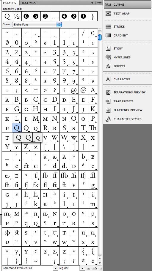
19 Alternative Glyphs (Definition taken from the Adobe Resource Guide) A glyph is a specific form of a character. For example, in certain fonts, the capital letter A is available in several forms, such as swash and small cap. You can use the Glyphs Panel to locate any glyph in a font...such as ornaments, swashes, fractions, and ligatures.
20 Alternative Glyphs: why Alternative glyphs can add emphasis and or create customization within your design. Alternative glyphs gives the designer more control and options for good typography.
21 Alternative Glyphs sample: swash letters Some font families have a nice variety of alternative glyphs, such as Swash Letters. Alternative glyphs, such as Swash Letters, are useful for logos, display type, and or as a drop cap which leads into a paragraph.
22 Swash Letters: helpful hint Never use all swash letters in one word: HELLO vs Hello
23 Alternative Glyphs sample: fractions Some typefaces have alternate glyphs containing superior/inferior figures and/or composite fractions.
24 Fractions: helpful hint You can construct fractions by using superscript & subscript commands in combination with the fraction bar (Option-Shift 1). Then shift the baseline of the numerals as needed. Here's an example: 1/2 1 2 vs ½ wrong right from the glyph panel
25 Alternative Glyphs: how to find them
26
27 What else should you look for?
28 Numerals Numerals can be classified as: Old Style (or lowercase) or Lining (or uppercase) according to how they are presented. The two differences reflect the way they would be used in text, such as in text blocks or in tabular form.
29 Numerals: lining numerals Lining numerals are aligned to the baseline and are of equal height. They are of fixed width allowing for better alignment in tables
30 Numerals: old style numerals Old style numerals do not align to the baseline and have ascenders and descenders. These numerals are used in running text for dates as the characters function more like letter forms because of the ascenders and descenders


31 Numerals: helpful hints Taken from The Buried Treasures of Typography by Nick Shinn Use old style numerals in body text. Use old style numerals with small caps. Use lining numerals in headlines. Use lining numerals with full capitals.
32 Numerals: helpful hints Taken from The Buried Treasures of Typography by Nick Shinn The standard typefaces, such as Century Schoolbook and Helvetica, usually have only one set of figures. The figures are short of the cap height and mono width, and can look a bit off in all-cap settings. SINCE 1961 SINCE 1961
33 How to Combine type type classifications
34 How to Combine type type classifications Find harmony and contrast.
35 How to Combine type type classifications single typeface: wide variety of weights styles
36 How to Combine type type classifications single typeface: wide variety of weights styles similar physical attributes: for example long ascenders/descenders, similar geometric shapes, and/or upright/vertical letter forms
37 How to Combine type type classifications single typeface: wide variety of weights styles similar physical attributes: for example long ascenders/descenders, similar geometric shapes, and/or upright/vertical letter forms complementary attributes: almost the same x-height
38 How to Combine type type classifications single typeface: wide variety of weights styles similar physical attributes: for example long ascenders/descenders, similar geometric shapes, and/or upright/vertical letter forms complementary attributes: almost the same x-height extended type face family: same x-height in serif and san serif
39 How to Combine type type classifications single typeface: wide variety of weights styles similar physical attributes: for example long ascenders/descenders, similar geometric shapes, and/or upright/vertical letter forms complementary attributes: almost the same x-height extended type face family: same x-height in serif and san serif two typefaces by the same designer: the thought is that the same hand will create fonts with similar qualities.
40 How to Combine type type classifications For a one page font combination guide, download the PDF file from the Introduction to Type site: 19 Top Fonts 19 Font Combinations
41 Review choose a type family that is both readable and legible choose a type family that has expanded type styles consider using a type family that has alternative glyphs have access to the appropriate glyphs: old style numerals and lining numerals start by following the 5 basic approaches to combining type type classifications review the numerals of your desired type to make sure you
TYPE ANATOMY jtittle
 TYPE ANATOMY TYPE ANATOMY TITTLE j Serif Typefaces Tt HUMANIST (a.k.a. Old Style ) - Modeled after the roman typefaces of 15 th & 16 th centuries - Closely related to calligraphy and hand movement CLASSIC
TYPOGRAPHY. ascender arm (as on the capital T) descender bar (as on the capital H) counter ear (as on the lower case g and r)
 descender bar (as on the capital H) counter ear (as on the lower case g and r)") TYPOGRAPHY Parts of letters: base line x-height ascender arm (as on the capital T) descender bar (as on the capital H) extenders bowl counter ear (as on the lower case g and r) serif stroke tail (as on
TYPOGRAPHY Parts of letters: base line x-height ascender arm (as on the capital T) descender bar (as on the capital H) extenders bowl counter ear (as on the lower case g and r) serif stroke tail (as on
MODULE CM 2004 / STAGE 2 / SEMESTER 2 / SESSION Module title Design Principles and Context
 MODULE CM 2004 / STAGE 2 / SEMESTER 2 / SESSION 06-07 Module title Design Principles and Context Typography Fonts are classified under the following headings. Old Face fonts make use of contrasting wide
Typography One typeface classification
 Typography One typeface classification Why classify? Classification helps us describe and navigate type choices Typeface classification helps to: 1. sort type (scholars, historians, type manufacturers),
jasonjuwono twentyfifteen TYPEDIA _ Typography Encyclopedia
 TYPEDIA _ Typography Encyclopedia ANATOMY_ Anatomy of a typeface Anatomy of a typeface What is a Font & Typeface? A design for a set of characters. A font is the combination of typeface and other qualities,
VOICE OF TYPE LECTURE 1
 VOICE OF TYPE LECTURE 1 TYPOGRAPHY II COUNTY COLLEGE OF MORRIS PROFESSOR GAYLE REMBOLD FURBERT VOICE OF TYPE As you look at typefaces, analyze their forms, learn their history and learn how to use them
Pre-Venetian or Ancient Humanist or Venetian Transitional Didone Slab Serifs
 Pre-Venetian or Ancient Humanist or Venetian Transitional Didone Slab Serifs 1400 1500 1700 1800 Humanist Sans Serif Transitional Sans Serif Geometric Sans Serif Display Typefaces 1900 2000 Pre-Venetian
Font, Typeface, Typeface Family. Selected Typographical Variables
 Font, Typeface, Typeface Family Font: A font is a set of printable or displayable text character in a specific style, weight, and size. E.g. Helvetica Italic 10 Point. Typeface: The type design for a set
Typography One typeface classification
 Typography One typeface classification Why classify? Classification helps us describe and navigate type choices Typeface classification helps to: 1. sort type (scholars, historians, type manufacturers),
Alphabet. elemental visual signs 26 characters frozen sounds
 Alphabet elemental visual signs 26 characters frozen sounds Evolution Handwriting > minimum number of strokes Engraving > lowercase > minimum number of curved lines > capitals Letterforms Appearance of
Graphic Design. shawacademy LESSON 5. summarynotes INTRODUCTION TO TYPOGRAPHY. For further questions visit us online at:
 shawacademy Graphic Design LESSON 5 INTRODUCTION TO TYPOGRAPHY summarynotes The Diploma in Graphic Design Toolkit For further questions visit us online at: www.shawacademy.com Lesson 5 S shawacademy Lesson
Putting type on a page without incorporating typographic principles is merely word processing. Terry Rydberg, Author Exploring InDesign 3
 Putting type on a page without incorporating typographic principles is merely word processing. Terry Rydberg, Author Exploring InDesign 3 Typography The study of all elements of type as a means of visual
Typefaces are character sets based on distinct design characteristics.
 Level 3 WGHS VISUAL ARTS 2011 ART DESIGN Typography An Introduction to Type Type Design Since the first recordings of letterforms the concept of the typographic form has evolved into a seemingly endless
understanding typography
 understanding typography What is typography?! it is what language looks like! it is the art and technique of modifying type and arranging it on a page What does the arrangement of type mean? the arrangement
In your lifetime you ve seen billions of letters and millions of words, yet you might never have consciously noticed the typefaces you read.
 In your lifetime you ve seen billions of letters and millions of words, yet you might never have consciously noticed the typefaces you read. Type is important because it is an unconscious persuader. It
LESSON 7 Introduction to Typography
 FOUNDATION IN GRAPHIC DESIGN with ADOBE APPLICATIONS LESSON 7 Introduction to Typography Summary Notes WHAT IS TYPOGRAPHY? Typography is, quite simply, the art and technique of arranging type. Typography
The Evolution of Type. Movable Type: Johannes Gutenberg Early 15th Century
 The Evolution of Type Movable Type: Johannes Gutenberg Early 15th Century Studio on Fire: Minneapolis Anatomy of Type cap height cross bar Anatomy n bowl describes g counter ascender finial stem type eye
How Typography Determines Readability: Serif vs. Sans Serif, and How To Combine Fonts.
 18/03/2018 How Typography Determines Readability: Serif vs. Sans Serif, and How To Combine Fonts. Harshita Arora Follow 16 y/o entrepreneur & programmer. Formerly at Salesforce and MIT Launch. Creator
HOW TO COMBINE TYPE TYPE CLASSIFICATIONS. Find harmony and contrast.
 HOW TO COMBINE TYPE TYPE CLASSIFICATIONS Find harmony and contrast. HOW TO COMBINE TYPE TYPE CLASSIFICATIONS u Single typeface: wide variety of weights styles Taken from The Buried Treasures of Typography
TYPE BASICS Cartographic Design & Principles Winter 2016
 TYPE BASICS Cartographic Design & Principles Winter 2016 Words on a Map Everything on the Earth has a name Names on a map, make it a map Otherwise it is a picture, photograph or design Assigning names
THINGS YOU NEED TO KNOW
 TYPOGRAPHY THINGS YOU NEED TO KNOW to prevent your work from appearing amateurish. (p. 151) Only one space after punctuation (p. 152) What is monospaced type? (p. 152) Correct Quotation Marks (as soon
Font Basics. Descender. Serif. With strokes on the extremities of the letters. T Script. Sans-Serif. No strokes on the end of the letters
 Font Basics Ascender Font Size d p x A X-height Cap height Counter The white space within letters Descender Bar A Serif With strokes on the extremities of the letters. T A Sans-Serif No strokes on the
INTRODUCTION TO TYPOGRAPHY DESIGN
 INTRODUCTION TO TYPOGRAPHY DESIGN Goals of typographic design Typography plays an important role in how audiences perceive your document and its information. Good design is about capturing your audience
Project 2 reminders: Hand in your typed book summary/response at end of class today. Make sure to include your name and section.
 Project 2 reminders: Hand in your typed book summary/response at end of class today. Make sure to include your name and section. Project 2 reminders: First book cover critique this Friday. Bring 3 book
Adjust the point size
 Adjust the point size create contrast small and dark Strive for contrast rather than harmony. Mixing typefaces on the same line, designers usually adjust the point size so the x-heights align. Placing
Unit 4. Multimedia Element: Text. Introduction to Multimedia Semester 2
 Unit 4 Multimedia Element: Text 2017-18 Semester 2 Unit Outline In this unit, we will learn Fonts Typography Serif, Sans Serif, Decorative Monospaced vs. Proportional Style Size Spacing Color Alignment
BASIC ABOUT TYPE TYPO GRAPHY
 BASIC ABOUT TYPE TYPO GRAPHY TYPOGRAPHY BASIC DESIGN Relative & Absolute measurements Absolute measurements Inche : Millimetres : Points : Pica 3 Inches 76.2 mm 216 Points 18 Picas 1 Inches = 3 Picas A
TYPO GRA PHY THE ANATOMY OF TYPE A BRIEF HISTORY OF TYPOGRAPHY WHAT IS YOUR TYPE ACTUALLY SAYING? OPEN FONT DISCUSSION
 THE ANATOMY OF TYPE A BRIEF HISTORY OF TYPO WHAT IS YOUR TYPE ACTUALLY SAYING? OPEN FONT DISCUSSION THE ANATOMY OF TYPE Typeface Anatomy The upward vertical stem on some lowercase letters, such as h and
TYPE. Design Process
 TYPE Design Process 01 Vocabulary 02 Classification 03 Six Classic Typefaces 04 Readability 05 Ten Type Commandments 06 Inspiration 07 Assignment 01 Vocabulary 02 Classification 03 Six Classic Typefaces
Typographic. Alphabet. Book. Interactive PDF of typographic rules & terms YOU NEED TO KNOW. Home. Table of Contents
 Typographic Alphabet Table of Contents > Rules That Every Typographer Should Know... 2-3 Book Interactive PDF of typographic rules & terms YOU NEED TO KNOW > Baseline... > Gutter... > Hierarchy... > Kerning...
section four typography contents introduction...44 helvetica neue...45 bodoni...46 examples of type usage...47 body text examples...
 section four typography 43 contents introduction...44 helvetica neue...45 bodoni...46 examples of type usage...47 body text examples...48 introduction Consistent application of type fonts and styles allows
> what is a font? Times New Roman [10 pts] Times New Roman [12 pts] Times New Roman [14 pts] Times New Roman [18 pts] Times New Roman [24 pts]
![> what is a font? Times New Roman [10 pts] Times New Roman [12 pts] Times New Roman [14 pts] Times New Roman [18 pts] Times New Roman [24 pts]](/thumbs/88/117283063.jpg "> what is a font? Times New Roman [10 pts] Times New Roman [12 pts] Times New Roman [14 pts] Times New Roman [18 pts] Times New Roman [24 pts]") > what is a font? > what is a font? A font is set of glyphs (or images) that represent a complete series of alphabetic and numeric characters, punctuations and symbols in a particular size and style (or
> what is a font? > what is a font? A font is set of glyphs (or images) that represent a complete series of alphabetic and numeric characters, punctuations and symbols in a particular size and style (or
WEB TYPOGRAPHY FOR WEB DEVELOPERS. Matej Latin Lead UX/UI Designer at Autotrader.co.uk
 WEB TYPOGRAPHY FOR WEB DEVELOPERS Matej Latin Lead UX/UI Designer at Autotrader.co.uk 1 A MEANINGFUL WEB TYPOGRAPHY STARTER KIT 2 Most people think typography is about fonts. Most designers think typography
serif: the short strokes that finish off the major strokes of the letterform. bracket: a curving joint between the serif and the stroke
 PARTS OF THE LETTER Typography evolved from handwriting, which is created by making a series of marks by hand; therefore, the fundamental element constructing a letterform is the linear stroke (stem).
anatomy cap height x-height baseline descender ligature finial terminal ascender spine small capital uppercase counter cross bar lowercase
 Type Anatomy anatomy cap height x-height baseline stem bowl serif descender ligature ascender finial terminal ascender spine uppercase small capital cross bar counter lowercase 36 thinking with type cap
Typography. is the foundation of good web design
 Typography is the foundation of good web design my name is Samantha Warren I am a web designer for Viget Labs I teach web & graphic design at the Center for Digital Imaging Arts at Boston University &
TYPOGRAPHY 1. letter-form mechanics. letter-form MECHANICS
 letter-form MECHANICS The Anatomy of Letter-forms The letters of all alphabets, whether classical or modern, display the same basic structural characteristics and adhere to similar conventions in drawing
HURME GEOMETRIC SANS
 No.1 SHARP No.2 ALTERNATIVE HURME TYPEFACE SPECIMEN PRINT SAMPLES No.3 BLUNT No.4 SWASH Hurme Geometric Sans Typeface Specimen 03/20/2013 2 Page heading: Black. 30pt/30pt. Byline: Regular/Bold SmallCaps.
How to use text. Adding a text frame
 How to use text Because Adobe InDesign CS6 is a page layout tool, working with text is an important skill. With InDesign, you add all text (and all content) into frames. Frames are shapes (called paths)
A Crash Course in Typography: Principles for Combining Typefaces - noupe
 A Crash Course in Typography: Principles for Combining Typefaces Cameron Chapman When combining typefaces, there are a couple of important principles you ll need to keep in mind, namely contrast and mood.
SUCCESSFUL TYPE? Interface Aesthetics
 TYPO GR AP HY SUCCESSFUL TYPE? SUCCESSFUL TYPE? TYPOGRAPHY 1 2 TYPOGRAPHY /t 'p gr fi/ n. The art or process of setting and arranging types and printing from them. The style and appearance of printed
a e yp fi Letterform Anatomy Ascender Shoulder Tittle Bowl Crossbar Stem or Main Stroke Terminal Leg Ascent Line Cap Line Mean Line Baseline
 Letterform Anatomy Tittle Ascender Shoulder Ascent Line Cap Line Mean Line Baseline Crossbar Bowl Stem or Main Stroke HtiQfgxR Terminal Ear Counter Leg Descent Line Crossbar Serif Tail Loop or Bowl Juncture
Lumin Lumin Sans Lumin Sans Condensed Lumin Display
 Typotheque type specimen & OpenType feature specification. Please read before using the fonts. Lumin Lumin Sans Lumin Sans Condensed Lumin Display OpenType font family supporting Latin based languages
LECTURE 4 THE USES OF TEXT IN MULTIMEDIA
 LECTURE 4 THE USES OF TEXT IN MULTIMEDIA 1 Objective Media Types What text is How text is created and stored in the computer How text is used in Multimedia Systems Advantages and Disadvantages of using
DESIGNING THE PAGE FOUNDATIONS OF DIGITAL DESIGN. Layout composition, the grid and typography. Prof. Eva Machauf
 DESIGNING THE PAGE Layout composition, the grid and typography FOUNDATIONS OF DIGITAL DESIGN Prof. Eva Machauf prof.machauf@gmail.com THE GRID The grid is the foundation of all design. Creating and working
Modifying Type: effects of a letter change COLDS
 Modifying Type Modifying Type The goal of good typography is like fabric. It should be evenly woven together where all facets and all parts of the letter forms work together. Sometimes if you have one
BBN ANG 183 Typography Text colour: vertical and horizontal spacing
 BBN ANG 183 Typography Text colour: vertical and horizontal spacing Zoltán G. Kiss & Péter Szigetvári Dept of English Linguistics, Eötvös Loránd University gkz & szp (delg) typo/spacing 1 / 43 outline
OUR TYPOGRAPHY APPROVED UNIVERS FONTS. Univers 65 Bold Univers 65 Bold Oblique Univers 75 Black Univers 75 Black Oblique
 BRAND TYPOGRAPHY For Internal Use Only Not For Use With The Public. For help and guidance on our brand standards, contact marketinginbox@firstcommand.com. 63 OUR TYPOGRAPHY Typography is a powerful extension
BRAND. For Internal Use Only Not For Use With The Public. For help and guidance on our brand standards, contact
 BRAND TYPOGRAPHY. 1 OUR TYPOGRAPHY. Typography is a powerful extension of our brand s personality. It plays an important role in creating a consistent look for First Command across all communications and
Document and Web design has five goals:
 Document and Web design has five goals: to make a good impression on readers to help readers understand the structure and hierarchy of the information to help readers find the information they need to
Multimedia for the Web: Creating Digital Excitement. Multimedia Element Text
 : Creating Digital Excitement Multimedia Element Text Chapter Concepts Discuss Fonts Understand Fonts Define Cascading Style Sheets (CSS) Explain Additional Options for Implementing Text on the Web Chapter
FOUNDATION IN GRAPHIC DESIGN. with ADOBE APPLICATIONS
 FOUNDATION IN GRAPHIC DESIGN with ADOBE APPLICATIONS CAN YOU ALL HEAR ME? SPECIAL ANNOUNCEMENT Win a Lifetime Membership to Shaw Academy The draw will be held live during Lesson 8 * CONDITIONS Attend at
ALL CAPS Text set completely in UPPERCASE or all capital letters. Also refered to as: Uppercase
 ALIGNMENT Refers to lining up the top, bottom, sides, or middle of text or graphic elements on a page. Horizontal text alignment is referred to as Flush-left, Left-justified or Ragged right Flush-right,
TYPOGRAPHY. The art of type
 Typography TYPOGRAPHY The art of type TYPE All the letters (abc), Numbers (123) & characters (;? @) of the alphabet. MONOTYPE Trade name for hot metal composition system Monotype Corporation Machine Shop
Tribunal. ewjduhiz tvnsgfq. Typotheque type specimen & OpenType feature specification. Please read before using the fonts.
 Typotheque type specimen & OpenType feature specification. Please read before using the fonts. Tribunal OpenType font family supporting Latin based languages with their own small caps, with extensive typographic
ASerif. AfbcyE TYPE AND LETTERS
 TYPE AND LETTERS Before 1455 books were made by hand. Only the wealthy could afford a book. A book could cost as much as an acre of land. Say! you bought two books for this class that will be $800,000
Chapter 8: Rococo Graphic Design 18 th century
 Chapter 8: Rococo Graphic Design 18 th century Romain du Roi (French for King s Roman) The first printing of the Romain du Roi at the beginning of the eighteenth century signified a shift to transitional
Elements of typographic design
 Type Terminology Serif fonts Sans serif fonts Elements of typographic design Times News Roman Ariel Verdana Calligrapher 24 pt 20 pt 14 pt 10 pt Univers 45 Light Univers 45 condensed light Univers 55 Univers
Logos. North Dallas Shared Ministries
 Brand Guidelines Logos The NDSM logo stands at the center of the NDSM brand. For this reason it must be reproduced and applied with consistency in all of our brand communications. It is essential that
Reading and Typography. Contributions from Bill Cowan, Byron Weber Becker, Michael Terry, and Designing with the Mind in Mind.
 Reading and Typography Contributions from Bill Cowan, Byron Weber Becker, Michael Terry, and Designing with the Mind in Mind. Reading 2 We re Wired for Language; not Reading Children exposed to spoken
Baskerville. abcdefghijk For fun I like to jump cars while reading a quote by Albert Einstein.
 serif Baskerville page 2 Baskerville page 3 Baskerville Baskerville Regular 26/28 while reading a quote by Baskerville italic 26/28 quote by Baskerville Semi bold 24/30 quote by Baskerville bold 24/26
Introduction A global icon needs an iconic logo. Fashion has evolved since 1969, when Gap opened its first store. Our logo has changed with the
 Introduction A global icon needs an iconic logo. Fashion has evolved since 1969, when Gap opened its first store. Our logo has changed with the times, too. One thing that hasn t changed is our mission
Principles of Typography
 Principles of Typography Different fonts send a different message to the reader. Categories: Sans serif Serif Script Decorative Fonts Sans-serif Fonts Easy to read, especially online Modern and clean Good
art 118: intro to communication design // FALL 2011
 t y p e specimen Due: Wednesday, November 30 ov e r v i e w A type specimen is a publication, that shows the range of a particular typeface in use. Printers and typographers have produced type specimens
Using Text in Photoshop
 Using Text in Photoshop So, we re going to take a break for a while from talking about photographs and how to manipulate them, and instead focus on some design elements! We re going to spend a while talking
This file includes FILLABLE FORM FIELDS. Enter your answers and then save the form as a PDF with your name to submit. Ex: 4CChrisJohnson.pdf.
 BASIC SKILLS: TYPOGRAPHY This file includes FILLABLE FORM FIELDS. Enter your answers and then save the form as a PDF with your name to submit. Ex: 4CChrisJohnson.pdf Kristy Ryan Name: Overview Complete
Chapter 12: FORMATTING TEXT
 Disclaimer: All words, pictures are adopted from Learning Web Design (3 rd eds.) by Jennifer Niederst Robbins, published by O Reilly 2007. PART III: CSS FOR PRESENTATION Chapter 12: FORMATTING TEXT CSc2320
Franklin Gothic. Seniors: Use larger text that is clear and legible. (Souvenir, Times, Garamond, Helvetica)
") one TYPOGRAPHY LECTURE: Do s and Don t s in Typography Do Build a basic library first. Find out who your audience is. Use appropriate type sizes. Celebrate white space. Use correct alignment. Use correct
one TYPOGRAPHY LECTURE: Do s and Don t s in Typography Do Build a basic library first. Find out who your audience is. Use appropriate type sizes. Celebrate white space. Use correct alignment. Use correct
ACSC 231 Internet Technologies
 ACSC 231 Internet Technologies Lecture 7 Web Typography Efthyvoulos Kyriacou - Assoc. Prof. Frederick University Resources: C. Markides (Frederick University) Slide 1 ACSC 231: Internet Technologies 23/12/2008
Brand Guidelines Solano County Transit (SolTrans)
") Brand Guidelines Solano County Transit (SolTrans) May 2018 Table of Contents The SolTrans Story... 1 Brand Elements... 2 Logo Usage... 3 Color Palette... 7 Typography.... 8 Photography.... 9 The SolTrans
Brand Guidelines Solano County Transit (SolTrans) May 2018 Table of Contents The SolTrans Story... 1 Brand Elements... 2 Logo Usage... 3 Color Palette... 7 Typography.... 8 Photography.... 9 The SolTrans
Corporate Identity Guidelines
 Corporate Identity Guidelines CONTENTS 1.0 TRADEMARK Watco Companies Logo Logo Clear Space Logo Variations Project Logos Proper Logo Use 03 04 05 06 07 08 2.0 TYPOGRAPHY Type Family 3.0 COLOR Brand Color
5. Text CHAPTER HIGHLIGHTS 10/12/2016 CHAPTER. Text tradition. Codes for computer text. t. Font technologies. Multimedia text.
 CHAPTER 5. Text CHAPTER HIGHLIGHTS Text tradition. Codes for computer text. t Font technologies. Multimedia text. Guidelines for use of text in multimedia. 2 1 POWERS OF TEXT Multimedia developers value
Text Topics. Human reading process Using Text in Interaction Design
 Text SWEN-444 Text Topics Human reading process Using Text in Interaction Design Humans and Text the Reading Process Saccades quick, jerky eye movements forward 8-10 letters at a time plus CR/LF to the
INTRODUCING THE Transition family
 INTRODUCING THE Transition family A TYPFACE DESIGNED BY JAN ERASMUS CIRCA 2006 INFORMATION GUIDE RELEASED AND DISTRIBUTED BY: Cybergraphics.bz ALSO DISTRIBUTED BY: Fonts.com Linotype.com ITC.com Transition
Digital Media, UX-UI Design > Website Principles
 Contents At a glance: Page layout header To ensure the correct appearance of our brands in a broad spectrum of applications with a web front end, uniform treatment of design elements is an absolute necessity.
User-Centered Website Development: A Human- Computer Interaction Approach
 User-Centered Website Development: A Human- Computer Interaction Approach Daniel D. McCracken City College of New York Rosalee J. Wolfe DePaul University With a foreword by: Jared M. Spool, Founding Principal,
Visual Style Guide. April 2016
 Visual Style Guide April 2016 Page 2 Contents Introduction to the Logo 3 Safe Area and Size 4 Incorrect Usage 5 Color Palette 6 Typography 7 Tone and Style of Photography 9 Print Examples 10 Screen Examples
Introduction to Multimedia. MMP100 Spring 2016 thiserichagan.com/mmp100
 Introduction to Multimedia MMP100 Spring 2016 profehagan@gmail.com thiserichagan.com/mmp100 Troubleshooting Check your tags! Do you have a start AND end tags? Does everything match? Check your syntax!
C L A S S 2 T Y P O G R A P H Y. FOUNDATIONS OF GRAPHIC DESIGN MW 8 a.m.
 C L A S S 2 T Y P O G R A P H Y FOUNDATIONS OF GRAPHIC DESIGN MW 8 a.m. Typography Typography separates graphic design from visual art. In every piece of type you see, somebody has considered how the letters,
Accessible Documents & Presentations. By Amy Maes, DNOM
 Accessible Documents & Presentations By Amy Maes, DNOM 1 Overview Accessibility: What am I required to do? Disability Characteristics Creating an Accessible Word Document & PowerPoint Presentation v2010
Web Site Design and Development Lecture 6
 Web Site Design and Development Lecture 6 CS 0134 Fall 2018 Tues and Thurs 1:00 2:15PM Inheritance Before we talk about font properties, it needs to be known that font properties are inherited by the descendants
In your lifetime you ve seen billions of letters and millions of words, yet you might never have consciously noticed the typefaces you read.
 In your lifetime you ve seen billions of letters and millions of words, yet you might never have consciously noticed the typefaces you read. Type is important because it is an unconscious persuader. It
Graphic Standards Manual. Athletics
 Graphic Standards Manual Athletics 63 GRAPHIC STANDARDS MANUAL ATHLETICS FLAGS 64 HAS TWO ATHLETICS FLAGS. Athletics Flags Monmouth College has two athletics flags, and they are routinely displayed during
Branding Guidelines - gather, grow, go
 Branding Guidelines - gather, grow, go Heartland Community Church, June 2008 Brand Attributes 1 2 The Heartland gather, grow, go logos are made up of 2 different elements 1. Symbol - Each g logo has a
BRAND GUIDELINES + UPDATED
 + UPDATED NOVEMBER 2015 Primary Mark Guidelines Vertical Lockup is the primary style and should be used across all applications. Do not change the color unless using one of the alternate logos provided
Character Formatting. Formatting the Text in Text Frames
 FIGURE 4-1 Formatting the Text in Text Frames CHAPTER 4. TYPE 199 Use the Selection tool to select the text frames you want to format and apply formatting. InDesign applies the formatting to all of the
Identity Standards The College of New Jersey Exterior Signage and Wayfinding Master Plan
 10.1 Identity Standards 10.2 F1 Myriad Pro Regular F2 Myriad Pro Regular Italic F3 Myriad Pro Semibold 10.3 F4 Myriad Pro Semibold Italic F5 Palatino Small Caps Typefaces Notes No substitute typefaces
ewjduhiz tvnsgfq Brenner Type System: Typotheque type specimen & OpenType feature specification. Please read before using the fonts.
 Typotheque type specimen & OpenType feature specification. Please read before using the fonts. OpenType font family supporting Latin based languages with their own Small Caps, with extensive typographic
8/19/2018. Web Development & Design Foundations with HTML5. Learning Objectives (1 of 2) Learning Objectives (2 of 2)
 Learning Objectives (2 of 2)") Web Development & Design Foundations with HTML5 Ninth Edition Chapter 3 Configuring Color and Text with CSS Slides in this presentation contain hyperlinks. JAWS users should be able to get a list of links
Web Development & Design Foundations with HTML5 Ninth Edition Chapter 3 Configuring Color and Text with CSS Slides in this presentation contain hyperlinks. JAWS users should be able to get a list of links
Essentials for Text and Graphic Layout
 5. Essentials for Text and Graphic Layout This section provides specific text and graphic guidelines that will help create a unified series of interpretive signs around Humboldt Bay. Text refers to the
Brand Identity Guide. September 2017
 Brand Identity Guide September 2017 Welcome At Canada Drives our goal is to be the number one consumer lending company in Canada by making financing simple and accessible to every Canadian while maintaining
Project Justification
 Project Justification This unit of instruction is based on typography and the creative use of letterforms to visually communicate a message through images rather than just the printed word. Type manipulation
typography.net Shaker Pure, energetic, contemporary
 typography.net Shaker Pure, energetic, contemporary typography.net Introduction ABCDEFGHIJKLMNOPQRSTUVWXYZ About Shaker families Features Language support Further information Shaker is a lively sans with
QUICK GUIDE. Graphics Standards & Guidelines University of Nebraska at Kearney
 QUICK GUIDE Graphics Standards & Guidelines University of Nebraska at Kearney 08 2016 Summary The visual identity for the University of Nebraska Kearney is the face the school shows the public. It is representative
BRAND ASSETS AND GUIDELINES
 BRAND ASSETS AND GUIDELINES PAS Brand Guidelines 2 The PAS Brand The PAS visual style uses a bold, energetic aesthetic. The focus is on personality and good vibes allowing for a deeper connection with
LOGO & BRAND STANDARDS GUIDE
 LOGO & BRAND STANDARDS GUIDE INTRODUCTION The SparkPost Brand Standards Guide provides key information needed to accurately and consistently produce external and internal documents and communications.
Microsoft PowerPoint 2013 Module
 Microsoft PowerPoint 2013 Module Signing your name below means the work you are turning in is your own work and you haven t given your work to anyone else. Name Period Seat Completed Activity Points Poss.
Static Visual Displays: Flight Deck Documentation
 Static Visual Displays: Flight Deck Documentation Source: Degani, A. (1992). On the Typography of Flight-Deck Documentation, NASA Contractor Report #177605. Moffett Field, CA: NASA Ames Research Center,
Corporate Identity Guidelines
 Corporate Identity Guidelines - CONTENTS 1.0 TRADEMARK Watco Companies Logo Logo Clear Space Logo Variations Project Logos Proper Logo Use 03 04 05 06 07 08 2.0 TYPOGRAPHY Type Family 3.0 COLOR Brand Color
Writing and Document Design Lecture 6 Typography
 Writing and Document Design Lecture 6 Typography Last week We looked at Kress and van Leeuwen s work on composition/layout and considered its usefulness as both an analytic tool (a way of analysing and