Build websites that suit the needs and abilities of users
|
|
|
- Todd Snow
- 5 years ago
- Views:
Transcription
1
2 Goal 1 Build websites that suit the needs and abilities of users The main goal of many websites is to display information users need. 2


3 Tools for indicating importance in the visual information hierarchy Conceptual grouping Location Whitespace Size Images Contrast Color 3

4 In addition to indicating importance, the colors and fonts you pick will have meaning to users. 4

5 What meaning will these colors have to users? (in addition to importance) 5
6 What meaning will these fonts have to users? (in addition to importance) 6

7 What meaning will these fonts, colors and design have to users? 7
8 What meaning does this font have? 8
9 The human brain is always perceiving meaning (even when it is not intended) 9
10 The human brain is always perceiving meaning (even when it is not intended) U Use color, typography, and design carefully to convey your intended meaning 10
11 Color

12 On the web, we mostly use RGB color. RGB Mixing amounts of Red, Green and Blue light 12

13 There are three perceptual dimensions of color 13
14 Every color is a point in the HSV space. 14
15 How would we find this color? 15
16 From Yellow, how do we get Brown? Saturation 16

17


18 Choosing colors! Start in grayscale, then keep the luminance values! Common schemes: analogous, split complement

19 Benefit from others! Adobe Color CC Fork popular schemes explore/most-popular 19
20 Cultural Differences in Color Interpretation
21 What cultural connections do these colors have?
22 Are color meaning arbitrary?
23 Are color meaning arbitrary? Color meanings are not absolute. U But at any time and place, they may mean something you don t intend.
24 Typography

25
26 Six Typographic Terms
27 } Point Six Typographic Terms size S S Gill Sans Calibri Calibri: 2005, Lucas de Groot for Microsoft,
28 Six Typographic Terms } Leading Six Typographic Terms

29 Six Typographic Terms } x-height Six Gill Sans Six Baskerville Low x-height Typefaces with high x-height: easier to read at small point size Typefaces with low x-height: harder to read at small point size Lucida Bright: 1993, Charles Bigelow & Kris Holmes Baskerville, 1757, John Baskerville
30 ascenders Six Typographic Terms descenders
31 Six Typographic Terms light regular bold weight

32 Weights and Styles
33 Six Typographic Terms: Serif Source: R. Williams The Non-Designers Design Book
34 Six Typographic Terms: Serif????? Source: R. Williams The Non-Designers Design Book
35 Six Typographic Terms: Serif Source: R. Williams The Non-Designers Design Book
36 Six Typographic Terms: Serif????? Source: R. Williams The Non-Designers Design Book
37 Six Typographic Terms: Serif????? Source: R. Williams The Non-Designers Design Book
38 Six Typographic Terms: Serif Source: R. Williams The Non-Designers Design Book
39 Six Typographic Terms: Sans Serif Source: R. Williams The Non-Designers Design Book
40 Small caps, lowercase 2002, Christian Schwartz, House Industries, An Ode to a Typeface,
41 Small caps, lowercase Numbers: Lowercase Uppercase , Christian Schwartz, House Industries, An Ode to a Typeface,
42 The Serif Hypothesis Serif typefaces are easier to read -- and thereby preferable for long stretches of text -- because the serifs provide anchors that guide the reader s eye. Sans serif fonts lack these anchors and are therefore inappropriate for long stretches of text.
43 Challenges Individual differences dwarf manipulation effects i.e., some people read faster than others. If there is an effect, it s very small Confound: Reading requires familiarity Dependent Variable? Speed? Comprehension??
44 Legibility, in practice, amounts simply to what one is accustomed to Eric Gill, 1931
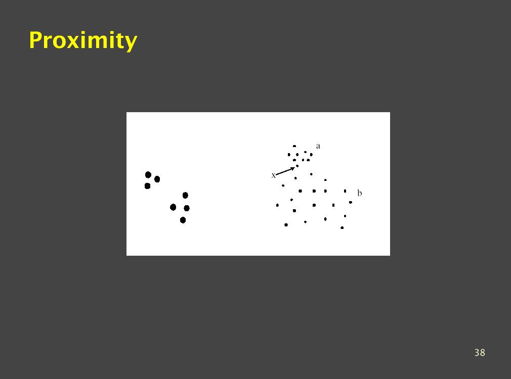
45 Combining Type: Concordant
46 Combining Type: Contrasting
47 Combining Type: Conflicting
48 Typefaces, like everything, build reputations Baskerville Optima POUR HOMME The Literary Magazine for Gifted Kids & Their Families AFTER SHAVE BALM BAUME APRES RASAGE Hoefler + Frere-Jones:
49 Gestalt noun an organized whole that is perceived as more than a sum of its parts
50 What pattern do you see here?
51 What pattern do you see here?
52 Proximity

53 Proximity
54 How is proximity used?

55 What pattern do you see here?
56 How is similarity used?
57 What pattern do you see here?
58 What pattern do you see here? How are proximity and similarity used?
59 Connectedness Connection overrules proximity and similarity
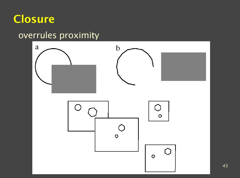
60 What literal difference do you see between A B and C? A B C
61 What perceptual difference do you see between A B and C? A B C
62 Symmetry Bilateral symmetry gives strong sense of figure
63 Which paths are easier to follow?
64 Continuity We prefer smooth not abrupt changes Connections are clearer with smooth contours
65 What is the literal difference between a and b?
66 What is the perceived difference between a and b?
67 Closure
68 Illusory contours
69 What do you see?


70 Figure/Ground Principle of Relative Size
71 Figure/Ground
72 Figure/Ground Principle of Surroundedness
73 8 Gestalt Principles 73
74 Summary
75 The human brain is always perceiving meaning (even when it is not intended) Color Font Gestalt 75
76 As a designer, you have to know how these principles are represented by the system, and how they are interpreted by the user. Color Font Gestalt 76
INTRODUCTION TO TYPOGRAPHY DESIGN
 INTRODUCTION TO TYPOGRAPHY DESIGN Goals of typographic design Typography plays an important role in how audiences perceive your document and its information. Good design is about capturing your audience
Visual Design. Gestalt Principles Creating Organization and Structure Typography. UI Visual Design Objectives
 Gestalt Principles Creating Organization and Structure Typography 1 UI Objectives 1. Information communication - Enforce desired relationships (and avoid undesired relationships) 2. Aesthetics - well designed,
Visual Design. Gestalt Principles Creating Organization and Structure Typography. Visual Design 1
 Visual Design Gestalt Principles Creating Organization and Structure Typography Visual Design 1 UI Visual Design Objectives 1. Information communication - Enforce desired relationships (and avoid undesired
communication design and the web John Zimmerman HCI Institute and the School of Design, Carnegie Mellon University 17 November 2010
 communication design and the web John Zimmerman HCI Institute and the School of Design, Carnegie Mellon University 17 November 2010 goals for today explore communication design familiar with basic principles
Font, Typeface, Typeface Family. Selected Typographical Variables
 Font, Typeface, Typeface Family Font: A font is a set of printable or displayable text character in a specific style, weight, and size. E.g. Helvetica Italic 10 Point. Typeface: The type design for a set
Chapter 7 Typography, Style Sheets, and Color. Mrs. Johnson
 Chapter 7 Typography, Style Sheets, and Color Mrs. Johnson Typography Typography refers to the arrangement, shape, size, style, and weight of text. Affects the navigation and usability of a web site and
TYPOGRAPHY. ascender arm (as on the capital T) descender bar (as on the capital H) counter ear (as on the lower case g and r)
 descender bar (as on the capital H) counter ear (as on the lower case g and r)") TYPOGRAPHY Parts of letters: base line x-height ascender arm (as on the capital T) descender bar (as on the capital H) extenders bowl counter ear (as on the lower case g and r) serif stroke tail (as on
TYPOGRAPHY Parts of letters: base line x-height ascender arm (as on the capital T) descender bar (as on the capital H) extenders bowl counter ear (as on the lower case g and r) serif stroke tail (as on
Document and Web design has five goals:
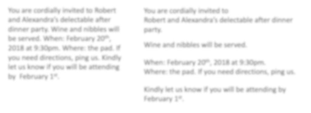
 Document and Web design has five goals: to make a good impression on readers to help readers understand the structure and hierarchy of the information to help readers find the information they need to
TABLE OF CONTENTS. About OASIS. Branding. Typography. Colors. Brand Guidelines for OASIS Inc., First Edition 2015 OASIS Inc. All rights reserved.
 Brand Guidelines TABLE OF CONTENTS About OASIS 3 Mission, work and structure Branding 4 Primary logo 6 Alternate logos 8 Logo clear space & minimum size 10 Incorrect use of the logo Typography 12 Preferred
Perceptual Organization and Visual Design
 Perceptual Organization and Visual Design Heidi Lam January 20, 2003 Outline Perceptual Organization: Theory Gestalt Laws Transparency Summary 1 Perceptual Organization How all the bits and pieces of visual
Elements of typographic design
 Type Terminology Serif fonts Sans serif fonts Elements of typographic design Times News Roman Ariel Verdana Calligrapher 24 pt 20 pt 14 pt 10 pt Univers 45 Light Univers 45 condensed light Univers 55 Univers
Project 2 reminders: Hand in your typed book summary/response at end of class today. Make sure to include your name and section.
 Project 2 reminders: Hand in your typed book summary/response at end of class today. Make sure to include your name and section. Project 2 reminders: First book cover critique this Friday. Bring 3 book
This file includes FILLABLE FORM FIELDS. Enter your answers and then save the form as a PDF with your name to submit. Ex: 4CChrisJohnson.pdf.
 BASIC SKILLS: TYPOGRAPHY This file includes FILLABLE FORM FIELDS. Enter your answers and then save the form as a PDF with your name to submit. Ex: 4CChrisJohnson.pdf Kristy Ryan Name: Overview Complete
Typographic. Alphabet. Book. Interactive PDF of typographic rules & terms YOU NEED TO KNOW. Home. Table of Contents
 Typographic Alphabet Table of Contents > Rules That Every Typographer Should Know... 2-3 Book Interactive PDF of typographic rules & terms YOU NEED TO KNOW > Baseline... > Gutter... > Hierarchy... > Kerning...
Project Justification
 Project Justification This unit of instruction is based on typography and the creative use of letterforms to visually communicate a message through images rather than just the printed word. Type manipulation
In your lifetime you ve seen billions of letters and millions of words, yet you might never have consciously noticed the typefaces you read.
 In your lifetime you ve seen billions of letters and millions of words, yet you might never have consciously noticed the typefaces you read. Type is important because it is an unconscious persuader. It
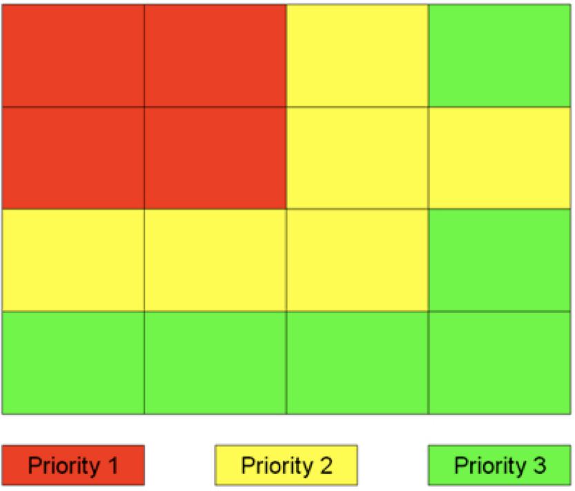
Typographic hierarchy: How to prioritize information
 New York City College of Technology, CUNY Department of Communication Design Typographic Design III Instructor: Professor Childers pchilders1@mac.com Typographic hierarchy: How to prioritize information
font pairing FONT PAIRINGS GCEF
 font pairing As the saying goes, type is a beautiful group of letters, not a group of beautiful letters. ~Matthew Carter image as a designer ASSETS and type Two Functions of Type In order for your type
Style Guide August 1, 2012
 Style Guide August 1, 2012 Introduction and Purpose Pitt Public Health provides a clear identity for the Graduate School of Public Health. This updated identity will help us market ourselves regionally,
Font classification review
 Font classification review Taken from Lettering & Type by Bruce Willen Nolen Strals Old Style Transitional Modern Slab Serif Garamond ag Baskerville ag Bodoni ag Cowboys ab Sans Serif Gill Sans ag Decorative
BRAND ASSETS AND GUIDELINES
 BRAND ASSETS AND GUIDELINES PAS Brand Guidelines 2 The PAS Brand The PAS visual style uses a bold, energetic aesthetic. The focus is on personality and good vibes allowing for a deeper connection with
FOUNDATION IN GRAPHIC DESIGN. with ADOBE APPLICATIONS
 FOUNDATION IN GRAPHIC DESIGN with ADOBE APPLICATIONS CAN YOU ALL HEAR ME? SPECIAL ANNOUNCEMENT Win a Lifetime Membership to Shaw Academy The draw will be held live during Lesson 8 * CONDITIONS Attend at
BRAND STANDARDS GUIDE UPDATED 9/15
 BRAND STANDARDS GUIDE UPDATED 9/15 LOGO USE THE LOGO EXACTLY AS IT IS DESIGNED. The logo and positioning line are the results of research and creative development - as well as a rigorous approval process.
Font Basics. Descender. Serif. With strokes on the extremities of the letters. T Script. Sans-Serif. No strokes on the end of the letters
 Font Basics Ascender Font Size d p x A X-height Cap height Counter The white space within letters Descender Bar A Serif With strokes on the extremities of the letters. T A Sans-Serif No strokes on the
8/19/2018. Web Development & Design Foundations with HTML5. Learning Objectives (1 of 2) Learning Objectives (2 of 2)
 Learning Objectives (2 of 2)") Web Development & Design Foundations with HTML5 Ninth Edition Chapter 3 Configuring Color and Text with CSS Slides in this presentation contain hyperlinks. JAWS users should be able to get a list of links
Web Development & Design Foundations with HTML5 Ninth Edition Chapter 3 Configuring Color and Text with CSS Slides in this presentation contain hyperlinks. JAWS users should be able to get a list of links
Corporate Identity Style Guide. April 2014
 Corporate Identity Style Guide April 2014 Table of Contents Our Signature 1.0 Restrictions Legibility 2.0 Color 2.1 Usage with Photos 2.2 Color Palette 3.0 Typography Primary Type 4.0 Websafe / Alternate
Text Topics. Human reading process Using Text in Interaction Design
 Text SWEN-444 Text Topics Human reading process Using Text in Interaction Design Humans and Text the Reading Process Saccades quick, jerky eye movements forward 8-10 letters at a time plus CR/LF to the
DESIGNING THE PAGE FOUNDATIONS OF DIGITAL DESIGN. Layout composition, the grid and typography. Prof. Eva Machauf
 DESIGNING THE PAGE Layout composition, the grid and typography FOUNDATIONS OF DIGITAL DESIGN Prof. Eva Machauf prof.machauf@gmail.com THE GRID The grid is the foundation of all design. Creating and working
The Visual Scientist Presents Poster Design
 The Visual Scientist Presents Poster Design layout fonts science! Hailpern & Danilevsky www.thevisualscientist.com Topics Covered This is a how-to-guide for effectively presenting scientific work in the
20 _. 14 _ Visual Identity. 03 _ Brand Message. 24 _ Brand Consistency 04 _. 10 _ Color Palette. 02 _ Our Mission. Our Logo. Our.
 brand guidelines 02 Our Mission 03 Brand Message 04 Our Logo 06 Construction & Clearspace 07 Using Our Logo 08 Logo Don ts 09 On Photographs 10 Color Palette 12 Primary Colors 13 Complimentary Colors 14
OCA Graphic Design: Core Concepts 1 Assignment 5 - Penguin Books Jane Braybrook Jane511794
 OCA Graphic Design: Core Concepts 1 Assignment 5 - Penguin Books Jane Braybrook Jane511794 Supporting Blog Post: https://jane511794.wordpress.com/category/assignments/assignment-5/ Critical Evaluation
Topic 0b Graphics for Science & Engineering
 Course Instructor Dr. Raymond C. Rumpf Office: A 337 Phone: (915) 747 6958 E Mail: rcrumpf@utep.edu Topic 0b Graphics for Science & Engineering EE 4386/5301 Computational Methods in EE Outline What are
TYPE. Design Process
 TYPE Design Process 01 Vocabulary 02 Classification 03 Six Classic Typefaces 04 Readability 05 Ten Type Commandments 06 Inspiration 07 Assignment 01 Vocabulary 02 Classification 03 Six Classic Typefaces
The American Legion. Visual Style Guide
 The American Legion Visual Style Guide 04.15.2015 Table of Contents Communicating the American Legion Brand 3 The Legion Emblem 4 Emblem 5 Logo Type 6 Standard Typefaces 7 Myriad Pro 8 Minion Pro 9 Color
GRAPHIC STANDARDS BOOK
 BOOK PURPOSE A uniformly applied visual identity program is essential to building a strong brand. It helps to immediately establish recognition for The Innevation Center University of Nevada, Reno, expresses
AFerry Brand Guidelines
 2 Contents Introduction 3 The AFerry Logo 4 Protecting Our Master Logo 5 Incorrect Master Logo Application 6 AFerry Family Logos 7 Typography 8 Print Typography 9 Digital Typography 10 Colour 11 Responsive
DESIGN AND BRAND GUIDELINES
 DESIGN AND BRAND GUIDELINES Address Phone & Fax Online LinkResearchTools GmbH LeonardBernsteinStraße 10/ Floor 7 Saturn Tower 1220, Vienna, Austria, Europe Phone AT: +43 720 116 440 Phone US: +1 866 3473660
Before & After. Use the Principles Cheatsheet! From The Non-Designer s Design Book, Robin Williams Non-Designer s Design 8
 Before & After Use the Principles Cheatsheet! From The Non-Designer s Design Book, Robin Williams Non-Designer s Design 8 Before & After From The Non-Designer s Design Book, Robin Williams Non-Designer
LOGO & BRAND STANDARDS GUIDE
 LOGO & BRAND STANDARDS GUIDE INTRODUCTION The SparkPost Brand Standards Guide provides key information needed to accurately and consistently produce external and internal documents and communications.
BETTER LOOKING S
 BETTER LOOKING EMAILS First impressions matter. So if you want a positive response to your email campaign you need to make a positive first impression. Here are some simple design strategies to help you
A Crash Course in Typography: Principles for Combining Typefaces - noupe
 A Crash Course in Typography: Principles for Combining Typefaces Cameron Chapman When combining typefaces, there are a couple of important principles you ll need to keep in mind, namely contrast and mood.
TYPO GRA PHY THE ANATOMY OF TYPE A BRIEF HISTORY OF TYPOGRAPHY WHAT IS YOUR TYPE ACTUALLY SAYING? OPEN FONT DISCUSSION
 THE ANATOMY OF TYPE A BRIEF HISTORY OF TYPO WHAT IS YOUR TYPE ACTUALLY SAYING? OPEN FONT DISCUSSION THE ANATOMY OF TYPE Typeface Anatomy The upward vertical stem on some lowercase letters, such as h and
Graphical Screen Design
 1 Graphical Screen Design Grids are an essential tool for graphical design Important graphical design concepts include visual consistency visual relationships visual organization legibility and readability
WEB TYPOGRAPHY FOR WEB DEVELOPERS. Matej Latin Lead UX/UI Designer at Autotrader.co.uk
 WEB TYPOGRAPHY FOR WEB DEVELOPERS Matej Latin Lead UX/UI Designer at Autotrader.co.uk 1 A MEANINGFUL WEB TYPOGRAPHY STARTER KIT 2 Most people think typography is about fonts. Most designers think typography
BASIC ABOUT TYPE TYPO GRAPHY
 BASIC ABOUT TYPE TYPO GRAPHY TYPOGRAPHY BASIC DESIGN Relative & Absolute measurements Absolute measurements Inche : Millimetres : Points : Pica 3 Inches 76.2 mm 216 Points 18 Picas 1 Inches = 3 Picas A
CS 556: Computer Vision. Lecture 18
 CS 556: Computer Vision Lecture 18 Prof. Sinisa Todorovic sinisa@eecs.oregonstate.edu 1 Color 2 Perception of Color The sensation of color is caused by the brain Strongly affected by: Other nearby colors
Typography. is the foundation of good web design
 Typography is the foundation of good web design my name is Samantha Warren I am a web designer for Viget Labs I teach web & graphic design at the Center for Digital Imaging Arts at Boston University &
BRAND GUIDE JANUARY 2013 PREPARED BY JULIE ZACK GRAPHIC DESIGNER
 BRAND GUIDE JANUARY 2013 PREPARED BY JULIE ZACK GRAPHIC DESIGNER 716.517.6298 BRIEF AERIS Latin word meaning air, atmosphere, ether, or weather. SPECIFICS Asbestos abatement Lead hazard control Mold mitigation
VOICE OF TYPE LECTURE 1
 VOICE OF TYPE LECTURE 1 TYPOGRAPHY II COUNTY COLLEGE OF MORRIS PROFESSOR GAYLE REMBOLD FURBERT VOICE OF TYPE As you look at typefaces, analyze their forms, learn their history and learn how to use them
B R A N D GUIDELINES
 BRAND GUIDELINES You never get a second chance to make a first impression. 01 02 03 INTRODUCTION About the City of New Bedford s brand 5 THE LOGO The Logo and usage 7 Color & variations 7 Clearspace &
TYPE BASICS Cartographic Design & Principles Winter 2016
 TYPE BASICS Cartographic Design & Principles Winter 2016 Words on a Map Everything on the Earth has a name Names on a map, make it a map Otherwise it is a picture, photograph or design Assigning names
Typography One Project Two
 Typography One Project Two Typographic Systems, Emphasis and Hierarchy An important design problem is to aid reader comprehension of information through carefully considered logic, structure and order.
MODULE CM 2004 / STAGE 2 / SEMESTER 2 / SESSION Module title Design Principles and Context
 MODULE CM 2004 / STAGE 2 / SEMESTER 2 / SESSION 06-07 Module title Design Principles and Context Typography Fonts are classified under the following headings. Old Face fonts make use of contrasting wide
The building block of a CSS stylesheet. A rule consists of a selector and a declaration block (one or more declarations).
.") WDI Fundamentals Unit 4 CSS Cheat Sheet Rule The building block of a CSS stylesheet. A rule consists of a selector and a declaration block (one or more declarations). Declaration A declaration is made
WDI Fundamentals Unit 4 CSS Cheat Sheet Rule The building block of a CSS stylesheet. A rule consists of a selector and a declaration block (one or more declarations). Declaration A declaration is made
> objective(s): Students will create a text-only design in either Adobe Illustrator or Photoshop
: Students will create a text-only design in either Adobe Illustrator or Photoshop") > word art > objective(s): Students will create a text-only design in either Adobe Illustrator or Photoshop > curricular focus: This lesson emphasizes the creative use of typography as the dominant artistic
> word art > objective(s): Students will create a text-only design in either Adobe Illustrator or Photoshop > curricular focus: This lesson emphasizes the creative use of typography as the dominant artistic
Adjust the point size
 Adjust the point size create contrast small and dark Strive for contrast rather than harmony. Mixing typefaces on the same line, designers usually adjust the point size so the x-heights align. Placing
Text. Text metrics. There are some important metrics that we must consider when working with text. Figure 4-1 shows the basics.
 Text Drawing text has some special properties and thus is treated in a separate chapter. We first need to talk about the sizing of text. Then we discuss fonts and how text is actually drawn. There is then
BRAND GUIDELINES JANUARY 15,
 BRAND GUIDELINES JANUARY 15, 2015 1 THIS IS WORLDCARE Trusted, reassuring, knowledgeable and globally connected. To us, a brand is more than just a name, logo or tagline. It is a shared set of values and
Creating A Positive Impression
 MARKETDENTAL.COM + 1 (888) 204-1112 Creating A Positive Impression Branding and Visual Identity Standards Guide Prepared for: ABC Dental Care / Dr. Monica Lau & Dr. Philip Wu MarketDental Branding and
Quick Reference Guide
 University of Guelph Quick Reference Guide Effective January 2007 Edited September 2016 The University of Guelph is Canada s pioneer in accelerating discoveries about the interdependencies of life systems
Brand Manual THE NEW CORPORATE DESIGN GUIDELINES FOR ARABRENEUR COMPANY CORPORATE DESIGN MANUAL V1 PREPARED FOR
 Davinci Digital Agency +2 010 2000 99 32 Brand Manual THE NEW CORPORATE DESIGN GUIDELINES FOR ARABRENEUR COMPANY CORPORATE DESIGN MANUAL V1 PREPARED FOR Address Phone & Fax Online Arabreneur Company City
GO Transit type treatments report
 GO Transit type treatments report Prepared for Russell McGorman Signage Services Engineering GO Transit 81 Middlefield Rd. Scarborough M1S 5A9 2002.08.15 Project overview As an adjunct to the May 2002
In this lesson: Line height, type size and line width are the three aspects of shaping a perfect paragraph. Lesson 2
 In this lesson: Line height, type size and line width are the three aspects of shaping a perfect paragraph. Lesson 2 The reader should be able to read the message of a text easily and comfortably. This
Logos. North Dallas Shared Ministries
 Brand Guidelines Logos The NDSM logo stands at the center of the NDSM brand. For this reason it must be reproduced and applied with consistency in all of our brand communications. It is essential that
WCSD Graphic Standards and Logo Use Guide
 SM WCSD Graphic Standards and Logo Use Guide WCSD Logo WCSD logo with slogan SM The WCSD logo should be used on all school district signage and every District-generated publication, website or webpage,
LESSON 7 Introduction to Typography
 FOUNDATION IN GRAPHIC DESIGN with ADOBE APPLICATIONS LESSON 7 Introduction to Typography Summary Notes WHAT IS TYPOGRAPHY? Typography is, quite simply, the art and technique of arranging type. Typography
DMD DIAMOND, BRAND GUIDE ISSUE 01: DESIGN MANUAL CREATED FOR: DMD DIAMOND DESIGN AND BRAND GUIDELINE BOOK
 DMD DIAMOND, BRAND GUIDE ISSUE 01: DESIGN MANUAL CREATED FOR: DMD DIAMOND DESIGN AND BRAND GUIDELINE BOOK CREATION DATE: FEBRUARY 2018 ISSUE 01: BRAND GUIDELINE CREATED FOR: DMD Diamond www.bit.diamonds
Designing Research Posters. College of Art and Design Chris Jackson, Associate Dean Keli DiRisio, Assistant Professor
 Designing Research Posters College of Art and Design Chris Jackson, Associate Dean Keli DiRisio, Assistant Professor Size and Orientation If you are NOT using the poster template: Start is with a 48"
JABRA CORPORATION GRAPHIC STANDARDS MANUAL
 JABRA CORPORATION GRAPHIC STANDARDS MANUAL A simple reference guide for how to use the JABRA Corporation logo in real-world communications applications. INTRODUCTION Corporate image is a valuable asset,
INTRODUCTION. Please respect the integrity of the brand and the careful thought and craft that has gone into it.
 BRAND STANDARDS MAY 2017 INTRODUCTION The Intelligent Office brand is more than a name. It is a complete system of color, typography and artwork that reflects the true spirit of the organization. Using
Visual Style Guide. April 2016
 Visual Style Guide April 2016 Page 2 Contents Introduction to the Logo 3 Safe Area and Size 4 Incorrect Usage 5 Color Palette 6 Typography 7 Tone and Style of Photography 9 Print Examples 10 Screen Examples
Web Site Design and Development Lecture 6
 Web Site Design and Development Lecture 6 CS 0134 Fall 2018 Tues and Thurs 1:00 2:15PM Inheritance Before we talk about font properties, it needs to be known that font properties are inherited by the descendants
Introduction A global icon needs an iconic logo. Fashion has evolved since 1969, when Gap opened its first store. Our logo has changed with the
 Introduction A global icon needs an iconic logo. Fashion has evolved since 1969, when Gap opened its first store. Our logo has changed with the times, too. One thing that hasn t changed is our mission
Web Design, 5 th Edition
 Typography and Images Web Design, th Edition Chapter Objectives Explain webpage typography issues Discuss effective use of webpage images Describe image file formats Discuss how to prepare web-ready images
Putting type on a page without incorporating typographic principles is merely word processing. Terry Rydberg, Author Exploring InDesign 3
 Putting type on a page without incorporating typographic principles is merely word processing. Terry Rydberg, Author Exploring InDesign 3 Typography The study of all elements of type as a means of visual
Multimedia Design Principles
 By: Chelsea East Things to Consider Organization Form & Content Basic Design Principles Design Rules of Thumb Things to Consider Time/Cost Skills Audience Equipment Things to Consider Time/Cost How much
Guiding Principles for PowerPoint Presentations
 Guiding Principles for PowerPoint Presentations Karen Fujii Media Services Manager Center for Instructional Support Office Faculty Development & Academic Support October 12, 2017 History Developed 30 years
GÉANT CORPORATE IDENTITY GUIDELINES FOR USE. connect communicate collaborate
 GÉANT CORPORATE IDENTITY GUIDELINES FOR USE connect communicate collaborate THE LOGO The GÉANT logo is the core element within the brand. From printed brochures and datasheets through PowerPoint presentations
Cartographic Principles: Map design
 MSc GIS: GIS Algorithms and Data Structures Cartographic Principles: Map design Martin Dodge (m.dodge@ucl.ac.uk) With Changes by Dan Ryan http://www.casa.ucl.ac.uk/martin/msc_gis/ some (scientific) rules
Multimedia Design Principles. Darnell Chance August 2005
 Multimedia Design Principles Darnell Chance August 2005 Home Page Things To Consider Organization Story Board Organization The 3 C s Alignment Proximity Tips/ Techs White Space Contrast Rule of Thumb Typography
THINGS YOU NEED TO KNOW
 TYPOGRAPHY THINGS YOU NEED TO KNOW to prevent your work from appearing amateurish. (p. 151) Only one space after punctuation (p. 152) What is monospaced type? (p. 152) Correct Quotation Marks (as soon
CMPT 165 INTRODUCTION TO THE INTERNET AND THE WORLD WIDE WEB
 CMPT 165 INTRODUCTION TO THE INTERNET AND THE WORLD WIDE WEB Unit 3 Cascading Style Sheets (CSS) Slides based on course material SFU Icons their respective owners 1 Learning Objectives In this unit you
Principles of Professional Communication 1!! Familiar icons & symbols what do they represent?! Familiar signs!
 Principles of Professional Communication 1!! Lecture 12! Graphics & Visuals a picture paints a thousand words! Familiar icons & symbols what do they represent?! Principles of Professional Communication
QUICK GUIDE. Graphics Standards & Guidelines University of Nebraska at Kearney
 QUICK GUIDE Graphics Standards & Guidelines University of Nebraska at Kearney 08 2016 Summary The visual identity for the University of Nebraska Kearney is the face the school shows the public. It is representative
Writing and Document Design Lecture 6 Typography
 Writing and Document Design Lecture 6 Typography Last week We looked at Kress and van Leeuwen s work on composition/layout and considered its usefulness as both an analytic tool (a way of analysing and
The Fresno EOC logo includes the box symbol and wordmarks
 Brand Guidelines box symbol wordmarks The Fresno EOC logo includes the box symbol and wordmarks Introduction The foundation of our graphic identity system, the Fresno EOC logo, represents the most concise
PLANNING. CAEL Networked Worlds WEEK 2
 PLANNING CAEL5045 - Networked Worlds WEEK 2 WEEK 2 CHOOSING COLOURS CHOOSING FONTS COLLECTING CONTENT PLANNING STRUCTURE WIREFRAMES + MOCKUPS Every colour, including black and white, has implications for
Alphabet. elemental visual signs 26 characters frozen sounds
 Alphabet elemental visual signs 26 characters frozen sounds Evolution Handwriting > minimum number of strokes Engraving > lowercase > minimum number of curved lines > capitals Letterforms Appearance of
CMPT 165: More CSS Basics
 CMPT 165: More CSS Basics Tamara Smyth, tamaras@cs.sfu.ca School of Computing Science, Simon Fraser University October 14, 2011 1 The Favorites Icon The favorites icon (favicon) is the small icon you see
Principles of Typography
 Principles of Typography Different fonts send a different message to the reader. Categories: Sans serif Serif Script Decorative Fonts Sans-serif Fonts Easy to read, especially online Modern and clean Good
Typography 2! HCC 710 2/1 /13. Human&Centered,Compu/ng,at,University,of,Maryland,,Bal/more,County
 Typography 2! HCC 710 2/1 /13 1, Human&Centered,Compu/ng,at,University,of,Maryland,,Bal/more,County Letterform Critiques! 25-30 minutes 2, Wordpress Questions / " Graphic Design Inspirations! 3, Human&Centered,Compu/ng,at,University,of,Maryland,,Bal/more,County
TYPE ANATOMY jtittle
 TYPE ANATOMY TYPE ANATOMY TITTLE j Serif Typefaces Tt HUMANIST (a.k.a. Old Style ) - Modeled after the roman typefaces of 15 th & 16 th centuries - Closely related to calligraphy and hand movement CLASSIC
Step 10 Visualisation Carlos Moura
 Step 10 Visualisation Carlos Moura COIN 2017-15th JRC Annual Training on Composite Indicators & Scoreboards 06-08/11/2017, Ispra (IT) Effective communication through visualization Why investing on visual
Brand Overview COLORS / FONTS / LOGOS rd Street, Suite 210 Denver, CO communityengineeringcorps.org
 Brand Overview COLORS / FONTS / LOGOS 1031 33rd Street, Suite 210 Denver, CO 80205 720 204-3194 Color Palette PRIMARY COLORS PRIMARY PALETTE For most situations, it is important to utilize the two main
jasonjuwono twentyfifteen TYPEDIA _ Typography Encyclopedia
 TYPEDIA _ Typography Encyclopedia ANATOMY_ Anatomy of a typeface Anatomy of a typeface What is a Font & Typeface? A design for a set of characters. A font is the combination of typeface and other qualities,
Corporate Identity Guidelines
 Corporate Identity Guidelines CONTENTS 1.0 TRADEMARK Watco Companies Logo Logo Clear Space Logo Variations Project Logos Proper Logo Use 03 04 05 06 07 08 2.0 TYPOGRAPHY Type Family 3.0 COLOR Brand Color
Format and Layout 8/31/2012. Using Visuals to Inform and Persuade
 ENG112 Prof. Katherine Delhagen *No sound read every slide of the presentation carefully Using Visuals to Inform and Persuade Effective technical communication integrates textual and visual elements: o
Helvetica Type Specimen Process book
 Helvetica Type Specimen Process book Project Goal Using the history and typeface of Helvetica to inspire my design, the goal of this project was to create a booklet that would essentially sell the type
Brand Identity Guide. September 2017
 Brand Identity Guide September 2017 Welcome At Canada Drives our goal is to be the number one consumer lending company in Canada by making financing simple and accessible to every Canadian while maintaining
Basic Brand Guidelines
 Basic Brand Guidelines Basic Brand Guideline Usage How to use this document The following guidelines are for general use only. Use these guidelines when preparing general use department communications